Last Updated on July 9, 2024 by UX World
Quotes are a great source of inspiration and learning. While working on UX design, UX quotes act similarly for UX designers. They get inspiration and stay motivated by going through the related quotes.
I am passionate about collecting and reading quotes, especially relevant to UX design. These quotes serve as valuable guidelines, aiding me in learning more about UX design. They offer insightful solutions to the challenges I encounter in my work.
In the first part of this article, I shared some of the quotes by relating them to my experience. I am providing a new collection of famous UX quotes and their explanation in this article. I hope it will help you to learn UX design and thus improve your skills.
#1. Design respectful, generous, and helpful products
“If we want users to like our software we should design it to behave like a likable person: respectful, generous and helpful.”–Alan Cooper
This UX quote instructs us to create a design that respects, helps, and generously guides users.
Respectful design cares for user needs, handling their actions gracefully. Be generous, guiding users through errors politely and helping them find the best solutions. A helpful design ensures users achieve their goals efficiently.
“Remember, design speaks to its users, so make it a pleasant experience for them.” – UX World
#2. Involve customers in your design decisions
“I get very uncomfortable when someone makes a design decision without customer contact.” – Dan Ritzenthaler
This UX quote highlights the importance of customer involvement in your design journey. Meet them, gather their needs, and engage them in discussions, ideas, and decisions. Improve your product by collecting, analyzing, and incorporating customer feedback.
“You are not designing for yourself, but you are designing for someone else who has put his trust in you.” – UX World
Building a strong relationship with customers is vital as this is the way to keep them loyal to your business.
#3. Prototype as it is worth 1000 meetings

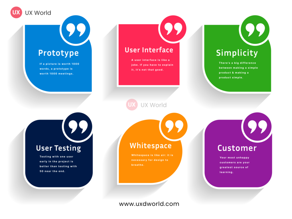
“If a picture is worth 1000 words, a prototype is worth 1000 meetings.” – Tom & David Kelley
The idiom ‘A picture is worth a thousand words’ holds true for prototypes too.
A prototype is a clickable journey of your design idea. It simplifies communicating your concept and user flow to clients before development. Getting early feedback and making updates is easier and less costly in a prototype as compared to altering a fully implemented system.
This UX quote mentions the importance of prototypes in understanding the concept.
“Without a prototype, it’s only a concept. It can be difficult to get a potential client to commit to the purchase of a concept.”–Steve Upton
#4. Share your thoughts with people around you

“None of us is as smart as all of us. Keeping your ideas to yourself is detrimental. Diversity of people equals diversity of ideas.” — Denise Jacobs
Sharing your thoughts opens new perspectives. Each person interprets ideas differently. Keeping thoughts to yourself will limit your growth. Design thinking follows the same principle.
“Key to successful UX design is collaboration.” — Ashley Ramous
As per the quote, collaboration is integral to the design process. To maximize effectiveness, collaborate to generate ideas. Sharing and working together are essential for successful outcomes.
#5. Follow consistency in your design
“Consistency is one of the most powerful usability principles: when things always behave the same, users don’t have to worry about what will happen.”— Jakob Nielsen
Consistency is the key principle of UX design. A user-friendly design ensures a consistent experience. If users find different solutions for a similar problem, they will get confused and frustrated. Consistency reduces learning time as it makes the experience familiar.
“A simple way to ensure consistency throughout our products is to maintain UI guidelines and follow them while designing the experience.” – UX World
#6. Make your products usable for humans
“When I design, I work very hard to make the interface experience feel like there’s a human on the other end, not a computer. “— Aarron Walter
A design should cater to users ’ needs. First, understand their requirements, behavior, and working environment. It is tempting to jump into the design phase without user research, however, it can harm the product. Create user personas based on user research. Reference them during design to stay on the right track.
“You’re almost always wrong about your users.” — Manik Rathee
#7. Make Understandable designs

“A user interface is like a joke. If you have to explain it, it’s not that good”. — Martin Leblanc
Effective communication in design is similar to telling a joke, relying on seamless understanding. Just as explaining a joke diminishes its humor, an interface loses charm when constant clarification is needed.
A self-explanatory design effortlessly guides users, ensuring smooth navigation without explaining each step. Good designs provide information, warnings, and error messages gracefully.
“If you find an element of your interface requires instructions, then you need to redesign it.” — Dan Rubin
#8. Prioritize simplicity in your design
“There’s a big difference between making a simple product and making a product simple.”— Des Traynor
Creating a simple product involves offering basic and common features within a limited scope.
Simplicity, however, goes beyond this — it means providing user-centric features without unnecessary complexity. The role of a UX designer is crucial in maintaining this simplicity. They translate customer needs into a visually intuitive interface while avoiding feature overload.
“More options, more problems.” – Scott Belsky
#9. Don’t ignore the usability aspect of your design
“Usability is not a quality that can be spread out to cover a poor design like a layer of peanut butter.” — Clayton H Lewis
Usability is the ease of use with which users work on a product to achieve their goals. It is a critical factor measured by user satisfaction.
Ignoring usability in design results in several challenges, including a steep learning curve, more errors resulting in more error handling, higher support costs, lost user trust due to unexpected behavior, and expensive change management.
Ensuring usability involves making it an integral part of the design process, not an afterthought.
#10. Perform early user testing of your design

“Testing with one user early in the project is better than testing with 50 near the end.” — Steve Krug
User testing is pivotal in enhancing design decisions and should be an integral part of the design process.
Working on the initial stages, when you sketch ideas on paper, whiteboard, or screen, make your users part of your discussion. Get their feedback and shape your design accordingly.
During the middle stage, when you create low-fidelity and high-fidelity images and prototypes, share them with users to get their suggestions.
During the final stage, when you build the system, get in touch to see whether users can achieve their goals.
“I get very uncomfortable when someone makes a design decision without customer contact.”–Dan Ritzenthaler
#11. Share your perspective with others
“No matter what, if you have a desire to be heard and create value for others, do it. It may have already been “said”, but not by you.” — Jeremy Frandsen
In the world of UX design, it is like repeating a good idea multiple times. You have probably encountered design principles and UI guidelines many times. Why do you need to keep reminding yourself?
First, our brains need repetition to remember things. It is like staying positive – you need a daily dose.
“People often say that motivation doesn’t last. Well, neither does bathing — that’s why we recommend it daily.” –Zig Ziglar
Similarly, design principles need regular revisiting for them to stick.
Secondly, design concepts never get old. For example, consistency is crucial for UX design, and you can find many articles discussing this concept – and all of them are correct. So, even if an idea seems simple, share your unique perspective about it.
#12. Don’t ignore whitespace in your design

“Whitespace is like air: it is necessary for design to breathe.” –Wojciech Zieliński
Whitespace or negative space is crucial for providing an organized UI and improving user interaction.
Whitespace in design offers several benefits. Users can quickly scan and understand the content and structure of a page. You can achieve logical grouping by placing related elements with clear empty space around them. Also, whitespace helps differentiate unrelated items without explicit separators, maintaining a visually clean interface.
Despite its significance, sometimes whitespace is missing in UI design. It deserves equal attention alongside other visual elements.
#13. Use criticism to improve yourself

“Do not seek praise, seek criticism.”–Paul Arden
Receiving praise feels fantastic, but the real power for improvement lies in criticism.
It holds true in everyday life and is especially related to the world of UX design. Feedback is an important element in the design process, guiding you from one step to the next.
To grow in the design field, critically analyze your UX work, improve, and iterate. Listening to criticism is the path to self-improvement.
“Praise may make you feel good, but you need criticism to make yourself stronger and better.” – UX World
#14. Pay attention to details

“Look at usual things with unusual eyes.”–Vico Magistretti
Being a UX designer, you must have an eye to look at usual things in an unusual way.
UX designers naturally see things with a unique lens. Before practicing UX, you might not have viewed things distinctively, but now you have developed a habit of seeing with a different eye. Whether it is an interface or daily life, UX designers keenly observe the usability of things around them.
These observation skills are vital for recognizing good and bad design ideas.
#15. Take design inspiration from your surroundings

“Design is everywhere. From the dress you’re wearing to the smartphone you’re holding, it’s design.”— Samadara Ginige
Design is everywhere, not just in our digital world but in the everyday items we use for comfort.
Think of your hairbrush—it is designed for easy use, ensuring a seamless brushing experience. The same applies to a toothbrush; its appealing look means little if it is not user-friendly.
This human-centered approach aims for user ease. Whether creating digital apps or wardrobes, the design process remains consistent—understand needs, gather ideas, involve users, build, test, and refine.
“Design really is everywhere, so take inspiration from your surroundings.” — Emily Stevens
#16. Innovate your design
“Asking users to adopt new behaviors or even modify their existing behaviors is very, very hard.” — Khoi Vinh
Change is difficult to accept.
When users continuously use a product, they become comfortable with it, although it might have several shortcomings. Designers aim to enhance products based on user needs and trends, but how can changes be more acceptable?
First, gather user feedback and make your design decisions for future updates. If you are building a product based on ‘what the world was waiting for’, then it would be something that the user is already expecting.
The second option is to build something that changes the user’s thinking. You can try some innovative ideas that the user is not expecting, but when they use it, they get a pleasant experience.
#17. Learn from your unhappy customers

“Your most unhappy customers are your greatest source of learning.” — Bill Gates
While happy customers inspire and build your reputation, unhappy customers offer valuable growth opportunities. Embrace them as a chance to improve. Listen attentively to their concerns, put extra effort into solutions, seek continuous feedback, and maintain a positive relationship.
Unhappy customers can turn into strong referrals when handled well. Customer satisfaction is crucial; a displeased customer can harm your reputation, especially in the digital age where their voice can reach thousands.
“If you make customers unhappy in the physical world, they might each tell six friends. If you make customers unhappy on the internet, they can each tell 6,000 friends.” Jeff Bezos
#18. Understand users’ needs
“We tend to be distracted by the voices in our own heads telling us what the design should look like.” — Michael Bierut
While designing, it is natural to see things from your perspective, but remember, you are not the end user. Although you are an expert, your likes and dislikes might not align with your users.
The solution?
Get to know your users deeply—visit their environment, talk to them, and observe their behavior. Act like your user. Continuously involve them in your design process to stay on track.
“Never try to impose your likes and dislikes on your design. You are not designing for yourself.” – Saadia Minhas
#19. More options, more problems
“Rule of thumb for UX: More options more problems.” — Scott Belsky
Hick’s law emphasizes that the more choices users face, the longer it takes for them to decide. Imagine an app or website with 7-8 options in a list – the users will take time to understand and select an option.
To retain visitors, simplify the user experience. Trim unnecessary options, guide users clearly, and employ progressive disclosure for advanced features. This approach ensures user satisfaction, as they efficiently achieve their goals.
“Anything we can do to make things simpler and more transparent is a plus.” — Cap Watkins
#20. If you can design one thing, you can design everything
“If you can design one thing, you can design everything.” — Massimo Vignelli
Designing is a process—you understand the problem, collaborate with users, sketch ideas, gather feedback, and finalize your design. This journey teaches you to delve deep, work with users, communicate ideas effectively, and deliver a great experience.
The process is your guide, and while each design may require customization, the standard remains the same. Using your enhanced skillset, you can confidently design usable, efficient, and user-friendly experiences.
You may need to customize your process when you work on a new app design, but the standard process will remain the same.
Want to Learn UX Design?
- Try Interaction Design Foundation. IxDF offers online design courses that cover the entire spectrum of UX design, from foundational to advanced level. As a UX Design World reader, you get 25% off your first year of membership with the IxDF.
- The UI/UX Design Specialization from Coursera brings a design-centric approach to user interface and user experience design and offers practical, skill-based instruction centered around a visual communications perspective. By learning this Design Specialization, you can design high-impact user experiences for your customers.
Thanks for reading.
Subscribe for more related articles at UX World.
If you have any questions, contact us here: Facebook | YouTube | Twitter | Instagram | Linkedin
