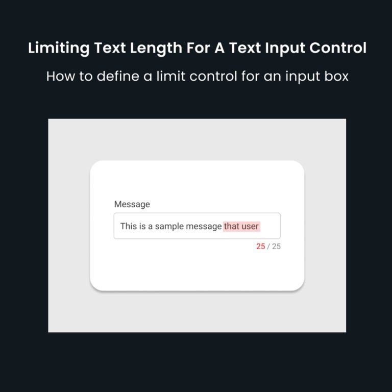
Limiting Text Length For A Text Input Control
Text input controls are the most commonly used controls in a web form. They are used to take input from users in the form of text. The user needs to write the …
Limiting Text Length For A Text Input Control
Text input controls are the most commonly used controls in a web form. They are used to take input from users …

5 UX Design Books You Should Read in 2025
Below are 5 UX design books that you must read in 2025. 1. The Design of Everyday Things: Revised and …
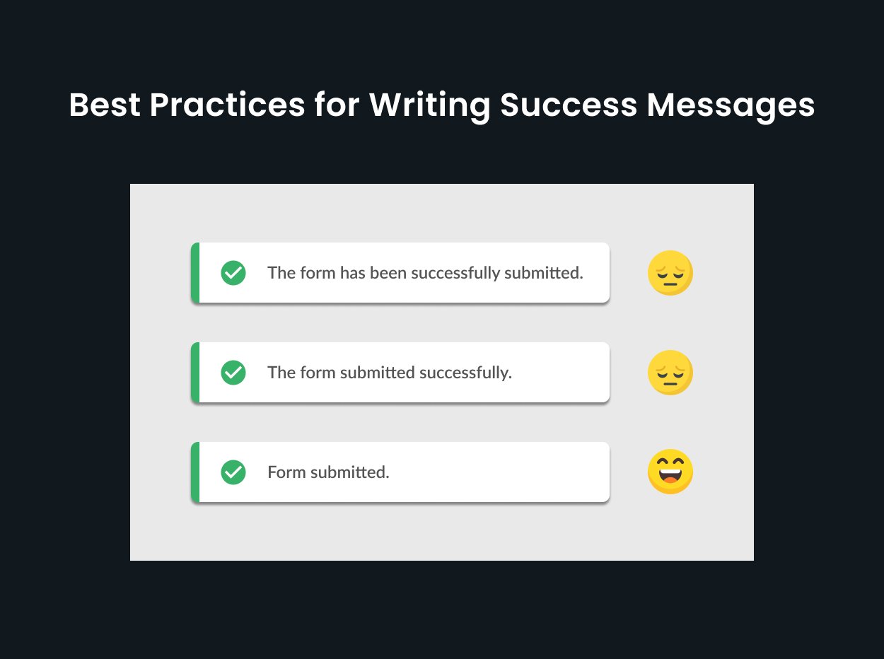
Best Practices for Writing Effective Success Messages
Best practices for designing success messages “Perfection is achieved not when there is nothing more to add, but when there …


Importance of Whitespace in Design
“Whitespace is like air: it is necessary for design to breathe.” –Wojciech Zielińsk Whitespace or negative space is an important …

User Testing at Initial Design Stages
“Testing with one user early in the project is better than testing with 50 near the end.” — Steve Krug …
If You Can Design One Thing, You Can Design Everything
“If you can design one thing, you can design everything.” — Massimo Vignelli That’s true. When you are designing an experience, you are …

7 Ways to Validate a Product Idea
How to validate a product idea? Product idea validation is …

Create a Flow Chart in FigJam in a Single Click
Forget about adding rectangles and arrows, write the flow and …

5 Best AI Design Tools to Boost Your Efficiency
In the exciting world of design, artificial intelligence (AI) is …

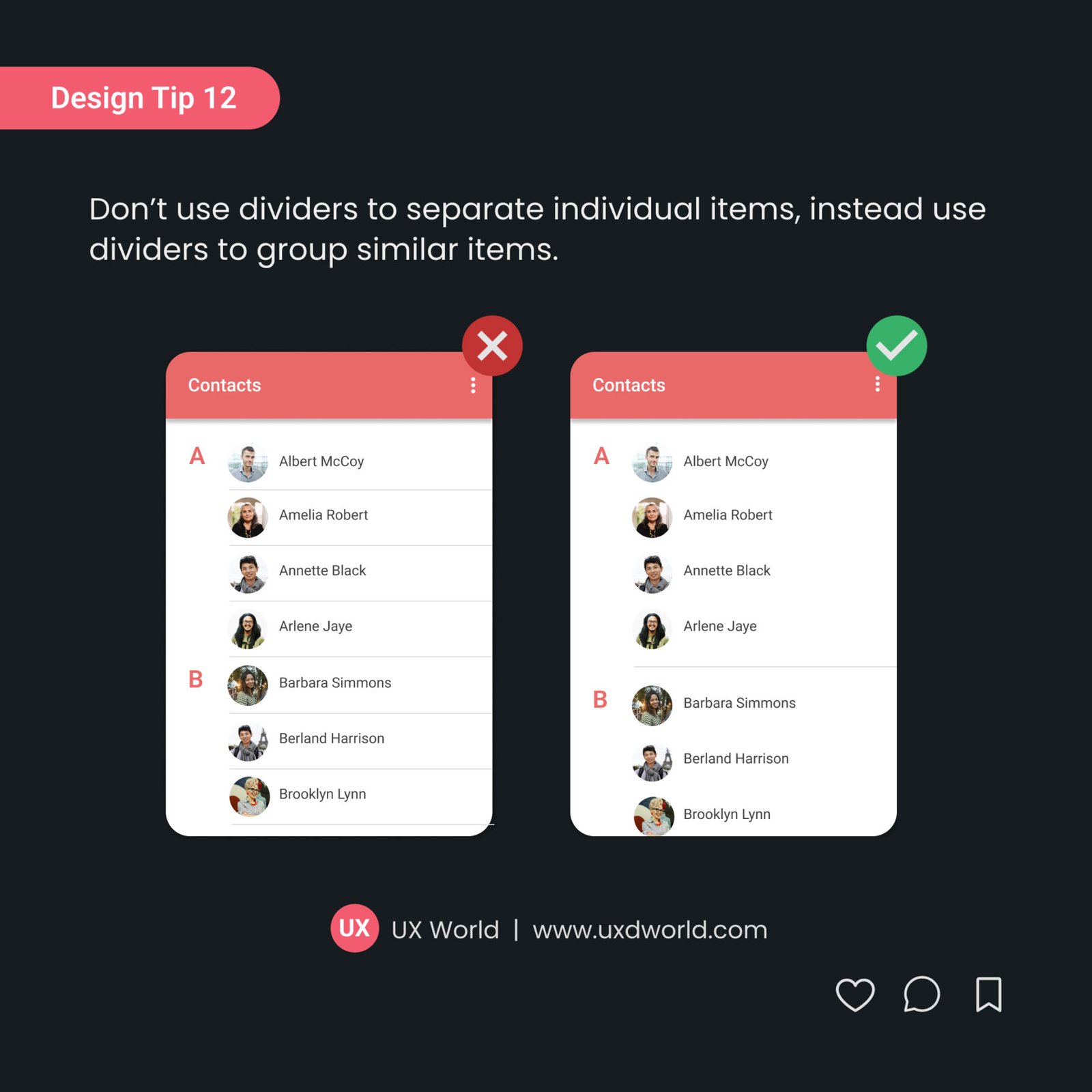
Design Tip #12 – Use Divider to Group Related Items on UI
Don’t use dividers to separate individual items; instead, use dividers to group …
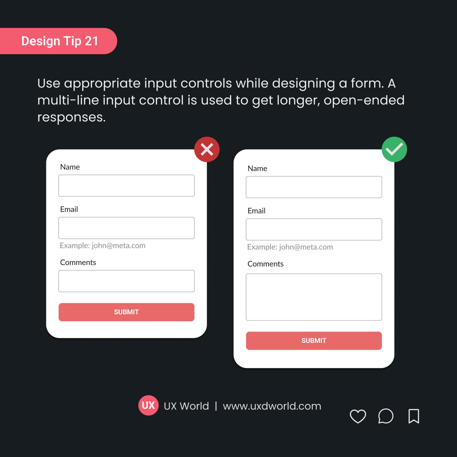
Design Tip#21 – Use Appropriate Input Controls in Your Forms
A multi-line input control is used to get longer, open-ended responses. Design the layout of the control in a way that makes it clear to the user that they can enter multiple lines of text.
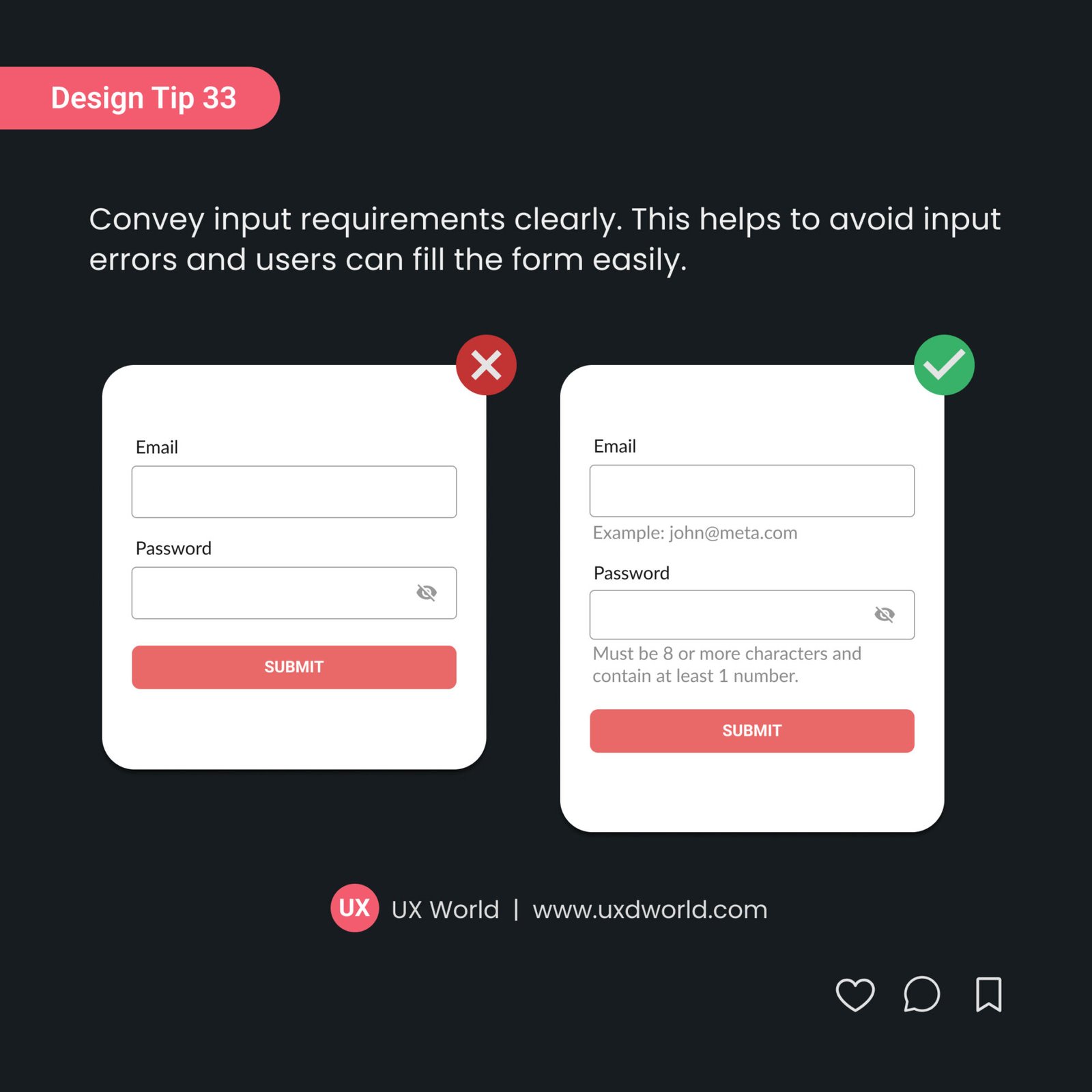
Design Tip #33 – Convey Input Requirements Clearly
Clearly communicate what kind of information users need to provide in a …