Last Updated on May 15, 2024 by UX World
Forms are an essential part of websites and applications. In today’s digital era where every aspect of life has shifted to online, filling a form has become a requirement for users. The users interact with applications by providing their information in a form to achieve their desired goals. It is important to design a form that is easy to understand and navigate.
A common yet important aspect of form designing is a clear distinction between required and optional fields. A clear indication helps users fill out their forms smoothly. This article describes a few ways to indicate required and optional fields in a form.
Key takeaways
- Different approaches are being used to indicate required and optional fields in a form design. Selecting an approach that helps to build usable forms is a challenge.
- Providing a label with optional fields only is a good way to reduce clutter, and provides a clear indication, still requires a little training for the users.
- Using an asterisk (*) symbol with the required fields is the most common way to differentiate between the two types of fields.
- Conducting user testing can help to find a suitable option for your users.
4 ways to mark required and optional fields
Below are 4 ways to mark required and optional fields in a form. We will analyze each method so you can choose the best possible way to design your forms to get higher conversion rates.
1. Using contextual help with all fields
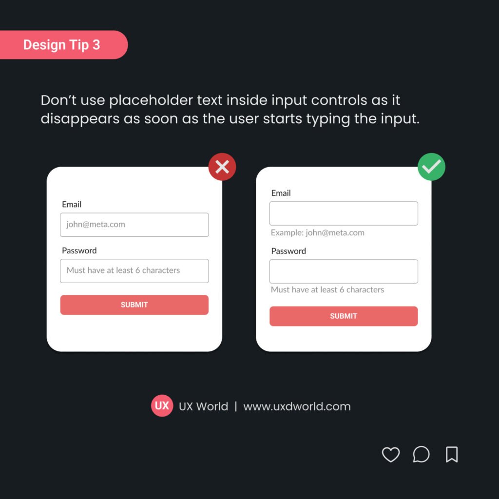
This method uses a textual label to guide users about the required and optional fields.

PROS
- This method can be effective for most people because it provides clear information.
CONS
- This method can cause visual clutter as each field has an additional information text.
- The user has to pause and look at each field to find if it is required or optional. This can take a reasonable amount of time for longer forms.
2. Using labels with required fields
This method uses textual labels with required fields only.
PROS
- This method will quickly attract the user’s attention to the required information in the form.
- If we see from the human psyche’s perspective, we usually tend to seek out the required information first when filling out a form. So this method allows your users to understand and navigate smoothly without any hassle.
CONS
- This method can create a visual clutter if there are too many fields in the form.
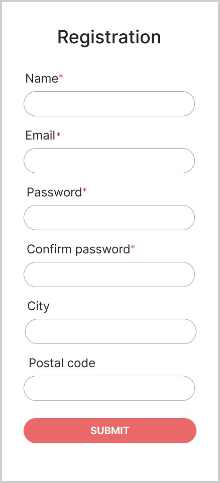
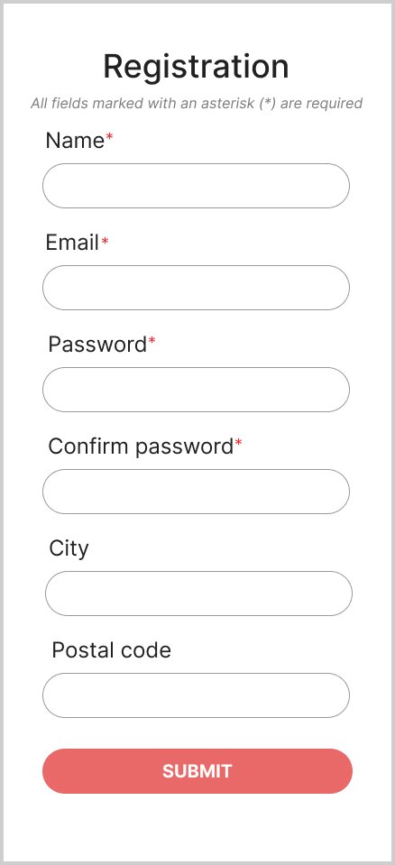
3. Using icons or symbols with required fields
This method uses a suitable and common symbol to distinguish between the required and optional fields. For example, the most popular way is using an asterisk for required information.
PROS
- This method is the most popular one and is understood by almost everyone.
- An asterisk symbol helps to grab the user’s attention towards the required fields so they can enter the required information.
CONS
- Overusing an asterisk symbol, or applying it inconsistently can contribute to visual noise in the design.
- Some users may not understand the purpose of an asterisk particularly if an explanation does not accompany it. To resolve this, you may need to display an explanation in your form as shown below.
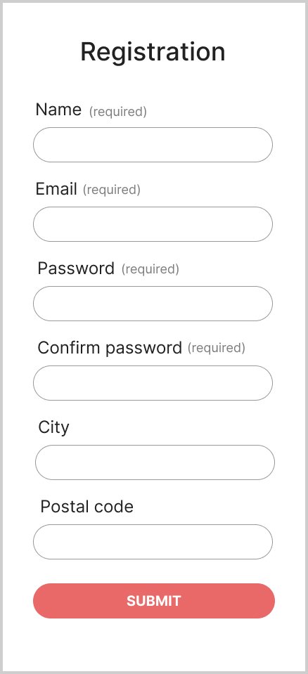
4. Using labels with optional fields
This method uses contextual help only with the optional fields, assuming that users understand the required fields automatically.
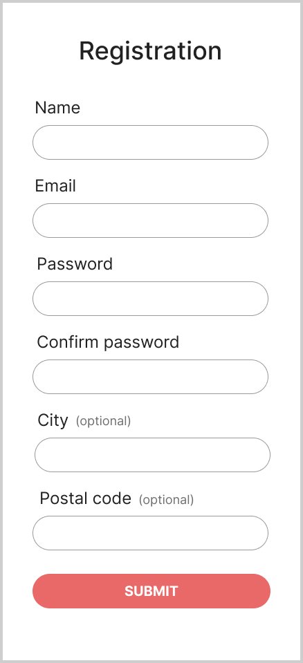
PROS
- This method reduces the visual noise by highlighting only the optional fields that automatically distinguish them from the required fields.
CONS:
- This method can be confusing for users as it may take some time to find a field with an optional label. Only after that user will know that the remaining fields are required.
Which option is better to follow?
In my opinion, methods 3 or 4 are better choices to design usable forms.
- Providing a label with optional fields only is a good way to reduce clutter, and provides a clear indication, still requires a little training for the users.
- Using an asterisk (*) symbol with the required fields is the most common way to differentiate between the two types of fields.
You can choose an option based on your requirements. When it comes to design, user testing is like trying on different pairs of shoes before selecting the perfect fit. It is better to conduct user testing before following a method.
A/B testing is a common way to test multiple variants of the forms with your users and determine the best way. This will eventually lead you toward usable forms and satisfied users.
Conclusion
Designing a user-friendly form is an important aspect of product usability. The article has explained various methods to indicate required and optional fields in a form design. You can choose a method that best matches your requirements. And do not forget to conduct user testing before you launch your product.
Want to Learn UX Design?
- Try Interaction Design Foundation. IxDF offers online design courses that cover the entire spectrum of UX design, from foundational to advanced level. As a UX Design World reader, you get 25% off your first year of membership with the IxDF.
- The UI/UX Design Specialization from Coursera brings a design-centric approach to user interface and user experience design and offers practical, skill-based instruction centered around a visual communications perspective. By learning this Design Specialization, you can design high-impact user experiences for your customers.
Thanks for reading.
Subscribe for more related articles at UX World.
If you have any questions, contact us here: Facebook | YouTube | Twitter | Instagram | Linkedin