Last Updated on February 21, 2024 by UX World
Forms are an essential element of the user interface whether you are working on mobile apps or web-based tools. They are the best source of user interaction. The users provide their information and input through forms and the system interprets this information to fulfill user requests.
Certain items make a form usable including input controls, input validation, error handling, and user feedback.Two important input controls are radio buttons and drop-down menus. Both of them can be used interchangeably when input is required from the user. However, if we study the usability of these controls, it becomes apparent that radio buttons and drop-downs should be used in certain scenarios to make it easier for users to select a given input.
Below are a few rules based on this usability study that will help you to decide about one of these controls while designing a form.
Use Radio Buttons
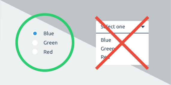
Rule#1: When you want to emphasize options
There can be multiple cases where you want to emphasize options:
- There is no clear default or recommended option.
- You want users to read all options.
- The options are unfamiliar to users and there is less or no chance that they can predict them.
In the example, using a drop-down menu does not seem good as the default option does not give a clue about other options.
Rule#2: When you have less than 5 options
Lesser options are good to place side by side so that:- Users scan the option easily and quickly.
- They provide a quick response instead of opening a drop-down menu and selecting from multiple options.
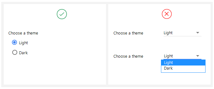
It is better to use radio buttons when the user has to select from 2 to 4 options, as shown in the example.
Rule#3: When comparison of options is needed
Comparable options are good to place side by side because:
- Users can see them at a glance and compare them easily.
- Comparing and deciding about an option from a drop-down menu takes time.
- Users have to open the menu and compare options each time they want to review the selected option.
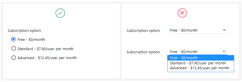
A good example above is about the selection of a subscription plan where the user has to make a serious decision.
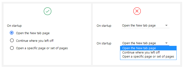
Rule#4: When visibility and quick response is a priority
Clear visibility and a quick scan of options are more understandable for users.
- For longer forms, it becomes easier and quicker to scan the options and mark the required ones.
- Clicking a drop-down each time to select something takes a lot of time.
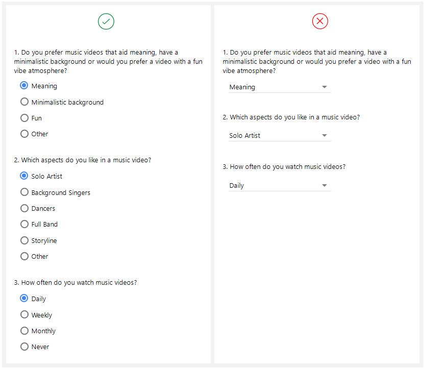
It is obvious from the given example that long forms provide a good user experience when all selectable options are visible to the user.
Use Drop-Down Menus
Rule#5: When default option is the recommended option
Viewing only the recommended option makes it easier for a user to decide the selection because:
- Displaying all options will draw the user’s attention.
- It is not encouraged for users to change the default option.
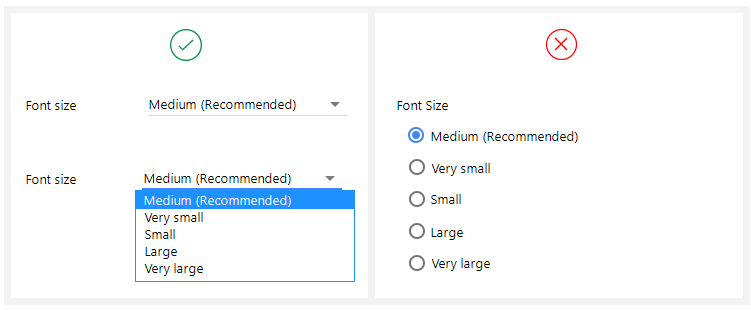
In the example, there is no need to display all options as there is a lesser chance for the user to change the default option.
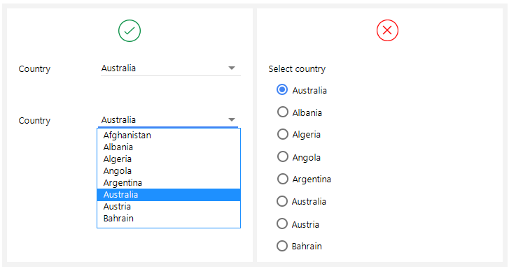
Rule#6: When a large number of familiar options are available
A large number of familiar options are encouraged to display in drop-down because:
- Users can predict them easily.
- There is no need for users to see options side by side.
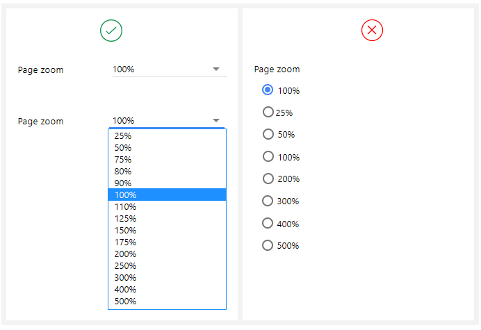
Rule#7: When you have more than 7 options
A large number of options is not good to display side by side because:
- It becomes cluttered on the UI if a pile of options is placed side by side. Users can get confused while looking at them.
- It takes time to scan a large list of radio options.
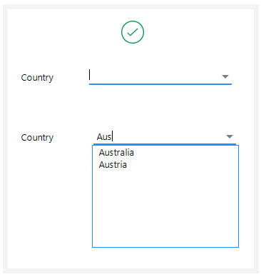
Also, for a long drop-down, it is a good practice to provide a text box where users can type the option name and the list displays filtered options only. This makes selection easier and quicker.
Conclusion
To enhance the form’s user experience, it is very important to provide correct controls to take the user’s input. Since forms can be very long with a large number of options, it becomes tedious for the user if he has to make extra clicks to fill in his information. The given set of rules will help you to decide between two controls, radio buttons, and drop-down menus while designing your forms.
Want to Learn UX Design?
Try Interaction Design Foundation. IxDF offers online design courses that cover the entire spectrum of UX design, from foundational to advanced level. As a UX Design World reader, you get 25% off your first year of membership with the IxDF.Thanks for reading.
Subscribe for more related articles at UX World.
If you have any questions, contact here: Facebook | YouTube | Twitter | Instagram | Linkedin