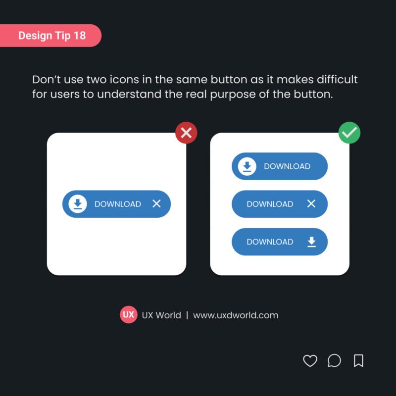
Design Tip#18 – Don’t Use Two Icons in the Same Button
Design Tip: Don’t use two icons in the same button as it makes difficult for users to understand the real purpose of the button.
Design Tip: Use checkboxes when applied settings require confirmation before they are submitted.
Design Tip: Use a background overlay with modal bottom menus so that users know that they cannot interact with the rest of the screen.
Don’t use multiple colors in the bottom navigation bar. It will make it harder to find out the selected icon and navigate between options.
Don’t place a button below another button if there is enough space to place them side by side.
Don’t use dividers to separate individual items, instead use dividers to group items. Find more UI design tips here.
The color contrast should support easy-to-read and distinguishable text over the background and make the useful information stand out effectively. Find more UI design tips here.
A good UX designer always looks forward to learning and sharing related knowledge with other designers. The below list contains a few amazing UX links that I believe will enhance your UX understanding and help you to grow in the …
Basic search is based on a single parameter whereas Advanced search is a way to find something from large content by defining criteria using multiple parameters
What Are UI Design Guidelines? While working on UI design, a few principles and guidelines are required to follow that help you design a standard and consistent experience throughout your products.