
Last Updated on January 2, 2024 by UX World
What is Advanced Search?
Search is a method of finding required information from large content. Basic search is based on a single parameter (usually name) that is used to find an item. Advanced search is a way to find something from a large list of items by specifying criteria including multiple parameters.
Let’s have a look at a few examples and extract best practices that will help you design a simple and efficient user experience to perform an advanced search while designing your products.
How Does Advanced Search Work?
The advanced search option is usually placed somewhere closer to the basic search box on the UI so that users can easily find and go towards it.
The user defines a search filter and applies it to large data to narrow down its scope. A filter is created by adding different parameters. For example, to search a list of contents, parameters can be Name, ID, Type, Status, Creation Date, Author, etc. The user selects a parameter and defines its value. A parameter can have a set of values for selection, like the Type can be Image, Docx, PDF, etc.
Multiple parameters defined for specific criteria make a filter. Users can define and save a filter for later use. When the search is executed, results are displayed, and the user can see and further narrow down these results.
This is how advanced search works.
Best Practices for Advanced Search
This section presents a few examples and best practices that can be used to define a simple and intuitive user experience for advanced search UI.
- I. How to add search parameters
- II. How to select parameter values
- III. How many values need to display
- IV. How to execute search
- V. How to display search results
- VI. Filtering and searching in results
- VII. How to save and access filters
- VIII. How to exit search mode
- IX. Advanced mode for technical user
I. How to add search parameters
Search parameters and their values can be displayed in different ways.
1. All parameters available on front UI
The advanced search page displays all available parameters on the front UI and users do not have to add parameters explicitly. They can just select values against the required parameters. This is called faceted search.
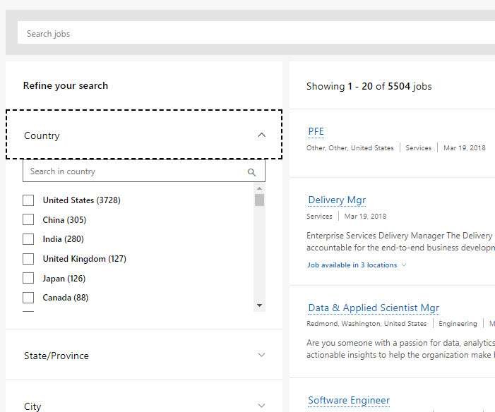
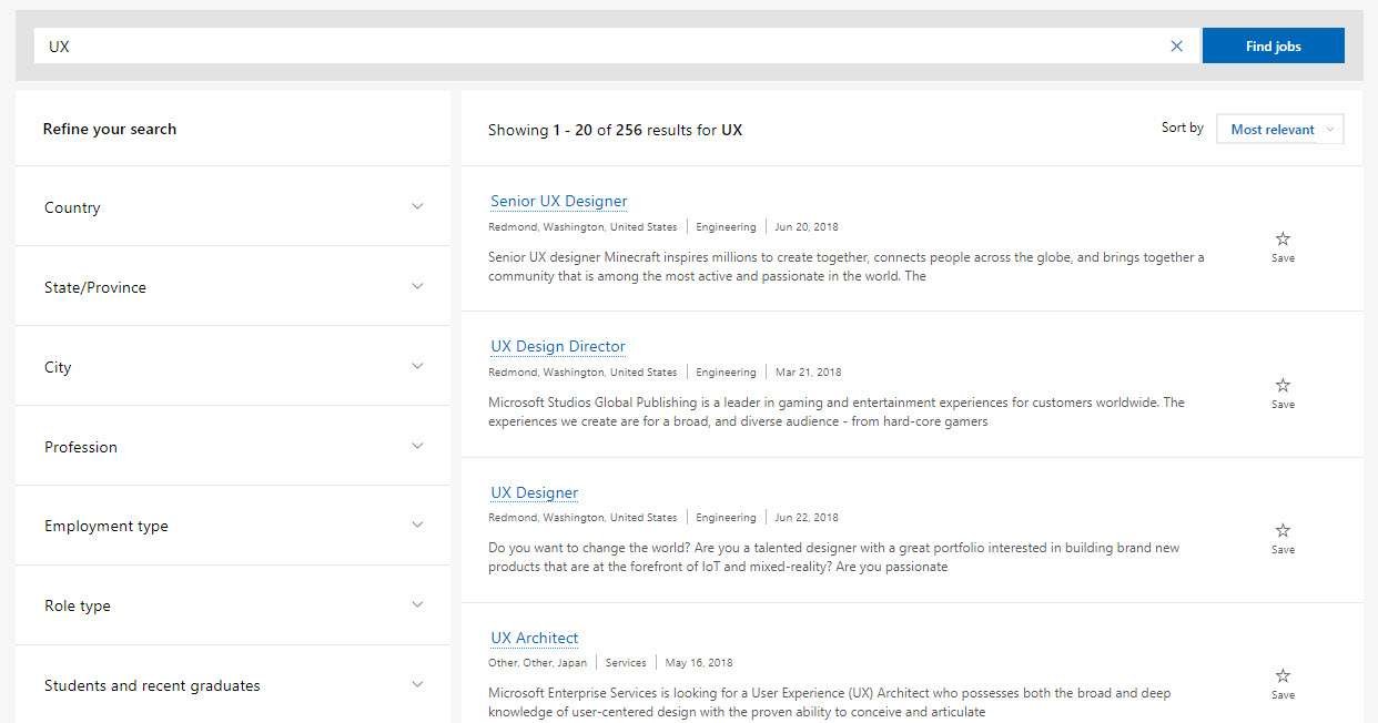
Microsoft Careers page displays search parameters in the left panel. By default, all parameters are in a collapsed state and the user can expand them one by one and select values.
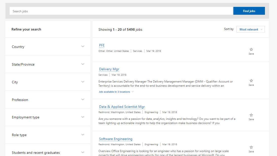
Analysis:
- Displaying all parameters on the front UI is a user-friendly approach and users can easily scan them.
- It works well for very large content.
- The only disadvantage is that enough space is required to display all parameters and sometimes it creates clutter on UI.
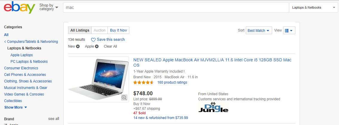
2. Commonly used parameters available on front UI
This approach displays commonly used search parameters on the front UI. Parameters are displayed in a drop-down menu and users can select required parameters from the menu.
The same steps are repeated each time to add a parameter.
Jira displays commonly used parameters on UI and the user has the option to add more parameters from the available list.

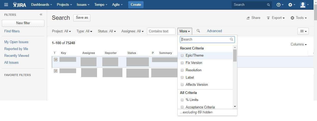

Analysis:
- This approach works well where most of the time common parameters are used to perform a search. The user is less worried about details that are not needed.
- Displaying only a few parameters on UI requires less space and hence less cluttering on UI.
- It requires more clicks each time when the user adds a parameter.
- Not good for a large number of content.
II. How to select parameter values
There are different ways to display the values against a parameter. You can select an approach that best fits your current context and requirements.
1. Input box
If the user is supposed to enter an input against a parameter, then a simple text box is displayed.
Twitter displays a search form to define search criteria that contains input boxes against parameters so that users can enter desired values.
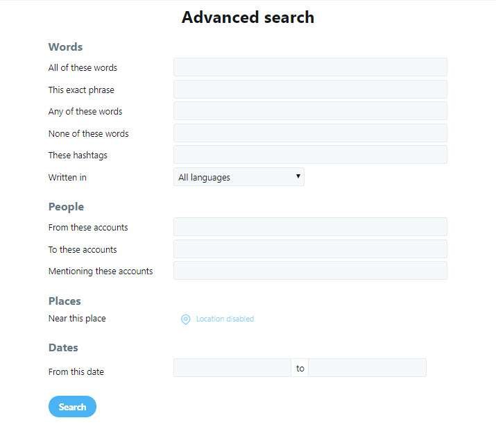
Analysis:
- The input box is good to use when no defined values are available for a parameter.
- A placeholder text about the type and format of the required input is helpful for the user.
- If an input box can contain multiple values, it should be clearly instructed to the user. For example, a help text like ‘add multiple values separated by comma’ is useful.
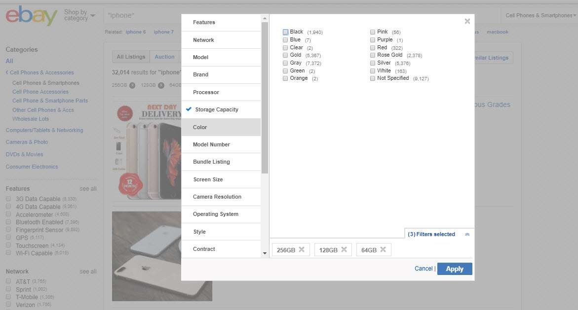
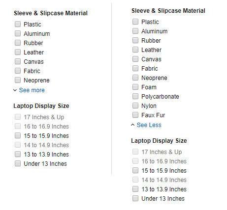
2. Checkbox list
If the user can select multiple options for a selected parameter, then the checkbox list displays. This checkbox list can be provided as an independent list or encapsulated within a drop-down menu to save space.
Microsoft Careers search page displays available options for a parameter when the user expands the parameter name. Also, you can see in the image below that an input box is available to search within values.
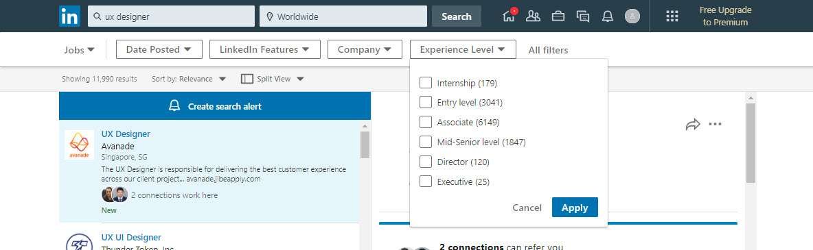
Analysis:
- If the user has to select from multiple options, then a checkbox list is a good option.
- The checkbox list is a user-friendly control as it provides a clear experience of the selection and deselection of values.
- The default state should be unchecked as selecting the desired option is more convenient for users as opposed to deselecting what they don’t want.
- Providing a checkbox list within a drop-down menu saves space, but needs more clicks. Also, displaying multiple selected options in the drop-down box is a challenge.
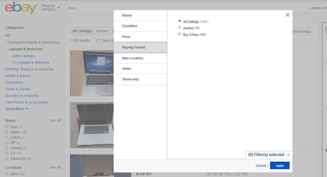
3. Hyperlinks
Few search parameters require a single input from a given list of values. Hyperlinks are used for this purpose.
Since hyperlinks can have multiple hierarchical levels, sometimes only the current level is shown on the UI.
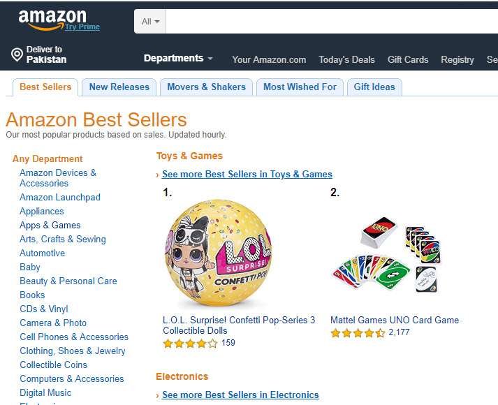
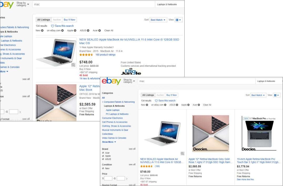
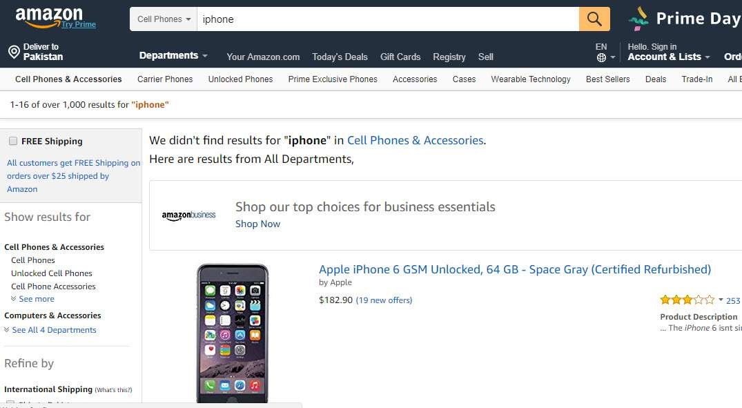
Amazon uses the approach of hiding the parent-level hyperlinks for a selected link. ‘Departments’ is their main level link that displays a list of departments. When the user selects a department, Amazon hides links to other departments. It means the user can now focus only on the selected department’s details.

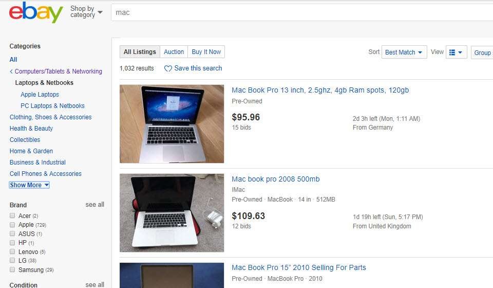
Whereas eBay does not hide anything and all links in the hierarchy remain visible and accessible whether a link is selected or not.
Analysis:
- Hyperlinks are used to execute search immediately and the user does not have to select a GO button to see the results.
- The selected hyperlink should be displayed in the selected state so users can easily differentiate it from others.
- It is better to display only the current level in the hierarchy when a link is selected from a multi-level list. Displaying all levels when the user wants to work only at one level creates extra clutter.
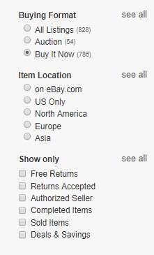
4. Radio button list
Radio buttons are also used to display values when the user has to select one value for a parameter.
eBay displays radio options in search facets as well as in advanced search forms where users can select a single option for a parameter.

Analysis:
- Radio buttons are good to use when the user has to execute a search explicitly after making selections. Otherwise, hyperlinks are a better approach to display results on run-time.
5. Visual icons
Visual representations like images, icons, or color boxes are used as values for specific types of parameters.
Customer reviews are shown as star icons by Amazon.

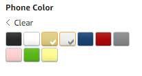
Analysis:
- Visuals provide a good and appealing way to present information. If the search parameter contains values that are best understood using visuals, then it is a good practice to use them. For example, colors should be given in visual form instead of names.
- Providing tooltips along with icons/visuals to make them more understandable is a good approach.
- Standard icons/visuals need to be used where applicable so that users can relate to them easily.
6. Slider
A slider is used when users have to select a value from within a range.
Mango uses a slider to display the price range and the user can drag the knob to make a selection.
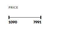
Analysis:
- A slider provides a quick idea of the available range and selected value.
- The slider should be used when start and end values are known.
- More user-friendly for touch devices, as selecting a precise value is difficult using a mouse.
III. How many values need to display
Another important thing is to decide how many values should be displayed for a parameter so that the user can make a selection.
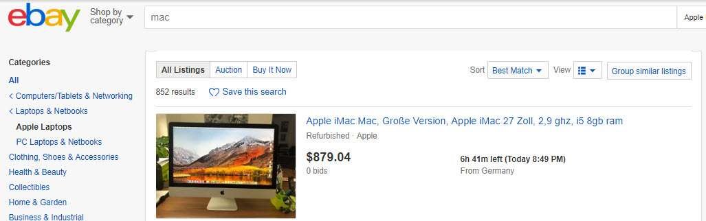
eBay displays 7–8 items for each parameter. Selecting the ‘see all’ option next to each parameter displays all values inside a dialog box.
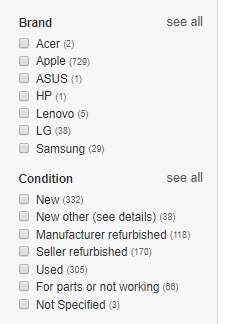

Analysis:
- Since values display in the form of a list — checklist, radio options, hyperlinks — the common guidelines to display a number of options in a list are applicable here.
- A good approach is to display all values when they are less than 8. If values are more than 8, then display only common values with a More option. When the number of items still exceeds, provide the remaining items in an extended list or a dialog box.
- Using a scroll to display all items in the same place may create difficulty for the user to find the required value.
- Displaying a count of available items with values is a good way to provide the user with an idea of the number of items from which he is going to perform the search.
IV. How to execute a search
Search can be executed using either of the ways: (i) clicking a Search or OK button, or hitting the Enter key, (ii) on run-time when the user changes a parameter.
Amazon and eBay, both execute the search just after the user sets any of the given options.
Linkedin executes the search when the user hits the Apply button after settings parameters.
Analysis:
- Executing a search on run-time provides a simple and enjoyable experience to the user where he can see the results just after each click.
- Executing a search by hitting a button requires the user to set all parameters and then click the button to see results. If the user wants to see results after each change, he has to click the button each time he makes changes in parameters.
- Also, if users want to go back to previous results, they have to revert all changes and there is much chance that they have already forgotten the defined options.
V. How to display search results
When the search is executed, the resultant contents display as per the defined filters. There are a few considerations that should be made while displaying search results.
1. Placement of search results
Search results are displayed either on the same page where filters are defined, or a new page is opened to show the results.
Twitter and LinkedIn follow the convention of displaying search results on a separate page.

Analysis:
- When the new page opens to display search results, the context of the user changes and it feels like something new is opened.
- If the search parameters are displayed on a separate screen or dialog, the users have to go back each time they want to make a change in parameters.
- Refreshing only results area as being done by Microsoft Careers is a good approach as the user gets a strong feeling that he is working on the same page.
2. Search progress
Search operation takes some time to display results. During this waiting state, feedback about the progress of the search function is displayed.
Amazon displays a loading icon in the center of the page when results are loading.

Analysis:
- The loading icon is a good way to show that content is being loaded.
- If something goes wrong while loading results, it should be conveyed to the user in the form of a proper message.
3. Layout
Search results are displayed in the form of a list or grid whatever is suitable for a site or application.
eBay displays results in a list view, however, the user can change the view to grid mode if required.

Analysis:
- The desired layout is one that best describes the searched items as per their type and user requirements.
4. Pagination vs infinite scroll
Advanced search results usually contain large content that is required to be displayed on multiple pages. Pagination or infinite scroll is used to navigate contents. Pagination can be displayed by using a usable style.
eBay and Microsoft Careers display pagination at the bottom of the results page.


Analysis:
- Infinite scroll is best suited for sites and apps that are streams of user-generated content (Twitter, Facebook, Pinterest, Instagram). Pagination, on the other hand, is well-suited for goal-oriented sites and apps.
- While scanning through results, the user goes from top to bottom, so there is a chance of skipping page navigation at the top. A more user-friendly approach is to display pagination at the bottom.
5. List of applied filters
Advanced search results display a list of filters that are applied to produce results. The user is able to remove any of the applied filters and search results are updated accordingly.
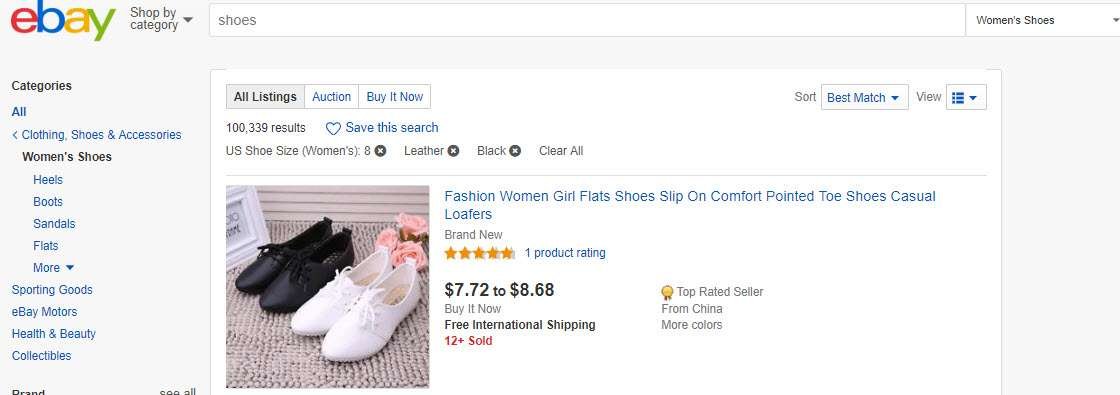
eBay lists all applied filters on top of search results. Users can remove any filter they want. Clicking the ‘Clear All’ option will remove all filters at once.

Analysis:
- All applied filters should be listed on the results page so that users can easily relate them to results.
- If the user has to go to the other page to see applied filters, it provides a disconnected behavior to the user.
6. Results count
The result count displays the number of items produced as search results.
Analysis:
- Result count is useful information that helps users to get an idea of the number of results generated for applied filters, and how much navigation is required to see them.
7. Empty results
If the search result contains no items, this needs to be handled gracefully.
eBay displays a message of empty results. However, it displays items that are closer to the defined search criteria.

Amazon displays a message of the empty results. All contents displayed in the results area that show no filters are applied.

Analysis:
- A good approach is to give users some suggestions in response to an empty search result.
- The approach from eBay seems the best from the given examples. It is giving results of criteria that matched a few of the defined parameters. It is easier for the user to change one or more parameters and see the updated results.
VI. Filtering and searching within results
Search results usually contain a lot of information for users. It is good to provide a few logical filters that users can apply to results.
The sorting option helps the user to sort the results in the desired order.
Also, users can change views to see the results in a preferred layout.
eBay provides Sorting, Change view, Filtering, and Grouping options to narrow down the search results.

Analysis:
- Filters can be used to further limit the number of results.
- However, it is not a good idea to provide a lot of filters on the result page that overwhelms users with a feeling of searching within search results. Decide on a few logical filters that help users to filter results.
VII. How to save and access filters
While performing advanced search, it is a common practice to save applied search filters so that they can be used for later searches. You can also select a saved filter and make changes to create a new one.
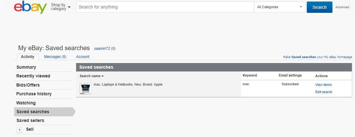
eBay provides an option ‘Save this search’ along with results and the user clicks on it to save this filter. The filter is saved using an auto-generated name based on defined filters. The filled heart icon and ‘Saved’ text show that the filter is saved.

Users can access this saved filter by going to the ‘My eBay’ settings. The filters list provides a few functions that users can apply on filters: sort, edit search filters, and view results.
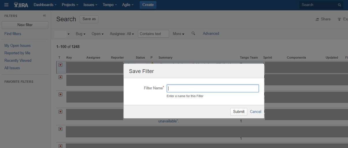
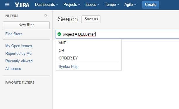
Jira provides a ‘Save as’ option on the search page and the user can click on it, name the search filter, and save it. The saved filters are displayed in the left panel and the user can simply click on a filter to execute it.
Different functions can be applied to a selected filter including Rename, Copy and Delete.

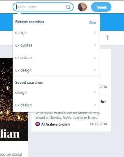
Twitter provides the ‘Save Filter’ option in a drop-down on the search result page. The filter is saved with a default name and can be accessed by clicking the search box inside a menu.

Analysis:
- An option to save the search should be available on the advanced search page so that the user can define a filter and save it.
- Users should be able to access filters easily and perform different functions on them like execute, edit, or remove.
VIII. How to exit search mode
An exit option is provided for the user to go back to the screen from where the search was initiated.
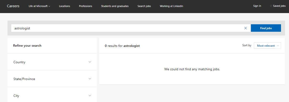
eBay, Microsoft Careers, and Linkedin all provide a ‘Clear’ option to clear all applied filters, and hence search mode will be exited.
Analysis:
- A clear and simple option is required to display on the advanced search page
IX. Advanced mode for technical user
Query-based search is available for technical users.
Users can write a complex SQL query in the search box.
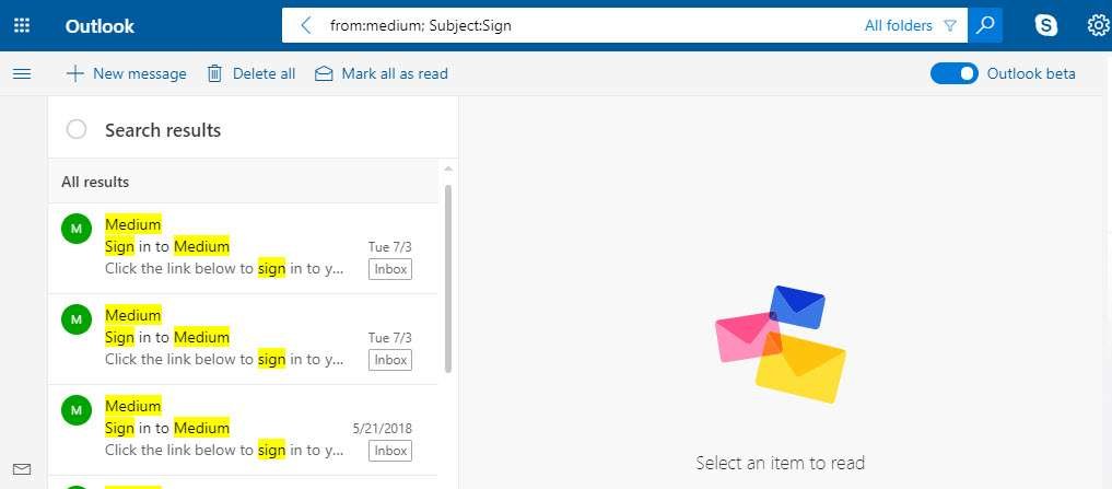
Microsoft Outlook provides query-based search. However, no help is visible when a user enters query parameters.
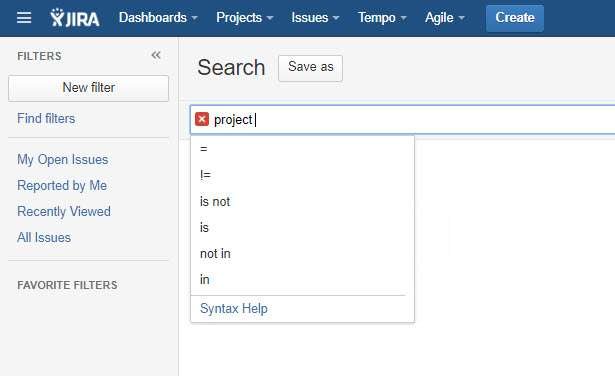
Jira is a very good example of providing advanced search options with instant help.
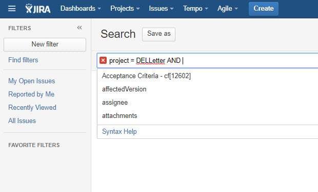
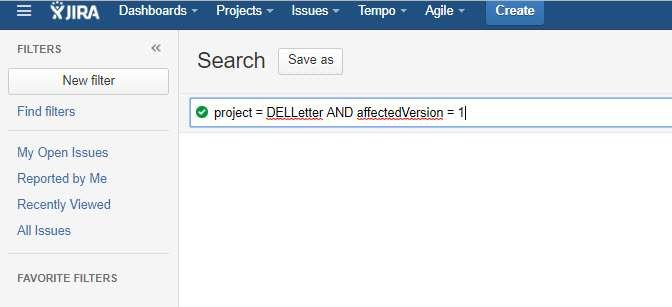
Analysis:
- Proper and instant help needs to be provided when the user is writing the query.
- Run time evaluation of query format is more helpful as compared to an explicit execution of the action from the user.
Conclusion
Providing a simple experience to perform an advanced search is a challenge. This can be achieved by following the best practices while designing advanced search screens.
Want to Learn UX Design?
- Try Interaction Design Foundation. IxDF offers online design courses that cover the entire spectrum of UX design, from foundational to advanced level. As a UX Design World reader, you get 25% off your first year of membership with the IxDF.
- The UI/UX Design Specialization from Coursera brings a design-centric approach to user interface and user experience design and offers practical, skill-based instruction centered around a visual communications perspective. By learning this Design Specialization, you can design high-impact user experiences for your customers.
Thanks for reading.
Subscribe for more related articles at UX World.
If you have any questions, contact us here: Facebook | YouTube | Twitter | Instagram | Linkedin