Last Updated on September 30, 2024 by UX World
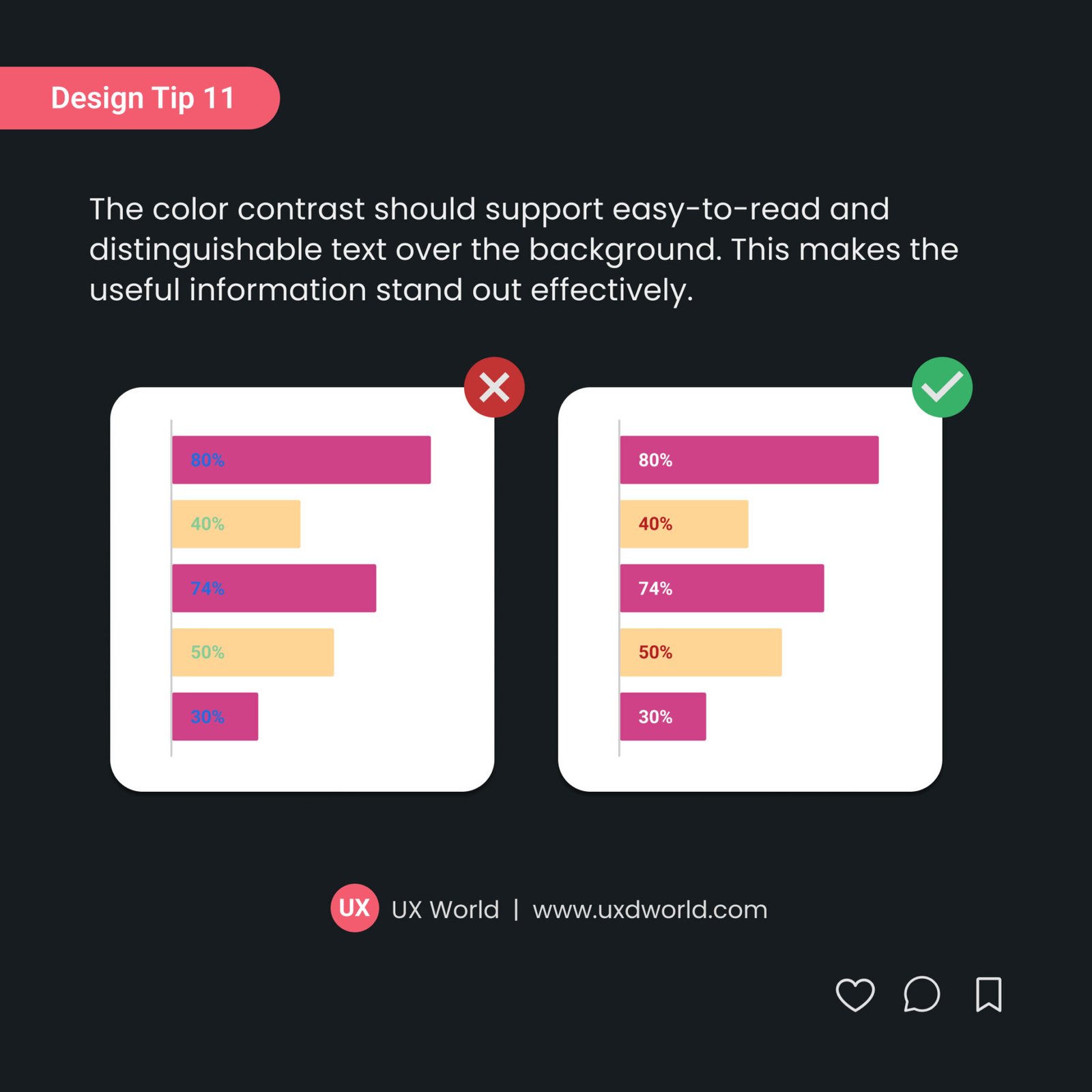
The color contrast should support easy-to-read and distinguishable text over the background and make the useful information stand out effectively.

Want to Learn UX Design?
- Try Interaction Design Foundation. IxDF offers online design courses covering the entire UX design spectrum, from foundational to advanced level. As a UX Design World reader, you get 25% off your first year of membership with the IxDF.
- The UI/UX Design Specialization from Coursera brings a design-centric approach to user interface and user experience design. It offers practical, skill-based instruction centered around a visual communications perspective. By learning this Design Specialization, you can design high-impact user experiences for your customers.
Thanks for reading.
Subscribe to more related articles at UX World.
If you have any questions, contact us here: Facebook | YouTube | Twitter | Instagram | Linkedin


