Last Updated on December 20, 2023 by UX World
The most important step towards designing the dashboard UI is to know the audience for whom you are creating the dashboard and the goal they will achieve using it.
A dashboard UI should be Clear, Meaningful, Consistent, and Simple.
Below are a few important tips for designing a useful dashboard UI for your audience.
Read the complete article here.
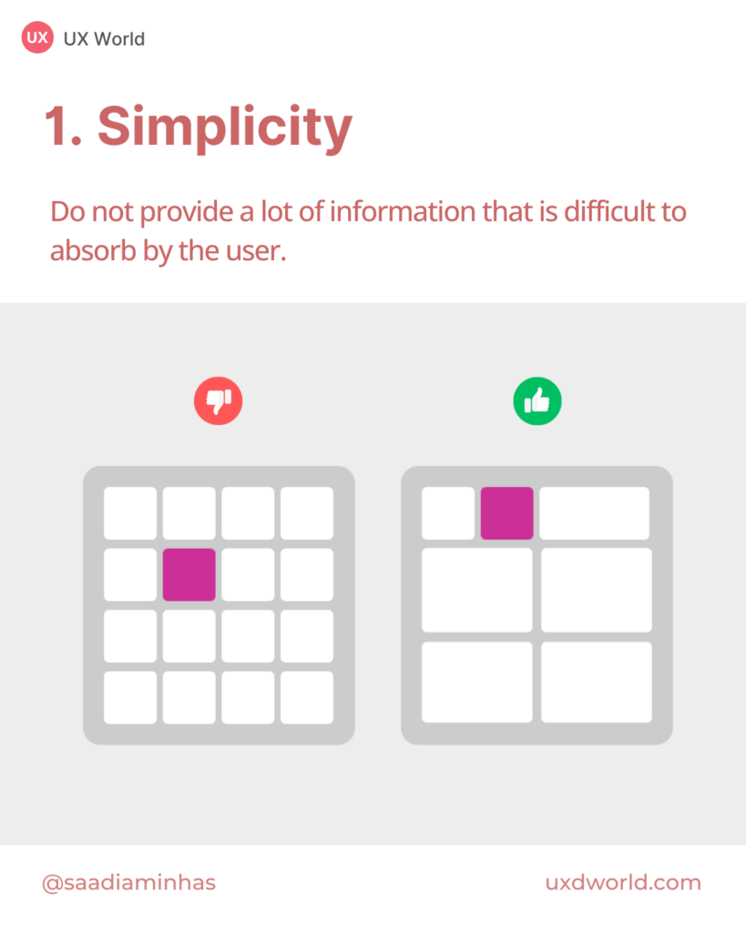
1. Simplicity
The real purpose of the dashboard is to present complex information in an understandable and simpler form.
- Don’t provide a lot of information that would be difficult to absorb for the user.
- Use fewer columns to display information.
- Reduce clutter by removing redundant content.
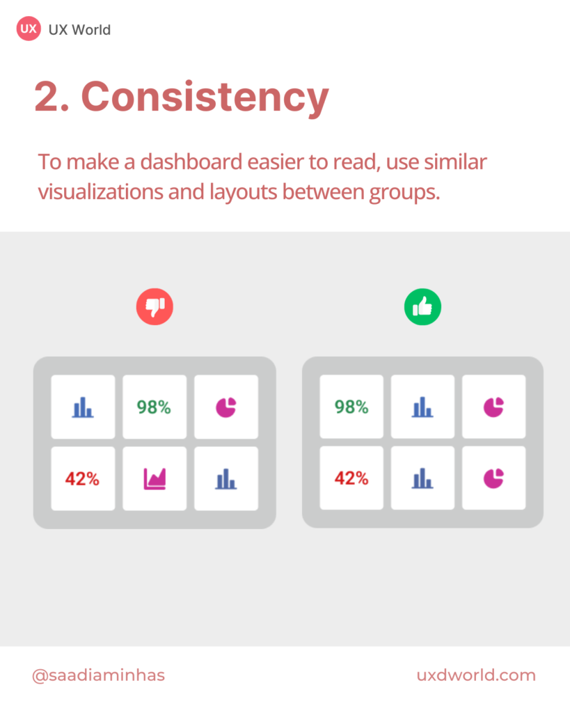
2. Consistency
A dashboard looks better when it is designed using a consistent layout.
- Use similar visualizations and layouts between groups to make your dashboard easier to read.
- Put related information closer to each other.
- Group the related content visually.
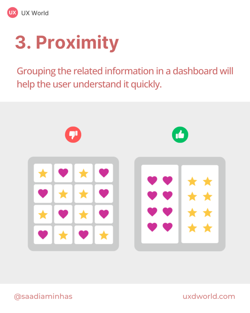
3. Proximity
Displaying related information together in a dashboard will help the user to understand it quickly.
- Put related information closer to each other.
- Don’t scatter related information across the dashboard.
- Group the related content visually.
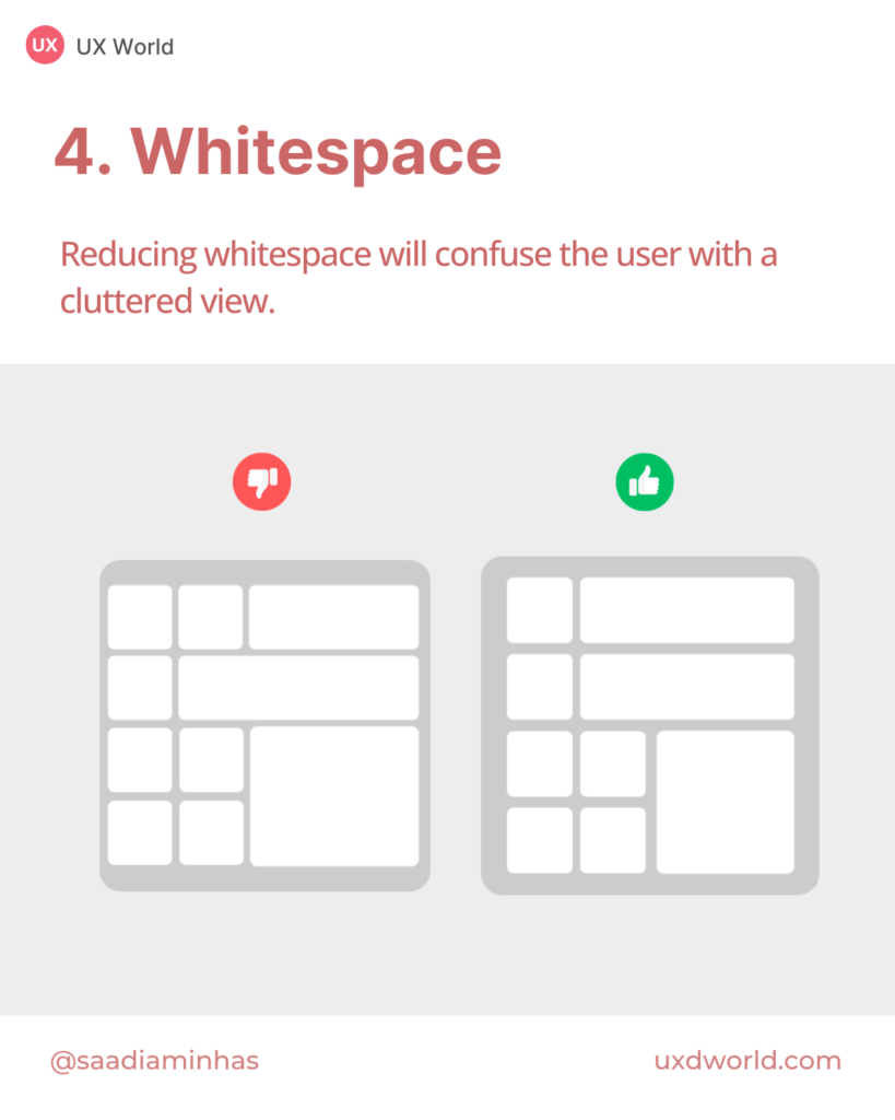
4. Whitespace
Whitespace is as necessary to design as air to breathe. It provides a breathing space to users when they are using your design.
- The whitespace in the dashboard design appeals to the user when he comes to see the information.
- Reducing whitespace will overwhelm the user with a cluttered view.
- Use whitespace to group related information visually.
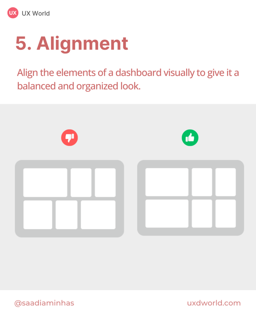
5. Alignment
The elements of a dashboard need to align visually to make it a balanced look.
- Do align dashboard elements with each other to organize them better.
- Try to place dashboard widgets in a Grid view.
- An unaligned view does not have a good impact on the user.
Conclusion
Dashboards are intended to save time and effort, providing a simpler representation of complex and abstract data. The purpose of a dashboard is to communicate critical information to your audience in a way they can understand. Make sure to design dashboard UI based on their requirements.
Read the complete article here.
Thanks for reading.
Subscribe for more related articles at UX World.
If you have any questions, contact here: Facebook | YouTube | Twitter | Instagram | Pinterest