Last Updated on December 3, 2024 by UX World
Why Does Dashboard Design Matter?
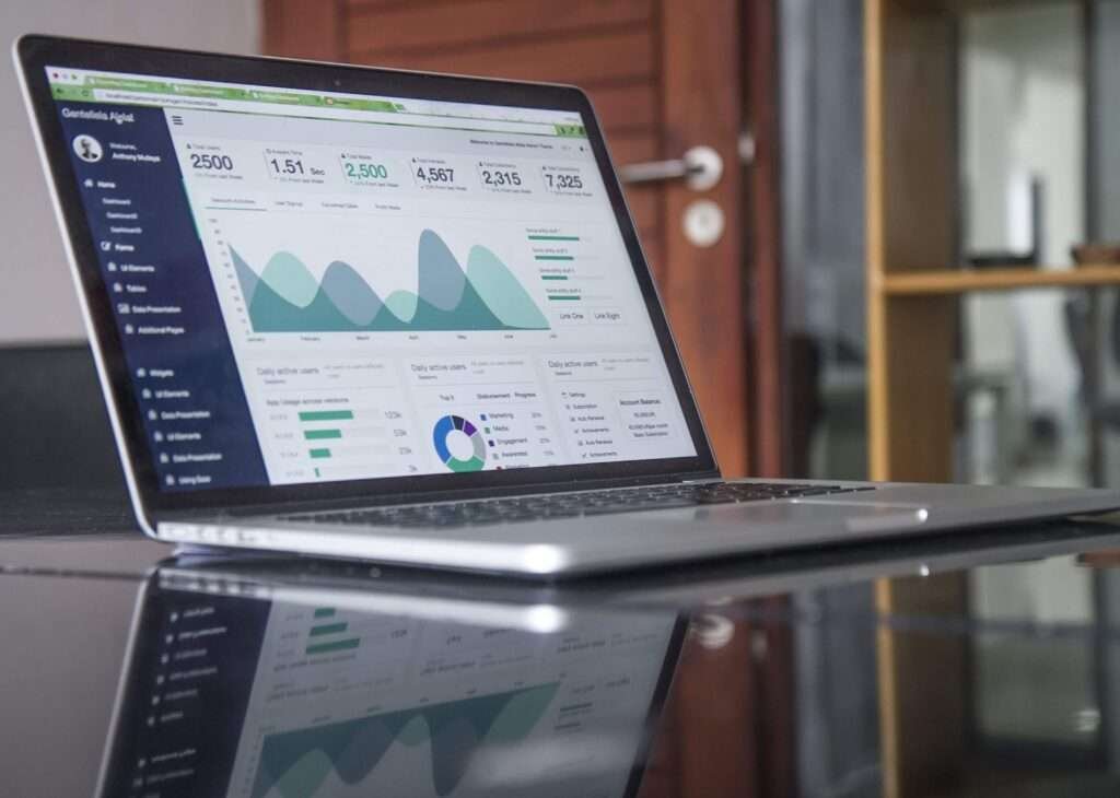
A dashboard is a visual representation of information. The purpose of a dashboard is to present complex information in an easy-to-understand format for its users.
A usable dashboard should be:
Clear: A good dashboard clearly displays the required information. When users look at the dashboard, they should be able to know the purpose of the dashboard within the first 5 seconds. They do not need to stay there for a few minutes to understand the information the dashboard is displaying.
Meaningful: A usable dashboard contains meaningful information. Meaningful information describes what the designer wants to convey using this dashboard. The story behind the dashboard visuals should be understandable to the user.
Consistent: Great dashboards display information in a consistent format. Consistency should be applied to its layout, organization, and content.
Simple: A complex dashboard does not fulfill the purpose of its existence which is to present complex information in a simple form. If presenting information visually does not keep it simple, then there is an issue with the dashboard design.
Watch the video below to learn the tips for designing a useful dashboard.
How to Design a Dashboard?
The most important step towards dashboard design is to know the audience for whom you are creating the dashboard and what value it will provide to them. Knowing their background and level of understanding will help you build a valuable dashboard for them.
While knowing your audience, it is necessary to understand what kind of data the audience is interested in seeing.
Focusing on the users’ needs helps to design something that they would love to use.
It is a possibility that your audience level varies from level one to the other. This is a challenging point and like any other design project, you can segment your audience and divide the information accordingly as basic and advanced content.
Selecting the correct metrics (KPIs) is another key element in designing a meaningful dashboard for your audience. There are multiple ways to represent a set of information in a dashboard. However, choosing the correct metrics is a key step in designing usable dashboards. This also relates to your audience’s preferences like what kind of information they want to see.
Design dashboards as per needs – use different types of dashboards for different businesses.
Below are 10 rules for dashboard design to consider while designing a dashboard for your audience.
10 Rules of Dashboard Design
1. Hierarchy
A common mistake in designing the dashboard is presenting all information as if it is equally important. Use the size and position of content widgets to show the hierarchy.
- Make it clear to the viewer what’s most important by defining information levels.
- Display more important information on the top left. Move towards the bottom right direction with the information from more to less important levels.
- It is also possible to divide the information into categories and display them in different views.


2. Simplicity
The real purpose of the dashboard is to present complex information in an understandable and simpler form.
- Don’t provide a lot of information that would be difficult to absorb for the user.
- Use fewer columns to display information.
- Reduce clutter by removing redundant content.


3. Consistency
A dashboard looks better when it is designed using a consistent layout.
- Use similar visualizations and layouts between groups to make your dashboard easier to read.
- Put related information closer to each other.
- Visually group the related content.


4. Proximity
Displaying related information together in a dashboard will help the user to understand it quickly.
- Put related information closer to each other.
- Don’t scatter related information across the dashboard.
- Visually group the related content.

5. Alignment
The elements of a dashboard need to align visually to make it a balanced look.
- Do align dashboard elements with each other to organize them better.
- Try to place dashboard widgets in a Grid view.
- An unaligned view does not have a good impact on the user.

6. Whitespace
Whitespace is as necessary to design as air to breathe. It provides a breathing space to the user when he is using your design.
- The whitespace in the dashboard design appeals to the user when he comes to see the information.
- Reducing whitespace will overwhelm the user with a cluttered view.
- Use whitespace to group related information visually.

7. Color
Use an effective color scheme to grab the user’s attention and help them go through the information easily.
- Choose colors carefully to make the content readable.
- Use maximum contrast to display the visual elements properly over the background.

8. Fonts
Standard fonts are the best fonts to display on a dashboard unless there is a specific need to use other fonts.
- Use standard fonts as they are easier to read and scan.
- Unusual and stylish fonts may look good visually but are difficult to understand.
- Avoid All-caps text as it is difficult to read and the human mind takes time to absorb it
- Use a suitable size and style of font that communicate the information effectively.

9. Number Formats
Displaying numbers with a more than-required level of precision makes them difficult to read and understand.
- Round numbers where necessary as long numbers can confuse the user.
- Truncate the unnecessary information.
- Make it easier for the user to compare simple details.


10. Labels
Use labels that convey the required information to the user quickly and efficiently.
- Avoid using rotated labels as they are difficult to read for the user.
- Use standard abbreviations where possible.

Conclusion
Dashboards are intended to save time and effort, providing a simpler representation of complex and abstract data. The purpose of a dashboard is to communicate critical information to your audience in a way they can understand. Make sure to deliver what your audience needs. The given 10 rules of dashboard design will help you design usable dashboards for your products.
Learn how to design a dashboard Figma.
Learn More
- Information Visualization: Getting Dashboards Right
- 10 rules for better dashboard design
- Dashboard Design – Considerations and Best Practices
- The Golden Rules of Dashboard Design
- How to design and build a great dashboard
Want to Learn UX Design?
Try Interaction Design Foundation. IxDF offers online design courses that cover the entire spectrum of UX design, from foundational to advanced level. As a UX Design World reader, you get 25% off your first year of membership with the IxDF.
Thanks for reading.
Subscribe for more related articles at UX World.
If you have any questions, contact
Thanks for reading. Find more related articles at uxdworld.com. If you have any questions, contact us: Twitter | Facebook


