Last Updated on October 30, 2024 by UX World
Using All Caps on the user interface does not sound like a good practice. There are many other ways to emphasize your point when you are putting textual information for your user.
“All caps text is difficult to read and the human mind takes time to absorb it.”
To provide a good user experience, it is recommended to avoid All Caps text.
The examples below will provide a clear picture of why All caps text can create problems for a design.
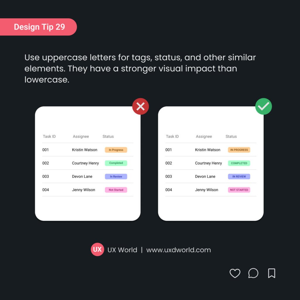
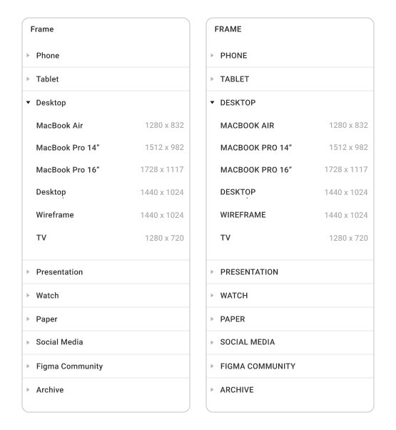
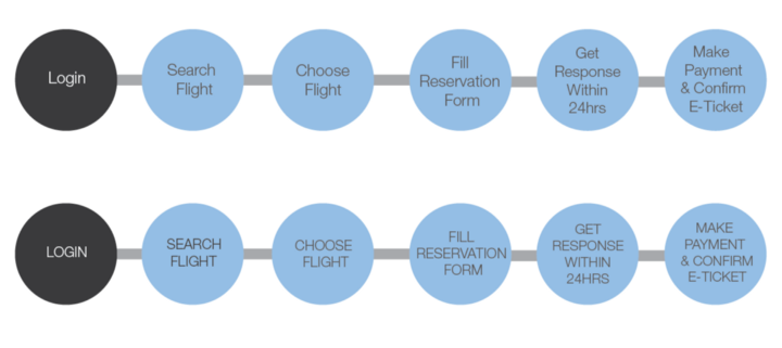
All Caps are Difficult to Read and Scan
The example below displays a list of Styles from MS Word. You can easily judge both images and tell which one is looking better.
A similar list view is displayed below from iOS. While looking at both images one after another, you can feel the difference in the stress level that your eyes and mind have experienced.

It Seems Like SHOUTING at User
“Providing instructions in all caps to users gives an impression that UI text is screaming at them.”
See the example below taken from UX Guidelines for iOS. Both images show the difference in expression clearly.

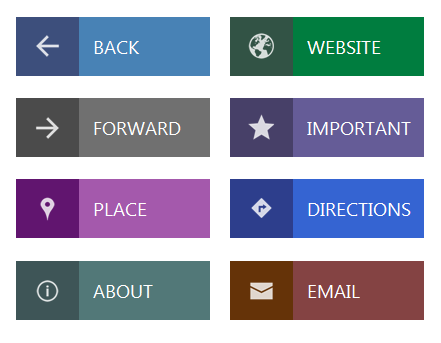
Buttons can be a place where All caps can sound good and stand out on UI. However, it also depends on the context in which buttons are used.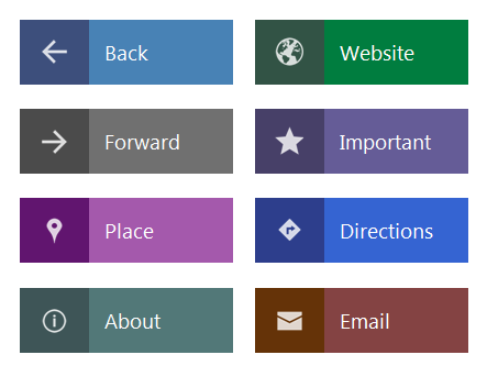
Makes Readability Slower
Since all caps are difficult to scan and take time to interpret by your mind, they make the reading speed slower than the title or sentence case.
“When text is set in all capital letters, reading speed is slowed about 13 to 20 percent” — Breland & Breland
Experience the example below by reading first the ‘All caps’ version, and then scanning the ‘title case’ image and you will feel the difference.
When is it OK to Use All Caps?
“All caps can be a good option where reading is not involved in a sense.”
For example, Logos, Brand names, Advertisements, Magazine covers, Book titles, and Buttons. A few examples showing a comparison between ‘All caps’ and ‘Title case’ are shown below.
All Caps in logos make them stand out visually and they seem more beautiful as compared to title case logos.

All Caps are suitable for books and magazine titles. It gives life to the book cover, as you can see in the given examples below.


Conclusion
From the given example, you can easily judge how All caps can affect your UI design. From the given examples, you can better decide when and where ‘All caps’ can help you to emphasize your text on UI; where you should take advantage of All caps text, and where it is better to avoid it.
Would love to hear your thoughts on this.
Learn UX Design
Try Interaction Design Foundation (IxDF). IxDF offers online design courses covering the entire UX design spectrum, from foundational to advanced level. As a UX Design World reader, you get 25% off your first year of membership with the IxDF.
Thanks for reading.
Subscribe to more related articles on UX World.
If you have any questions, contact us here: Facebook | YouTube | Instagram | Linkedin