Last Updated on May 23, 2024 by UX World
Being a product designer, you should be able to use common product design terms while conducting professional talks with your colleagues and clients. This helps you convey your ideas effectively and show your command over your design skills.
Below is a list of common terms that help you learn about product design.
Accessibility
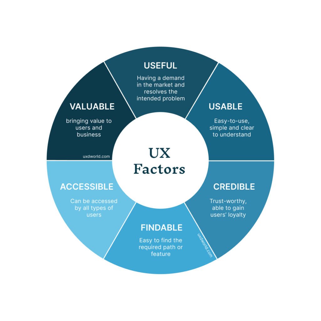
Accessibility defines the ease with which a product can be used by users including those who are suffering from disabilities. The design considers the needs of all users so that everyone can use the product with the same ease.
Aspect ratio
The aspect ratio of an element is the proportion between its width and height. To measure the aspect ratio of an image, divide its width by height. The aspect ratio is written as x:y where x is the width of the image and y is the height.
Alignment
Alignment is the way the objects are placed on a parent page or panel lined up horizontally or vertically. The borders of objects define a relation with each other. Alignment provides an overall balanced and attractive look to the design.
Balance
Balance in design refers to how things are arranged on a page so that both text and design elements are spread equally in the available space.
Baseline
The invisible line that is used to write a text in your design is known as the baseline grid. It helps to align objects and text on the screen.
Beta Launch
The beta launch is an initial release of a software product that has fewer features and functions. It is used to test the product and find any issues that need to be resolved before the final release.
Breadcrumbs
Breadcrumbs provide a way to navigate between pages of a site or an app. The user moves between the hierarchy levels of a site to perform certain tasks. Breadcrumbs allow users to keep track of the site location and move to any level they want using the available links.
CMYK
CMYK is the abbreviation of 4 different colors which are cyan, magenta, yellow, and black. Similar to RGB colors these 4 colors can be combined in a variety of ways to create multiple shades of colors.
Content Audit
It involves reviewing the content in design and identifying any required improvements that can be made to make the content more user-friendly.
Contrast
Contrast is created by incorporating components in the design that are noticeably distinct from one another in appearance. A designer can employ contrast by varying color, shape, texture, size, or typeface.
Design
The term design refers to product design which involves alignment, balance, closeness, contrast, design composition elements, hierarchy, repetition, and white space. Using the combination of all these elements, design helps to resolve users’ problems.
Flat
Flat design involves the use of simple yet usable elements. Flat design tends to have a large white space, vibrant colors, and two-dimensional drawings.
Font Size
It involves the size of letters in typography. It can be 10, 12, 14, etc. depending on the type. Font size helps to define the hierarchy of the content on UI. A heading has a large font size, whereas normal text has a smaller font size.
Font Weight
It involves the thickness of a font. For example Bold font. You can vary the intensity of the font using a numerical value. If you want to grab the user’s attention with a headline on your web page, you can use a heavy-weight of the font on UI.
Gradient
The term gradient refers to a gradual transition between colors. For example, you can gradually mix yellow and orange colors to form a new mixed color which will be called a gradient.
Grayscale
A color scheme known as greyscale solely uses black, white, and various shades of grey. A greyscale UI displays all elements on the UI using these colors.
Grid
An arrangement of intersecting vertical, horizontal, angular, or curved lines is called a grid. Grid is used to arrange visual elements on a page and define a relationship between elements.
Header
The most important design elements are kept on top of every page in a repeating manner which is called header. A header contains the design elements that users access most frequently while interacting with the UI.
Hex
Hex is a color system that uses six-digit codes to define colors. Hex codes can be found alongside RGB and CMYK in many design applications.
Hierarchy
Hierarchy is all about organizing and arranging the design elements according to their importance on UI. The most important element will be placed on top and then less important elements will be placed beneath in descending order.
Icon
An icon is a visual representation of an object that usually relates to a user’s action. For example, a magnifying glass is used for a search action, a home icon indicates the home page of an application, and a right arrow and a left arrow indicate the direction where the user should go. In addition to actions, icons are used to indicate the status of a process like In Progress, Done, etc.
Italics
Italics is a textual style used to attract users’ attention to particular words or sentences inside a paragraph. They are employed when characters slope to the right, e.g., right.
Leading
Leading defines the spacing between two lines of a single word. That is why it is also referred to as line height.
Logo
A logo is an important visual that represents a brand. An organization or business is recognized by its logo. The logo should reflect the purpose and idea of the business so that people can relate it to the company.
Lorem ipsum
Lorem ipsum, also referred to as dummy text, serves as a placeholder text until the actual copy is defined.
Mockup
A mockup represents the design and layout of a product. It can be sketched using paper, or created in a digital app. Mockups help to evaluate initial design concepts and give an idea of how the UI will look in the final design.
Navigation
The navigation of an app or site is a map that routes to different sections of the app. It shows the path that the user follows while interacting with the app.
Navigation Bar
A navigation bar shows a set of options that allow users to go to different pages of the app. These navigation options can be links, tabs, buttons, or other design elements.
Personas
User personas represent the users who are going to use a product. As a result of user research, you know about your users and their needs and thus create user personas. User personas help to remain focused on the users’ needs. A user persona includes the name, image, behaviors, motivations, challenges, and goals of a user group.
Prototype
A prototype represents the design and flow of an application and gives an idea of how the real product would behave. Prototypes make it easier to get early feedback without spending money on coding.
RGB
The three colors of light that are generally utilized to define other shades of colors are known as RGB. RGB stands for red, green, and blue. Any color in the design can be created by mixing Red, Green, and Blue in a variety of various ratios.
Responsive Design
Responsive design is an approach to ensure that design behaves well on multiple devices of different sizes and orientations. Responsive design adjusts itself when opened on any device without losing consistency and uniformity of components as well as behaviors.
User Experience (UX)
User Experience (UX) is the experience that users feel when they interact with a product. Ease of use helps to define a meaningful and pleasant experience and allows users to perform their tasks easily and efficiently.
Whitespace
The space between UI components on the screen is called whitespace. Whitespace provides a neat and clean look of the design, and it helps users perform more effectively without overwhelming them with clutter on UI.
Wireframe
Wireframes are simple visual representations of a website’s basic layout and key features. To illustrate how a page or website functions, designers use wireframes. Wireframes define the building blocks of the product simply and quickly.
Learn UX Design
To learn more on how to design better experiences, consider the Interaction Design Foundation’s (IDF) online courses on User Research – Methods and Best Practices.
Apart from courses, webinars, and bootcamps, the IDF is also home to the biggest and most authoritative library of open-source UX Design Resources. Check out the free UX Literature here.
In addition, the UX Academy offers world-class 1-on-1 online training in UX design, access to a vibrant community, and help to get a product design job.
Thanks for reading.
Subscribe for more related articles at UX World.
If you have any questions, contact here: Facebook | YouTube | Twitter | Instagram | Linkedin


