
Last Updated on January 17, 2024 by UX World
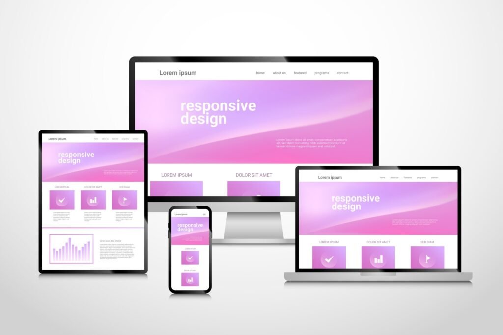
Responsive web design has become a standard part of our online experience. Today, we all expect websites to function well and provide good aesthetics on any device, regardless of the screen size. However, reaching this stage took a considerable amount of time and effort. The developers explore various techniques to adjust websites to different screen sizes before finally adopting a responsive web design.
As of now, the majority of users access websites through their smartphones and tablets. This evolution has resulted in a significant impact on website design, especially in terms of accommodating various screen sizes. Designers are now challenged with the task of providing a seamless user experience and excellent navigation, particularly on smaller screens.
In this blog post, we will discuss how responsive web design affects user experience and its advantages in establishing a seamless and user-friendly browsing environment.
Key Principles of Responsive Web Design
Fluid grids
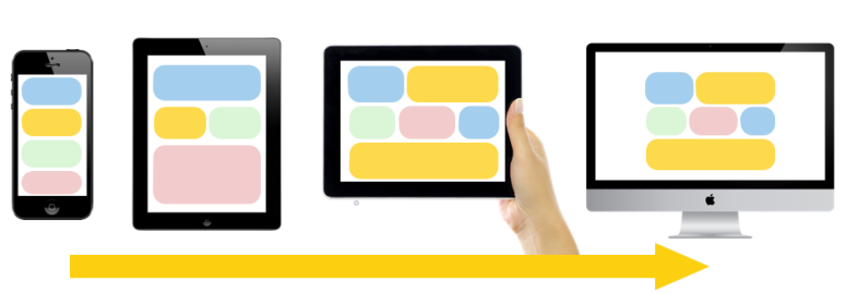
Responsive web design relies on the fundamental concept of fluid grids. Nowadays, there is a huge variation in display sizes i.e. from a smartphone to an HD TV. Therefore, to counter this variation, fluid grids are used.
These fluid grids seamlessly adjust to the user’s screen size by using relative units like percentage, unlike the fixed grids which rely on rigid pixel sizes. The result is a flexible and adaptive layout that adapts to a wide range of screen sizes, from mobile devices to larger desktop monitors.
Flexible images
When it comes to images, a lot of variations arise in terms of size and resolution. Responsive web design relies on flexible images as an essential component, ensuring seamless adaptation and resizing of images across diverse screen sizes and resolutions.
Optimized for high-resolution screens, flexible images use techniques such as CSS media queries and higher-resolution versions to maintain clarity on devices like smartphones and laptops. Art direction provides tailored visual experiences by offering different image versions for various screen sizes.
Media queries
Media queries allow websites to adapt to a variety of screen sizes. By defining the breakpoints, designers can create flexible layouts for optimal user experience by targeting features like screen width, height, and orientation. This same concept extends to displaying images, repositioning elements, and adjusting font sizes.
Mobile-first approach
As there is a noticeable increase in smartphone users, designers must by creating designs for the smaller screens, and then gradually improve the experience for larger screens. This method emphasizes focusing on vital content and features for mobile users.
Why is Responsive Web Design Crucial in the Current Digital Landscape?
Today, it is usual to develop a website or app that adapts its user interface based on the browser or device being used. Whether accessed on a desktop, smartphone, or iPad, the interface adjusts to the screen size and orientation, facilitating easier navigation, and content readability.
Appealing user experience
Due to the increase in mobile traffic worldwide, the website designed for small screens proves to be more effective and appealing. Using responsive design principles you can develop a website that automatically adjusts its interface according to various screen sizes. This will improve the user experience, thereby leading to high conversion rates.
Higher ranking in search results
Moreover, now search engines prefer websites that are designed for smaller screens (smartphones). This is based on the responsiveness of the website. The site which is more responsive and provides decent navigation and layout according to the screen size will attract more users, and get a chance to rank higher in search engine results.
Saving cost and time
Designing a responsive website also results in the reduction of your costs and time. Because a responsive website ensures that your layout will adjust according to the respective screen size, therefore you won’t have to carry out a hassle in designing separate websites for each screen size. This saves you your money and money. Well time is also money, isn’t it?
No separate layouts for difference devices
Lastly, designing a responsive website also removes all the future hurdles for you. You have no tension regarding the sizes of devices that have to come in the future, as you have already designed a website that will automatically adjust according to the screen size of any device.
Conclusion
Responsive web design has become a foundation pillar of the bridge of the digital landscape. The journey to this point involved extensive exploration by developers, adapting websites through different techniques before settling on responsive design.
The prevalence of mobile users has significantly influenced website design, challenging designers to provide a seamless user experience, especially on smaller screens.
Key principles like fluid grids ensure adaptability to a wide range of screen sizes, creating flexible and adaptive layouts. Similarly, flexible images, optimized for high-resolution screens, employ various techniques to maintain clarity on diverse devices. Media queries and the mobile-first approach further contribute to responsive design, allowing websites to adapt to different screen sizes and prioritize content for mobile users.
The role of responsive design in the current digital landscape is evident in its impact on user experience, appeal to search engines, cost-effectiveness, and future-proofing. Websites designed responsively automatically adjust to various screen sizes, ensuring improved user experiences, higher conversion rates, and reduced costs associated with designing separate layouts.
Responsive design not only meets current demands but also anticipates and adapts to the evolving landscape of devices, offering a forward-thinking solution for an ever-changing digital world.
Want to Learn UX Design?
- Try Interaction Design Foundation. IxDF offers online design courses that cover the entire spectrum of UX design, from foundational to advanced level. As a UX Design World reader, you get 25% off your first year of membership with the IxDF.
- The UI/UX Design Specialization from Coursera brings a design-centric approach to user interface and user experience design and offers practical, skill-based instruction centered around a visual communications perspective. By learning this Design Specialization, you can design high-impact user experiences for your customers.
Thanks for reading.
Subscribe for more related articles at UX World.
If you have any questions, contact us here: Facebook | YouTube | Twitter | Instagram | Linkedin