
Last Updated on June 5, 2024 by UX World
What is a Design System?
A design system is a collection of reusable components like code snippets, images, guidelines, and standards. These resources belong to a product team within an organization. This collection of resources is used to design and develop a product in the organization. This collection of resources is used to design and develop a product in the organization.
An organization’s repute and success are directly linked to its design system. It enforces a shared language and consistent experience in the organization’s products and branding. It behaves like a single source of truth across the teams. It also helps to maintain the quality of the product design.
“Understanding not only the what but the why, behind the design of a system is critical to creating an exceptional user experience.”- Better Design
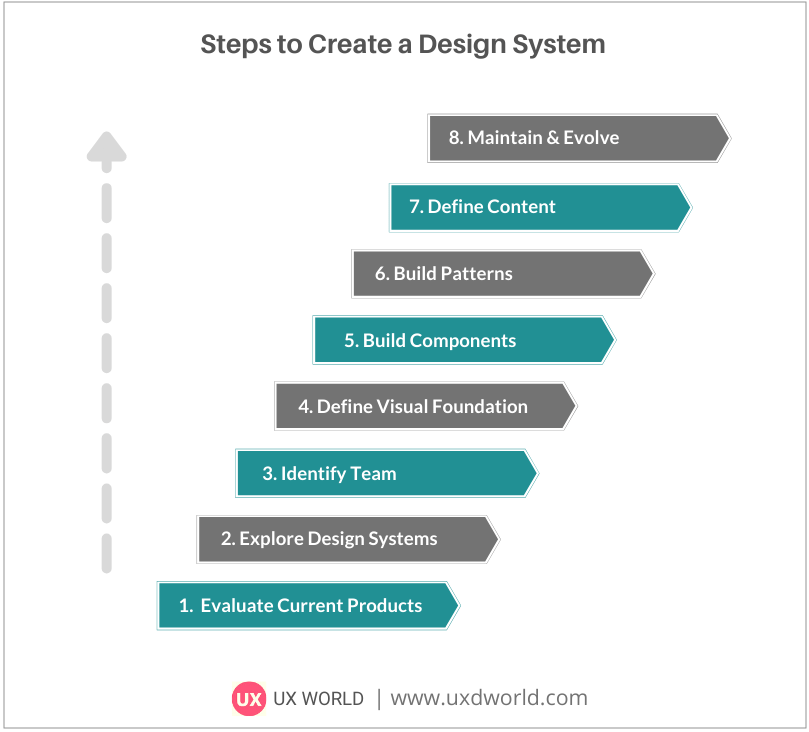
Steps to Create a Design System
The following steps are used to create a design system. For details of the first three steps, see Part I of the article.
- Evaluate Your Current Products
- Explore Existing Design Systems
- Identify a Team
- Define Visual Foundation
- Build Components
- Build Patterns
- Define Content
- Maintain and Evolve Design System
Step 4: Define Visual Foundation
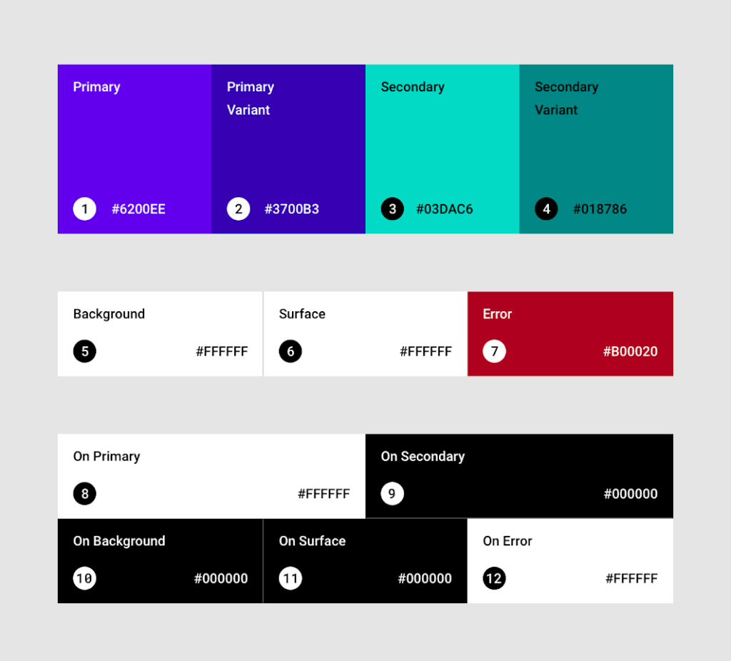
(a) color palette: Themes
Color plays a vital role in the brand and product design of an organization. It is a fundamental building block of your design system. It needs to be defined at the beginning of the design system creation process. Everything visible on the interface uses color as a part of its identity.
Use focused and meaningful colors to display the information on the interface. Use colors to provide status information, give feedback in response to user actions, and help people visualize data.
For this purpose, define primary, secondary, and extended color palettes that support clear contrast on the UI.
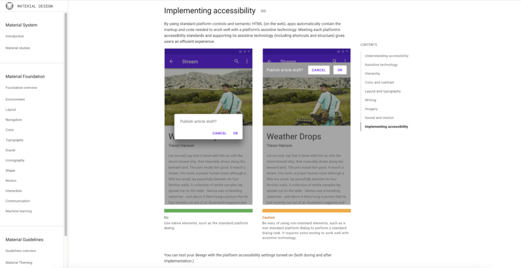
(b) Accessibility
Accessible design enables all users including people with disabilities to understand, navigate, and interact with the product.
Accessibility is an important feature to accommodate in your design system. More than 2 billion people in the world are facing some kind of disability which is 37.5% of the world’s population. Defining the accessibility guidelines helps you consider this large user group.
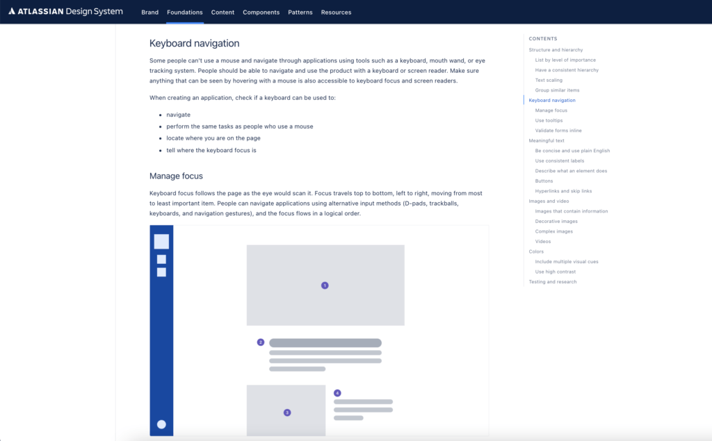
Accessibility design guidelines include consistency, responsive layouts, high contrast, help text along with input controls, alternative text with images and media, and keyboard navigation.
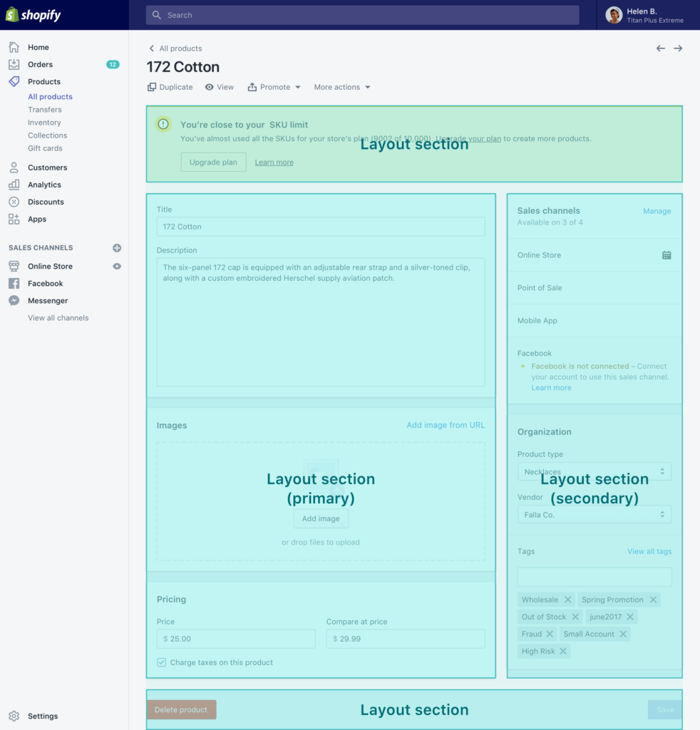
(c) Layout
Layout guidelines define the visual structure of your products. Layout across the platforms and screen sizes should be uniform and consistent so that users can get a similar experience for a product.
For layout, there is a need to cover the placement of multiple UI regions on the interface. These include spacing before, after, and between regions, padding within regions, and responsiveness against user actions, devices, and screen sizes.
To go into more detail, layout guidelines include a title bar, work area (or body), footer, sidebars, column grid, row grid, a visual grouping of elements, and many small things related to UI regions.
(d) Navigation
Navigation lets the user move through the pages of an app to perform the desired tasks. Providing simple navigation is very important to retain your users. Difficult and confusing navigation is a common way to lose your audience.
Navigation guidelines are defined in the design system. They include the standards for different types of navigation like forward navigation and reverse navigation.
Several UI controls and components are available to define the navigation behavior including tabs, menus, trees, breadcrumbs, etc. Each of these components has many types and you can decide their usage based on your requirements.
Providing consistent navigation across multiple devices is critical for a good user experience.

(e ) Icons library
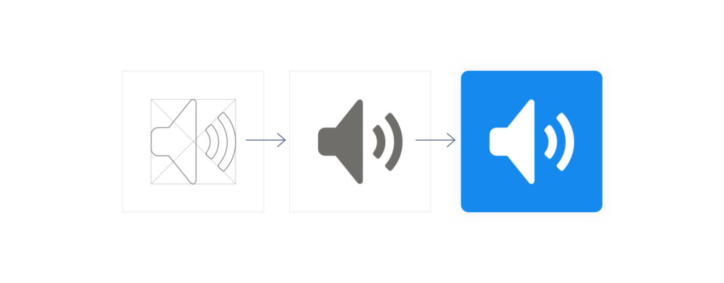
Icons provide a visual way to define states, objects, and actions. An icon should convey its meaning at a glance, that’s why icon design takes a lot of time and concentration.
A design system defines standards that help the designers create icons. These help to design consistent icons within a product or across the products belonging to the same organization.
The factors that need to be considered while defining the icons’ design guidelines are size, states, colors, shapes, shadows, dimensions, number of elements, touch targets, etc.
The design principles can be defined based on icon types. For example, different styles and conventions can be defined for system icons, object icons, action icons, status icons, and info icons.
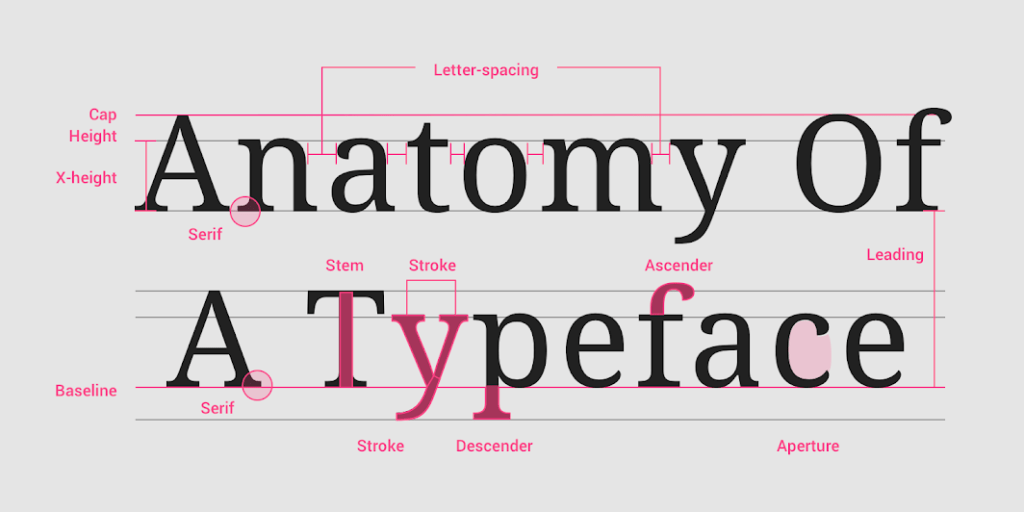
(f) Typography: fonts, sizes, headings
Typography defines the fonts to present the information in a hierarchy. Typography styles must be simple and clear so that users can read and scan the text.
Typography guidelines include font face, font size, colors, format, letter spacing, and line spacing.
Define a separate font style for different levels of hierarchies. For example, titles, headings, body, navigation links, buttons, messages, tooltips, etc.
This means all UI levels will have a font style that can be used to display the content at that level. Also, typography size guidelines should consider the device and screen size.
There can be different typography guidelines for branding since the purpose and audience is different.
Step 5: Build Components
The most commonly used part of the design system is the Components library. The Components library contains details of all reusable UI controls that are building blocks of the interface design. Designers design the components and developers write the code snippets for each control.
The components library contains attributes, dimensions, states, and best practices for all UI controls. Thus, it helps designers and developers to understand when and why they should use a component in a certain situation.
UI control guidelines cover a large number of controls. The list includes
- Buttons
- Containers like tables, and panels
- Navigation like tabs, menus, pagination
- Indicators like progress, and status
- Input controls like text, radio, checkbox, drop-down, dialogs, alerts, and many more

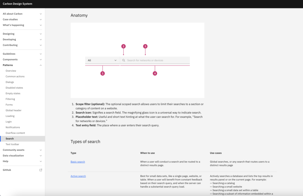
Step 6: Build Patterns
Pattern libraries help to define behaviors and templates by collecting several UI components. A pattern is a combination of UI components that covers a feature that can be re-used in your product design. A design system is not completed until it has definitions of design patterns.
The pattern library includes attributes, code snippets, usage, and best practices for each pattern.
The designers and developers refer to these guidelines and use the patterns as per their needs.
Patterns include templates for searching, filtering, and sorting input forms, login screens, layouts, headers, footers, and many other behaviors that become the identity of your brand and your products.
Defining templates takes time, but, it becomes much easier and quicker to select a template as per your need and re-use it in your product

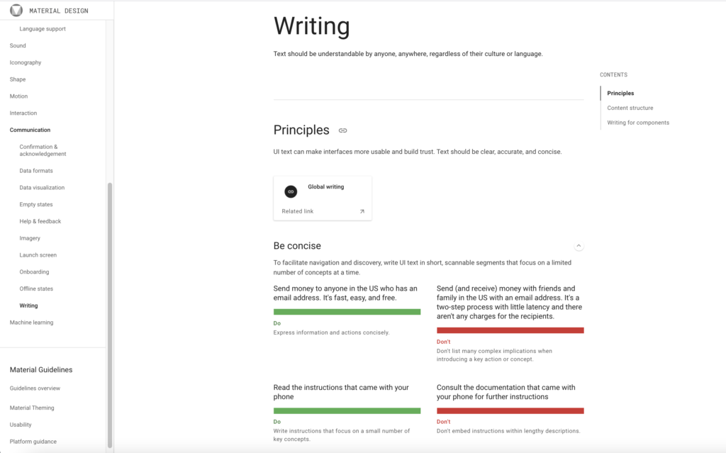
Step 7: Define Content
Content is an important part of the design, and both go side by side in the design process. Building and following content guidelines make it easier to present a uniform voice and tone across the products.
The language of an organization becomes its identity. A concise and professional tone helps users understand the meaning.
The goal of content guidelines is to create content that is understandable for everyone, without a difference in culture and abilities.
include the voice and tone, language and styles, user messages and tooltips, numbers, grammar, vocabulary, and any kind of text that the user sees while working on the UI.
To define content guidelines, consider each UI control and pattern. Define standards for each part of the content that belongs to the controls and patterns.
Since content is everywhere on the UI, defining a checklist will help you stick to the guidelines for each control, feature, and module design.

Step 8: Maintain and Evolve Design System
A design system requires regular reviews and continuous improvements.
The best way is for product teams to start using the design system and review the product design. This will also help teams learn about the design system and review it.
Take the design system as one of your products. As products evolve and improve over time, the design system should do the same.
Following an agile approach makes it easier to review the design system and make changes in sprints.
Review the design system in terms of consistency, trends, and feedback.
Getting feedback from internal teams and users is an important factor that enables you to identify improvements. Add these improvements to the design system product backlog.
Creating a checklist to measure the performance of your design system is an excellent way to maintain your design system.
Conclusion
An organization’s success depends on the design system that it is using to provide a consistent experience across its products and hence becomes its identity. Building a good design system is the responsibility of the product team and is useful for all stakeholders within the organization. A major benefit of a design system is that it reduces the gap between designers and developers by ensuring a single source of truth defining the guidelines of all required components shared with everyone in the organization.
The future design systems can enable the automation of development using the defined components and guidelines. Automated scripts will select suitable components and integrate them into a product that fulfills the users’ needs.
Learn More
To learn more on how to design better experiences, consider the Interaction Design Foundation’s online courses on UI Design Patterns for Successful Software.
Apart from courses, webinars and bootcamps, the IxDF is also home to the biggest and most authoritative library of open-source UX Design Resources. Check out the free UX Literature here.