
Last Updated on January 6, 2024 by UX World
Tabs are UI controls used to organize the content of a page into multiple panes where users can see one pane at a time. The content is related and lies in the same hierarchy in the application. Tabs provide a way to navigate between different sections of a page to see the related information distributed among these sections.
For example, the details of a user profile can be shown using Tabs: Personal, Professional, Education, etc.

Tabs Design Best Practices
The below best practices help you design attractive and usable tabs for your application.
- Anatomy
- Layout
- Tab Switching
- Labels
- States
- Indicators
- Placement
- Number of Tabs
- Ordering Tabs
- Nested Tabs
Anatomy
A tab bar has several elements and states that make it easier for users to interact with the control. It is important to design these elements and states carefully so that the tab bar is discoverable and usable in the design. A detail of these elements and states is given below.

- Container
- Active/inactive tab
- Active/inactive label
- Active/inactive icon
- Content
- Uniform space between tabs
- Uniform padding in tabs

Layout
The layout of a tab bar can be either Fixed or Scrollable.
Tabs can be displayed in a fixed layout on the screen while using a fixed width to display all the tabs. The content of the page (or parent object like dialog, sheet, etc.) is organized within these fixed tabs.

The tab bar can use a scrollable layout that allows users to swipe or scroll horizontally to see more tabs on the page. The tabs start from the left of the page. The scrolling works from left to right, and the user can move back to the right to see the starting tabs.

Always think twice before designing scrollable tabs, as users do not expect to scroll horizontally to see more content on the desktop screen. Though it is a common gesture on mobile devices, however, using it on a desktop requires a careful design that includes:
- Give clear cues to users that there are more tabs available in the view
- Ensure that a part of the next tab is always visible on the screen (the same goes for the previous tab scrolling back from right to left)
Tab Switching
Tab switching needs to be a seamless experience for users. Do not load the entire page when the user switches a tab.
Tab switching should be faster, and users must not wait for the content to be loaded every time a tab is switched. If data is coming from a back-end server that will take time, make sure to display a proper waiting icon and/or message in the tab so that the user can get the necessary information and not leave the application.
Labels
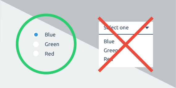
Tabs can be labeled as text, icons, or both.
Use meaningful labels for your tabs. The title of a tab must be related to the content that is being displayed in the tab so that users can have a clear expectation.
Do not use long titles for tabs. Use short titles for tabs. It is better to use a single word as a tab title. Avoid using more than two words as the tab title.

Do not truncate the label to fit it in the available space. Either use a short label or adjust the size of the tab bar in the parent area.

If you are using icons as labels, be careful to use icons that are easily understood. Sometimes it can be confusing for the users to relate the icon with the content of the tab.
For clear understanding, use icons along with the text as tab titles. This will give a visual and attractive look to your tab bar.
Do not use a mix of textual and iconic tabs in the same tab bar. Either go for the textual labels, iconic labels, or both for all tabs in the tab bar.

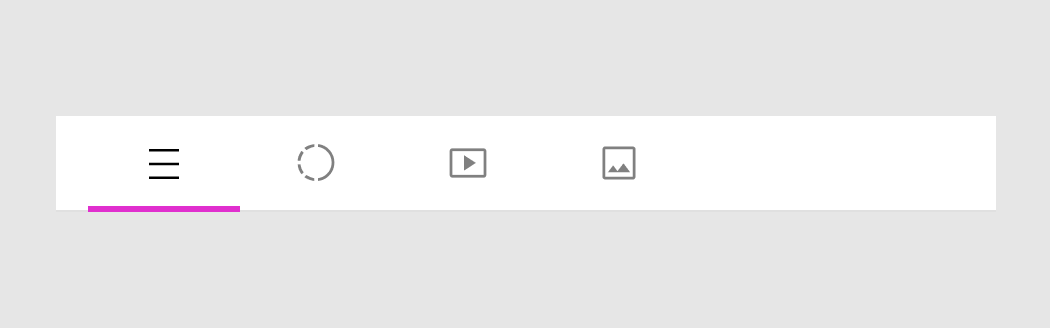
States
A tab has two states: Active and Inactive
Use clear contrast to differentiate the active and inactive tabs. Otherwise, users can get confused about the state of the tab while interacting with them. An addition of a bar for the active tab can improve usability even more, as shown in the image below.

Indicators
A tab can contain more information in the form of indicators. An indicator represents the state of the content of the tab without opening the tab. It helps to inform the users whether the tab content is changed and if there is something new in the tab, or if you have unsaved changes in the tab.
If you are using tabs to group a set of properties that the user can define, use an indicator to show the state of the tab as In Progress / Unsaved and Done / Saved.
For example, putting a Dot indicator along with the tab title shows that the tab has unsaved changes.

Where using a Tick indicator along with the tab title shows that the properties in the tab are done or completed.

If you are showing items in tabs that are populated in real-time like live posts, lists of emails, etc., use an indicator to show the tab contains a new item.
Using a Dot indicator can be helpful to show that tab has a new piece of information. Also, you can display a counter indicator that represents the number of new items within the tab.

Placement
Tabs can be placed on the page level, or inside an object like within a dialog or sheet.
It is better to place tabs on the top within the parent object as placing the tabs at the bottom on the desktop is an unusual way for users to find them.
Number of Tabs
Don’t use too many tabs in a tab bar. It will be difficult to navigate as well as look congested.
Show Tabs in a Single Row: Using multiple rows of tabs will make it hard to relate the tab with the content. If your design requires a large number of tabs to be placed at the same level, it is better to organize content in multiple hierarchy levels or consider other navigation patterns like a vertical navigation bar.

Ordering Tabs
Display tabs in a logical order that makes sense for the user. The order must reflect the flow of user interaction. For example, a user profile requires displaying the ‘Personal’ tab before the ‘Skills’ or ‘Education’ tabs as it is less expected to see the skills as a very first step.

Nested Tabs
Avoid using nested tabs as it makes it difficult to relate the content within each tab and its nested tabs. If you need to organize content in nested tabs, it is better to design them using different visuals or another design pattern.

For example, there can be different ways to display the sub-category of the ‘Qualification’ tab below in addition to defining the nested tabs.
You can make a separate section for each sub-category.

You can use an Accordion control to list down the information of sub-categories.

Summary
The listed best practices and guidelines for designing a tab bar will help you to improve the navigation experience of your application.
Learn UX Design
To learn more on how to design better experiences, consider the Interaction Design Foundation’s (IDF) online courses on User Research – Methods and Best Practices.
Apart from courses, webinars, and bootcamps, the IDF is also home to the biggest and most authoritative library of open-source UX Design Resources. Check out the free UX Literature here.
The UI/UX Design Specialization from Coursera brings a design-centric approach to user interface and user experience design and offers practical, skill-based instruction centered around a visual communications perspective. By learning this Design Specialization, you can design high-impact user experiences for your customers.
Thanks for reading.
Subscribe for more related articles at UX World.
If you have any questions, contact us here: Facebook | YouTube | Twitter | Instagram | Linkedin