Last Updated on July 4, 2024 by UX World
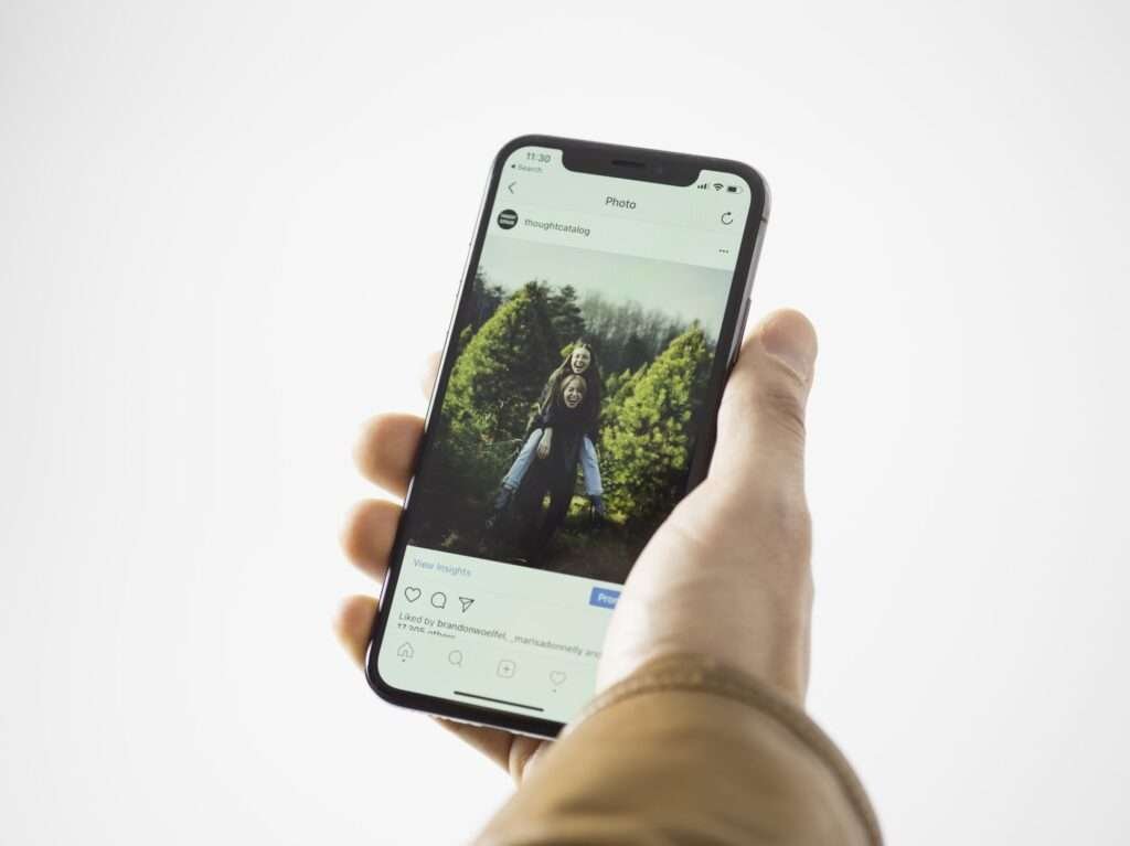
Mobile first is the latest strategy associated with web development. This involves designing your website or application by considering the layout and responsiveness of smartphones instead of desktops.
Due to the increase in the number of smartphone users, the need for acquiring a seamless user experience on all devices has increased. The mobile-first approach has been developed entirely to resolve the pain points of users who are not getting the same user experience on a smartphone as on a desktop device.
By reading this article you will be able to know about the benefits of the mobile-first approach in web development.
6 Benefits of Mobile First Experience
- Improved Search Engine Optimization (SEO)
- Improved Accessibility
- Increased Mobile Traffic
- Improved User Experience
- Edge Over Your Competitors
- Increased Conversion Rates
1. Improved Search Engine Optimization (SEO)

Google prioritizes the websites that are designed typically for mobile devices. Therefore these websites will rank higher in search results pages. Using a mobile-first approach, you can ensure that the chances of ranking your website higher in search results are higher. This results in an increased audience and more conversions.
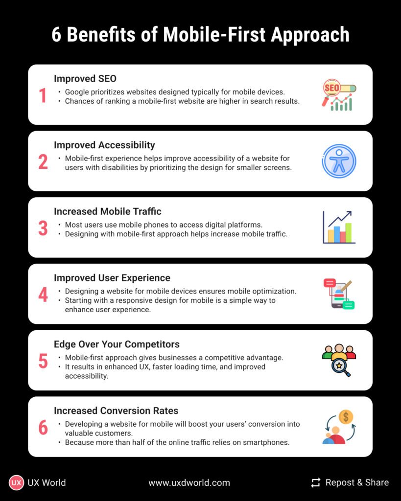
2. Improved Accessibility
Mobile-first experience helps improve the accessibility of a website for users with disabilities by prioritizing the design for smaller screens. Designers can design more responsive websites that are easier to navigate for users with visual impairments or other disabilities.
3. Increased Mobile Traffic

Nowadays, majority of the users use mobile phones to access digital platforms. In 2023, the smartphone users are estimated at 6.8 billion, marking a 4.2% annual increase. Therefore, a mobile-friendly website design can help increase mobile traffic to the website. If your users get a satisfying experience on mobile, then they will return to your site.
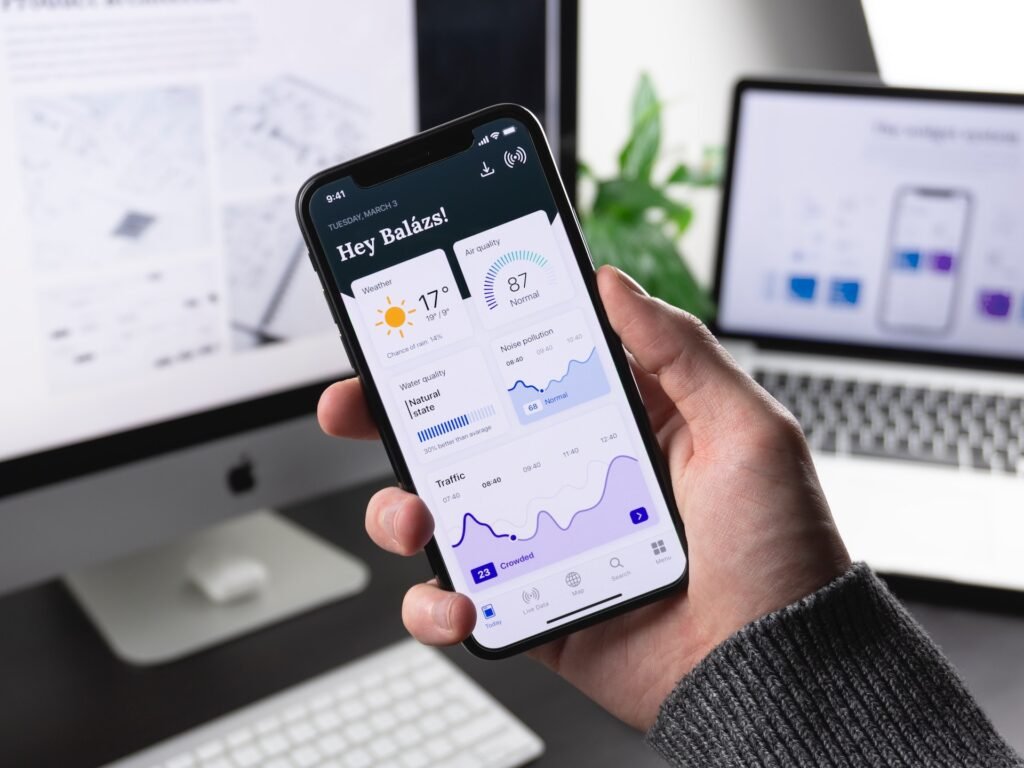
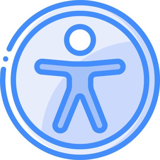
4. Improved User Experience
Designing a website for mobile devices ensures that your website is optimized for smaller screens. Creating a responsive design starting from mobile devices is an easy approach to providing an improved user experience. By prioritizing the user experience on mobile devices, it helps to design a seamless, intuitive, and easy-to-use experience on all devices.
5. Edge over your Competitors

Designing for mobile-first experiences can also give businesses a competitive advantage by providing a better user experience, faster loading times, and improved accessibility. Therefore, your business can be unique from other competitors and attract and retain more customers.
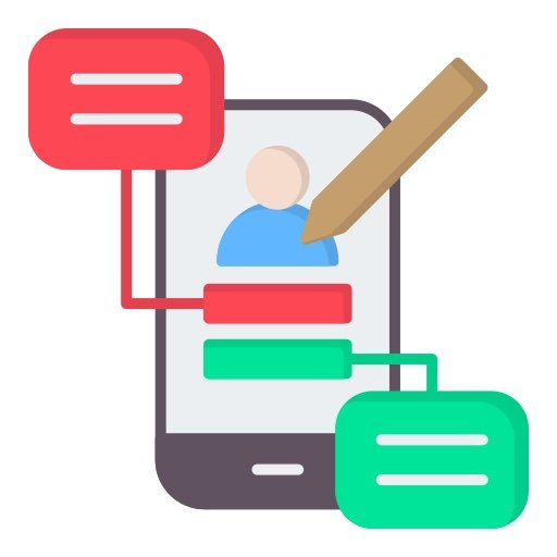
6. Increased Conversion Rates
Developing a website for mobiles will boost your random users’ conversion rates into your valuable customers. Because more than half of the online traffic relies on smartphones for accessing digital media. Therefore you should design your website keeping smartphone constraints in mind to provide a seamless user experience.
Conclusion
The mobile-first design approach is important for businesses that have aim to provide their users with a good user experience similar to desktops on their mobile devices. With the increasing use of mobile devices worldwide, ignoring the mobile-first approach can become a reason for not attracting the right audience to your website and businesses.
Want to Learn UX Design?
- Try Interaction Design Foundation. IxDF offers online design courses that cover the entire spectrum of UX design, from foundational to advanced level. As a UX Design World reader, you get 25% off your first year of membership with the IxDF.
- The UI/UX Design Specialization from Coursera brings a design-centric approach to user interface and user experience design and offers practical, skill-based instruction centered around a visual communications perspective. By learning this Design Specialization, you can design high-impact user experiences for your customers.
Thanks for reading.
Subscribe for more related articles at UX World.
If you have any questions, contact us here: Facebook | YouTube | Twitter | Instagram | Linkedin