Last Updated on July 4, 2024 by UX World
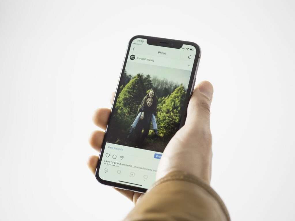
According to recent surveys, the percentage of global internet traffic using smartphones has been steadily increasing. As of March 2023, 58.43% of all website traffic comes from people using mobile devices. This highlights the importance of creating a mobile-friendly website design that caters to the needs and preferences of mobile users.
Due to the increasing use of mobile devices, businesses need to give attention to mobile-friendly websites that are optimized for smaller screens and touch-based navigation (smartphones). Designing a mobile-friendly website will enable users to stay on your website and engage with your content. In addition, a mobile website can also help to reduce bounce rates.
In this article, we will discuss 10 best practices that can be followed to create a mobile-friendly website.
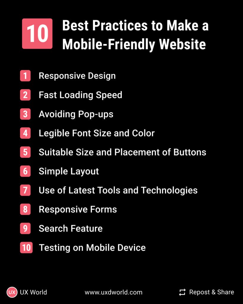
10 Best Practices to Make a Mobile-Friendly Website
- Responsive Design
- Improved Loading Speed
- Avoiding Pop-ups
- Legible Font Size and Color
- Suitable Size and Placement of Buttons
- Simple Layout
- Use of Latest Tools and Technologies
- Responsive Forms
- Search Feature
- Testing Your Design
1. Responsive Design
The very first best practice for creating a mobile-friendly website is to build a responsive design. You must put in the effort to search for a suitable theme or template for your website. When you are shifting your design from desktop to mobile, then you need to focus on the relevant content i.e. reducing the number of columns and rows for mobile design. Furthermore, you should keep in mind the loading time of your website i.e. choose a suitable theme or template which doesn’t affect your loading time.

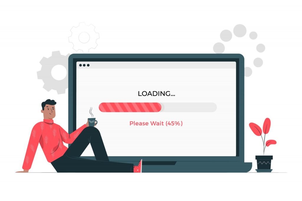
2. Fast Loading Speed
Loading speed is a very major concern for users. According to the latest statistics around 50% of users bounce back if they find your website sluggish. You can increase the loading speed of your website by optimizing images (using compression tools to optimize the size), minimizing HTTP requests, using a content delivery network (CDN), enabling browser caching, and minimizing the code.
3. Avoiding Pop-Ups
Avoid using pop-ups for mobile design. Pop-ups are only suitable for desktops having larger screen sizes. For mobile design, pop-ups can be annoying as they can interfere with the site navigation by blocking the content and interfering with the users’ ability to navigate your website. Moreover, pop-ups can also slow down your loading speed because they require additional scripts and resources to load, which will result in an increased loading time for your website.
4. Legible Font Size and Color
Make sure to use legible font size and color for mobile devices. Choose a font size of at least 14px and use a high-contrast color scheme that is easy on the eyes. Avoid using small font sizes or low-contrast colors, as they can make it difficult to read text on smaller screens.
5. Suitable Size and Placement of Buttons
Irrelevant placement and very small size buttons can lead to poor navigation and ultimately annoy users. Always remember that mobile users navigate mostly by their thumbs so your button size and placement should be accurate enough that users can easily click on it by using their thumbs. To be more precise, the buttons must be located at the bottom of the screen.

6. Simple Layout
You must keep your layout simple so that when the user lands on your website, he/she can easily understand your website’s layout and perform their desired actions. In case your layout is not simple, and it is full of fancy design elements, fancy images, irrelevant content, etc. then it is difficult to navigate on small screens.
7. Use of Latest Tools and Technologies
To create a truly mobile-friendly website, it is important to integrate it with the latest tools and technologies. This includes using responsive design frameworks, mobile-friendly content management systems (CMS), and mobile-compatible website builders. Additionally, you can integrate with the required plugins and widgets, such as mobile-optimized contact forms, social sharing buttons, and video players.

8. Responsive Forms
In case you want your users to provide you with certain information before their action, then you would go for forms. Now you must ensure that your forms are mobile-friendly i.e. forms are optimized for smaller screens and the forms aren’t too long. Filling out a lengthy form on mobile is annoying as the user might keep on scrolling which might result in frustration for the user.
9. Search Feature
Make sure to provide a search bar in your design as your users may expect it because they might be busy and cannot spend their time scrolling and finding what they want, so they just quickly want to do it using a search bar. Therefore search bar is an important element in your design.
10. Testing Your Design
The last, most common, and most important step in the phase of design. Test your website on mobile devices and check its functionality and mobile friendliness. Make sure you check your website supports both Android and iOS.

Conclusion
The increasing use of mobile devices has made it essential for businesses to create mobile websites. With more than half of all internet traffic generated by mobile devices as of 2023, it is important to implement best practices for creating a mobile-friendly website. By following the given practices, businesses can ensure that their websites provide the best user experience possible, reduce bounce rates, and engage mobile users for longer periods.
Want to Learn UX Design?
- Try Interaction Design Foundation. IxDF offers online design courses that cover the entire spectrum of UX design, from foundational to advanced level. As a UX Design World reader, you get 25% off your first year of membership with the IxDF.
- The UI/UX Design Specialization from Coursera brings a design-centric approach to user interface and user experience design and offers practical, skill-based instruction centered around a visual communications perspective. By learning this Design Specialization, you can design high-impact user experiences for your customers.
Thanks for reading.
Subscribe for more related articles at UX World.
If you have any questions, contact us here: Facebook | YouTube | Twitter | Instagram | Linkedin