Last Updated on January 7, 2025 by UX World
What are Infographics?
An infographic is a visual representation of a story. You have something to tell your audience, you can do it more effectively using infographics. It is a combination of imagery, graphical data, and text. Its purpose is to make data easily (and often enjoyably) understood at a glance or with brief attention. It is important to design infographics carefully.
“Visual information is easy to understand and memorize.“
Writing long articles has its own importance. An infographic is another way to show difficult concepts in a simpler form.
Infographics have multiple types and styles. You can select and design the type that best suits your audience.
“Few commonly used types are information infographics, timeline infographics, statistics infographics, process infographics, and comparison infographics.”
Key Takeaways
- Infographics are an effective way to present complex information in a simple visual format. They need to be designed carefully.
- Present a story in your infographic to make it interesting and understandable.
- Keep your infographics simple by presenting one idea at a time.
- Use a visualization type that best presents your data.
- Use visual hierarchy to present information according to their usage and importance.
Why Use Infographics?
The human brain processes images 60,000 times faster than it does text. And it is more accustomed to processing images.
Infographics are an effective way to present information visually instead of long reading material. It is easier to memorize the concept when it is presented in images.
You can use infographics for marketing purposes and attract more visitors and customers to your business.
How to Design Infographics?
An infographic is a simple representation of information. A UX Designer knows that providing a simple solution to a complex design problem is challenging.
Below are a few best practices and tips to design effective infographics.
6 Tips to Design Effective Infographics
Below is a list of useful tips that help you create effective infographics.
- Create a story
- Keep it simple
- Use right data visualization
- Organize content properly
- Avoid text clutter
- Choose the correct color scheme
1. Create a story
The most important tip for designing infographics is to present an end-to-end story.
- Understand the problem and then present its solution.
- Make your infographic an interesting read for your audience.
- Make it meaningful. Do not just put information in the form of images, make it understandable.
- Add related information to an infographic to make it a story from start to end.
- If your infographic does not present a good story, it will not make sense to the audience.
- Present an integrated idea by connecting all the dots of the story.
Bad example

Good example

2. Keep it simple
It is much easier to make the infographic UX a complex piece of information. However, reasonable time and effort are required to make it simple and understandable for your audience.
“Always present one idea and do not try to encapsulate several ideas within the same infographic.“
- Use text to support images.
- Use bullets when you are describing something, whereas use numbering steps when you are explaining a process.
- Use images with each bullet or step.
- Make your infographic memorable for your audience.
- If you display data in charts, pick a chart type that makes information effective for the audience.
Bad Example
Good Example
3. Use the right data visualization
Data visualization is used to present data in a graphical format so it becomes easier for the reader to understand it.
It is a challenge to present data using the correct visualization form to enhance infographic UX.
- If you just put data using a random visualization, it can confuse the reader even more.
- First, ensure that you have collected real data with no errors.
- Second, decide on a visualization type that best presents the data. It should make sense for the reader.
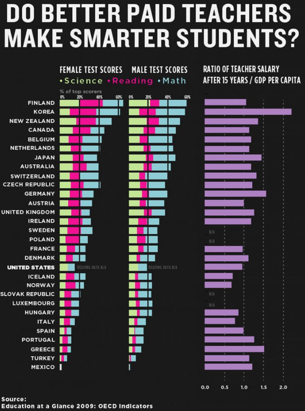
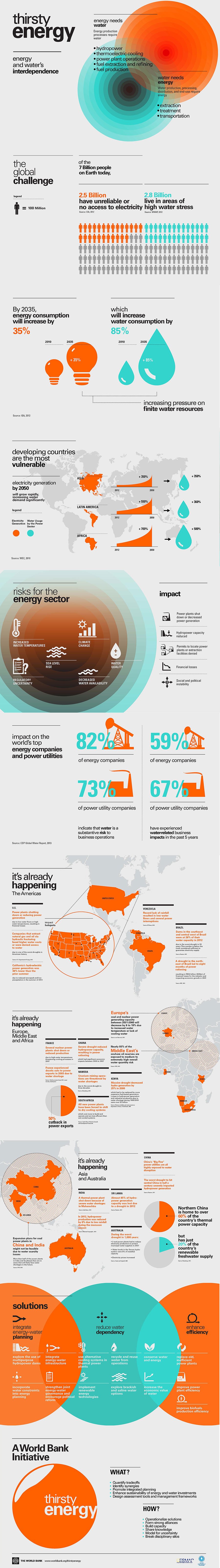
A few guidelines for providing good visual information can be seen here.
Bad Example
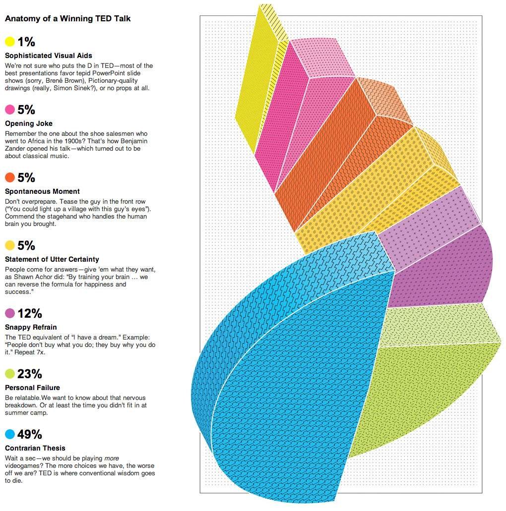
Good Example

4. Organize content properly
To define better UX for infographics, the content organization must be done in a user-friendly way.
- Organize your content in the infographic so that readers can easily scan and find the logical grouping of the content.
- Select the correct type of infographic. For example, use a timeline infographic to display information for certain periods.
“Use visual hierarchy to present the content. Highlight important information by making it larger. Use colors to differentiate an item from others.“
- Use reasonable white space between content. This will give a breathing space and it becomes easier to follow the content.
Bad Example

Good Example

5. Avoid text clutter
An infographic is more of a visual representation of information. The best infographic design displays a good balance of textual and graphic content.
“A lot of text will hurt the purpose of the infographic.”
- Use text to support the visuals in an infographic.
- Only use text where necessary. Do not add unnecessary explanations of graphics.
- Use correct fonts and colors to make the infographic appealing to the reader.
Bad Example

Good Example

6. Choose the correct color scheme
It is important to use colors effectively in infographics. Using too many colors in the design will confuse the reader, whereas using limited colors will make it a boring piece of information.
- Use a simple color palette of no more than 4 colors for your infographic, unless it contains some specific information like logos of different companies.
- Use colors to highlight information where necessary.
- Use good contrast to display different types of information.
- Font color is an important aspect that can make your infographic good or bad. Decide a font color based on the background color being used.
Make your infographic interesting by using colors wisely, otherwise, your readers will lose their interest if you fail to provide a good color combination.
Bad Example

Good Example
Conclusion
Infographics are important design deliverables that help you present complex information in a simpler form. It is essential to design your infographics with much attention and follow the best practices to make them beautiful and effective.
Remember, designing good infographics requires a lot of practice and patience. So, keep on working to improve your infographics.
Want to Learn UX Design?
- Try Interaction Design Foundation. IxDF offers online design courses that cover the entire spectrum of UX design, from foundational to advanced level. As a UX Design World reader, you get 25% off your first year of membership with the IxDF.
- The UI/UX Design Specialization from Coursera brings a design-centric approach to user interface and user experience design and offers practical, skill-based instruction centered around a visual communications perspective. By learning this Design Specialization, you can design high-impact user experiences for your customers.
Thanks for reading.
Subscribe for more related articles at UX World.
If you have any questions, contact us here: Facebook | YouTube | Twitter | Instagram | Linkedin