Last Updated on April 30, 2025 by UX World
A drop-down menu is a standard UI control that provides a clean and intuitive way to present a list of options to users.
However, they can be confusing for users if not designed properly. This article will discuss a few best practices that help you create drop-down menus that enhance your product’s usability.
Learn how to design an interactive Drop-down menu animation in Figma:
Drop-down Menu Design Guidelines and Best Practices
- Don’t use long menus
- Don’t use a drop-down for 2 options
- Disable options that are not valid at the moment
- Don’t use a drop-down where options are too obvious
- Don’t use a drop-down for more than 2 levels
- Make a clear visual design
- Consider mobile devices
- Organize options in a logical order
- Provide a search feature
- Make a default selection
1. Don’t use long menus
Using drop-down menus with too many options often leads to a poor user experience.
- It increases the cognitive load for users to process and compare a long list of options. Users will spend more time on a simple selection.
- Users will be required to scroll the list to see all the options. This can be more annoying on small screens.
- It takes more loading time to load all the options quickly when the user scrolls through the list to find the required option.

What if you need a long drop-down menu?
In such cases, certain best practices help you manage long drop-down menus.
- Use Categories /Groups: This helps users quickly navigate to the relevant category instead of scrolling through the entire list.
- Provide a Search feature: This allows users to enter the text and quickly find the required result.
- Limit the Number of options: Reevaluate whether all options are necessary. Limit the number by removing less important options.
- Use Alternative UI controls: Consider alternative UI controls, such as a list box or a group of checkboxes, which might be more user-friendly.
2. Don’t use a drop-down for 2 options
Using a drop-down menu for just two options is generally not recommended because it will add unnecessary complexity for users.
- A drop-down menu requires at least two clicks or taps. The first click opens the menu and the second click selects an option. For two options, this process is inefficient when compared to alternatives.
- Hiding two options in a drop-down menu can be frustrating for users.
What is the solution for providing 2 options for selection?
- In such cases, it is better to use another control. Radio buttons or toggle switches allow users to select an option with a single click or tap. Also, the options are always visible on the UI.

3. Disable options that are not valid at the moment
This approach guides users to focus only on the available and valid choices, thus improving efficiency.
- It prevents the selection of something that isn’t applicable or functional at the moment and thus reduces the chance of errors.
- Keeping the options visible but disabled provides a consistent experience, ensuring the user can see all possibilities.
How can you achieve this in a better way?
- It is important to show the disabled options differently. You can either gray them out or reduce their opacity. This makes it clear they are not selectable.
- You can provide additional context or explanation through tooltips or inline messages to explain why an option is disabled. This will let users know when and how the option will become enabled.

4. Don’t use a drop-down where the options are too obvious
It is not essential to provide a drop-down menu every time users need to select from available choices.
- Sometimes the options are simple and familiar, and providing them in a drop-down list can reduce efficiency.
- In such cases, asking users to scroll through a long list can slow the process.

What to do instead?
- Allowing users to enter the input can significantly speed up the process.
- You can provide auto-suggest to guide the users about related options.
- It reduces the cognitive effort of scanning and selecting from a long list. This approach is often more intuitive and quicker for users who already know what they are looking for.
5. Don’t use a drop-down for more than 2 levels
Drop-down menus with multiple levels can become overwhelming and confusing for users.
- Navigating through several levels of options increases complexity.
- With each next level, users must remember where they are in the menu hierarchy and keep track of previous selections.
- Deep levels can lead to interaction issues, such as accidentally hovering over the wrong item and causing the menu to close or shift unexpectedly. This can be particularly frustrating on touch devices, where precise control is more difficult.

What is the solution?
- Limiting the menu to two levels helps ensure simplicity and ease of use.
- If you want to add more levels for an option, consider alternative controls such as a mega menu, tabs, or a well-structured navigation page.
6. Make a clear visual design
Indicate clearly where a drop-down menu is available
- Use arrows along with the label/title of the menu. This will help users know about the presence of the drop-down menu.

Use a consistent style
- Use consistent styles for drop-downs across the application. It makes it easier for users to recognize and interact with the control.
- Since the drop-down menu overlaps the interface, use a clear contrast against the background.
Provide proper hover and selection states
- When the user hovers or selects an option in the menu, provide clear visual feedback.
- A background color or a checkmark can be used to show the selected option.

Ensure smooth animation
- Ensure the drop-down menu opens and closes smoothly using the standard animation that helps users understand the menu’s current state.
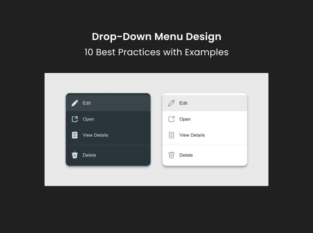
Use icons to support options
- Using icons and text makes the options visually intuitive and easier to understand.
- This approach is more effective when the options represent actions, categories, or items that can be quickly recognized through a visual cue.
- Use standard icons to represent the options.
- Conduct usability testing to ensure users understand the meaning of the icons.
Don’t use tooltips for options within a drop-down menu
- Using tooltips for the options in a drop-down menu depends on certain scenarios.
- Tooltips can be helpful when options require further explanation.
- However, they should be used carefully without complicating the design. Overusing tooltips can be annoying in a drop-down menu.
7. Consider mobile devices
On mobile devices, drop-down menus can be more challenging to design due to small screen sizes and touch-based interactions.
- Use responsive drop-down menus that can adjust themselves based on the device type.
- For longer lists, consider using a dedicated selection screen where users can scroll through options and make a selection.
- Ensure that the drop-down menu and its options have sufficiently large tap areas. Small or closely spaced options will lead to user frustration and errors.
- It is better to use native controls as they are optimized for touch interaction. These components are familiar to users and provide a better user experience than custom drop-downs.
- Avoid using drop-down menus with multiple levels on mobile. A single-level menu is easier to navigate and less confusing.

8. Organize options in a logical order
If the options can be logically grouped by category or type, consider organizing them into groups.
- To make groups more apparent, you can use visual dividers or headers within the drop-down to separate different categories.
- If the options are of equal importance or there is no clear pattern, arrange them alphabetically. This method allows users to predict where an option will appear.
- If the drop-down menu includes date, time, or other sequential options, arrange them in order.
- Similarly, if the menu shows numbers or ranges, arrange them in ascending or descending order.

9. Provide a search feature
A drop-down menu with a search feature enhances usability, especially when dealing with many options.
- It makes it easier for users to find the required option without scrolling through the entire list.
- Typing the required name and filtering the list reduces the time and effort required to locate an option.
- If the search query doesn’t match any options, display a clear message to inform users that they need to try a different search term.
- Ensure that the search box and drop-down menu work well on mobile devices. The search box should be easy to tap, and the filtered options should be easy to scroll through on a small screen.

10. Make a default selection
- If there’s a common or recommended option, consider setting it as the default selection. This can streamline the user’s interaction, especially if they are supposed to accept the default.
- If no clear default exists, or if you want to force users to make a conscious choice, start with a neutral option like ‘None’ or’ Select’.


Conclusion
A drop-down menu, when designed carefully, can greatly enhance the usability of your products. By following the given best practices, you can create drop-down menus that are intuitive and efficient.
Read More
- 7 Rules of Using Radio Buttons vs Drop-Down Menus
- Drop-Down Menus
- Checkbox vs Toggle Switch
- Disabled Buttons UX – Usability Issues and How to Avoid Them
- Tooltip Guidelines – Best Practices and Common Mistakes
Learn UX Design
Try Interaction Design Foundation (IxDF). IxDF offers online design courses that cover the entire spectrum of UX design, from foundational to advanced level. As a UX Design World reader, you get 25% off your first year of membership with the IxDF.
Subscribe for more related articles at UX World.
If you have any questions, contact here: Facebook | YouTube | Instagram | Linkedin