Last Updated on July 3, 2025 by UX World
Tables are an essential part of the user interface that helps users visualize a lot of data at once in an organized form. Designing a user-friendly experience when users interact with a table showing huge content is challenging.
Tables have several UI elements and features, like pagination, editing, filtering, sorting, show/hide columns, search, etc., that UX designers need to consider while designing a table. This article describes a few ways of displaying input validation messages when users perform inline editing of the table content.
What is Inline editing?
Inline editing provides a way of editing the table content while remaining on the same page without navigating to any other pop-up, dialog, or page. The users can click on a row or cell and edit its text. This helps to change the content instantly without moving away from the current view.
This is a convenient and quick way of editing the table content. If you take the user to another view, for example, you can open a pop-up or dialog to edit tables, there is a chance that users will lose the context.


How to do inline editing and input validation?
When you give the users an option to edit the table content inline, there is a need to provide a way to validate the data the user enters. The input validation approach in tables is related to an input form where users enter data, and the validation takes place instantly.
However, since the table is a container that can display a large amount of data, finding an appropriate way to show the validation messages can be a challenging design problem. Below are a few methods to show validation messages when the user edits text in the table.
Along with the cell that is being edited
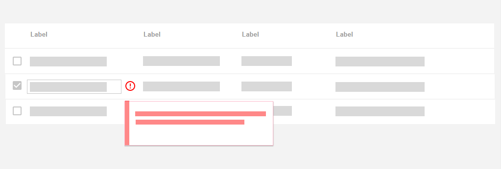
The simplest option is to show the error indication with the cell the user is currently editing. Just like inline validation in input forms, display an error icon along with the cell that helps the user identify that he has entered an invalid input in the cell.

Hovering on the error icon displays a help tip explaining the error and guiding the user to resolve it. Users can follow the guidelines and enter a valid input in the cell to remove the error.
Below the row or cell that is being edited
Another option is to display the error message below the row where the user has entered the invalid input.
Using this method requires an extra space below the affected row in the table.
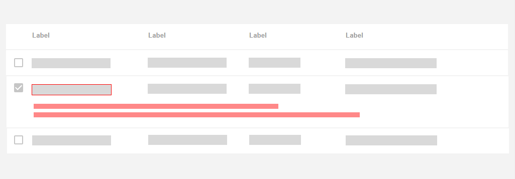
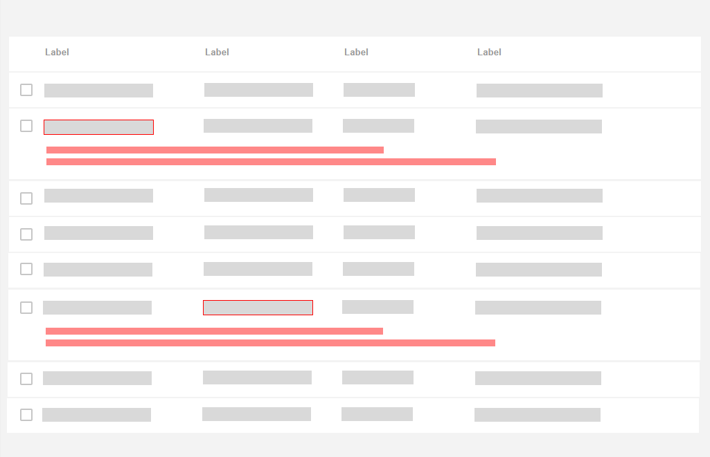
Providing the error below each erroneous row will require additional space in the table unless the user removes the error and enters the correct input.
On top of the current view
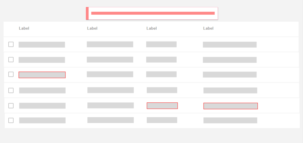
Another good option is to display the error message above the table. When the user enters an invalid input in a cell in any row, the error message displays on the top.
The affected cell will be highlighted in red so the user can identify the error and make the necessary corrections.

It’s critical to stick the error message on top of the current view, or else the message will be hidden if the user has already scrolled down the page for a large table.

A single error message will show the details of the error if it occurs on multiple rows. The error message will be removed when the user removes all the incorrect entries in the table.
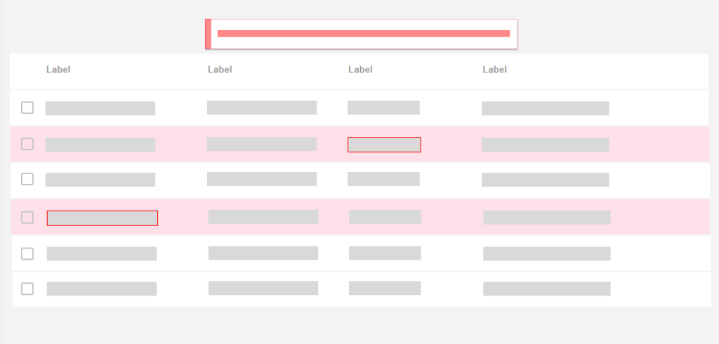
Changing the row color
Another way is to change the background of the table row to indicate invalid entries. The details of the error can be displayed on the top of the current view. The error message will be removed as soon as the user resolves the error.
Following the given methods will help you better handle the input validation problem in table design.
Read more:
- Data Table Design Best Practices
- Best Practices for Providing Actions in Data Tables
- Best Practices for Inline Editing in Tables
Want to Learn UX Design?
- Try Interaction Design Foundation. IxDF offers online design courses that cover the entire spectrum of UX design, from foundational to advanced level. As a UX Design World reader, you get 25% off your first year of membership with the IxDF.
Thanks for reading.
Subscribe for more related articles at UX World.
If you have any questions, contact us here: Facebook | YouTube | Twitter | Instagram | Linkedin


