Last Updated on May 31, 2024 by UX World
What is a Progress Indicator?
When users are working on a product, it is common that they are required to wait for some time after an action to get a response. The progress indicators help enhance the user experience of this waiting time.
It simply means that we should provide the user with feedback until the waiting time is over and the ongoing process is completed.
Progress indicators inform users about the status of the process, current progress, and the remaining time to complete the process.
Many user actions initiate the processes that require a specific time to show a response on UI. A few examples are: loading a web page, saving a document, downloading a file, etc.
This is a simple and common behavior that needs the attention of UX designers while designing a product.
You must have experienced some apps, websites, and products that do not take care of providing this feedback to the user. This leads to an annoying user experience as users do not have a clue whether the action is being performed or not, they should wait on the screen or leave it.
This uncertainty hurts the trust of the user in your product.
Key Takeaways
- The progress indicators enhance the user experience by providing feedback on an ongoing process in response to a user action.
- A good progress indicator shows the progress completed, the current status of the process, the remaining process, and details of the process.
- There are different styles of progress indicators including linear, circular, determinate, and indeterminate. The progress indicators also display the progress done in the form of a number or percentage.
Elements of a Progress Indicator
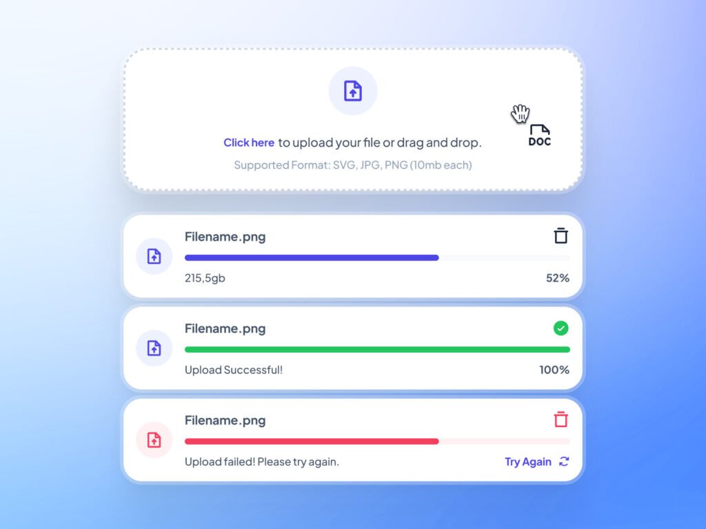
A good progress indicator UX provides the following information.
- Part of the process completed
- Current status of the process
- Part of the process remaining
- Details of the on-going process
Design Principles to Create Progress Indicators
An effective progress indicator follows the below design principles.
1. Informative
The progress indicator shows the information of the ongoing process as well as its status in terms of completion.
2. Consistent
The progress indicator follows a consistent style for similar processes. For example, uploading a file will display the same progress indicator everywhere in your product.
3. Animated
The progress indicator shows some kind of animation to give the user an impact of something happening in the background.
Creative Progress Indicator Styles
Below is a list of creative progress indicators grouped by their type.
1. Linear Progress Indicator
A linear progress indicator shows the progress of a process from start to end in the linear form.
A Linear progress indicator can be Indeterminate or Determinate depending on its behavior.
(i) Linear Indeterminate
A Linear Indeterminate progress indicator displays for an unspecified time, or you can say when the waiting time is not known.
These types of progress indicators are used for processes where progress is not detectable, or if the user doesn’t need to know how long an activity will take.

(ii) Linear Determinate
A Linear determinate progress indicator displays for a specified time, or you can say when the waiting time is detectable. They tell the user how long the process will take.

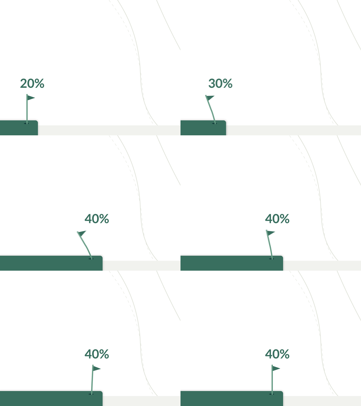
(iii) Linear With Value or Percentage
A linear progress indicator displays the progress of the process in terms of value or percentage.
The user can easily see how much process is completed, the current progress, and how much is remaining. This helps to analyze the time taken by the process.
2. Circular Progress Indicator
A circular progress indicator shows the progress of a process from start to end in the form of a circle.
Like a linear progress indicator, a circular progress indicator can be indeterminate or determinate depending on its behavior.
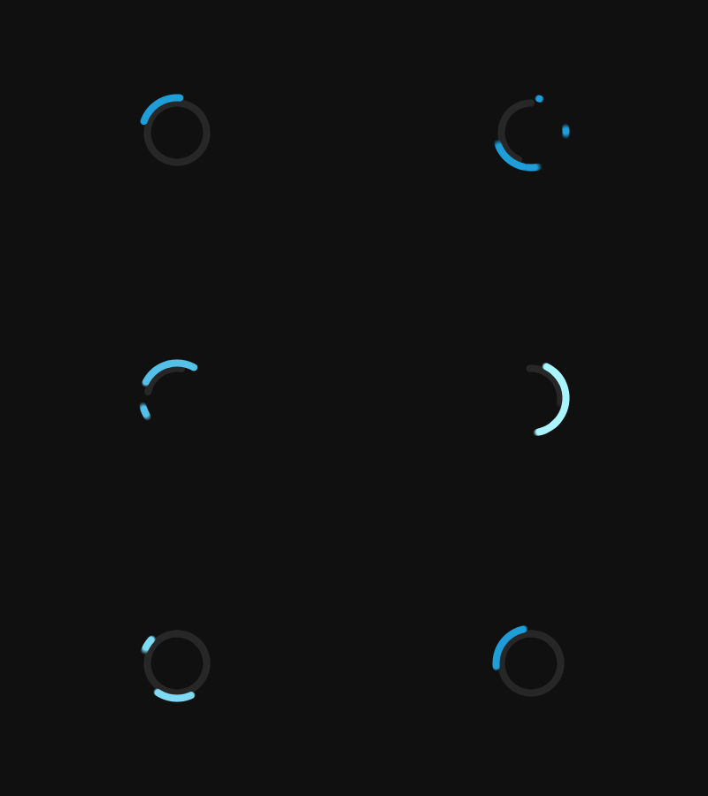
(i) Circular Indeterminate
A Circular Indeterminate progress indicator displays for an unspecified time, or you can say when the waiting time is not known.
These types of progress indicators are used for processes where progress is not detectable, or if the user doesn’t need to know how long an activity will take.
(ii) Circular Determinate
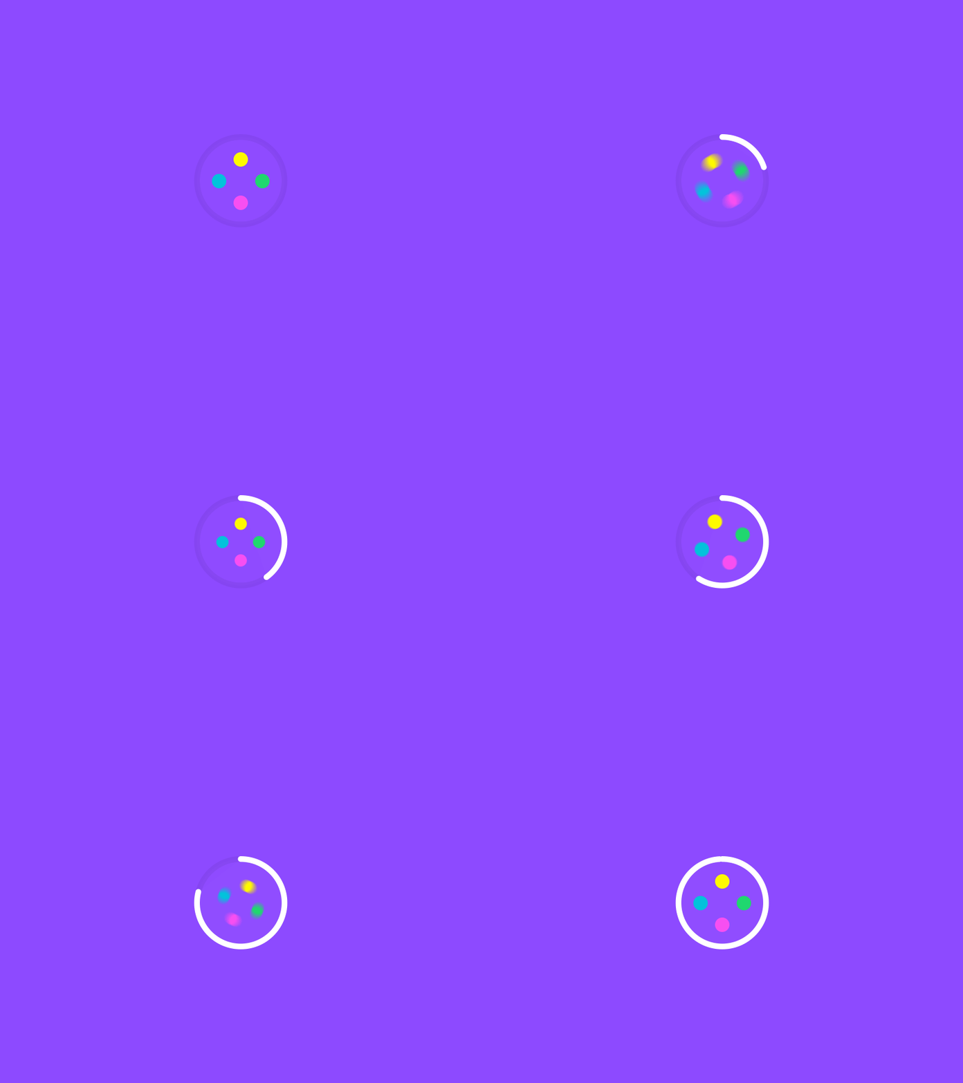
A Circular determinate progress indicator displays for a specified time, or you can say when the waiting time is detectable. They tell the user how long the process will take.
 UX World is an approved Educational Partner of the Interaction Design Foundation, the world’s largest UX Design learning community.
Get 3 months of free membership to learn UX Design here!
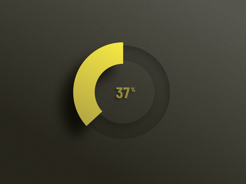
(iii) Circular with Value or Percentage
A circular progress indicator displays the progress of the process in terms of value or percentage.
The user can easily see how much process is completed, the current progress, and how much is remaining. This helps to analyze the time taken by the process.
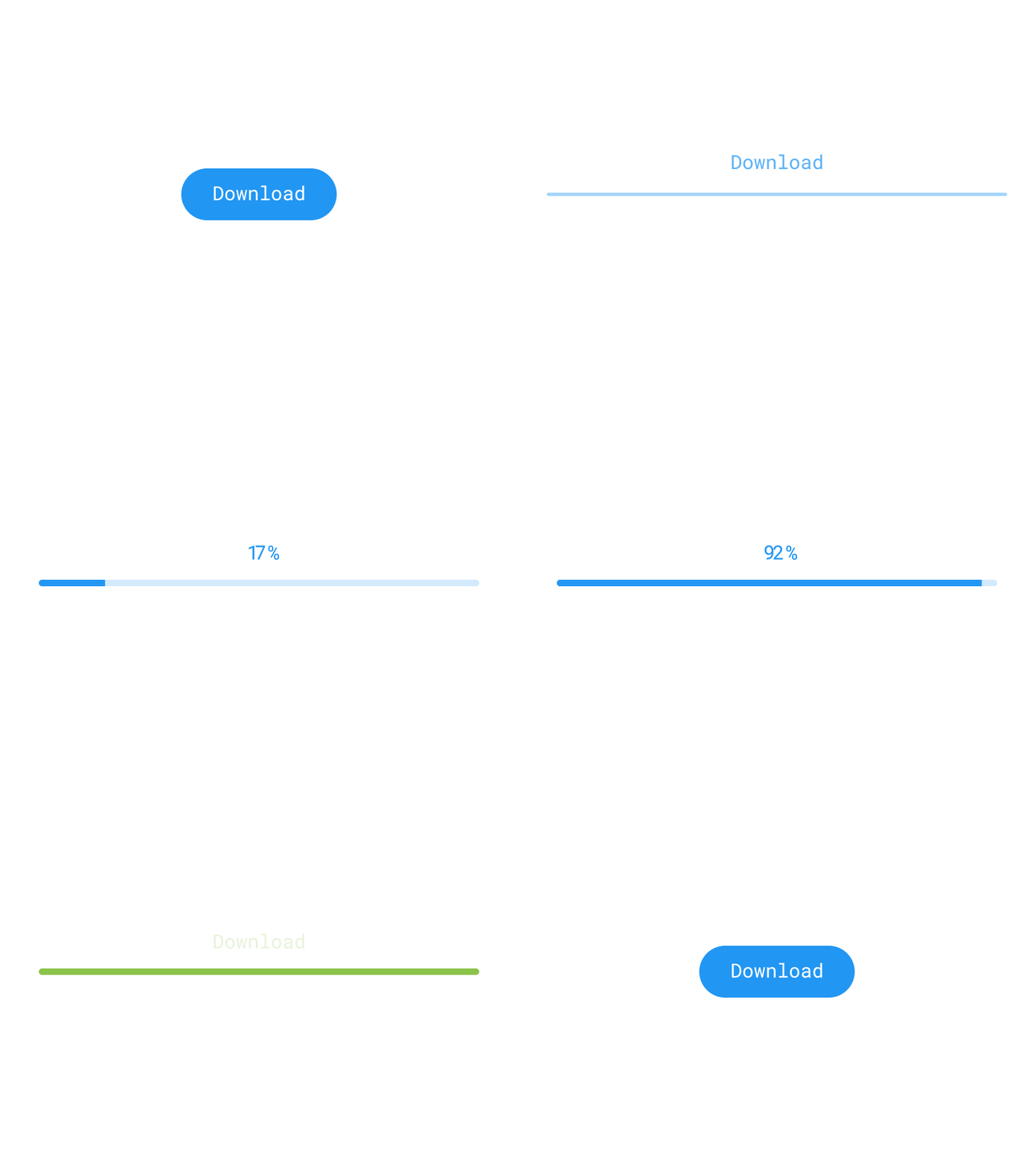
3. Progress Indicators Integrated with Actions
The progress indicators can be integrated with user actions and display the status of the response in terms of time or percentage.
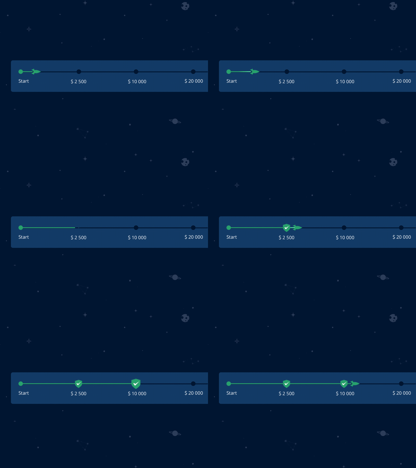
Examples of Creative Progress Indicators
There can be more creative ways to design progress indicators that help the users easily understand the progress of the ongoing process. A few progress indicator examples are shown below.

Conclusion
Progress indicators are important design controls that are often ignored by UX designers. Without providing proper user feedback, the UX design of your product remains incomplete. This helps to reduce uncertainty for the users and they will wait for the response without getting annoyed.
Want to Learn UX Design?
- Try Interaction Design Foundation. IxDF offers online design courses that cover the entire spectrum of UX design, from foundational to advanced level. As a UX Design World reader, you get 25% off your first year of membership with the IxDF.
- The UI/UX Design Specialization from Coursera brings a design-centric approach to user interface and user experience design and offers practical, skill-based instruction centered around a visual communications perspective. By learning this Design Specialization, you can design high-impact user experiences for your customers.
Thanks for reading.
Subscribe for more related articles at UX World.
If you have any questions, contact us here: Facebook | YouTube | Twitter | Instagram | Linkedin