
Last Updated on July 3, 2025 by UX World
When working with data tables in digital applications, it is essential to provide users with clear and efficient methods for performing actions on data. Users can perform two types of actions in data tables: editing a single row or applying changes to multiple rows at once. Poorly designed action layouts can lead to confusion, wasted time, or serious mistakes like accidental deletions.
In this article, we will learn the best practices for designing data table actions.
- Row-level actions: Applied to an individual row.
- Bulk actions: Applied to multiple selected rows.
We will discuss real-world examples and design best practices to help you make smart UX decisions.
Row-Level Actions (Applied to a Single Row)
These actions are used when a user needs to perform an action on a single item in the table. For example, editing a record, deleting an entry, or viewing a detail screen for a specific item. The key challenge here is to expose the most important actions without cluttering the table.
Below are a few methods to provide row-level actions in data tables.
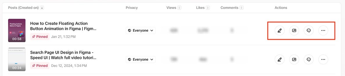
1. Action Icons on the Right Side
A common and user-friendly pattern is placing up to three action icons (such as edit, delete, or view) on the far right of each row. This layout makes the actions easy to find and keeps them visually separate from the main content.
It is important to use meaningful icons with tooltips so users can easily recognize the actions.
Example:
In TikTok, each row ends with icons for Edit, View Analytics, View Comments, and Custom actions.
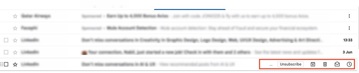
A more subtle interaction is to display action icons only when a user hovers over the row. This gives a cleaner appearance without removing functionality. It avoids overwhelming the user with options and keeps the interface focused on data until the user interacts. However, it is essential to give users an indication that actions are available on hovering a row.
Example:
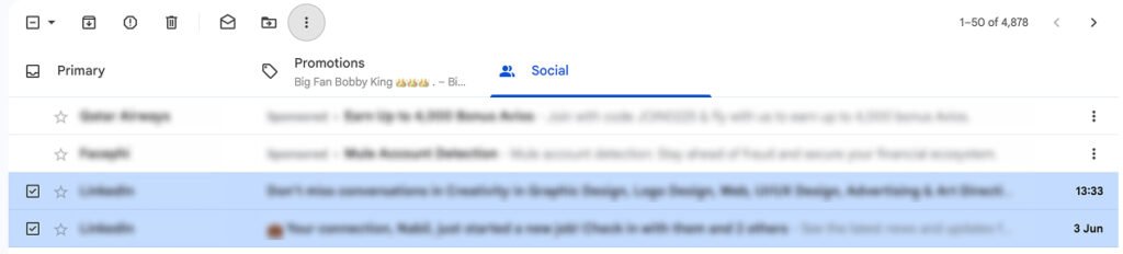
In Gmail, when you hover over an email row, icons for Archive, Delete, Mark as read, and Snooze appear. This helps declutter the inbox view while supporting fast interaction.
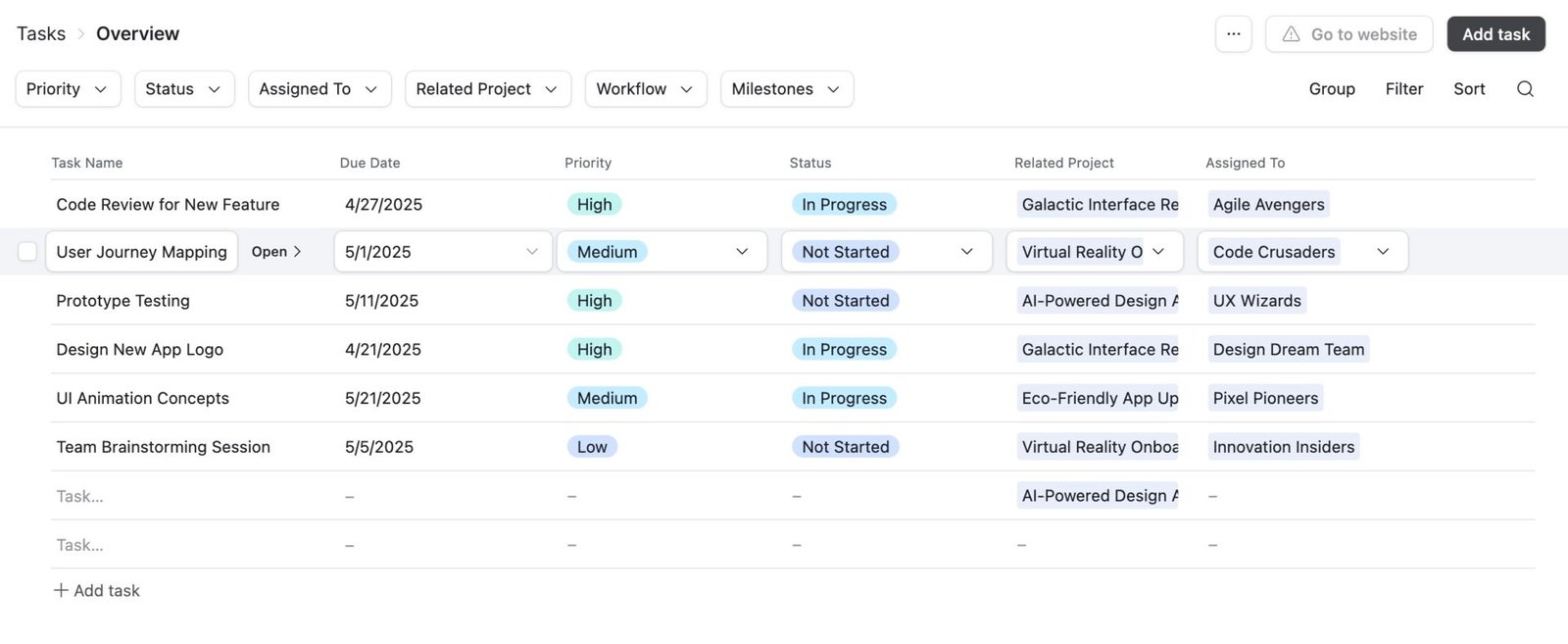
2. Action Icons in the First Column
Placing icons directly beside the primary cell content (like a task title or ID) works well when actions are closely tied to the identifier. This approach offers immediate contextual control. It works better for workflows where actions are expected near the start of the row.
Example:
In Airtable, the action item Open is displayed near the task name, helping users take quick action without scanning to the far right.
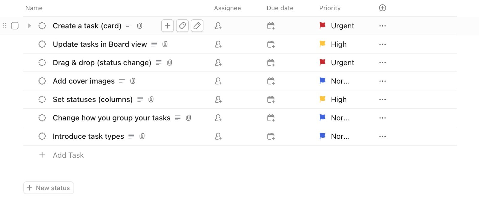
ClickUp displays the row-level actions in the first column when the user hovers over the row.
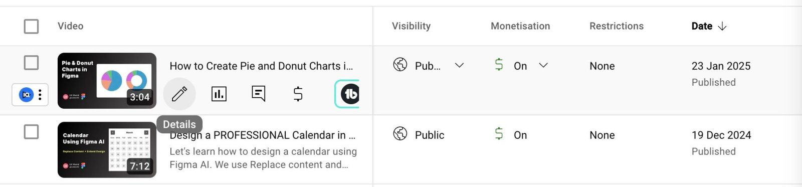
YouTube’s row-level actions display in the first column of the row that the user has hovered on.
3. Actions in a Top Toolbar (After Selecting a Row)
Another clean approach is showing row-specific actions only when the user selects a row. The toolbar typically appears at the top of the table. This method keeps the table clean in the default view.
Example:
Gmail uses this technique, where selecting a row brings up related actions at the top of the table view.
4. Drop-down Menu for More Actions
If there are more than three actions, avoid clutter by placing them inside a More dropdown menu. This keeps the UI clean while still offering flexibility.
Example:
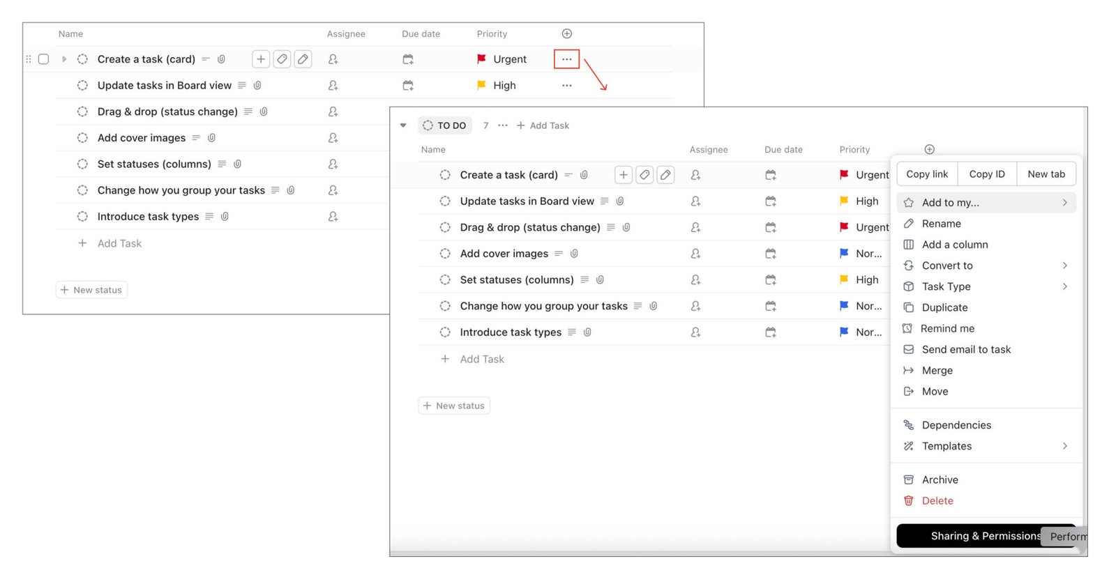
ClickUp uses a horizontal ellipsis (…) icon to display additional actions such as Add to my, Rename, Convert to, and more, along with a row.
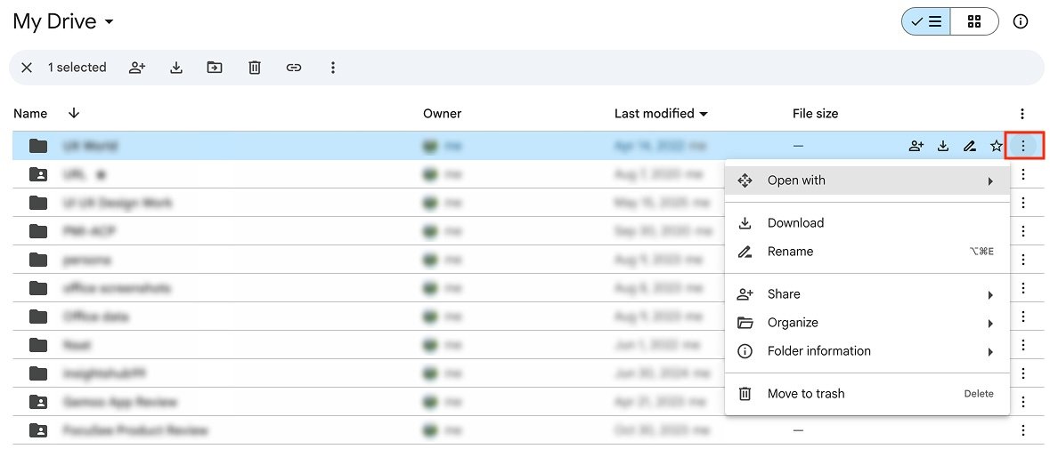
Google Drive uses a vertical ellipsis (⋮) icon that opens a dropdown menu with options for Download, Rename, Share, and more, per file.
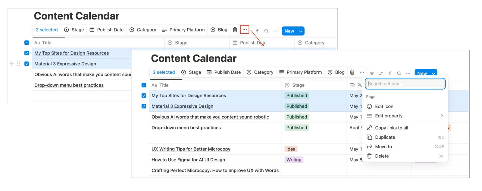
Bulk Actions (Applied to Multiple Selected Rows)
Bulk actions allow users to select multiple rows and perform an action on all of them at once, such as deleting multiple entries or applying a tag. These actions should only appear when rows are selected and should be designed carefully to avoid confusion or accidental clicks.
Below are a few methods to provide bulk actions in data tables.
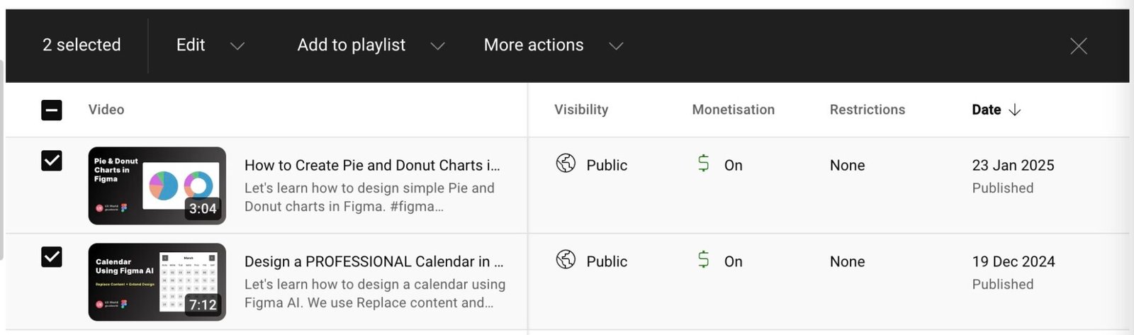
1. Actions Button with Drop-down
One effective approach is to show a contextual Actions button when multiple rows are selected. Clicking it reveals a drop-down menu with options like Delete, Export, or Assign. This allows scaling the list well for long action lists. It follows a minimal approach to keep the interface clean.
Example:
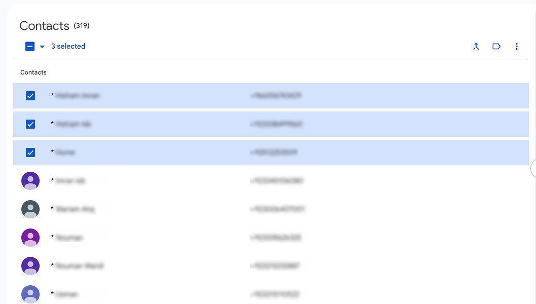
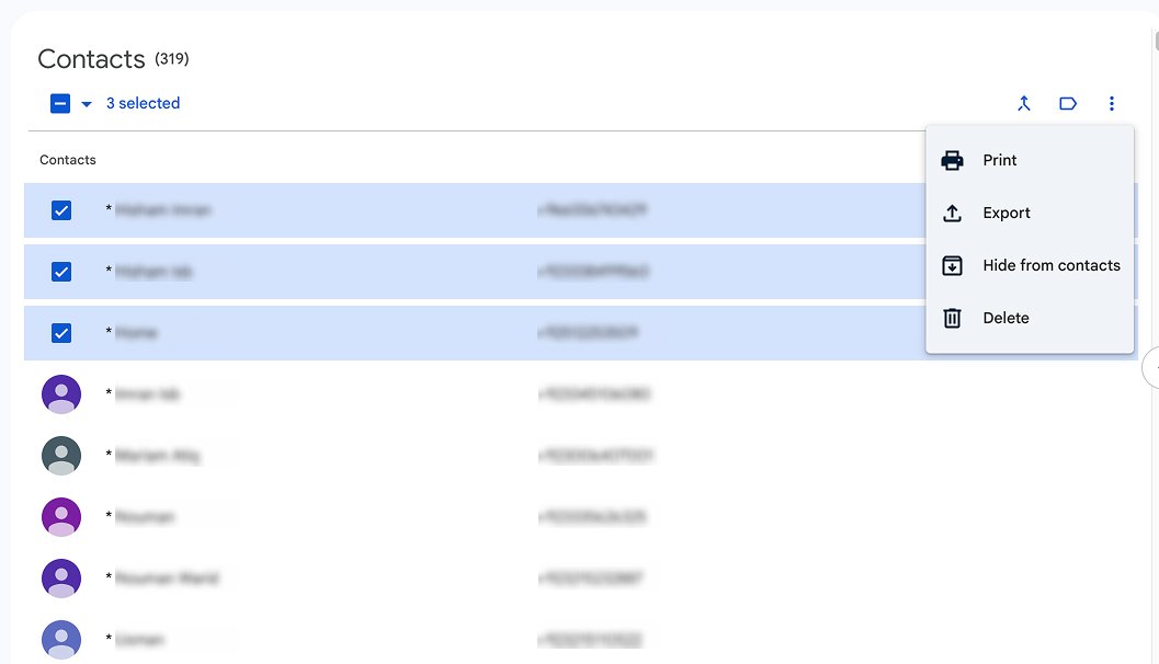
In Google Contacts, when you select multiple contacts, a top toolbar appears with a More actions icon. Clicking this icon displays a drop-down including options like Export, Delete, etc.
2. Actions in a Top Toolbar
A prominent toolbar at the top of the table appears when the user selects multiple rows. This method is faster to use for common tasks and reduces the number of clicks.
Example:
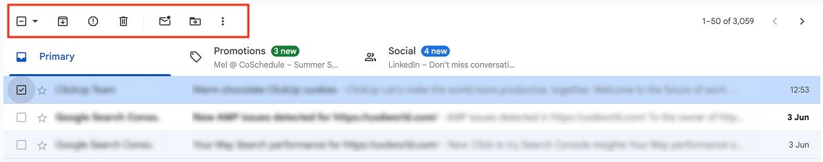
In Gmail, selecting emails displays an icon bar at the top with Delete, Archive, Mark as read, and more options.
YouTube Studio displays a toolbar with related actions at the top when multiple items are selected in the table.
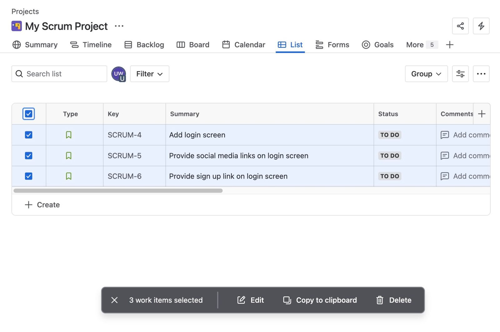
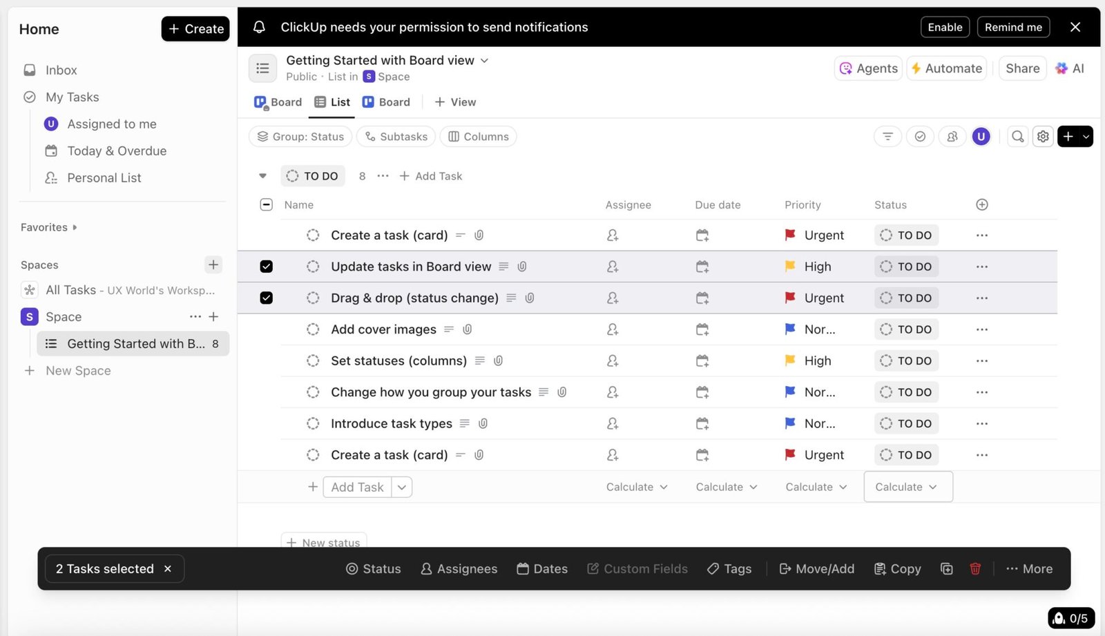
3. Actions in a Floating Toolbar
An increasingly popular UX pattern is to show a floating contextual toolbar when multiple items are selected. This toolbar typically appears just above the selected rows or fixed at the bottom of the screen, depending on the layout. This approach works well in mobile or responsive views. Also, it helps to reduce cursor movement between data and the toolbar.
Example:
In Jira, when you select multiple items, a floating bar appears with bulk actions like Edit, Copy to Clipboard, Delete, etc.
Another great example is ClickUp, where selecting multiple rows a floating toolbar appears at the bottom of the view, making actions contextually relevant and accessible.
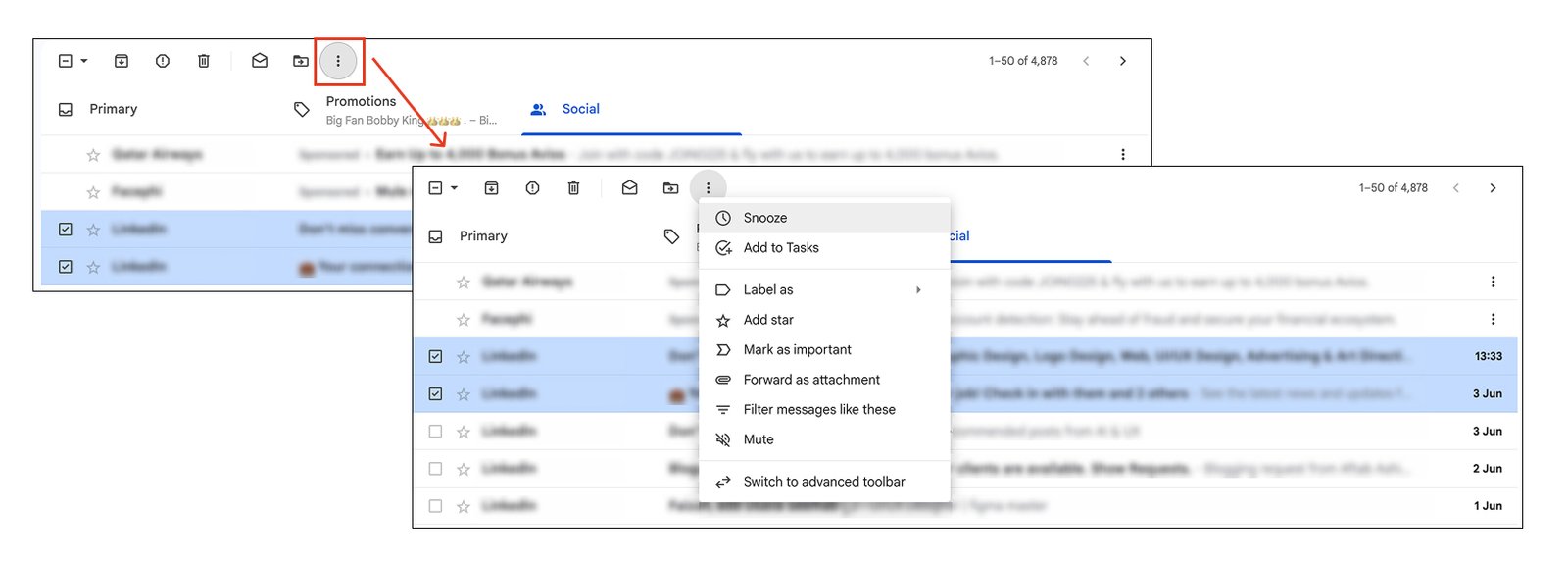
4. A Combination of Toolbar and Drop-down
For complex tables, combining both drop-down and toolbar gives users flexibility. You can expose key actions as individual options and put the rest inside a drop-down menu. This allows you to prioritize frequent actions, and you can extend the list when needed.
Example:
Gmail uses this pattern. When multiple rows are selected, the key action icons appear directly, while others are grouped in a More menu.
Notion uses the same approach. A toolbar shows a combination of key actions and a drop-down menu when multiple items are selected in a table.
Summary
Designing action patterns in tables is not just about looks; it directly affects usability, discoverability, and efficiency. You need to consider the following tips while designing actions for data tables.
- Prioritize clarity: Icons should be recognizable, with tooltips for context.
- Avoid visual clutter: Use hover states or dropdowns to hide less frequently used actions.
- Be responsive: Make sure the layout works well on smaller screens and mobile.
- Respect user flow: Don’t force users to jump through hoops for common tasks.
By following these patterns and customizing them to your needs, you will help users efficiently perform the desired actions.
Learn more about Table design:
- Data Table Design Best Practices
- How to Design Inline Editing and Validation in Tables
- Best Practices for Inline Editing in Table Design
Master Your UX Design Skills
Try Interaction Design Foundation (IxDF). IxDF offers online design courses that cover the entire spectrum of UX design, from foundational to advanced levels. As a UX Design World reader, you get 25% off your first year of membership with the IxDF.
Subscribe for more related articles at UX World.
If you have any questions, contact here: Facebook | YouTube | Instagram | Linkedin