Last Updated on June 13, 2025 by UX World
While working on design projects, I have developed a set of practical tips that help me maintain design standards throughout the process.
Today, I am sharing a few tips specifically related to button design. These tips will help you create buttons that are visually appealing and user-friendly.
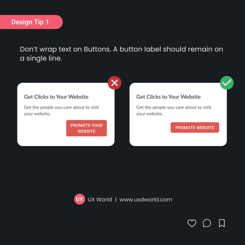
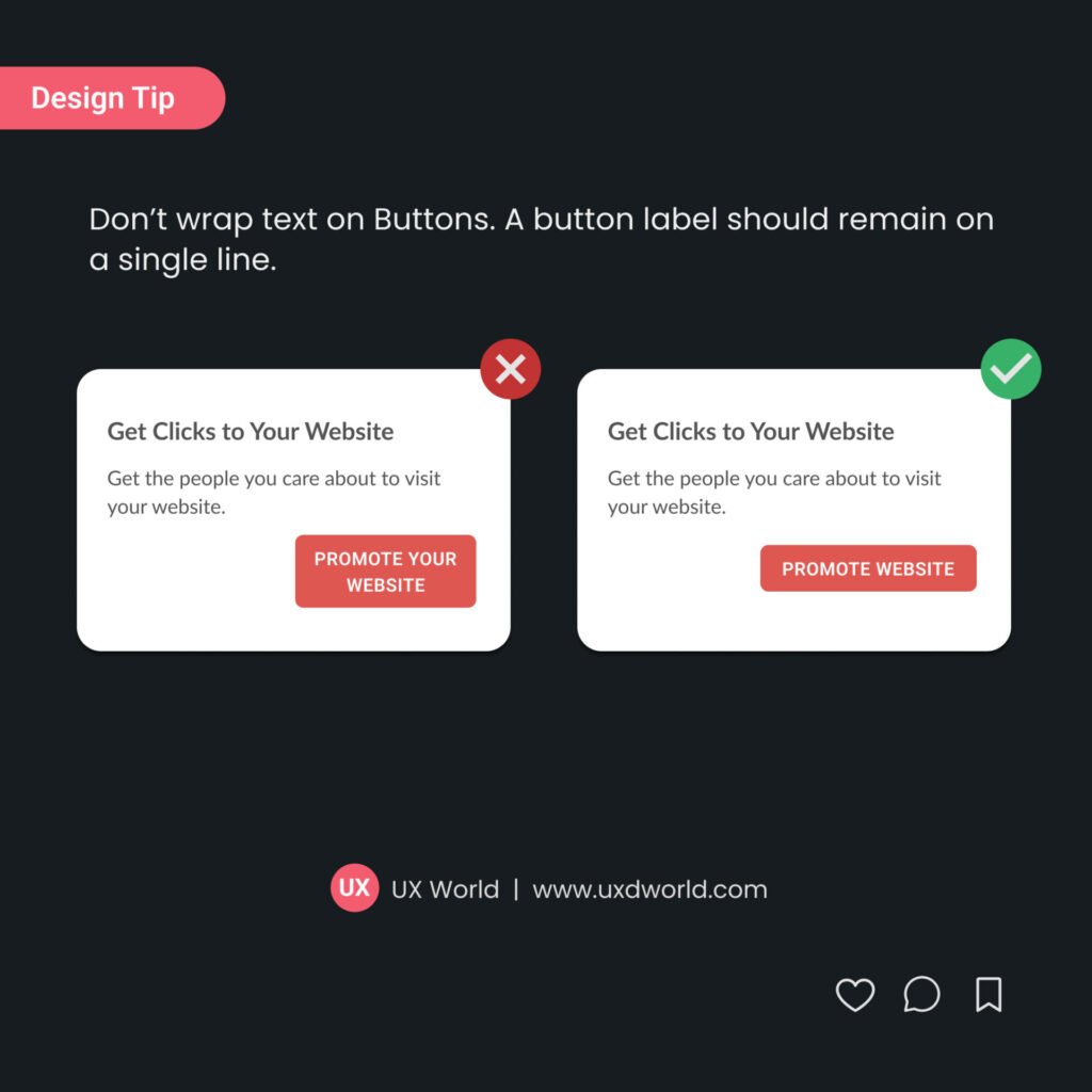
1. Don’t Wrap Text on Buttons

Don’t wrap text on buttons. A button label should remain on a single line.
- A single line of text is easier to scan, ensuring users can quickly understand the button’s function.
- Buttons with wrapped text can look cluttered or uneven.
- Keeping all button labels on one line helps maintain consistency across the interface.
- Use concise labels and avoid lengthy phrases on buttons.
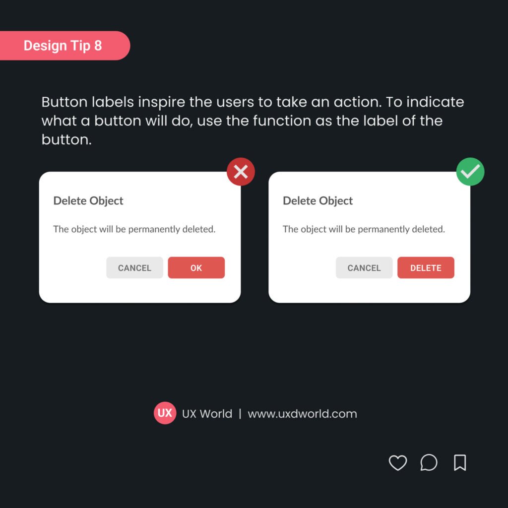
2. Use Action Verbs as Button Labels
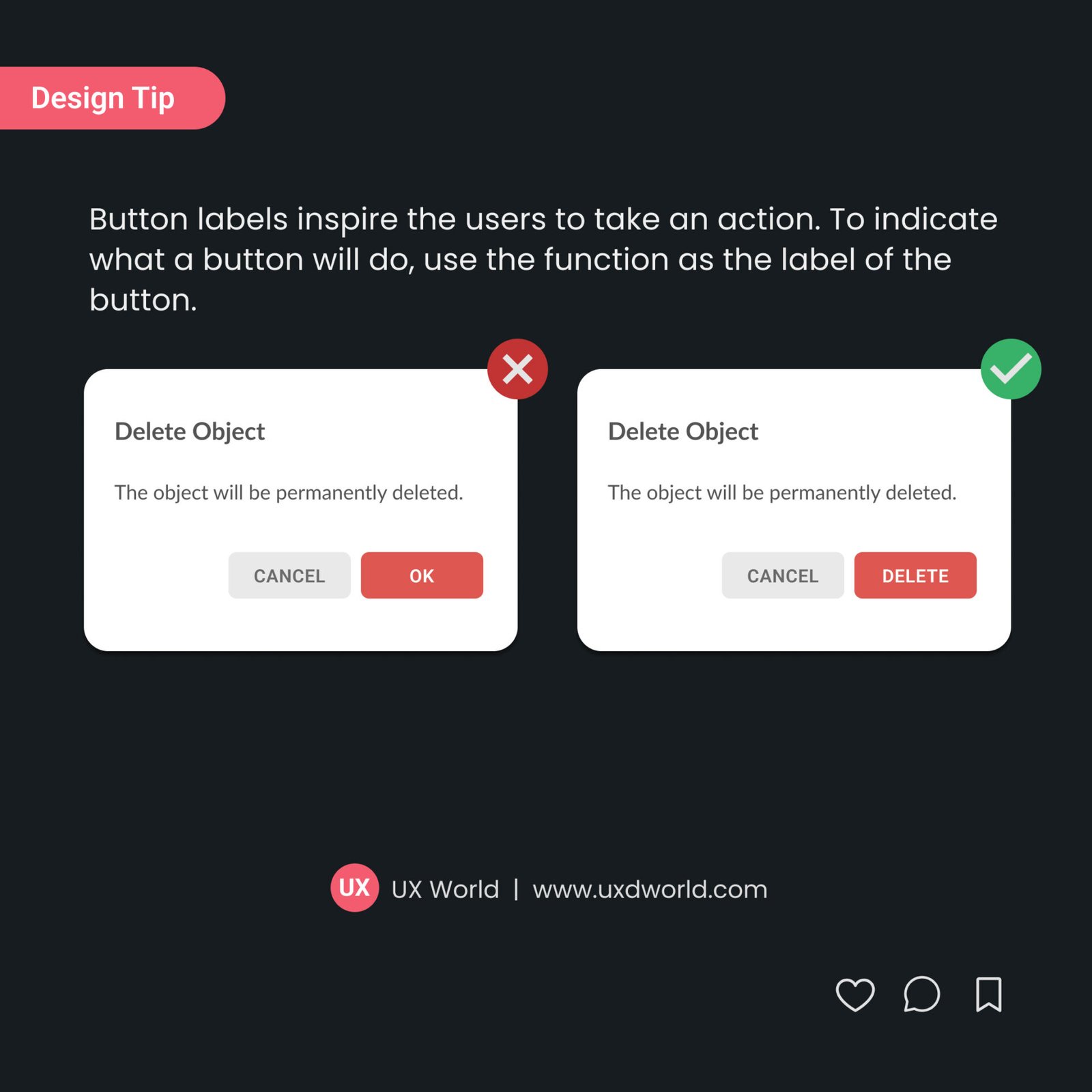
Button labels inspire the users to take action. To indicate what a button will do, use the function as the label of the button.
- Always use button labels that are clear and meaningful to the user.
- When users read the button labels like Save, Preview, and Publish, they know exactly what the button will do when pressed.
Learn best practices for writing useful button labels.
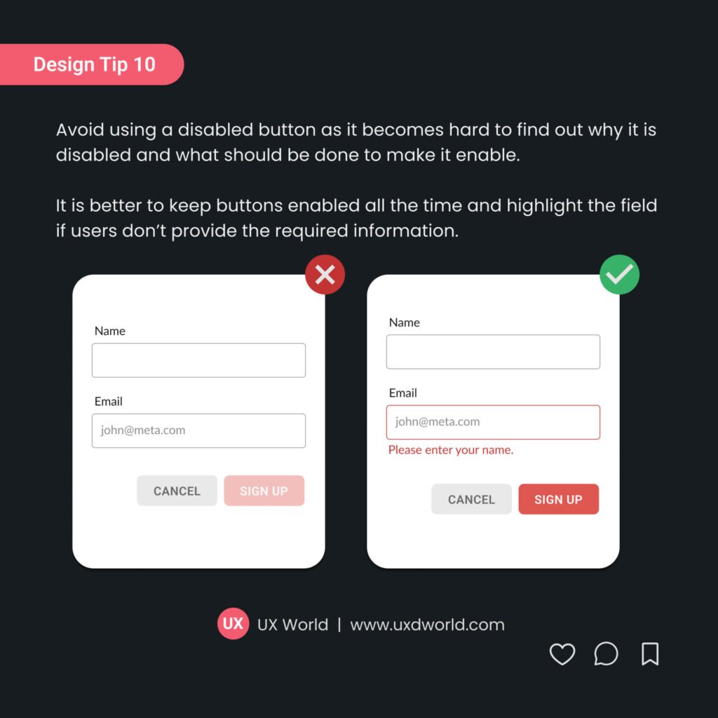
3. Don’t Use Disabled Buttons
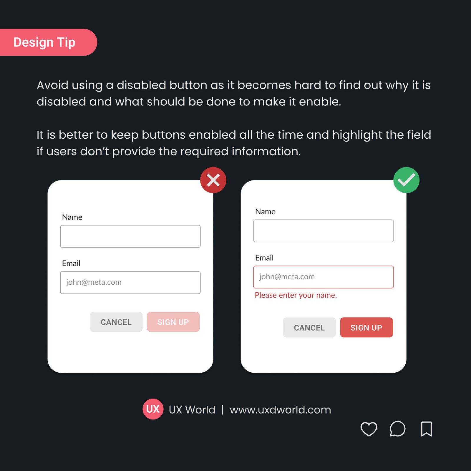
Avoid using a disabled button as it becomes harder to find out why it is disabled and what should be done to enable it.
- Disabled buttons break the flow of interaction. Users may feel stuck while looking at a grayed-out button with no clear guidance.
- It is better to keep buttons enabled all the time and highlight the field if users don’t provide the required information.
Learn best practices for designing accessible buttons.
4. Place Buttons Side by Side
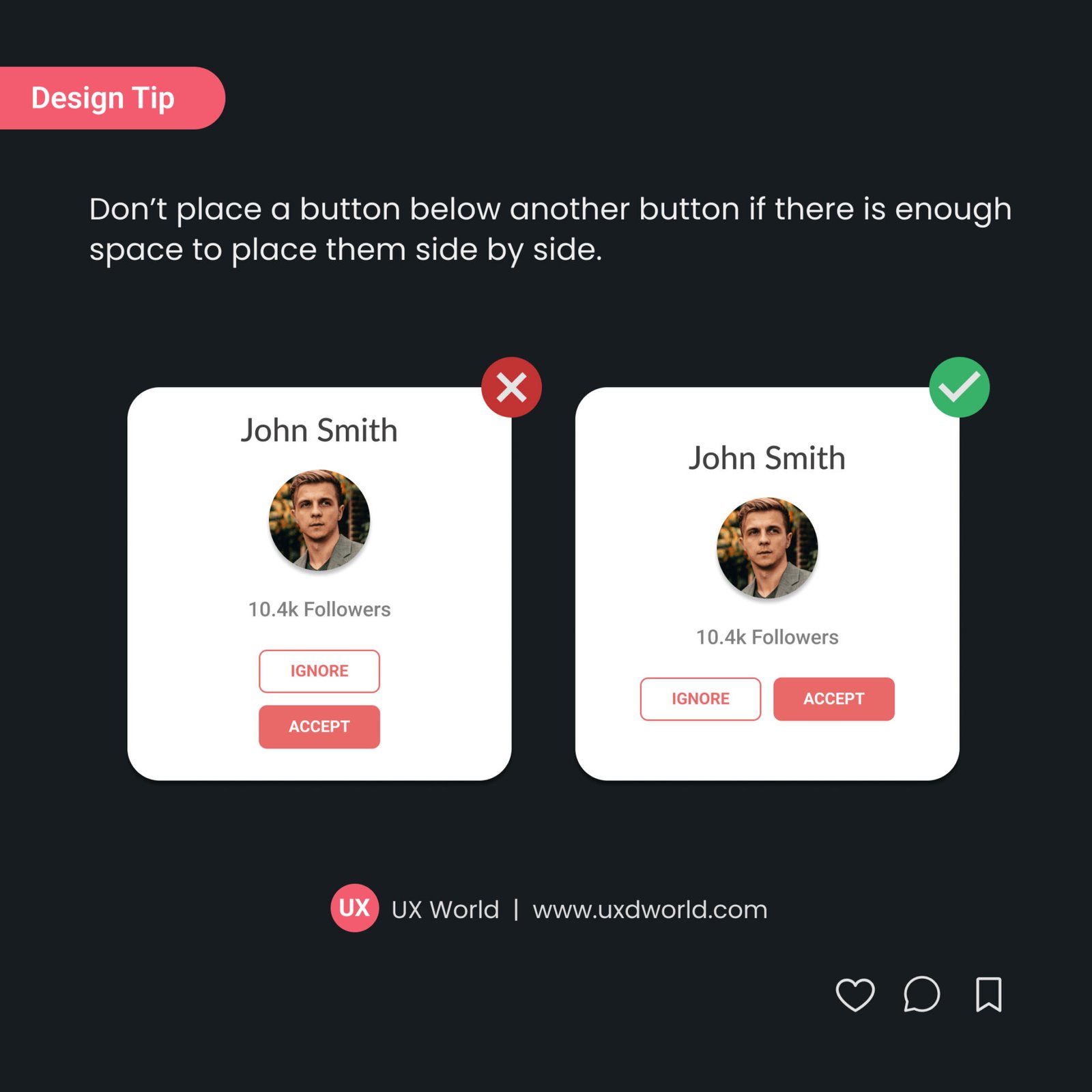
Don’t place a button below another button if there is enough space to place them side by side.
- Having buttons side by side allows for quicker decision-making since users can compare options at a glance.
- Vertical stacking can unintentionally create a perceived hierarchy, making one button seem more important than the other.
5. Make the Primary Action Button Stand out
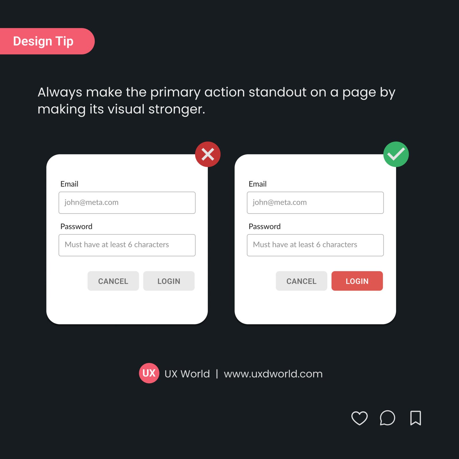
Make the primary action button stand out on the page by designing a stronger visual. This can include its visual weight, color, size, and placement.
- A primary button should have more visual weight, making it more prominent through boldness, borders, or shadow effects.
- The color of the primary button should contrast with the rest of the interface to make it easily noticeable.
- The placement of the primary action button is crucial. It should be positioned where users expect it to be.
6. Use Standard Button Layout
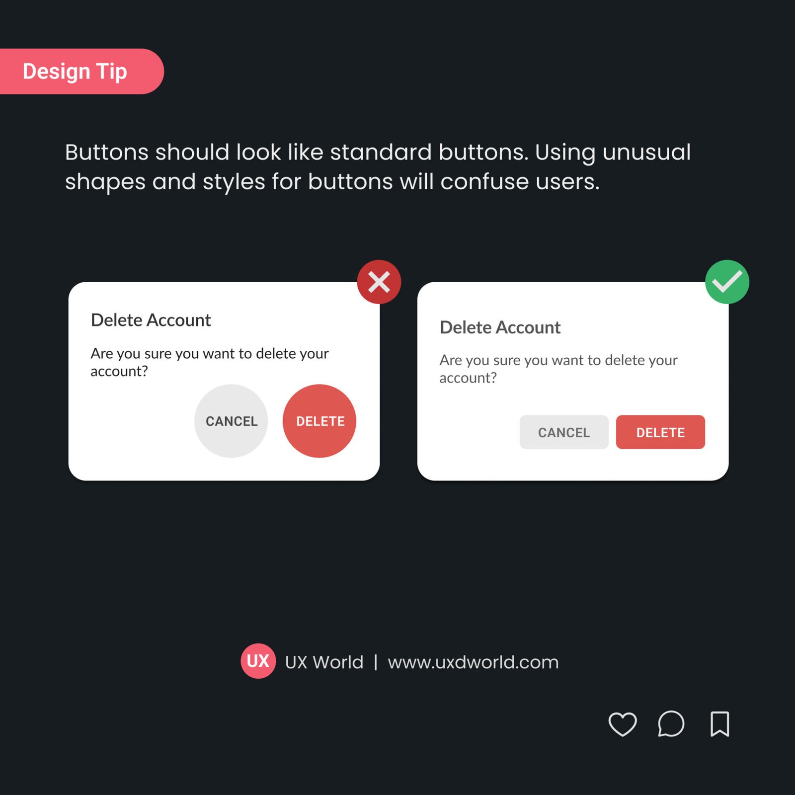
Buttons should look like standard buttons. Using unusual shapes and styles will confuse users.
- Following standard button designs maintains consistency across different apps, websites, and platforms.
- Create a style guide to use while designing your application. This will help you stick with the standard theme and style.
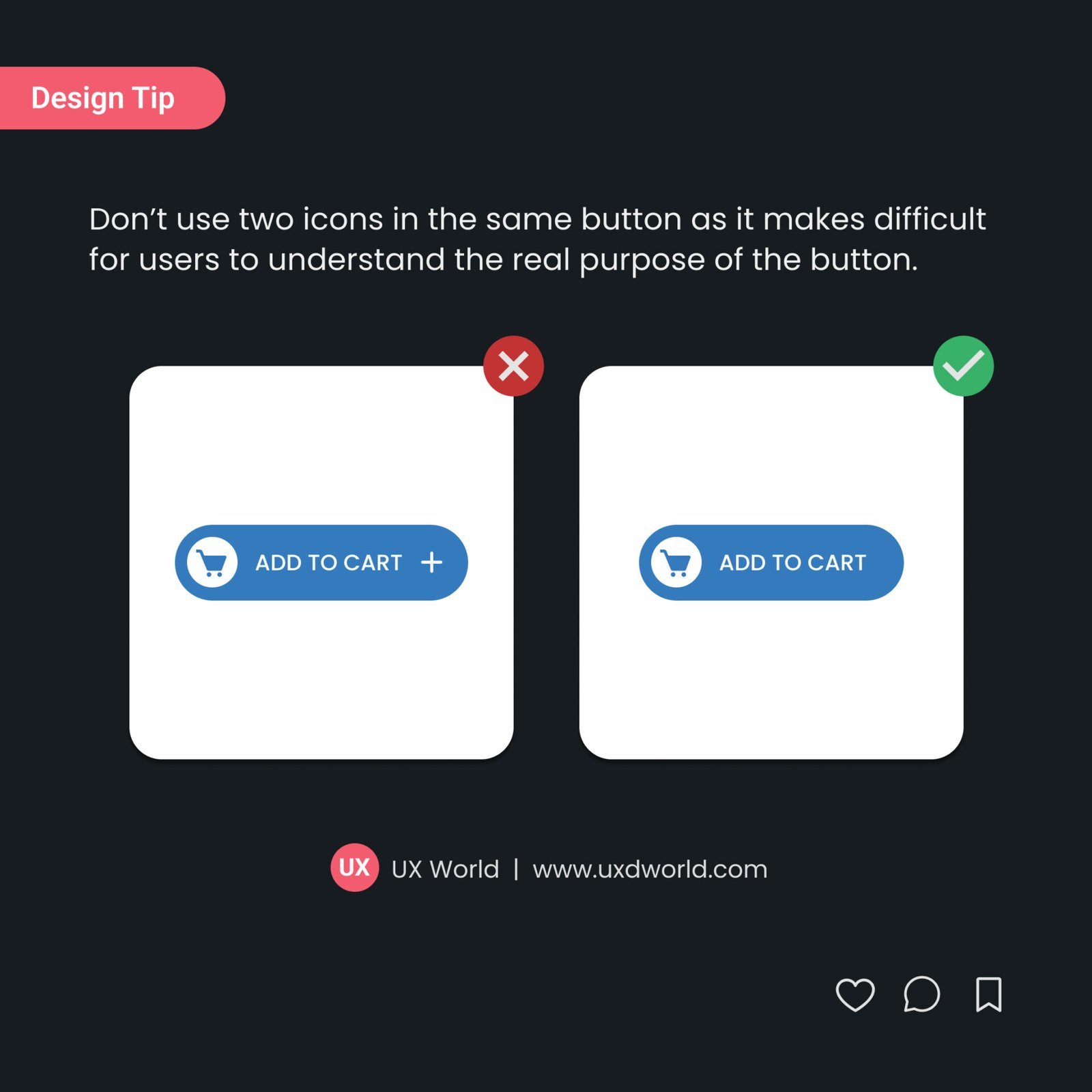
7. Don’t Use Two Icons in the Same Button
Don’t use two icons in the same button as it makes it difficult for users to understand the real purpose of the button.
- Each icon in a button has its own visual meaning, and using two icons can create ambiguity.
- Users may struggle to understand which icon represents the button’s action.
- A button has a single, clear purpose. The icon should represent that purpose.
Learn more about Button design:
- 5 Best Practices to Write Useful Button Labels
- 14 Rules to Design Accessible Buttons
- Disabled Buttons UX – Usability Issues and How to Avoid Them
Master Your UX Design Skills
Try Interaction Design Foundation (IxDF). IxDF offers online design courses that cover the entire spectrum of UX design, from foundational to advanced levels. As a UX Design World reader, you get 25% off your first year of membership with the IxDF.
Subscribe for more related articles at UX World.
If you have any questions, contact here: Facebook | YouTube | Instagram | Linkedin