Last Updated on January 6, 2024 by UX World
There are certain design principles and rules that a designer must follow to create a usable design that has a pleasant effect on users.
The basic principles of design philosophy include alignment, balance, emphasis, white space, hierarchy, unity, and repetition.
The details of these design principles are discussed below. To have a quick overview, refer to this article.
1. Alignment
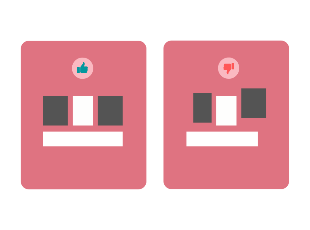
Alignment is one of the most crucial design elements. Alignment describes how visual components are positioned, arranged, and organized relative to one another on an interface.
Making sure your different design components have a good relationship with one another helps produce a defined and organized layout. The correct alignment in design provides meaningful guidance to the user to understand the flow of the product.
2. Balance
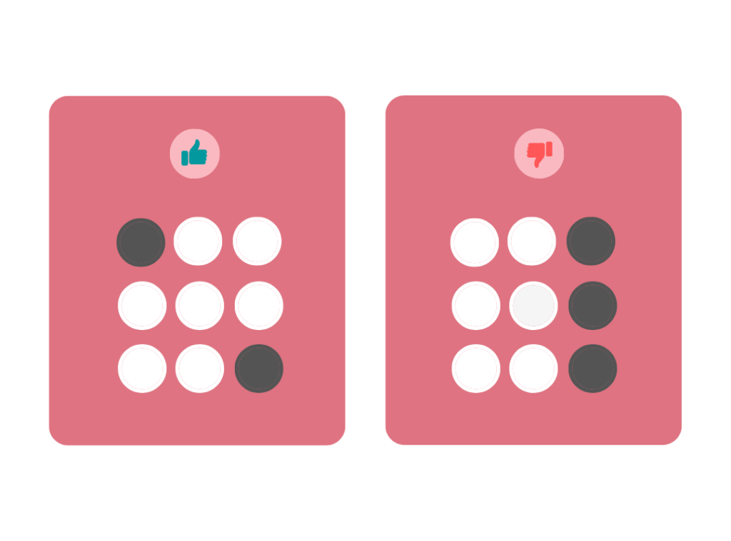
Every object you design has a weight similar to real life but this weight is known as visual weight.
For example, if in a room you have displayed 5 paintings. If you display all 5 paintings in one corner of the wall while leaving the remaining area of the wall empty, it will not look like a balanced setting. Therefore to make it visually balanced, the paintings must be spread out on the entire wall so that the aesthetic look of the room improves and visitors like it.
The same applies to the designs for digital products. The visual objects must be placed in a balanced way so that the user feels comfortable using the application.
3. Emphasis
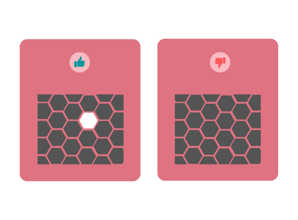
To establish a focal point, use emphasis. A focus point is anything that immediately stands out and attracts the user’s attention.
When a design feature is emphasized, it shows that a particular object is singled out from the others and is therefore significant. You can see emphasis in some bold text and all caps, for instance. The primary heading on a webpage might be an emphasis.
In addition to text and color, emphasis may also be created using other elements including size, shape, weight, texture, and placement. Make sure to emphasize an element without upsetting the overall balance of the page.
4. Whitespace
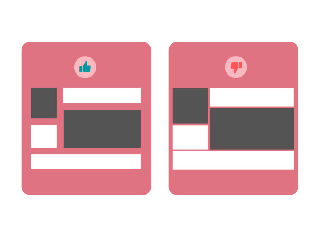
Whitespace or negative space is the empty area where no design elements exist in your design. White doesn’t mean that the empty area is white rather it can be of any color. The purpose of white space is to create a room for users to avoid overwhelming elements that will create confusion.
5. Hierarchy
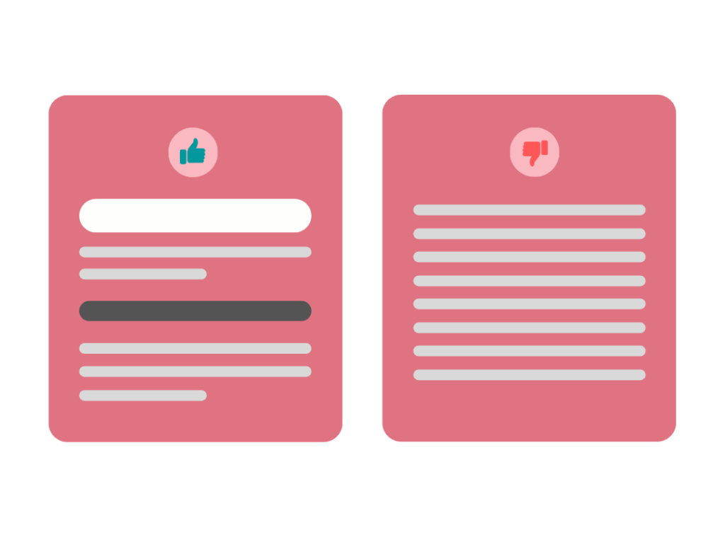
To build a hierarchy, designers focus on the critical elements on the screen and place them on top to notify the user.
It involves the organizing of all visual elements from top to bottom according to their importance. The most important element will be placed on the extreme top while medium important elements will be placed in the middle and the least top elements will be placed on the bottom of the screen.
6. Unity
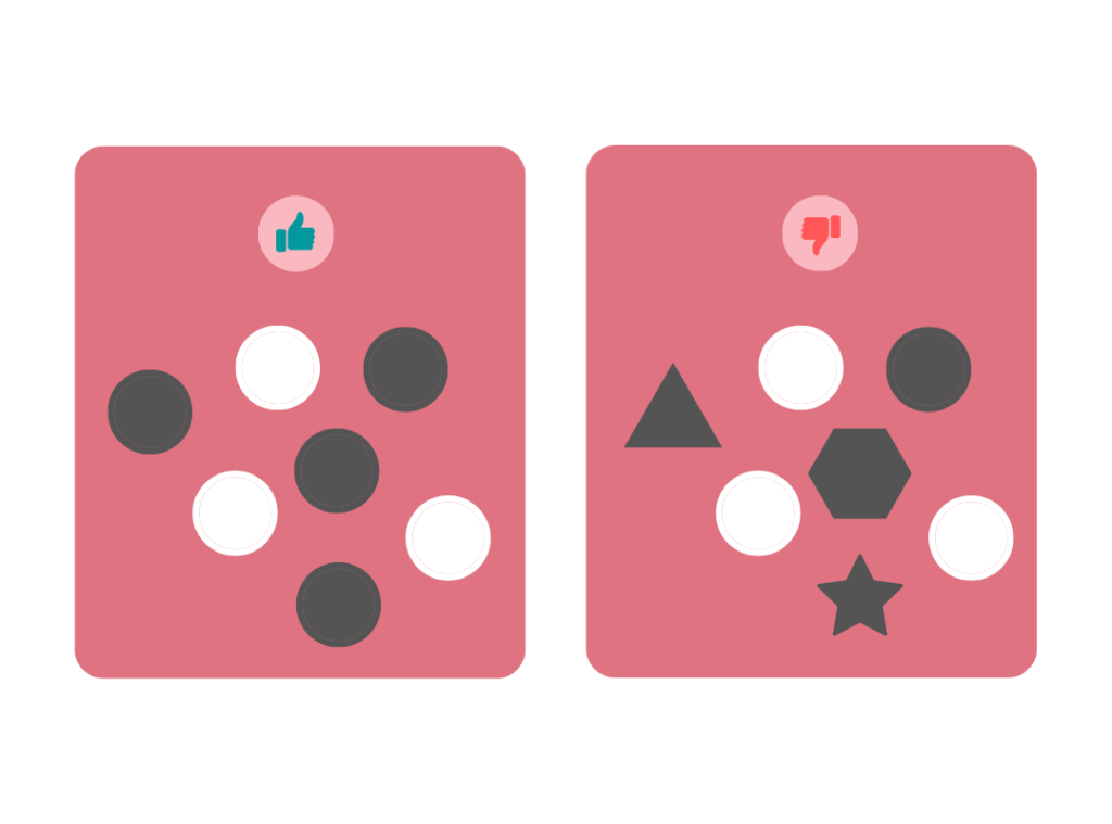
The concept of unity in design describes how various visual elements join together to produce coherence, completeness, and a pleasant effect in the design.
With unity, disparate things seem to come together to form a feeling of “oneness.” There are a couple of different ways to accomplish this. For instance, items of various sizes can all have the same color and proximity. This gives them the impression that they belong together or that they are related to one another and have something in common.
7. Repetition
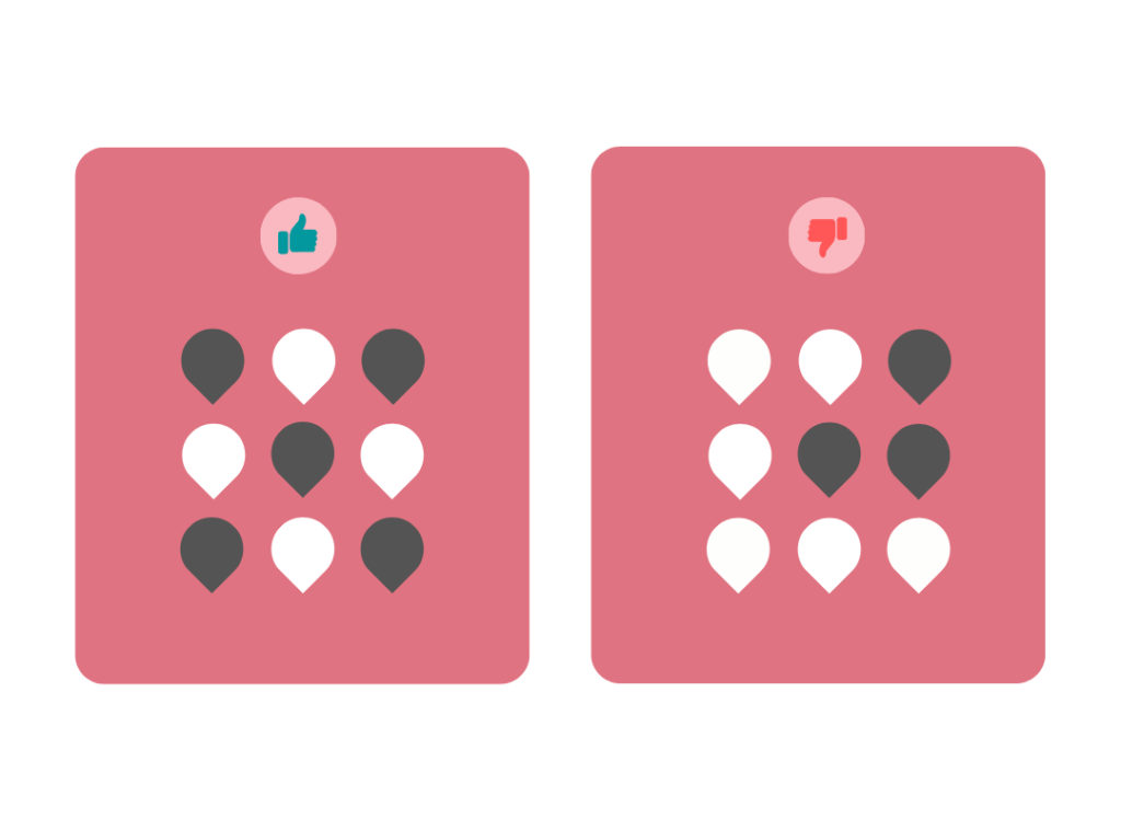
It involves repeating the same element multiple times. Repetition in design is an essential principle because it creates a consistent and balanced design.
Repetition is done by repeating the same colors multiple times or using a similar font size or style for repeating elements.
Want to Learn UX Design?
- Try Interaction Design Foundation. IxDF offers online design courses that cover the entire spectrum of UX design, from foundational to advanced level. As a UX Design World reader, you get 25% off your first year of membership with the IxDF.
- The UI/UX Design Specialization from Coursera brings a design-centric approach to user interface and user experience design and offers practical, skill-based instruction centered around a visual communications perspective. By learning this Design Specialization, you can design high-impact user experiences for your customers.
Thanks for reading.
Subscribe for more related articles at UX World.
If you have any questions, contact us here: Facebook | YouTube | Twitter | Instagram | Linkedin


