Last Updated on December 3, 2024 by UX World
“Usability does not equate to a specific number of clicks, taps, swipes, pinches, flicks.” – John Morkes
The usability of a design is the measure of ease by which a user can work on a product to achieve the desired goals efficiently.
Usability has 5 components:
- Learnability
- Efficiency
- Memorability
- Error Tolerance
- Satisfaction.
All these components are related to the ease of use a product provides to its users.
One factor that provides ease of use is the number of times the user must click, tap, swipe, pinch, or flick to perform a task.
While working with clients, it is common to hear, “Can we do something to reduce the number of clicks?”
Well, that’s a good goal for a UX designer to achieve.
The 3-Click Rule states that users should be able to perform a task in 3 clicks and that is the only measure of a good usable product. If you don’t follow this rule, the user will leave your design.
Is this a myth, or fact?
Things have changed now, and it seems that this rule is no longer considered as the measurement criterion for the usability of a product. Even at times, the focus on reducing the number of clicks can lead us to usability problems.
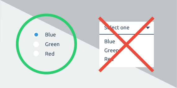
The goal of a UX designer is to make tasks easier for users. In certain places, this can be done by introducing a few additional clicks in the design.
A more flexible approach is presented by the 1-Click Rule which states,
“Every click or interaction should take the user closer to their goal while eliminating as much of the non-destination as possible.”
This means that the purpose of each click, tap, swipe, pinch, or flick should be to make the users’ tasks easier for them.
The secret of achieving a usable product is to provide balanced user interaction with no extra clicks. The users’ task will be easier if you provide them with simple navigation and understandable content in your product. They will never leave the product just because they need to click more than 3 times to complete a particular task.
Jakob Nielsen’s usability tests found that users’ ability to find products on an e-commerce site increased by 600 percent after the design was changed so that products were 4 clicks from the homepage instead of 3.
Want to Learn UX Design?
Try Interaction Design Foundation. IxDF offers online design courses that cover the entire spectrum of UX design, from foundational to advanced level. As a UX Design World reader, you get 25% off your first year of membership with the IxDF.
Thanks for reading.
Subscribe for more related articles at UX World.
If you have any questions, contact us here: Facebook | YouTube | Twitter | Instagram | Linkedin


