
Last Updated on July 3, 2025 by UX World
Data tables are important for enterprise applications that focus on information and data handling. Data tables are used to present information in a structured format so that users can scan and understand it easily.
Designing an easy-to-use data table requires research and effort. Enterprise applications can have complex and large amounts of data. Therefore, UX designers need to work hard to design data tables that make it easier for users to view and manipulate data and to make decisions and derive results.
Data Table Design
Before jumping into the design phase, understand the type of data you want to present in the tables. Research about the possible structure and layout.
It is always better to have a broader picture of the problem you are handling. At the same time, it is recommended to start with the simplest use case. Create user segments that will be using your data tables. Keep your tables simple for beginner users, and handle complex scenarios for advanced users.
Data Table Design Best Practices
Below are a few best practices that help you design data tables.
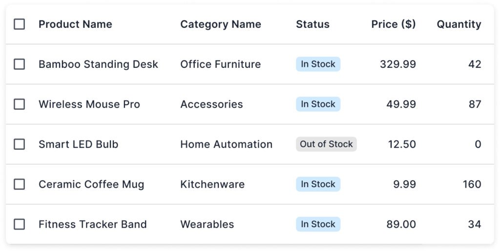
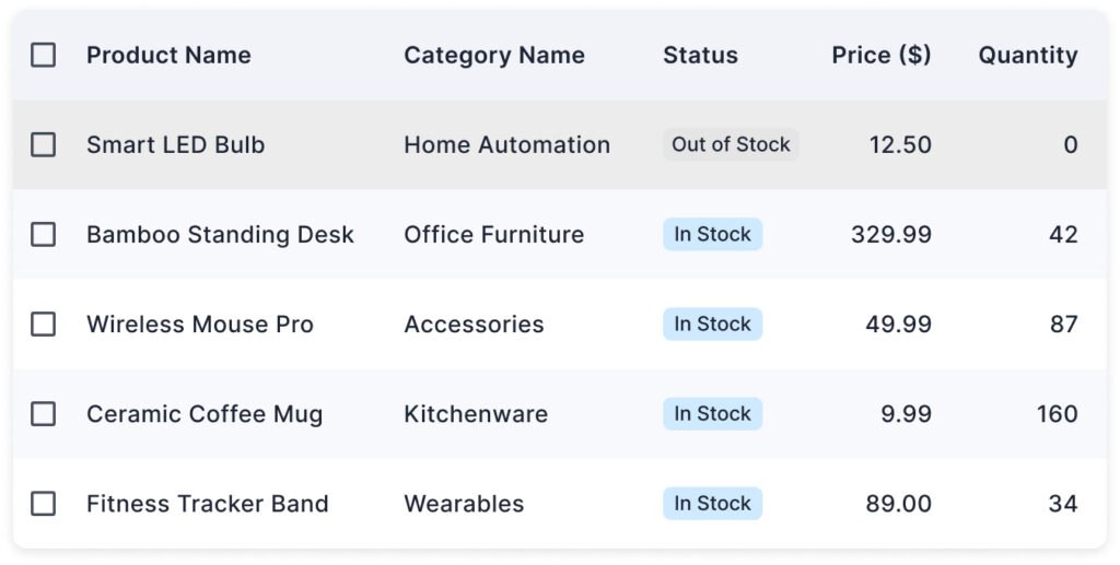
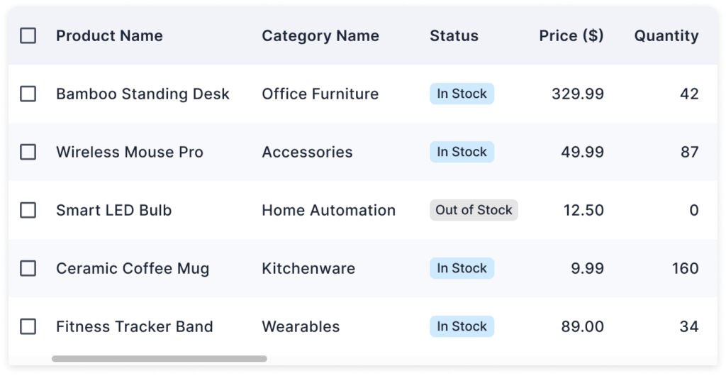
Content Alignment
Keep the text aligned to the left of the column. It improves readability. Textual content (like product name, category name) has different lengths. Left alignment creates a uniform starting line, making it easy for the eye to move vertically down the list.
Use right alignment for numeric values. It helps aligning the numbers by their least significant digit (the rightmost). It makes it much easier to compare them visually, like spotting the highest or lowest value.
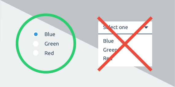
For image or icon columns, keep the content centered-aligned. It will visually balance the row without favoring left or right. It also makes targets (like tapping a checkbox) more predictable and accessible.
This simple alignment rule improves scanability dramatically.
Clear Contrast
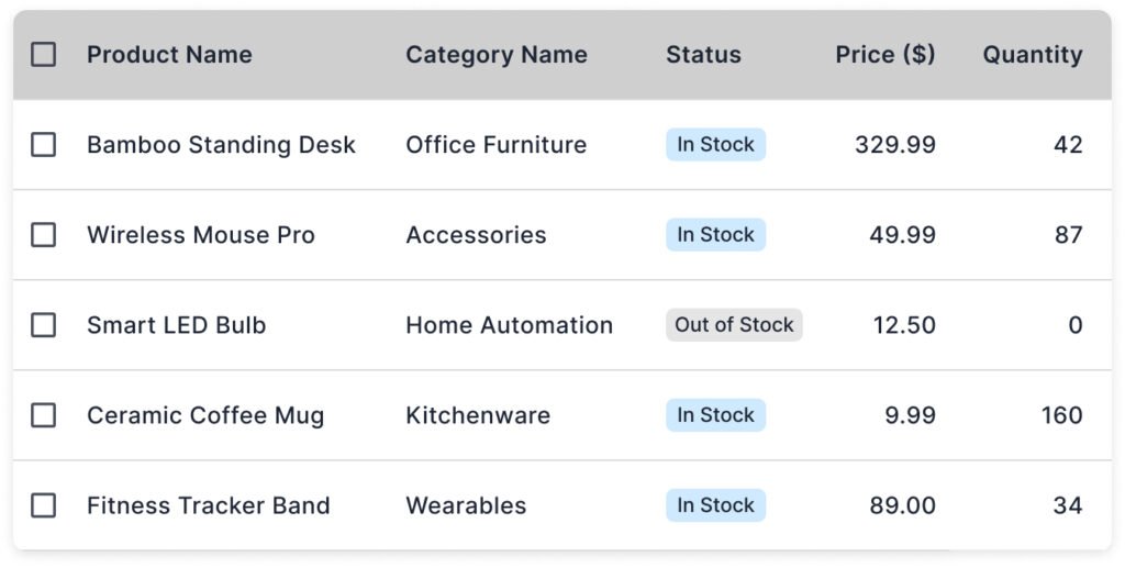
Clarity and scanning should be the top priorities while designing the visual layout of a data table. Use clear contrast to highlight the content hierarchy.
A bold and darker header immediately separates the column titles from the data, making the structure clear.
Using light row borders or zebra striping (alternating row colors) helps guide the eye horizontally throughout the row.
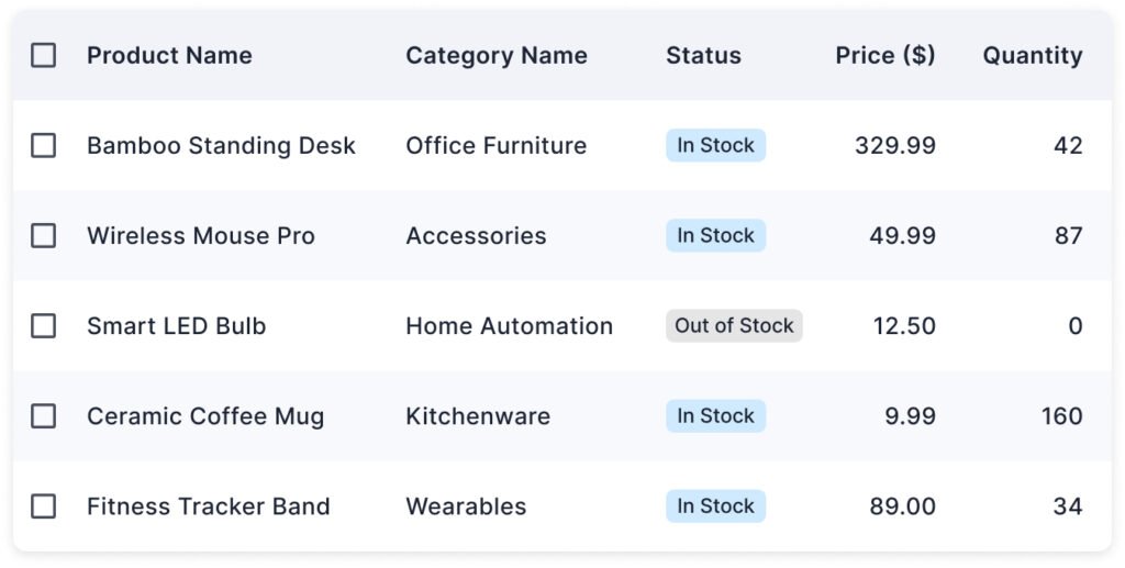
Zebra striping is particularly effective for long tables, while single-color rows with fine separators work well for shorter tables or minimalist designs.
Whichever approach you choose, keep the styling light and uniform to ensure the focus remains on data.
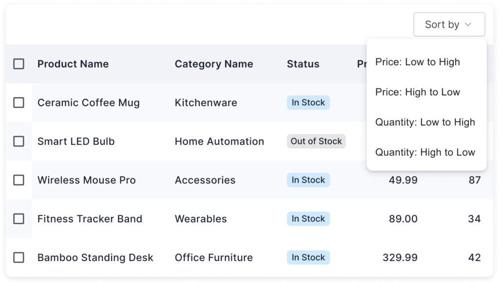
Data Sorting
Sorting help users manage data as per their requirements. It is helpful to see the desired content from a large amount of data.
Soritng may not be needed to provide with all columns. For example, sorting by Price or Quantity makes sense because users often need to compare. Sorting by Product Name might help alphabetically, but sorting by Status (‘In Stock’ vs. ‘Out of Stock’) may not always be meaningful unless users need to prioritize availability.
For sorting, use a small arrow icon next to the column header. Show tooltips like ‘Click to sort by Price’ when hovering over headers.
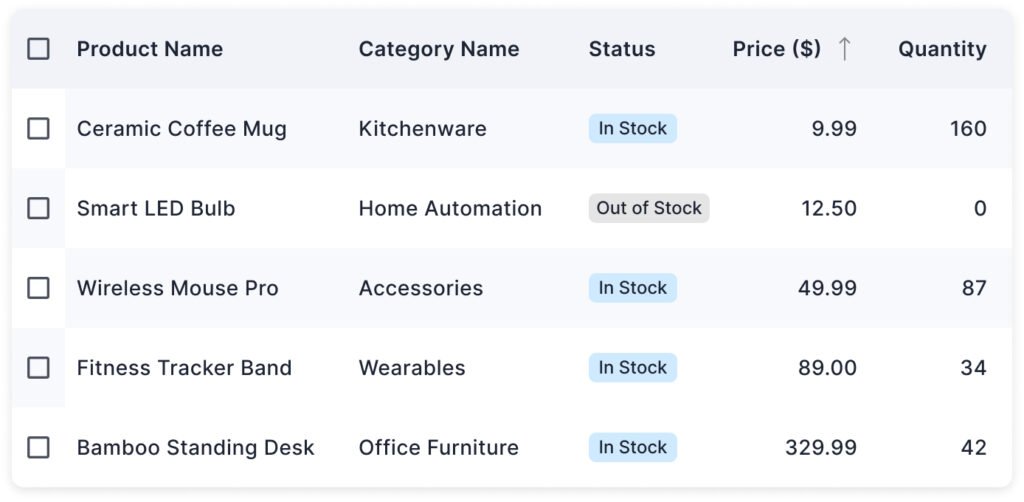
You can provide an explicit ‘ Sort by’ option on top of the table as well. Provide visual feedback by clearly indicating the sorted column.
Data Filtering
Filtering allows users to narrow down table content based on specific criteria. It helps users to find what they need in large datasets. It is important when tables contain hundreds or thousands of rows, like product inventories, orders, user lists, etc.
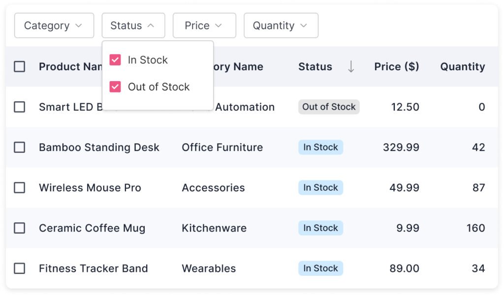
You can display a list of quick filters above the data table. Only show filters that make sense for the dataset.
Quick filters usually generate results instantly without clicking a button. The advanced filters, where users can define conditions, require an Apply button to show the results.
Hover and Selection States
Adding hover and selection effects improves clarity and accessibility in data tables.
The hover effect indicates that a row is interactive (clickable, selectable, expandable, etc.). It gives immediate visual feedback in response to the user’s action.
The selection effect shows that a row has been actively selected for an action (like editing, deleting, etc.). Selecting a row is important in tables with bulk actions where users have checkboxes to select multiple rows.
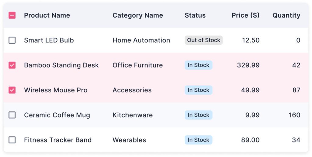
Maintain a clear contrast between selected, hovered, and normal states. If your table includes checkboxes, clicking the row should ideally also select the checkbox for better usability.
Pagination
When tables have a lot of data, pagination helps break it into manageable chunks, improving performance and user experience.
Instead of overwhelming users with hundreds of rows, pagination shows a smaller set (like 10–50 items) and lets users navigate between pages easily.
Display a reasonable page size by default. A few common options include 10, 20, or 50 rows per page. Allow users to change the page size.
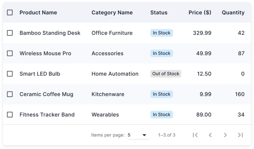
Place the pagination controls smartly along with the table. For example, below or above the table, right-aligned or center-aligned. When users switch pages, show a loading spinner or skeleton loader to indicate the system is working.
Tooltips for Long Text
In tables, columns often have limited space, especially on mobile or smaller screens. Long text entries, like product name, customer address, or description, can go beyond the available space and make the table harder to scan.
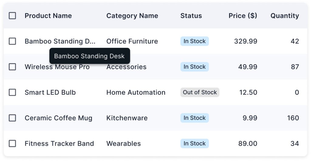
Truncate the text visually after a certain number of characters or within a fixed column width. Then, show the full content in a tooltip when the user hovers or taps on the truncated text. Users can quickly scan the main information without being distracted by lengthy text.
Column Resizing
Not all table columns need the same amount of space. Allowing users to resize columns manually gives them better control over how they view data, improving both usability and flexibility.
Column resizing helps to adapt the dynamic layout. Some fields (like ‘Price’) need little space; others (like ‘Product Name’ or ‘Address’) might need more. It also supports user preferences. Different users prioritize different pieces of information. Instead of wrapping or cutting off important data, users can adjust widths as needed.
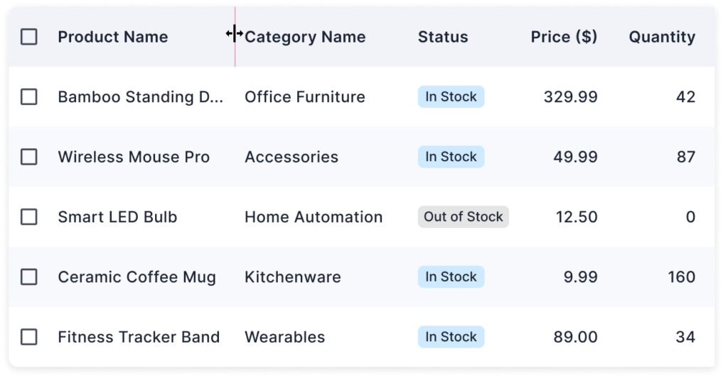
When users hover over the border between two column headers, the cursor changes to a ‘resize’ icon. User clicks and drags the border left or right. The column resizes dynamically, and the table content adjusts accordingly. Define minimum and maximum width limits to prevent an odd layout.
Show or Hide Columns
The default view of a table may not show all the available columns. Provide a show/hide column option so users can organize the column view as per requirements.
When tables handle large or complex datasets, not every column is always relevant to every user. Allowing users to customize the visible columns improves usability and efficiency.
Users can customize the table to their specific needs or tasks. It reduces visual clutter by hiding less-important or rarely used fields.
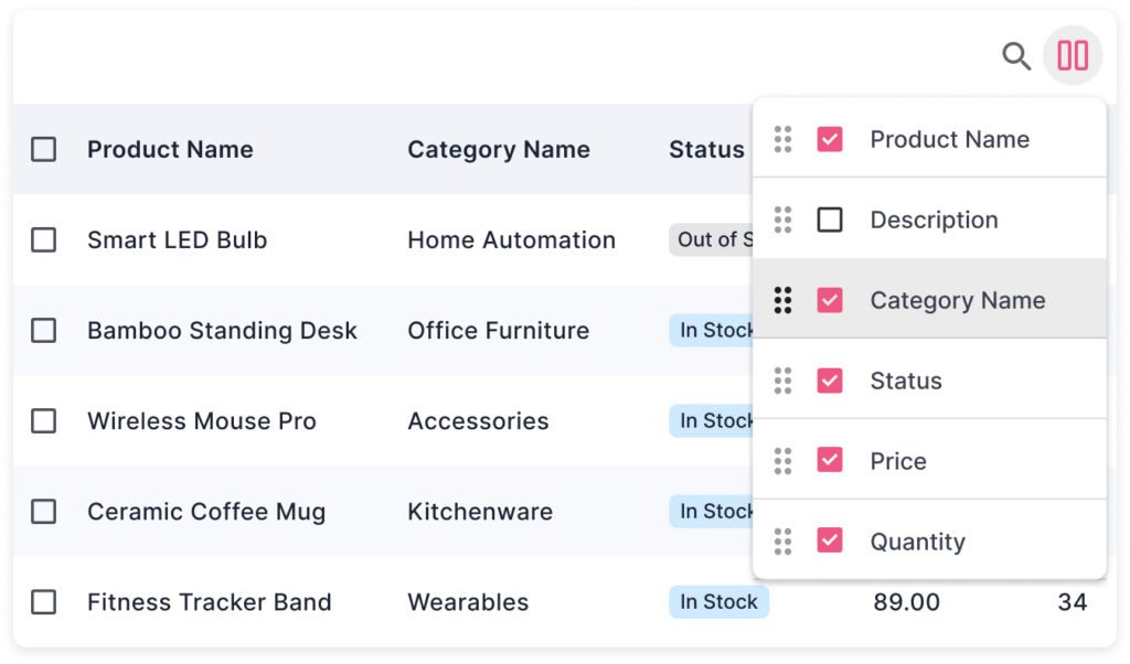
Provide a ‘Columns’ button or icon above or near the table. Clicking it opens a dropdown, modal, or panel listing all available columns. Users can select the columns they want to see in the table.
Column Re-ordering
Allowing users to reorder table columns (drag-and-drop) gives them the flexibility to arrange the data in the way that best suits their needs.
Users can arrange the columns logically, which helps them save time scanning for key data. They feel more in control of the interface, leading to better engagement.
Mostly, the re-order option is combined with the Show/Hide column feature on the UI. Users can drag the columns in the list to re-order them in the data table.

Otherwise, a ‘Move’ or ‘Drag’ icon can be provided on hovering the column header. Users click and hold the column header and drags it left or right. The column drops into the new position, and the table updates instantly.
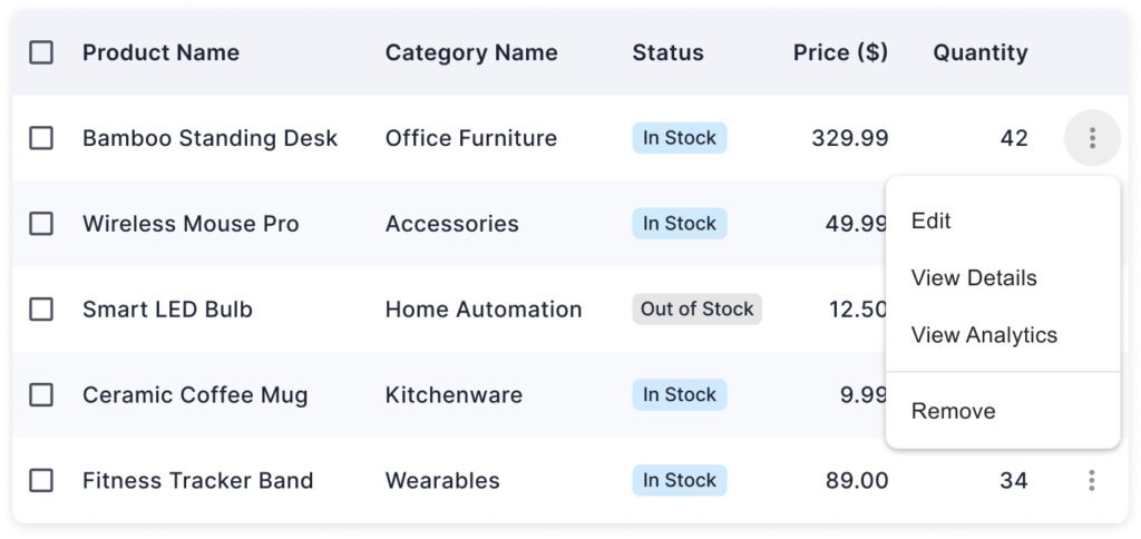
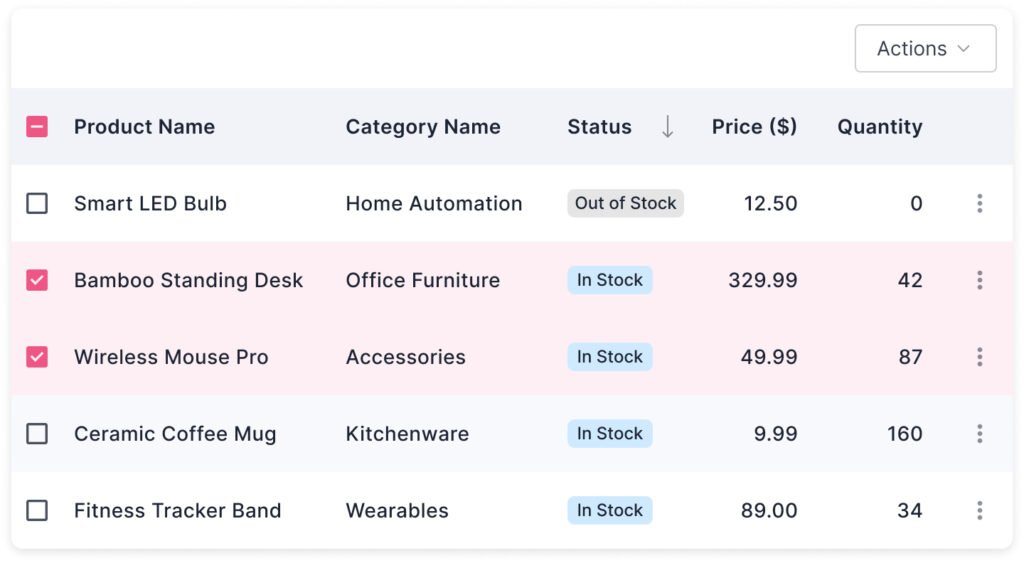
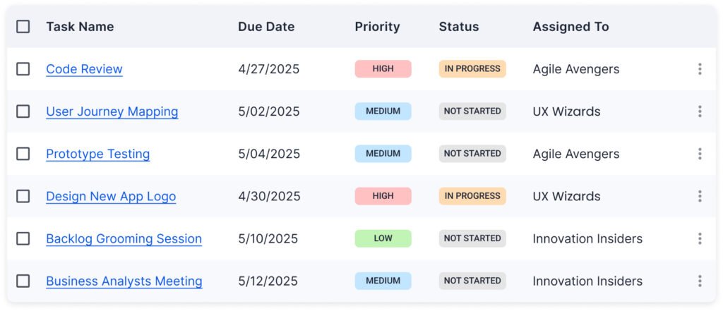
Row Actions (Single, Bulk Actions)
In well-designed tables, users often need to take actions on either a single item or multiple items at once. That’s where single row actions and bulk actions come into play.
The single row actions are usually placed along with the row. For fewer than 3 options, you can display the action icons at the end of each row. For more than 2 options, an ‘Actions’ icon allows users to open a drop-down menu and select the desired action.
Bulk actions are applied to multiple selected rows at once. For example, delete multiple items, change status of multiple items, etc.
Users select multiple rows using checkboxes, and a bulk Action toolbar or button appears above the table. The user can select the desired action.
Show a bulk action toolbar only when items are selected.
Horizontal Scrolling
When tables have many columns (e.g., 10+ fields like Product Name, Category, Price, Quantity, Date Added, Supplier, Status, etc.), trying to fit them into a narrow screen (especially mobile or small laptops) shrinks everything. It makes it hard to read and interact with the data.
Horizontal scrolling allows users to scroll left and right in the table. It preserves column readability and maintains the default column layout.
You can freeze your first column so it remains visible when the user scrolls left or right in the view.
Link Styling
When you place links inside a table (e.g., product names, user profiles, document titles), it’s crucial that they visually behave like links, and not just plain text.
It will help users quickly recognize the clickable area without guessing.
Traditionally, links are blue. In your product’s theme, using a primary action color indicates interactivity.
You can underline the text for clarity and accessibility. The cursor should change to a pointer indicating that the content is clickable.
Inline Editing And Error Handling
Inline editing means users can directly edit values inside the table without opening a separate modal, form, or page.
It is fast, efficient, and natural for power users who manage lots of data.
Direct editing feels lighter and quicker. Users can get immediate feedback and the changes reflect instantly.
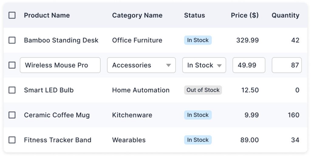
Editing should begin on a clear user action like double-click, clicking an “Edit” icon, or clicking into a field. The area converts itself to an edit box and users can edit the field value. If the field can have a specific value, a drop-down menu will display in edit mode.
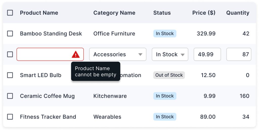
Inline editing must handle errors immediately and gracefully, to ensure a smooth user flow.
Read more:
- Best Practices for Providing Actions in Data Tables
- How to Design Inline Editing and Validation in Tables
- Best Practices for Inline Editing in Tables
Master Your UX Design Skills
Try Interaction Design Foundation (IxDF). IxDF offers online design courses that cover the entire spectrum of UX design, from foundational to advanced levels. As a UX Design World reader, you get 25% off your first year of membership with the IxDF.
Subscribe for more related articles at UX World.
If you have any questions, contact here: Facebook | YouTube | Instagram | Linkedin