Last Updated on October 13, 2024 by UX World
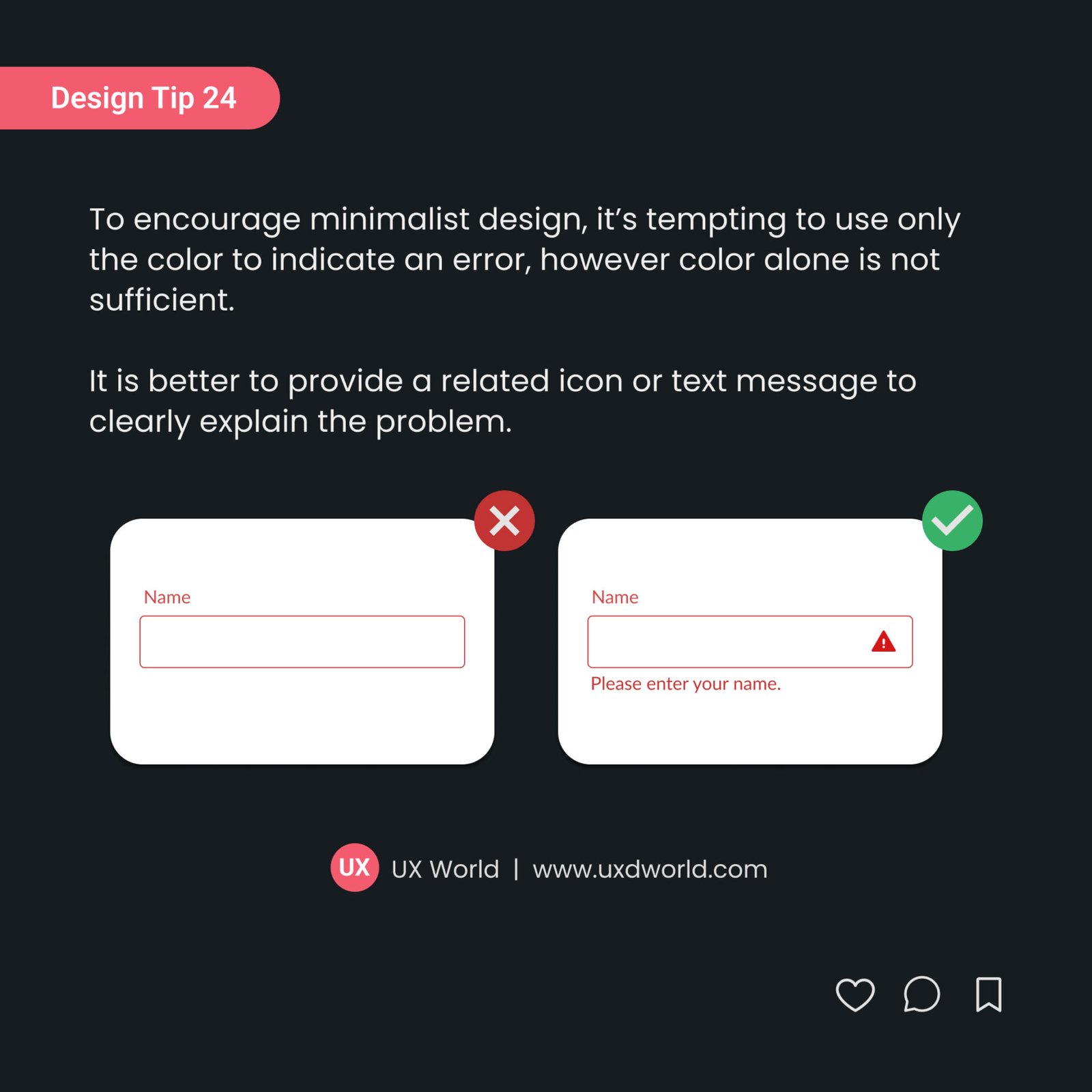
To encourage minimalist design, it’s tempting to use only color to indicate an error. However, color alone is not sufficient. It is better to provide a related icon and text message to explain the problem clearly.

Want to Learn UX Design?
- Try Interaction Design Foundation. IxDF offers online design courses covering the entire UX design spectrum, from foundational to advanced level. As a UX Design World reader, you get 25% off your first year of membership with the IxDF.
- The UI/UX Design Specialization from Coursera brings a design-centric approach to user interface and user experience design. It offers practical, skill-based instruction centered around a visual communications perspective. By learning this Design Specialization, you can design high-impact user experiences for your customers.
Thanks for reading.
Subscribe to more related articles at UX World.
If you have any questions, contact us here: Facebook | YouTube | Instagram | Linkedin


