Last Updated on February 28, 2023 by UX World

Do you want to improve the user experience and conversion rate of your ecommerce website? In this article, we will talk about 5 ecommerce navigation best practices (with a few examples) that you can apply today.
We will go through concepts like search bar, autocomplete, menu structure, and more.
Keep reading to learn more.
1. Prominent Search Bar
The search bar is an important aspect of an ecommerce website and it can either make or break the user experience. A prominent search bar is a must-have, especially if the website sells products that people know to search for.
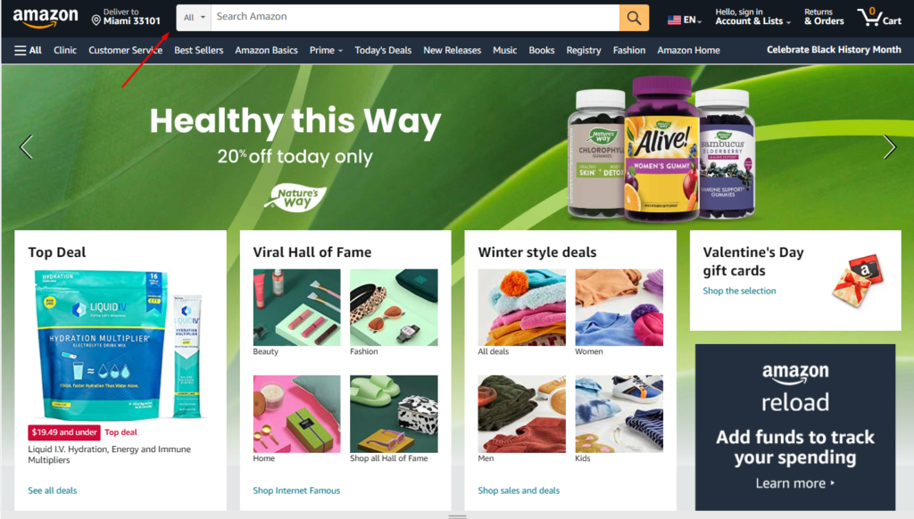
A big, bold, and centered search bar in the header area is a popular and successful design choice, similar to what you see on Amazon.
Not only does a prominent search bar improve user experience, but adding product images to the search results can further boost conversions.
For instance, BrickHouse saw a 100% increase in conversions rate (among shoppers who use site search) after they implemented product search with images. Whether it will have the same impact on your website remains to be seen, but it’s definitely worth trying.
Consider running a test where you run a search with text only for a month, followed by a search with images, and compare the results, or you can simply run an A/B test for a certain period of time.
You can hire a web design agency to do these tests or you can try and do it yourself with a tool like Google Optimize.
2. Intuitive Navigation Menu Structure Using Categories
A well-structured navigation menu makes it easier for potential customers to find what they are looking for and helps boost conversions.
A proper product categorization is the key to effective navigation. By grouping similar products together, customers can easily view and compare products with similar qualities, making the purchasing process easier.
The hierarchy of categories can be divided into two types – parent categories and subcategories.
Parent categories are groups of subcategories that best describe the shared qualities of a product group, while subcategories are used to group specific products together.
For example, the parent category could be “Clothing” and subcategories could be “Shoes”, “Hats”, and “Pants”.
Sometimes it can be difficult to choose the exact subcategory to which a certain product should belong, especially when it could logically appear in several parent categories.
For example, users might be searching for a coffee table in the “Living Room”, “Office” or “Tables” section. To avoid missing out on potential sales, consider having products and subcategories under multiple parent categories.
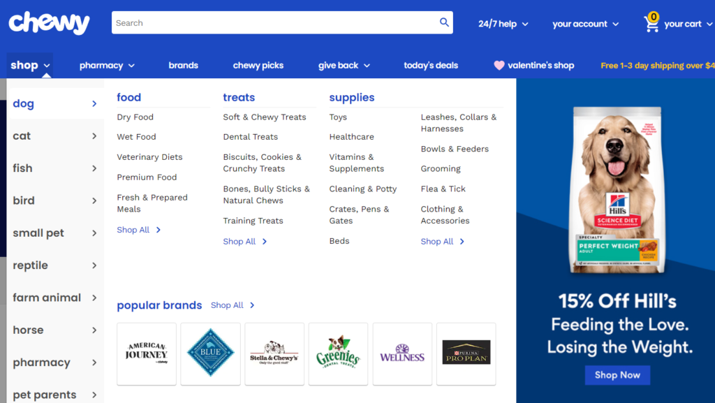
A good example of a well-structured navigation menu is Chewy. They have a ton of categories and sub-categories perfectly organized. For example, Dog > Food > Dry Food.
In conclusion, an intuitive navigation menu structure is crucial for a successful ecommerce website.
Proper product categorization, hierarchy, and ensuring products are placed under the most relevant parent categories can greatly enhance the user experience and lead to higher conversions.
3. Widely Accepted Symbols
The use of symbols in ecommerce navigation is a crucial aspect of creating a seamless user experience. Icons are widely used on the internet as they are a way to transmit information without using words.
It is important to use icons that are familiar and widely recognized by your target audience. If the icon is unfamiliar, it may confuse users, and they may not take the action you want them to take.
Familiar icons such as the magnifying glass for search are universally accepted, but others may have multiple meanings in different industries.
Before implementing icons in your navigation, it’s important to consider how the icon is used on other websites and apps, and how likely your visitors are to use those other sites and apps.
There are three categories of icon recognition: universal, multi-use, and unknown.
Universal icons are easily recognizable and comprehended by everyone, while multi-use icons may have multiple possible meanings and should be used with caution. Unknown icons, on the other hand, are not recognized by many people and should be avoided.
Here’s an example of Best Buy. As you can see, they use 4 universally recognized icons to represent the search bar, cart, account settings, and menu.
4. Autocomplete Search
Autocomplete search, also known as auto-suggest, or predictive search, is a valuable tool for ecommerce navigation.
This tool suggests possible matches to a query as the user types the text, making the search easier and faster.
Autocomplete can be as simple as predicting the word a user is typing or drawing from all website content such as product titles, descriptions, customer support information, and helpful how-to content.
However, there are best practices to consider when implementing autocomplete search. Firstly, it’s essential to ensure the autocomplete search is fast and responsive, as a slow autocomplete search can create a negative user experience and decrease conversions.
Additionally, autocomplete recommendations can also be used for merchandising, highlighting products that are on sale, from brands that a retailer is promoting, or have a higher margin, but it’s vital to ensure the results are still relevant to the searcher’s intent.
By following these best practices, ecommerce retailers can provide a more seamless and enjoyable shopping experience for their customers.
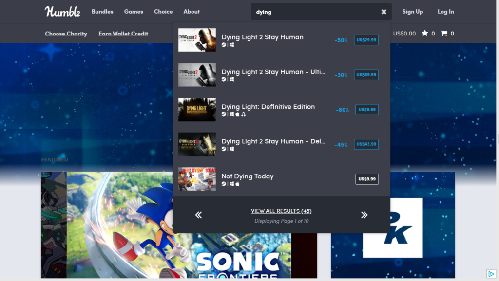
Here’s an example from The Humble Store. In their autocomplete results they show similar products that are on sale.
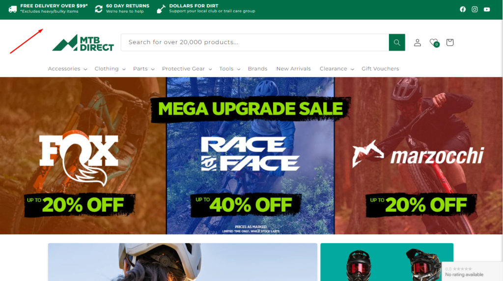
5. Benefit Bar
By showcasing information that is relevant to the customer’s concerns and needs, the benefit bar builds trust and provides a level of comfort for the customer. This information can include any guarantees or return policies that you offer.
Additionally, highlighting any awards or recognition that your company has received can demonstrate the level of quality and expertise in your industry, further building trust with the customer.
Another advantage of a benefit bar is that it can be used to display real-time information, such as the number of orders processed or the number of customers currently shopping on your site.
This information not only adds credibility to your business but also helps to create a sense of community and belonging among customers.
Moreover, the benefit bar is a valuable tool for promoting limited-time offers, discounts, and other promotions.
By displaying this information in a prominent location, you can attract customers who may not have been actively searching for these deals but may be inclined to take advantage of them once they are aware.
In conclusion, a benefit bar is an effective tool for building trust with customers, promoting your business, and boosting sales.
Its prime location and ability to display real-time information, guarantees, and promotions make it an important element to consider in your ecommerce website design.
Here’s an example from MTB Direct.
The Bottom Line
There are several key elements that contribute to a successful ecommerce website.
A prominent search bar, intuitive navigation menu structure using categories, widely accepted symbols, autocomplete search, and a benefit bar are all crucial components that can greatly enhance the user experience and lead to higher conversions.
- A prominent search bar should be big, bold, and centered in the header area, while product images in the search results can further boost conversions.
- A well-structured navigation menu makes it easier for customers to find what they are looking for.
- Familiar and widely recognized symbols should be used in ecommerce navigation, and autocomplete search is a valuable tool that helps to make the search easier and faster.
- A benefit bar builds trust and provides information that is relevant to the customer’s concerns and needs.
Want to Learn UX Design?
Try Interaction Design Foundation. IxDF offers online design courses that cover the entire spectrum of UX design, from foundational to advanced level. As a UX Design World reader, you get 25% off your first year of membership with the IxDF.
Thanks for reading.
Subscribe for more related articles at UX World.
If you have any questions, contact here: Facebook | YouTube | Twitter | Instagram | Linkedin