Last Updated on January 2, 2024 by UX World
Below is a collection of creative pagination UI styles that can be used while designing an app or site.
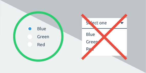
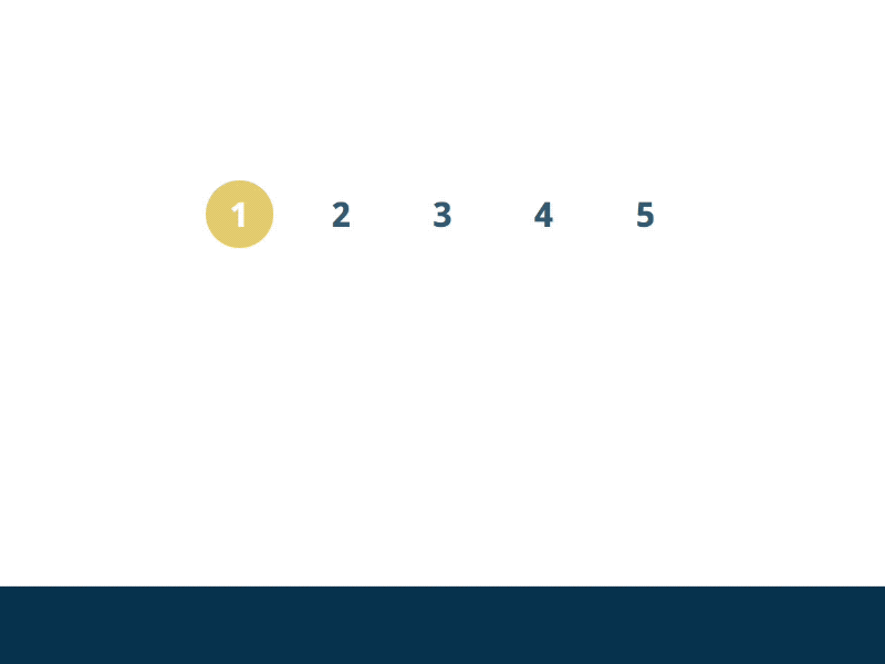
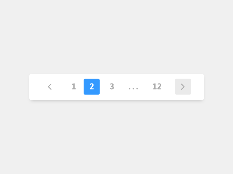
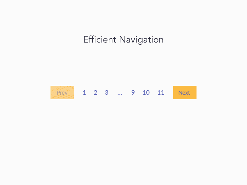
1. Highlight Selected Link
A simple approach is to highlight the selected link to make it prominent among a set of available links.
A change in color displays the selected link differently than other links. Darin
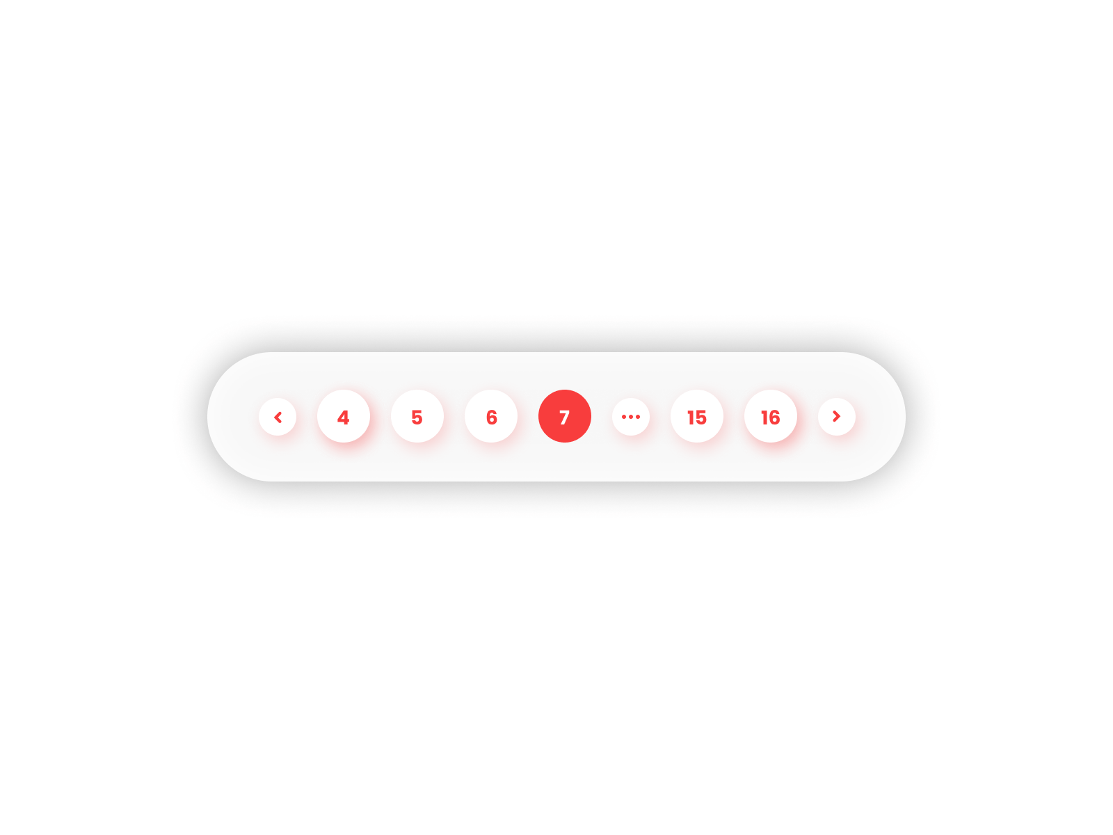
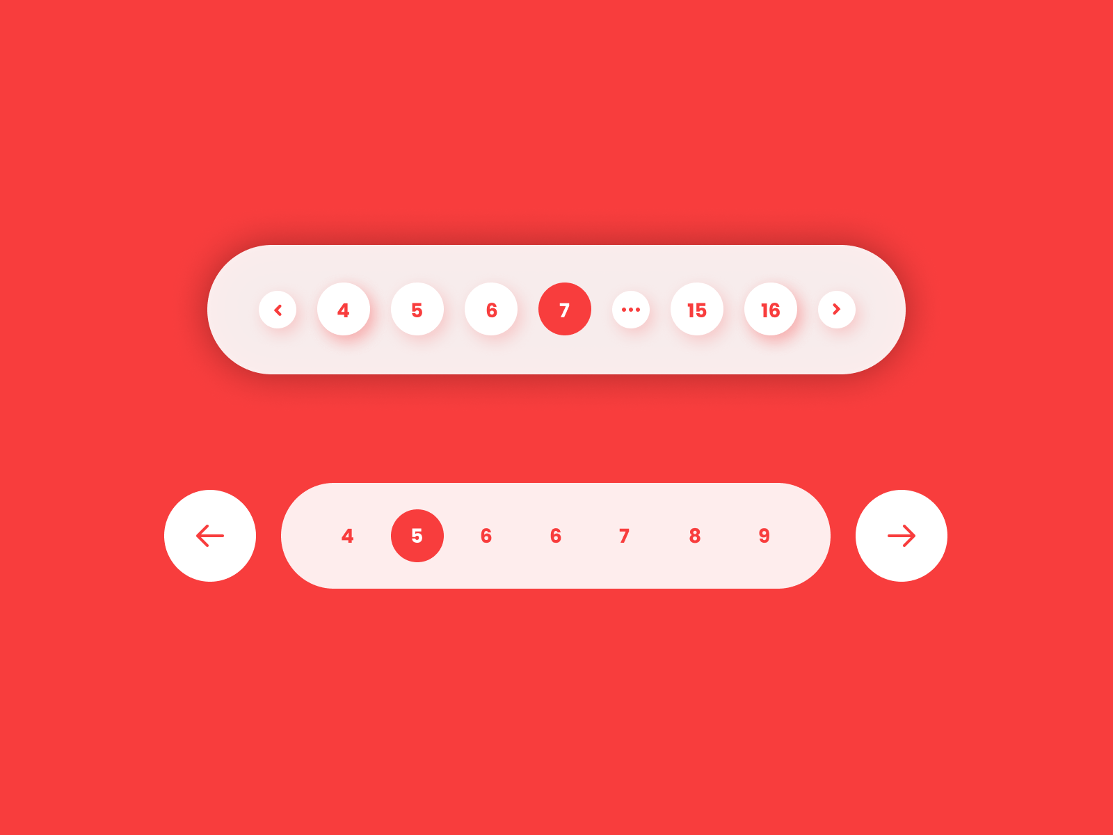
2. Large Number of Links
A large number of links cannot be placed in a pagination control due to the limitation of available space. The pagination UI adjusts itself in different ways.
3. Custom Input
An input box is provided where users can provide a page link label or value as input to go directly to that page.

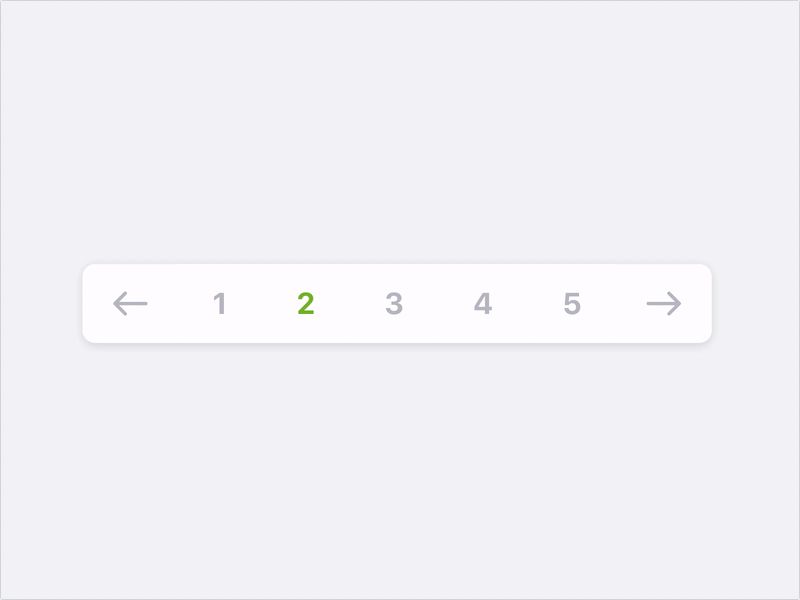
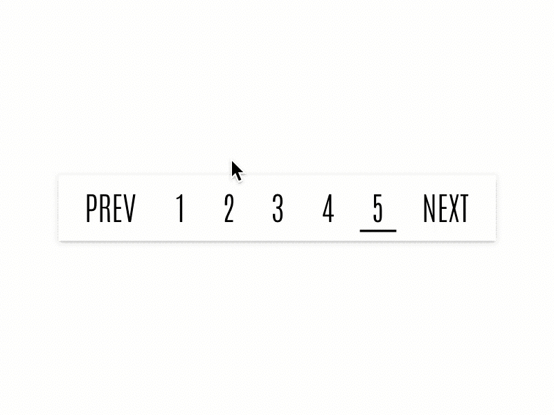
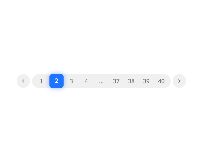
4. Next and Previous Links
Another approach is to provide Next and Previous links to navigate between page links in addition to clicking a link itself.
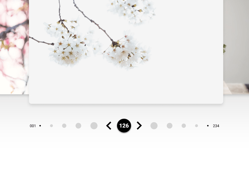
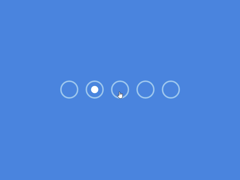
5. Dots Only
At times, when there is a lesser number of page links, dots can be used instead of labels.
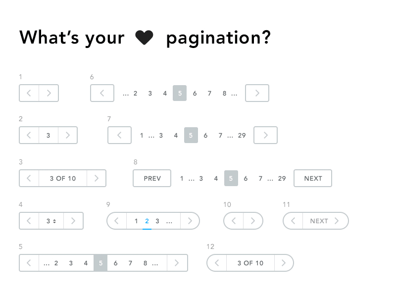
6. Twelve in One
There can be various ways to provide pagination options.
Conclusion
Pagination is a user interaction control that needs to be designed carefully. The purpose is to provide users with a good experience when they are navigating the content using this control. The given collection of styles can be used while designing a pagination UI for your website or app.
Want to Learn UX Design?
- Try Interaction Design Foundation. IxDF offers online design courses that cover the entire spectrum of UX design, from foundational to advanced level. As a UX Design World reader, you get 25% off your first year of membership with the IxDF.
- The UI/UX Design Specialization from Coursera brings a design-centric approach to user interface and user experience design and offers practical, skill-based instruction centered around a visual communications perspective. By learning this Design Specialization, you can design high-impact user experiences for your customers.
Thanks for reading.
Subscribe for more related articles at UX World.
If you have any questions, contact us here: Facebook | YouTube | Twitter | Instagram | Linkedin