Last Updated on September 15, 2024 by UX World
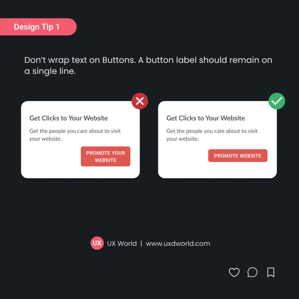
Buttons should look like standard buttons. Using unusual shapes and styles will confuse users. Create a style guide to use while designing your application. This will help you stick with the standard theme and style.
Learn more about designing accessible buttons.

Find more UI design tips here.
Want to Learn UX Design?
- Try Interaction Design Foundation. IxDF offers online design courses covering the entire UX design spectrum, from foundational to advanced. As a UX Design World reader, you get 25% off your first year of membership with the IxDF.
- The UI/UX Design Specialization from Coursera brings a design-centric approach to user interface and user experience design. It offers practical, skill-based instruction centered around a visual communications perspective. By learning this Design Specialization, you can design high-impact user experiences for your customers.
Thanks for reading.
Subscribe to more related articles on UX World.
If you have any questions, contact us here: Facebook | YouTube | Instagram | Linkedin


