Last Updated on November 11, 2024 by UX World
Buttons are designed so the users can perform actions while interacting with your application or product. Designing accessible buttons is essential for a seamless and inclusive user experience.
How to Design Accessible Buttons
Below are a few rules with examples to make your buttons accessible to users.
1. Make buttons look like buttons
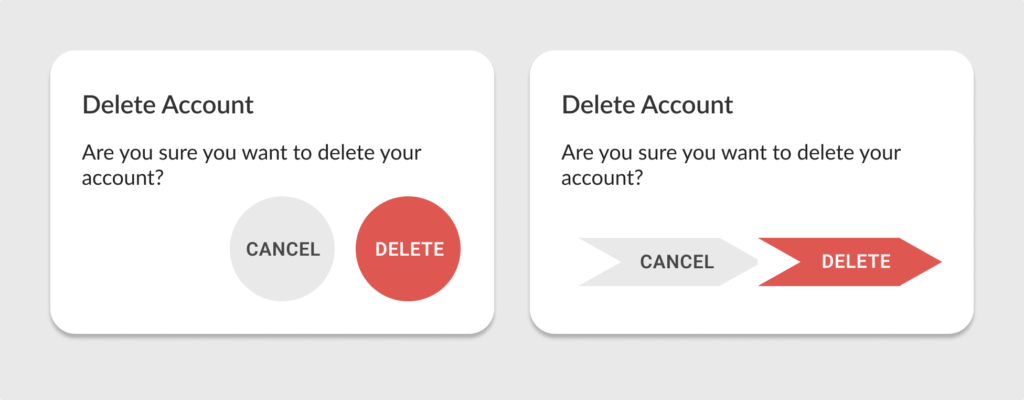
Buttons should look like standard buttons. Using unusual shapes and styles will confuse users. Create a style guide to use while designing your application. This will help you stick with the standard theme and style.
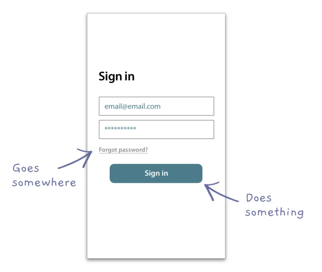
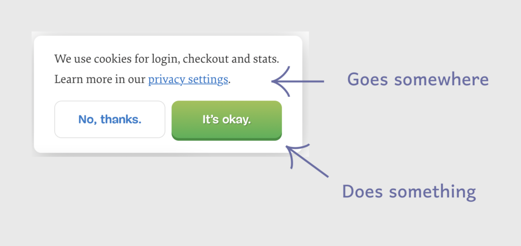
2. Differentiate buttons and links
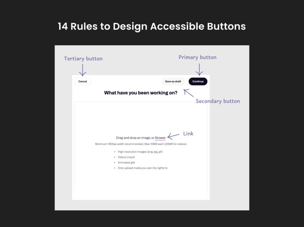
Make a clear distinction between buttons and links. A simple understanding is that a button helps users perform an action, whereas a link allows users to go somewhere. The button should look like a button and not follow the appearance and style of a link, which is a simple underlined text.
3. Make primary buttons stand out
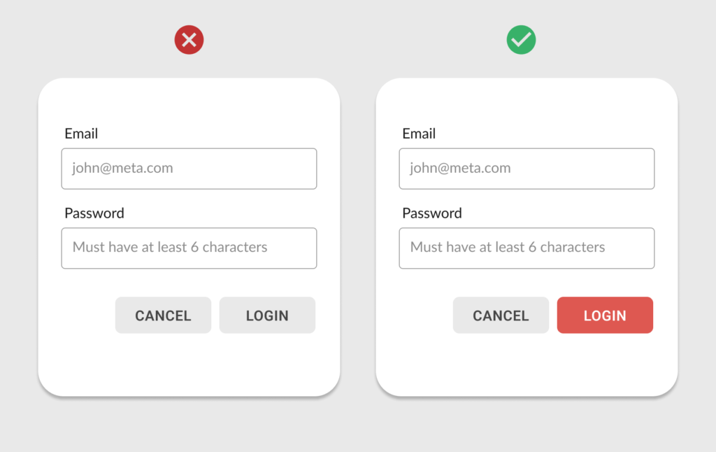
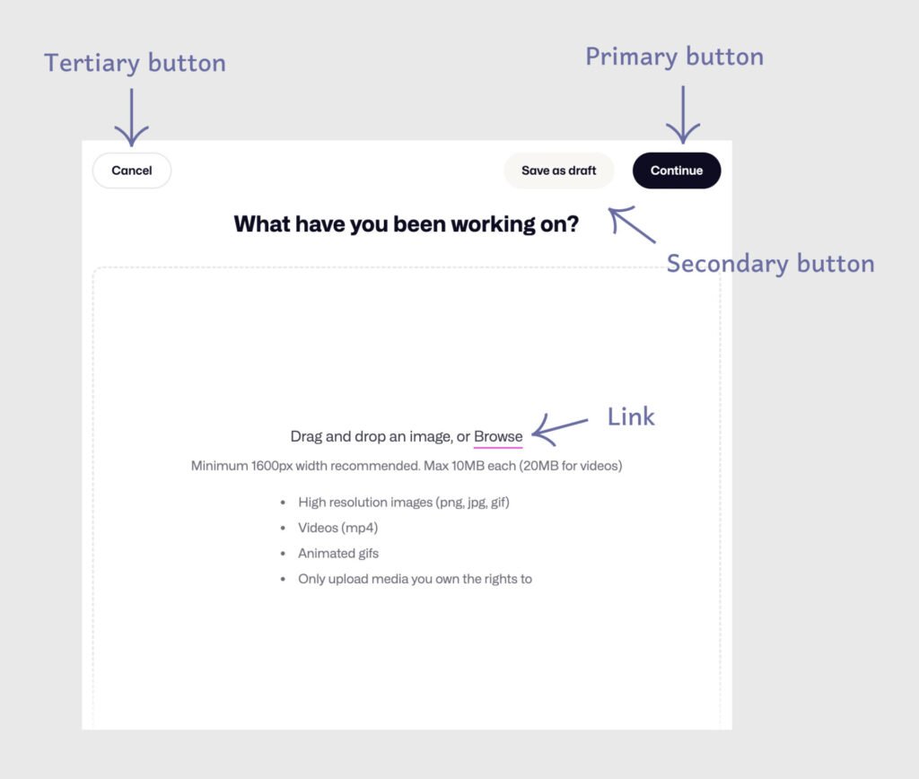
Usually, a page in your application involves one primary action users can perform. A primary button represents that primary action. The style of a primary button should make it stand out on the page from the rest of the items. Make a clear difference between primary and secondary buttons on the UI.
4. Use simple labels
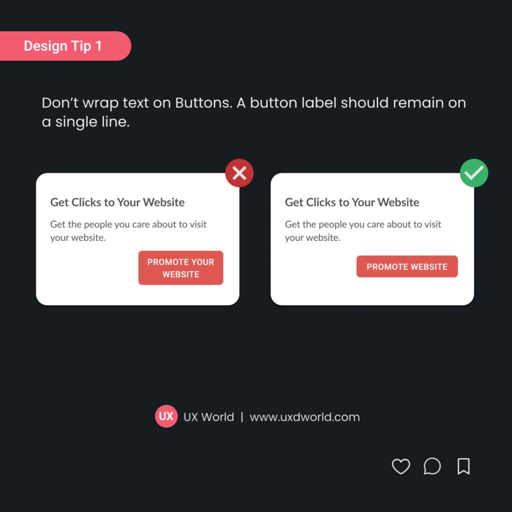
Use button labels that are clear and simple to understand. Do not use lengthy and irrelevant button labels. It will interrupt the user flow if button labels are misleading.
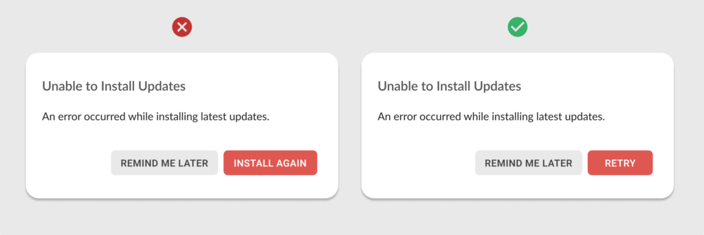
5. Use relevant labels
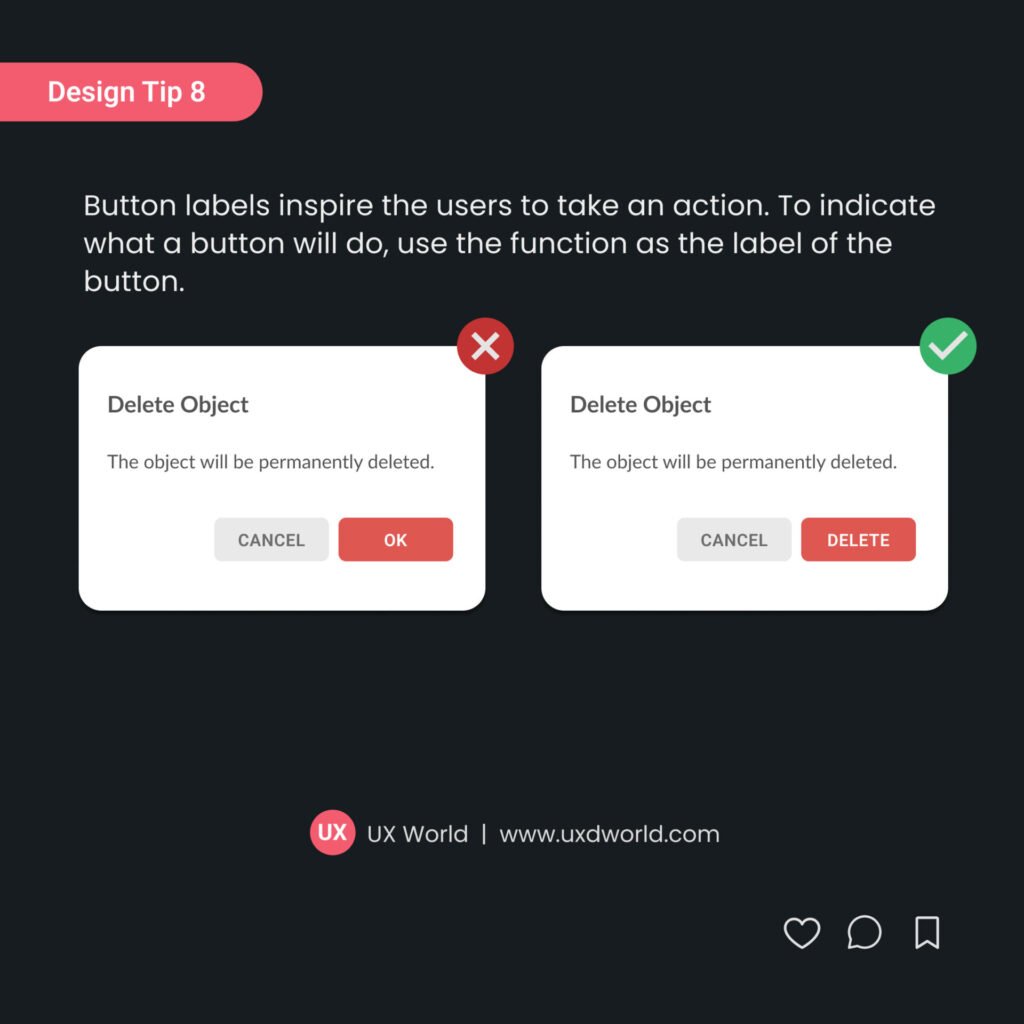
Avoid generic button labels like OK, Yes, or No. The button should mention the action the user can perform by clicking on it. Most of the time users just read the button text and click on it instead of going through all the details on the page.
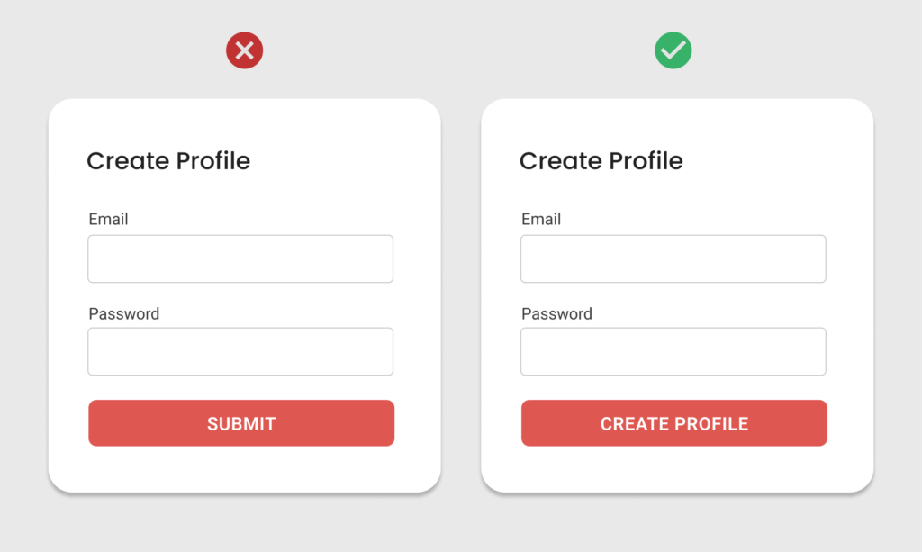
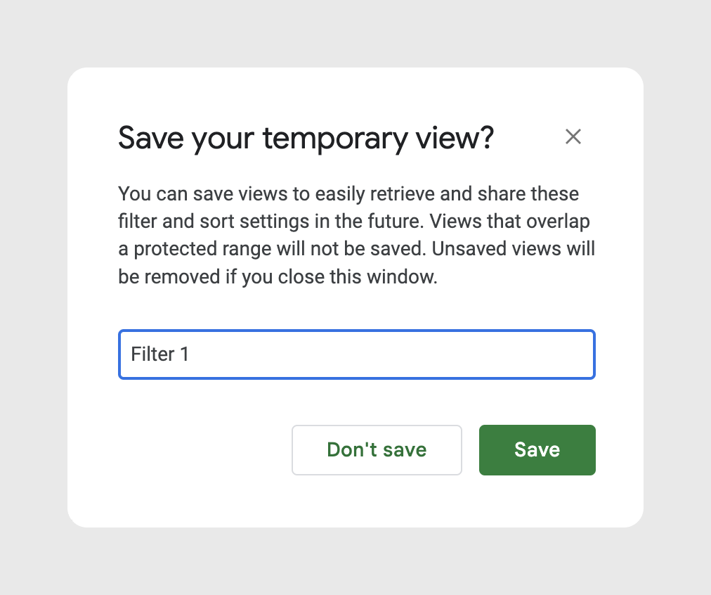
6. Use large font size
Use a large font size on the buttons which is easier to scan for users. The buttons are the primary UI elements and users click on them to move forward in the flow. If the button labels are too small to see, it will annoy the users.
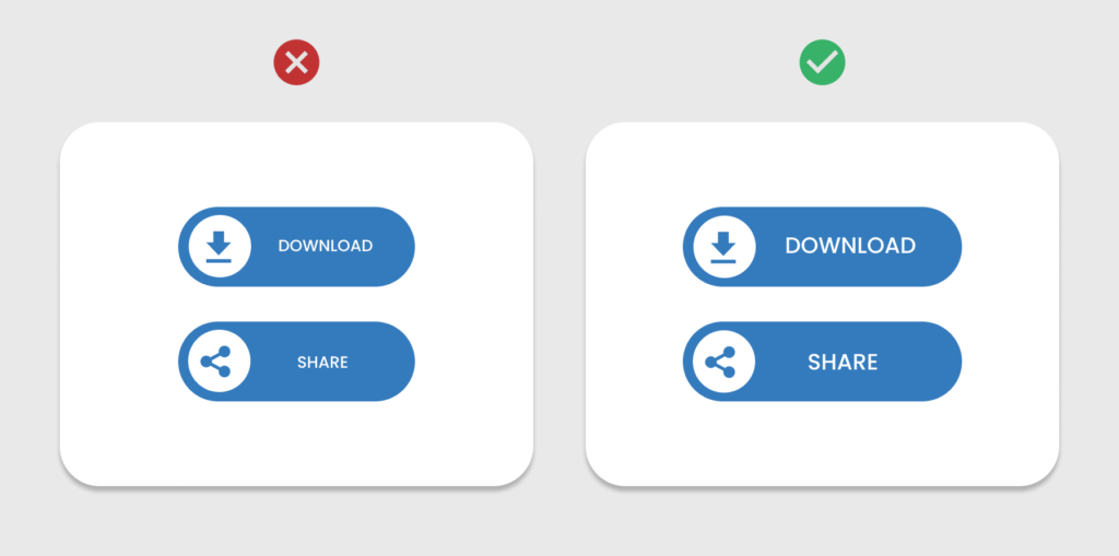
7. Avoid icon-only buttons, use labels with icons where possible
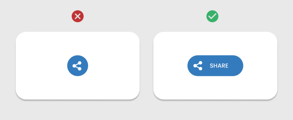
To make buttons accessible for users, add labels with icons where possible. Icon-only buttons are sometimes not understandable by users. Use standard icons along with relevant labels to make buttons user-friendly. This ensures users with cognitive disabilities or those unfamiliar with the icon can still understand the button’s function.
8. Use enough color contrast
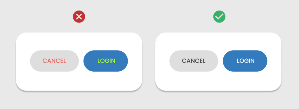
To cater to the needs of all user types including those with visual impairment, provide enough contrast between the button color and label text or icon to ensure readability. Follow Web Content Accessibility Guidelines (WCAG) to maintain a minimum contrast ratio of 4.5:1 for normal text and 3:1 for larger text.
9. Use the right target size
The button size should be large enough so the users can easily interact with them. This is more important for touch devices. A minimum target size of 44×44 pixels on mobile devices ensures that users with motor impairments can tap them easily. This also improves the overall touch target size, making it easier for all users.
10. Use proper spacing
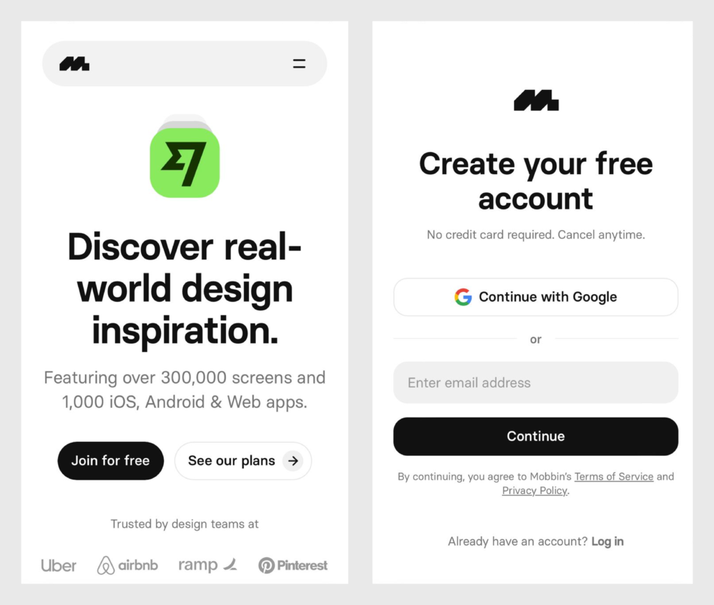
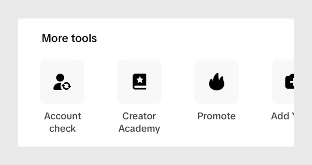
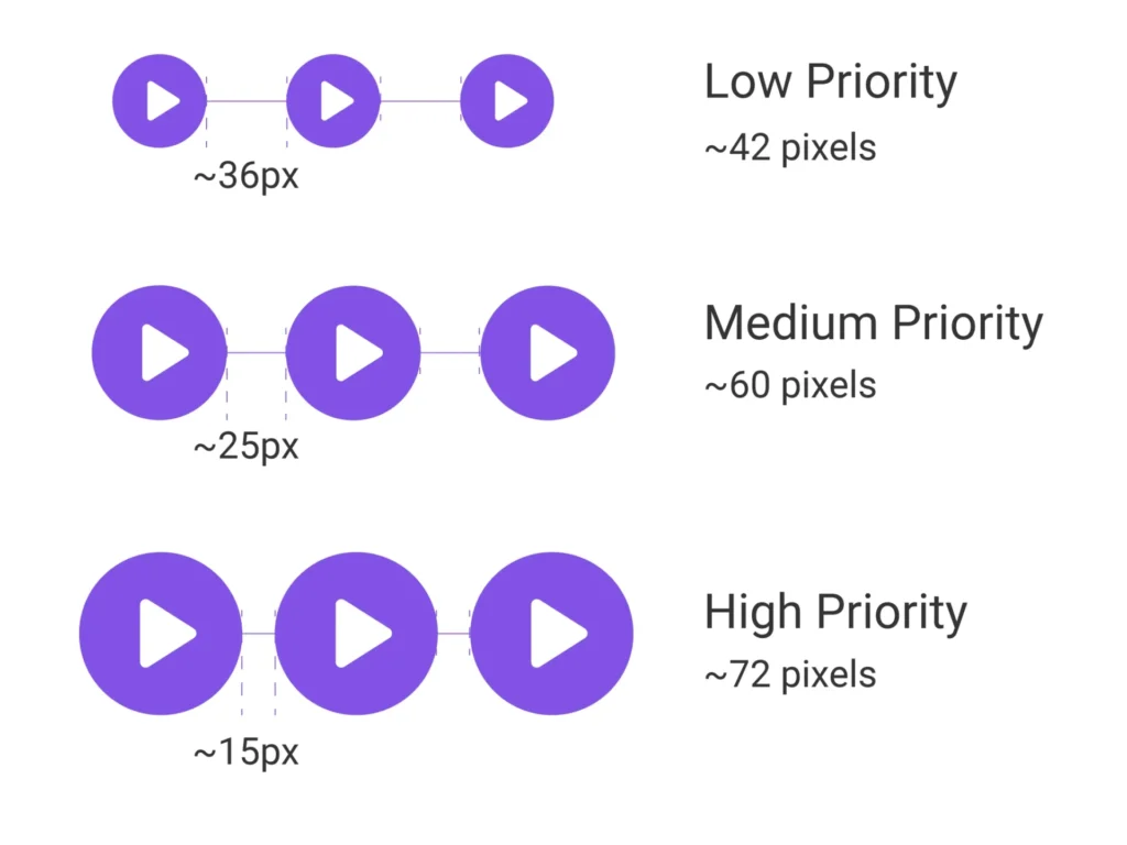
Keep enough space around buttons to avoid accidental clicks, especially on mobile devices. Proper spacing prevents overlapping elements and makes buttons easier to interact with for users. As per a given study, when the buttons were too far apart, users moved to the touch target much slower. And when the buttons were too close together, users had the lowest touch accuracy.
11. Use a clear focused state
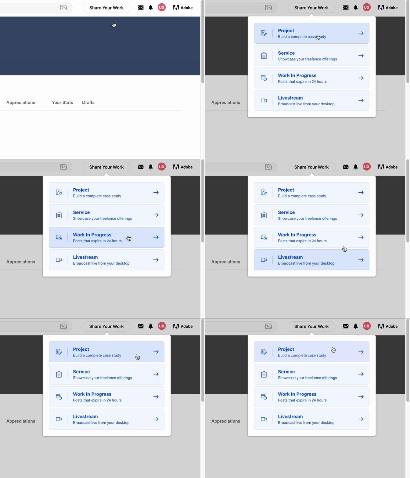
Provide clear focused and hover states of buttons. A visible focus state is important for keyboard navigation. Users relying on keyboard navigation must be able to see where they are on the page. Use noticeable borders, color changes, or outlines when the button is focused.

12. Don’t rely on color only to convey information
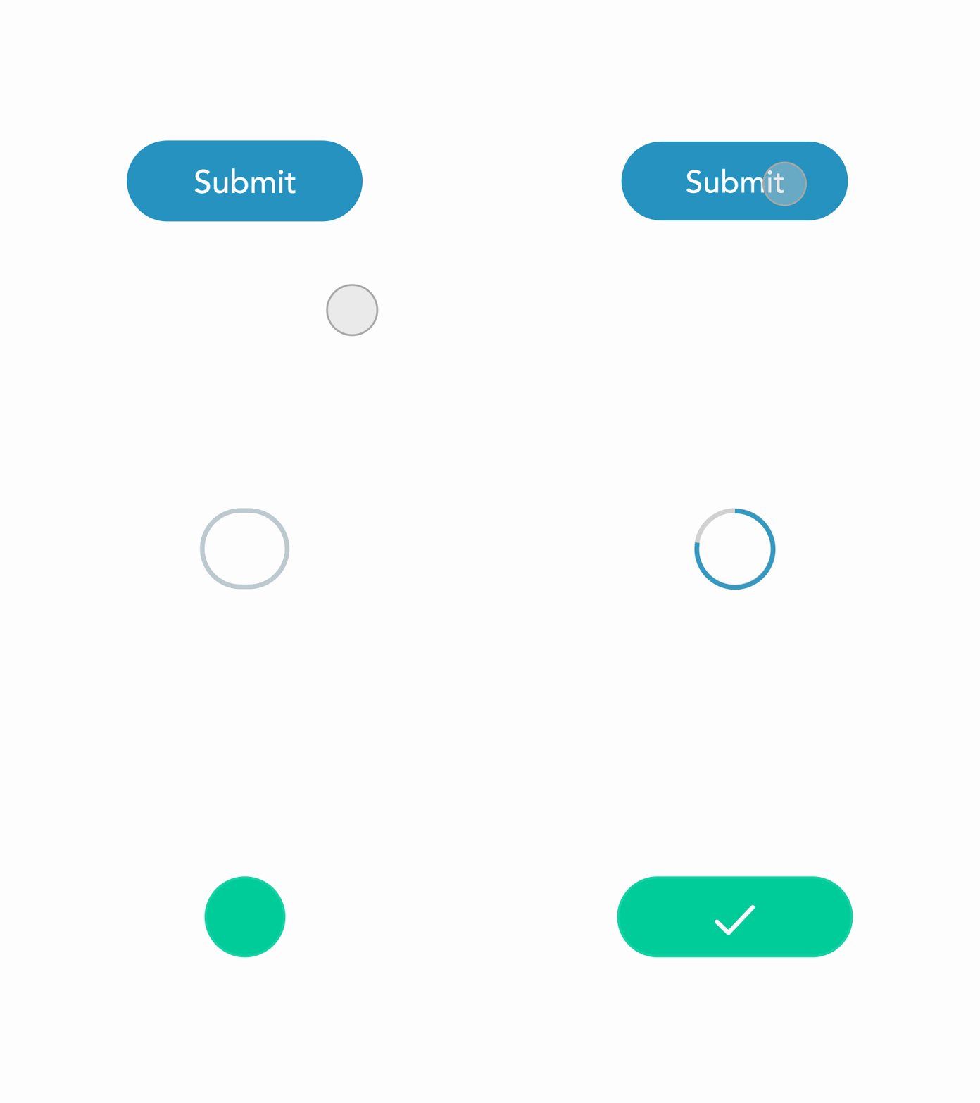
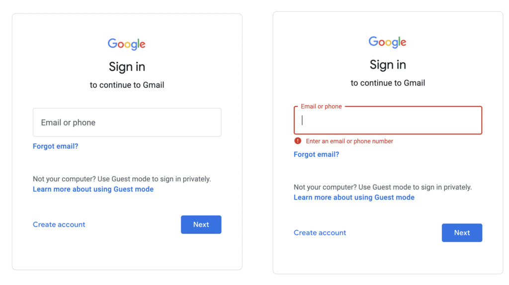
Buttons should not rely solely on color to indicate states (such as active or disabled). Include other visual cues like icons, underlines, or different text formatting to convey meaning. This is critical for users with color vision deficiencies.
13. Don’t use disabled buttons
Whenever you feel like adding a disabled button on the UI, ask yourself if there is a better alternative. If using disabled buttons is the only way, try to make them as convenient as possible for the users so they can understand their purpose and enable them by performing the required action.
Refer to the disabled button guidelines.
14. Test with users
Validate your design by conducting user testing. This ensures that your buttons are accessible to different user groups and helps identify usability issues early in the design process.
Conclusion
Always make your button design accessible. Ensure that every user regardless of their abilities, can interact effortlessly with your interface. By applying the given rules, you can improve the usability of your product and make it more inclusive and user-friendly.
Read More
- Designing for Action: Best Practices for Effective Buttons
- Designer Tips: Improving Button Accessibility
- Disabled Buttons UX — Usability Issues and How to Avoid Them
Learn UX Design
Try Interaction Design Foundation (IxDF). IxDF offers online design courses covering the entire UX design spectrum, from foundational to advanced level. As a UX Design World reader, you get 25% off your first year of membership with the IxDF.
Thanks for reading.
Subscribe to more related articles on UX World.
If you have any questions, contact us here: Facebook | YouTube | Instagram | Linkedin
