Last Updated on September 7, 2025 by UX World
Best practices for designing success messages
“Perfection is achieved not when there is nothing more to add, but when there is nothing left to take away.” –Antoine de Saint-Exupery
A success message appears when the user performs an action or completes a task. Usually, we discuss the best practices for error messages. However, it is essential to provide users with feedback on their actions, even when they have succeeded.
A success message is an opportunity to confirm users for their actions.
Success messages need to be designed carefully. These are usually notification messages that users scan and do not read since they do not require any further action.
The key takeaway is:
“Make clear and concise messages and avoid irrelevant details.“
Let’s discuss how to design brief and effective success messages.
Why use short success messages?
Short success messages are easy to understand. They are useful because:
They improve readability. Users can quickly understand what happened.
They minimize distraction on the UI.
They enhance clarity using fewer words.
They are action-oriented. Users can act fast when instructions are brief.
What is a common problem with success messages?
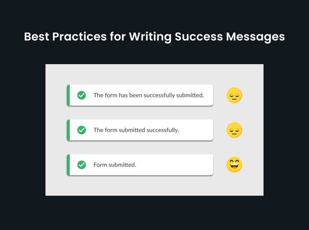
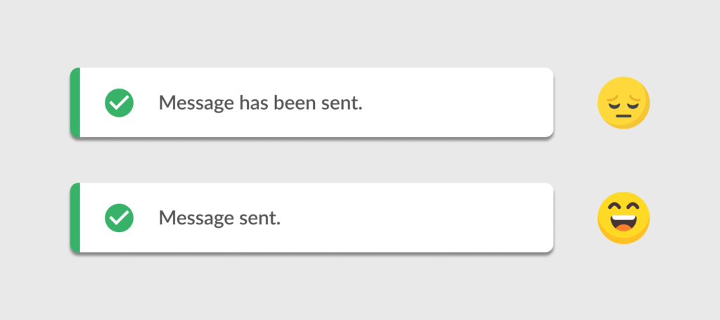
A common problem with success messages is using redundant words, like “successfully.”
The word “successfully” is almost always redundant in a success message. If the message is displayed, success is implied.
See the example below.
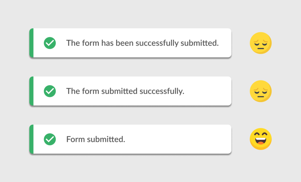
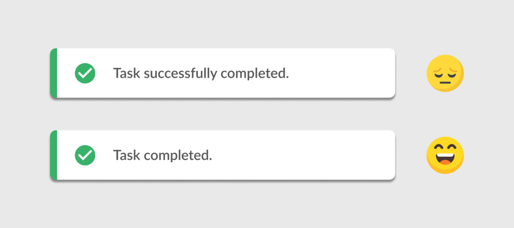
“The form has been successfully submitted.”
This is the message we have seen many times in my earlier UX days.
Then an improved version of this message was made by removing a few irrelevant words.
We evaluated and found that we don’t need to use the words “has been”. Instead, we can keep it simple by removing these two words.
The revised version was:
“The form submitted successfully.”
I have seen this type of success message many times. Many UX designers have used these types of messages in design screens.
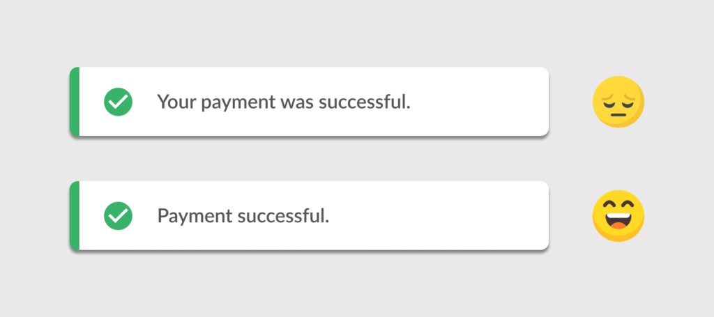
One of the content designers in my team discussed this. We were having a question: why are we using the word successfully? Isn’t it redundant?
“Successfully” is a long word that requires both space on UI and time to read and understand.
We thought of making the message even shorter and better.
The improved version is:
“Form submitted.”
We removed the words “successfully”. But you can see we also removed the article “The”. Did we need it? We didn’t think so.
“The” is not adding any meaning to the message.
The user works on a form and clicks the “Submit” button. If the action is successful, we can show a confirmation message: “Form submitted.”
Do we have something incomplete here? Not at all!
The improved version of the message is clear and brief.
Best practices for writing success messages
Let’s discuss a few guidelines to design better success messages.
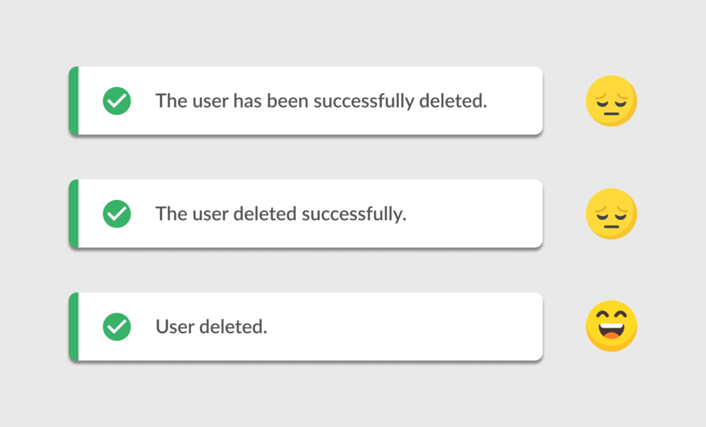
1. Avoid unnecessary words
Words like “successfully”, “was”, and “has been” often add no value to UI messages. Remove them to keep messages succinct.
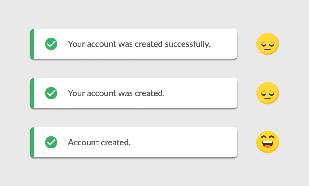
2. Start with a noun or verb
Leading with a noun or verb makes your message direct and action-oriented.
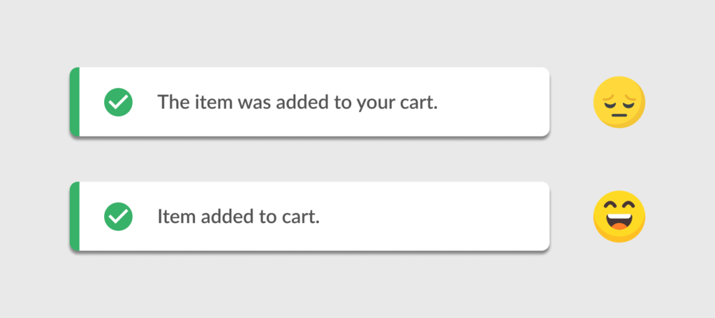
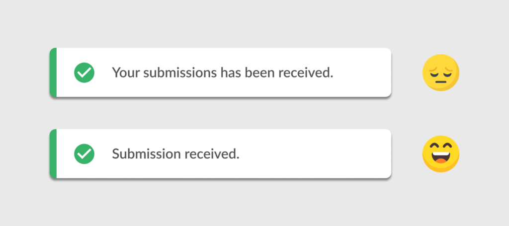
3. Drop Articles (the, a, an)
Articles can be omitted without losing meaning.
4. Be clear and direct
Be direct while maintaining a positive tone. Avoid unnecessary qualifiers.
When writing UI messages, focus on simplicity. Remove extra words, avoid redundancies, and keep messages to the point.
Clear and concise communication helps users understand the interface quickly and confidently.
Keep it short. Keep it clear. Keep it effective.
Read more:
Master Your UX Design Skills
Try Interaction Design Foundation (IxDF). IxDF offers online design courses that cover the entire spectrum of UX design, from foundational to advanced levels. As a UX Design World reader, you get 25% off your first year of membership with the IxDF.
Subscribe for more related articles at UX World.
If you have any questions, contact here: Facebook | YouTube | Instagram | Linkedin