Last Updated on March 13, 2025 by UX World
Designing user-friendly forms is challenging for UX designers. The difficulty increases with long forms.
The limited screen size of mobile devices makes it crucial to balance usability and functionality without overwhelming users. Organizing input fields on a small single-column layout can be challenging for UX designers.
Let’s explore practical steps to make long mobile forms more user-friendly so that users can interact with them easily.
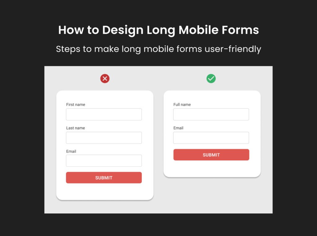
Step 1: Skip optional/unnecessary fields
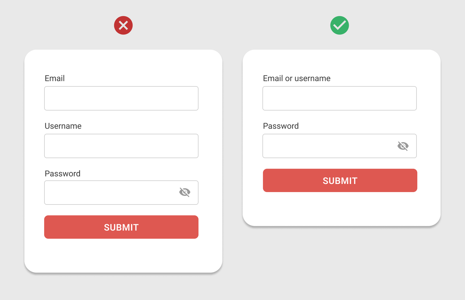
Start by carefully reviewing all the fields in your form.
Identify and remove fields that are optional or do not collect useful information.
Focus solely on the required and essential inputs.
If you have already designed the desktop version of the form, this is a great opportunity to trim down unnecessary fields and design an optimized form.
“Ask the users as few questions as possible.”
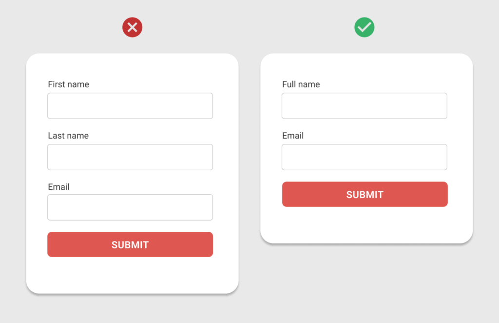
Instead of providing separate fields for First Name and Last Name, provide a single field Full Name.
Remove optional fields if they are not collecting useful information.
Step 2: Use a progressive disclosure approach
After choosing the essential fields, focus on presenting them in a user-friendly way.
Use a progressive disclosure approach to display fields dynamically.
Instead of showing all fields at once, reveal only those that are relevant to the user’s previous input or selection.
This method prevents clutter by skipping disabled or irrelevant fields.
“Display only the fields relevant to the user’s prior choices.”
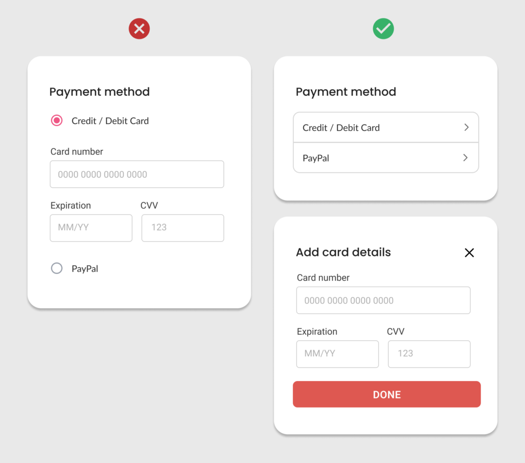
Display fields in a compact form, revealing only the relevant and required fields.
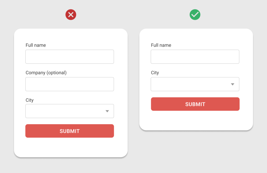
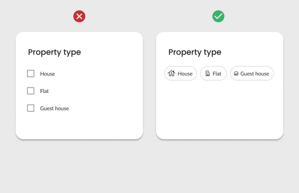
Step 3: Use mobile native controls
Desktop controls often occupy more screen space, leading to unnecessarily lengthy forms.
Native controls, on the other hand, are designed to make the best use of small screen sizes, enhancing both usability and efficiency.
Avoid conventional long drop-down menus that can feel cumbersome on mobile devices.
“Optimize your mobile forms by using native controls.”
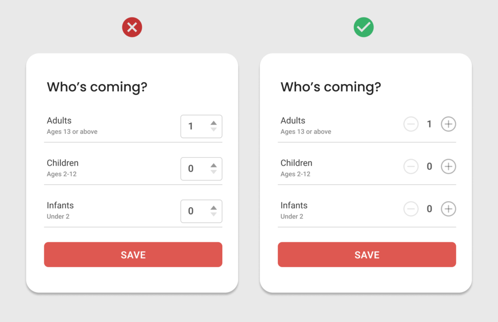
Do not use stepper control in mobile forms. Instead use optimized controls to select a number.
Use controls that help to optimize long forms.
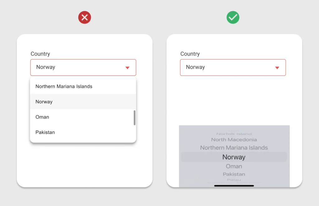
Avoid using long drop-down menus. Use native mobile controls.
Step 4: Group related fields
Once you’ve finalized the necessary fields and control types, the next step is to arrange them effectively.
Instead of splitting the form into multiple steps, visually group related fields together.
This approach optimizes screen space and helps users better understand the structure and flow of the form.
“Clear grouping makes the form more organized and reduces cognitive load for users.”
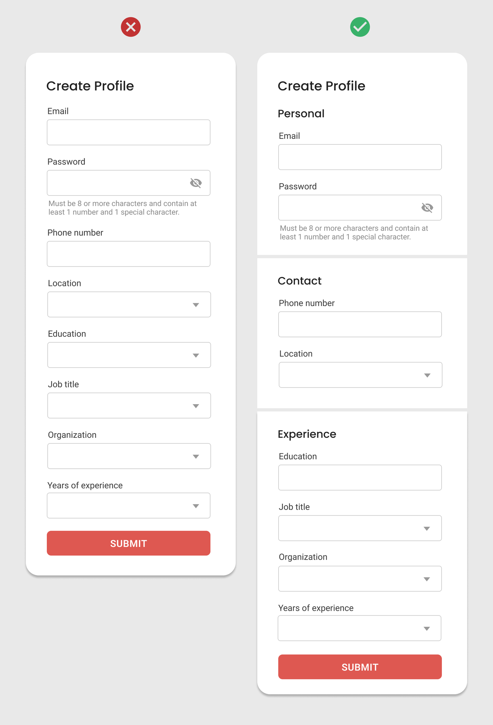
Group related fields together in a form to make it more organized and easy to understand.
Step 5: Break it into steps
If your form still looks longer, consider breaking it into multiple steps.
Organize the fields into logical steps. Clearly label each step and use numbers or descriptive titles to guide users.
Include a progress indicator that shows the current step and how many remain.
A multi-step form makes it easier to manage large information. Users can focus on a single group of properties at a time.
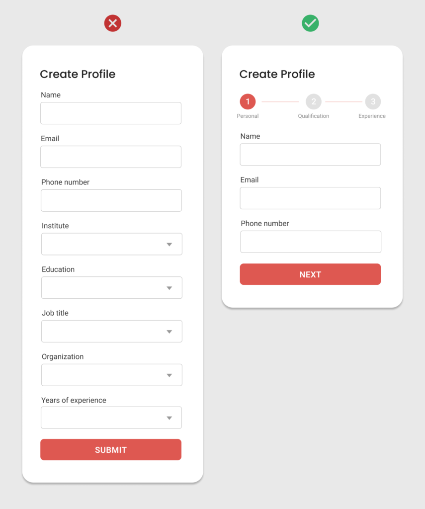
Use multi-step forms to manage large information.
Creating user-friendly long mobile forms requires attention to detail and a user-first approach.
These steps will help you simplify the design of long mobile forms and enhance overall user satisfaction.
Learn UX Design
Try Interaction Design Foundation (IxDF). IxDF offers online design courses covering the entire UX design spectrum, from foundational to advanced level. As a UX Design World reader, you get 25% off your first year of membership with the IxDF.
Thanks for reading.
Subscribe to more related articles on UX World.
If you have any questions, contact us here: Facebook | YouTube | Instagram | Linkedin