Last Updated on March 13, 2025 by UX World
Cards are important UI components that organize and present information in a clear and user-friendly format.
Due to their flexible and modular layout, cards can be used across various applications, helping users quickly engage with content.
Designing a card requires consistently applying UX principles to ensure it serves its purpose effectively.
This article covers best practices and UX guidelines for designing cards UI. In the later section, we will explore different types of cards that can be used in various situations.
Why UI cards are important
- UI cards are versatile containers that visually group information and actions related to a specific subject.
- They help break down complex data into digestible sections, making it easier for users to navigate and understand content.
- Cards can dramatically improve engagement by allowing users to interact with the content effectively.
Best Practices for Designing Cards UX
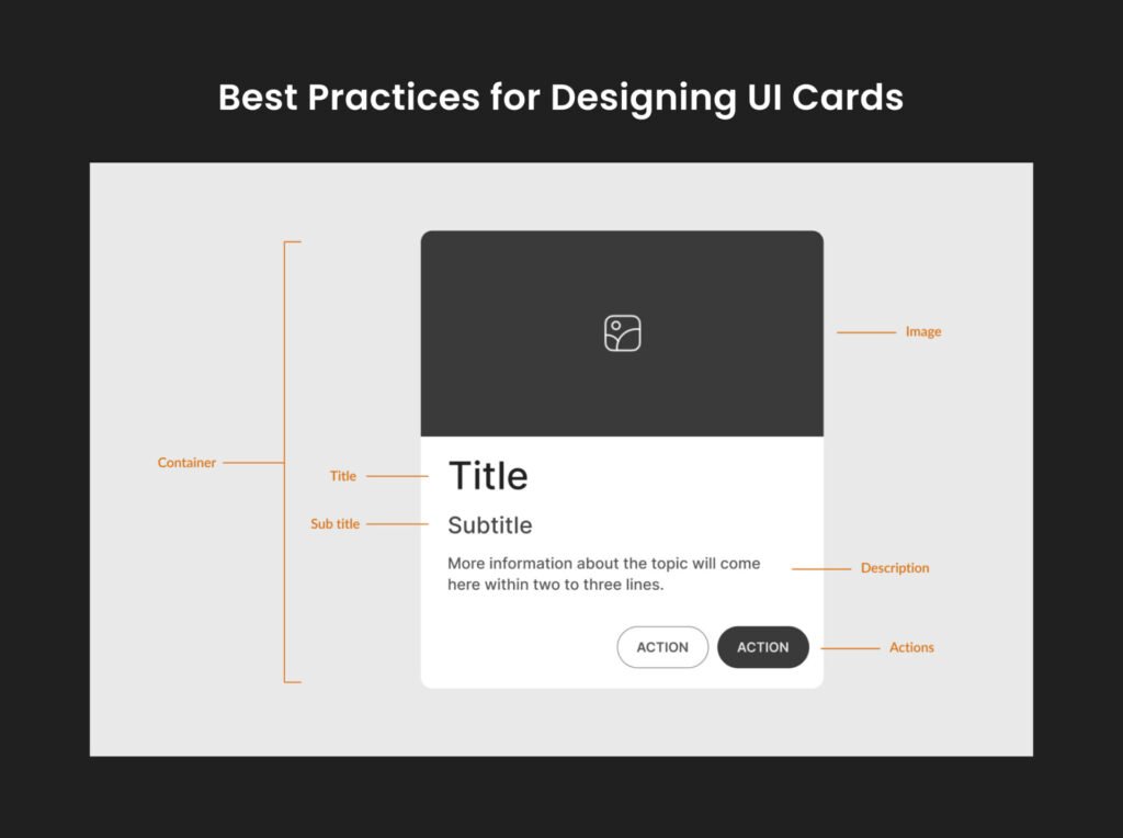
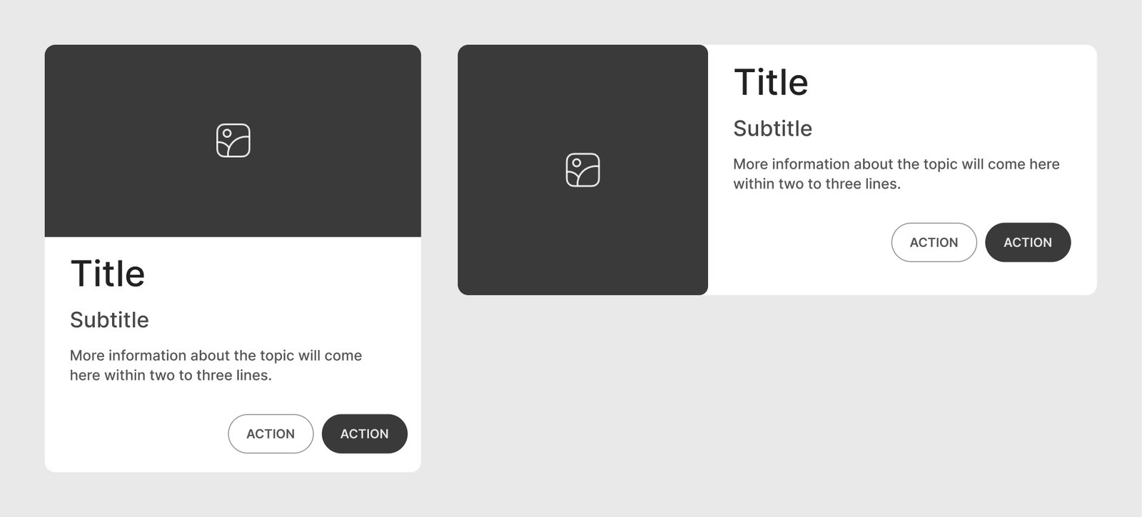
Anatomy
This is a basic card structure. Other optional elements can be added based on requirements.
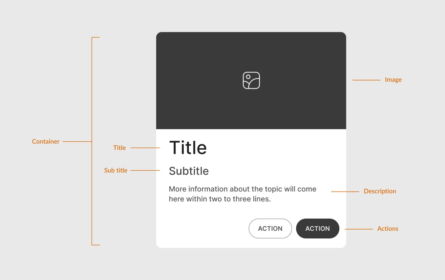
Header: Typically includes a title or image that describes the card’s content.
Image: Images add context to the content. Add a relevant image to make your card visual (like product cards).
Content Area: This section contains the primary text, such as a brief description, title, or other key information. Keep content concise and well-structured.
- Title
- Subtitle
- Description: A brief description of the card content. It can contain a few icons, tags, etc. to support the content.
- Image: An optional image can be included within the content area.
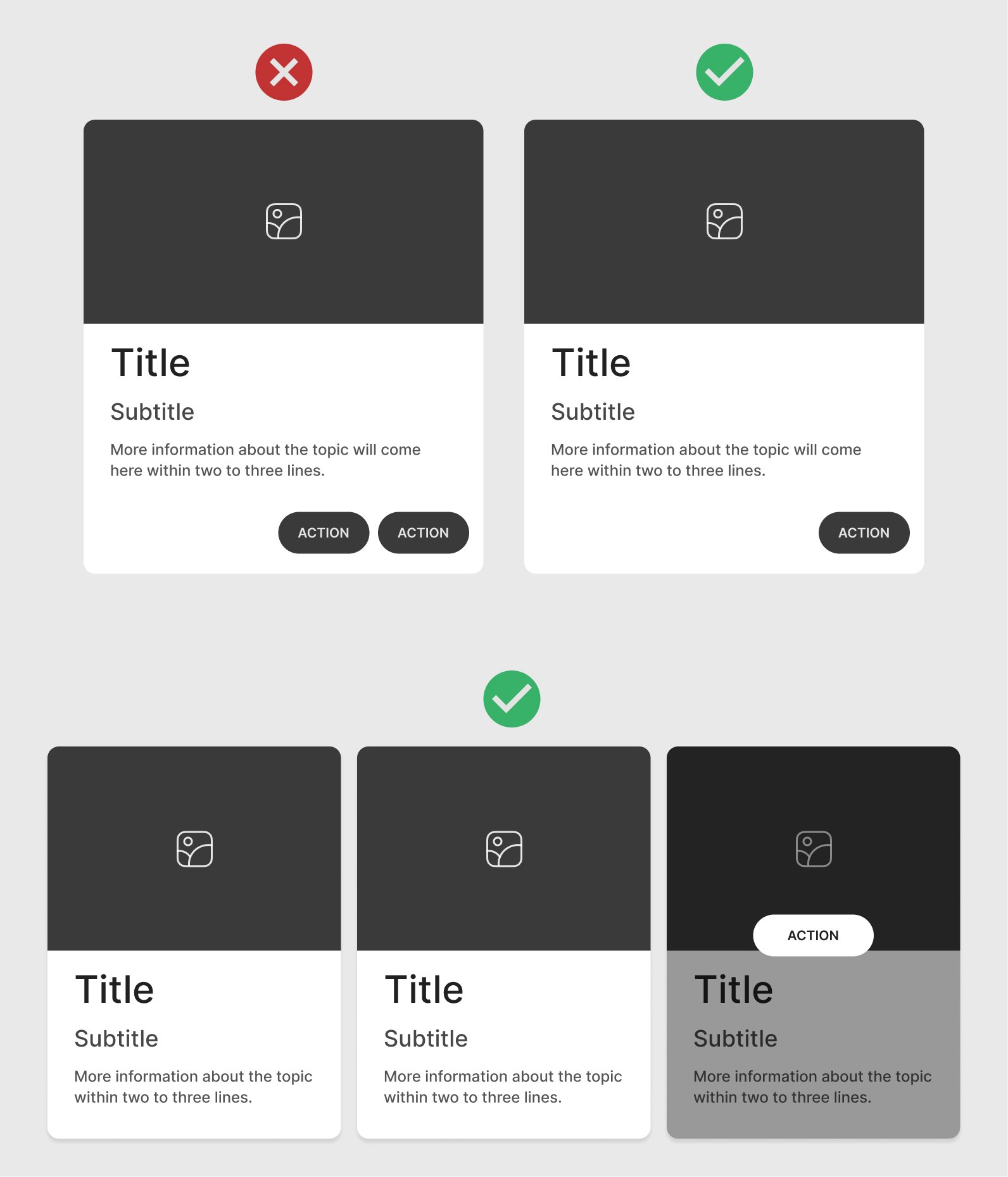
Actions: Add primary and secondary actions (like buttons) that users can perform, such as “Add to Cart” or “Read More”. Place actions clearly within the card’s boundary.
Structure and Layout
Visual Hierarchy
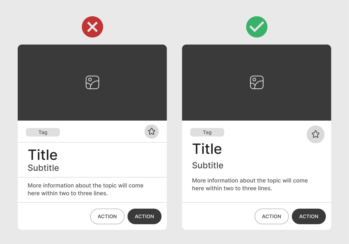
Ensure clear visual hierarchy in card elements, prioritizing important information with headings, icons, and typography variations.
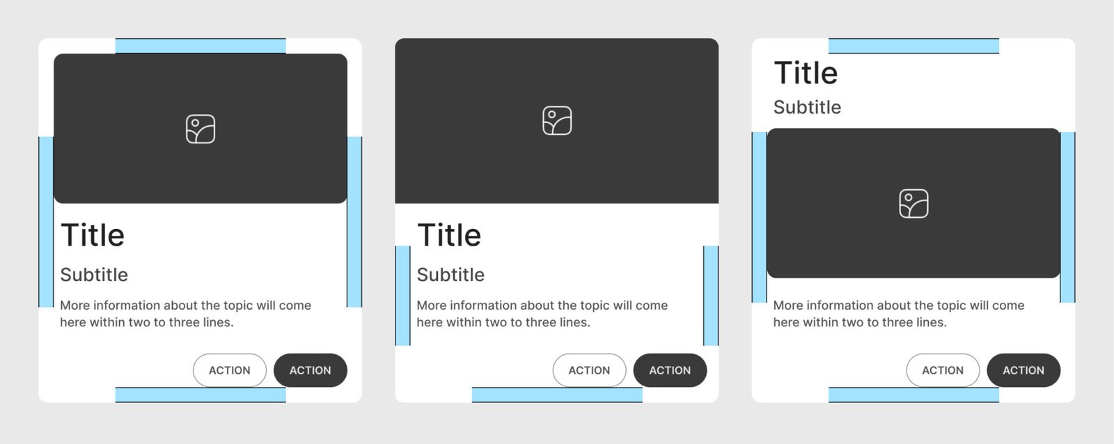
Spacing and Padding
Maintain even padding inside the card (both vertically and horizontally). Avoid overcrowding and add enough space between the edges and the content.
Alignment
Use left or center alignment for text and icons, depending on the design style, to maintain uniformity across cards.
Format and Size
Aspect Ratio
Use a fixed aspect ratio for cards (e.g., 4:3 or 16:9), especially if the card includes images, to ensure visual consistency across the UI.
Responsive Size
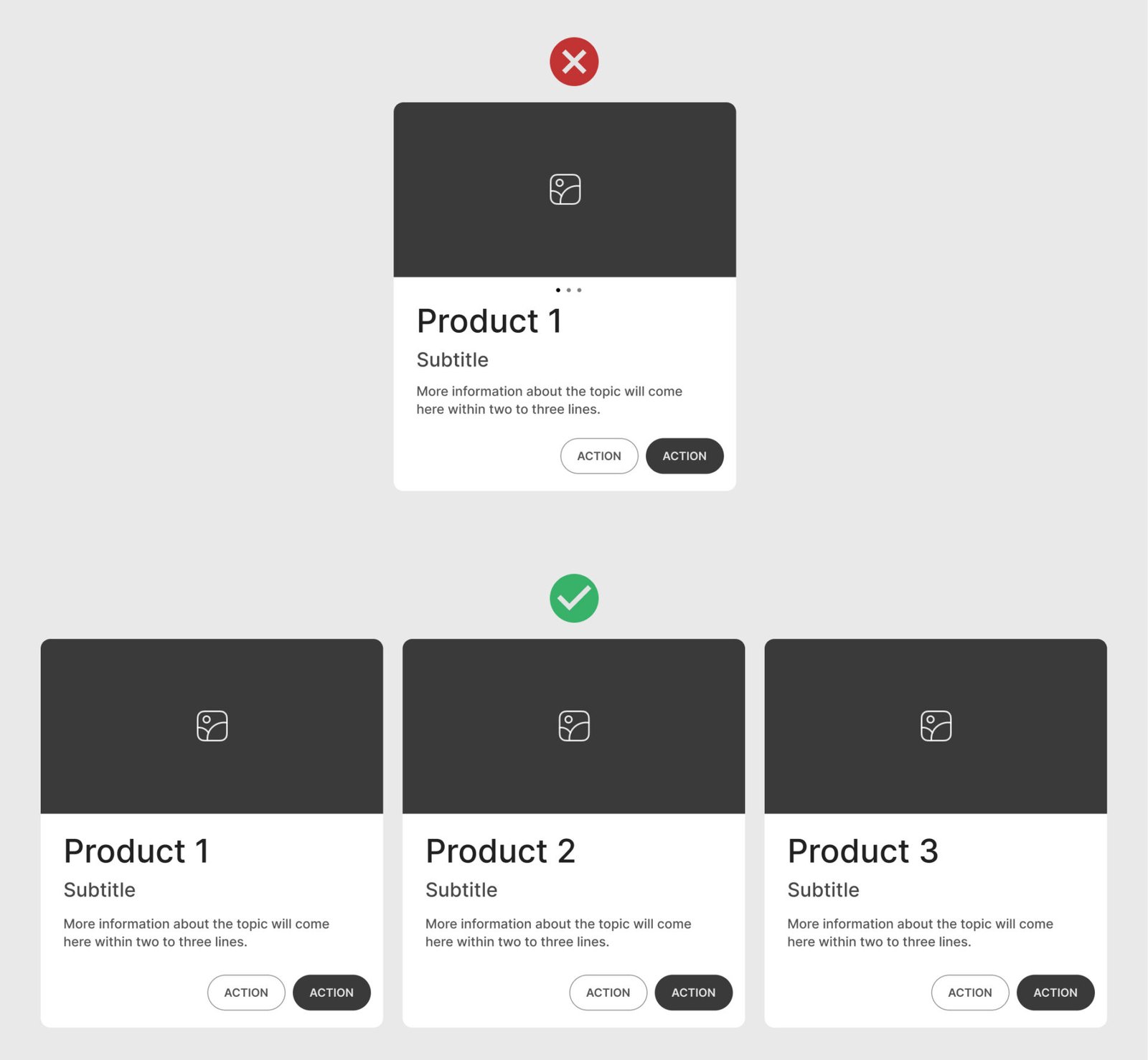
Design cards to adapt to different screen sizes, especially on mobile, where vertical layout often works best.
Proportional Size
Ensure the card isn’t too large or small relative to the screen and other UI elements; oversized cards may overwhelm the layout, while small cards may become unreadable.
Typography and Fonts
Font Hierarchy
Use different font sizes and weights to establish a clear visual hierarchy. Typically, use a larger font for the title and smaller fonts for body text.

Readability
Choose legible fonts, especially for small card sizes, and ensure enough contrast between text and background.
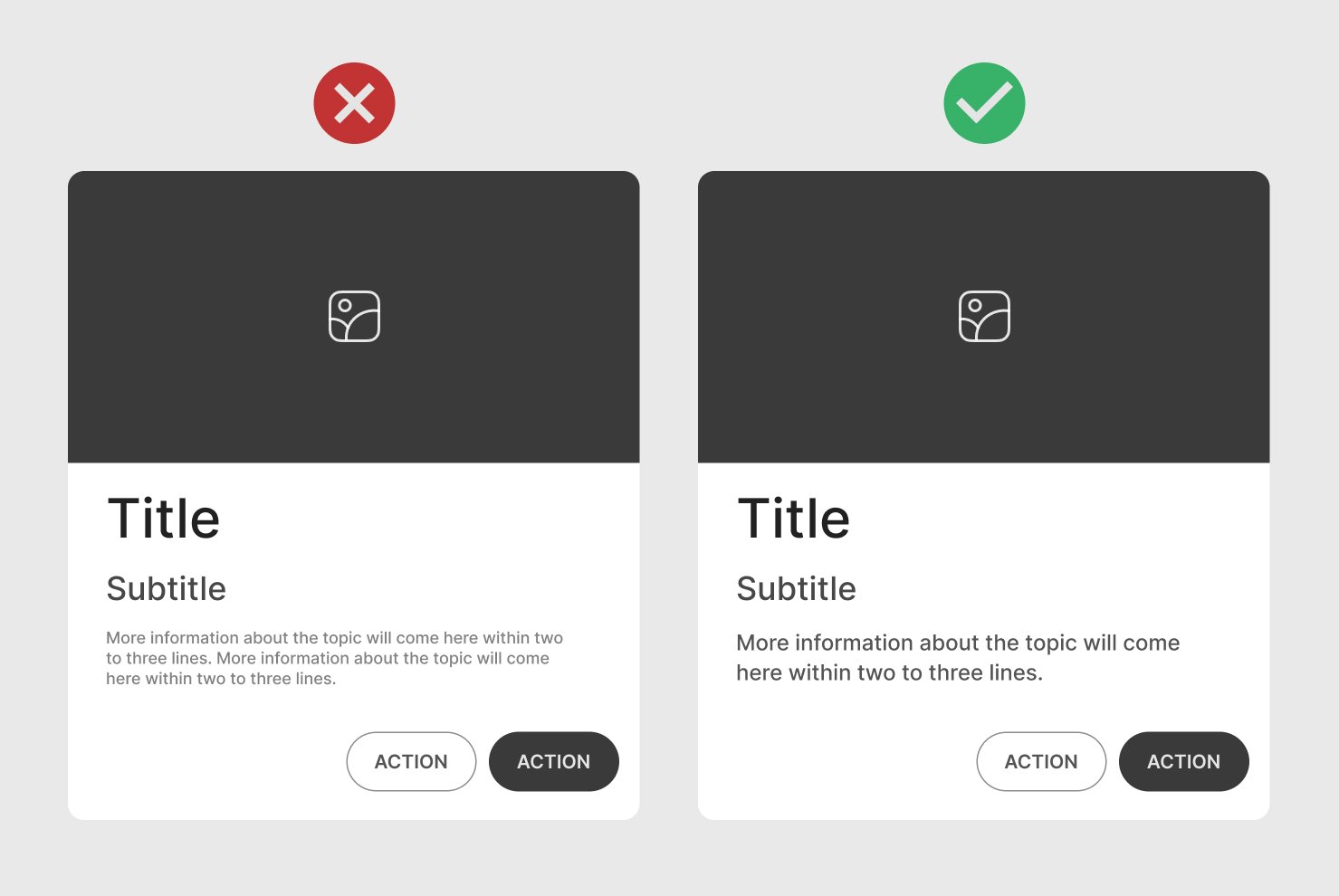
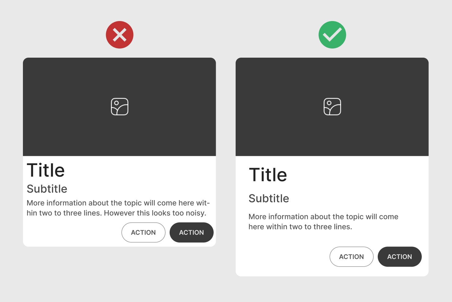
Limit Text Amount
Keep the amount of text minimal. Only include essential information that can be scanned without overwhelming the user.
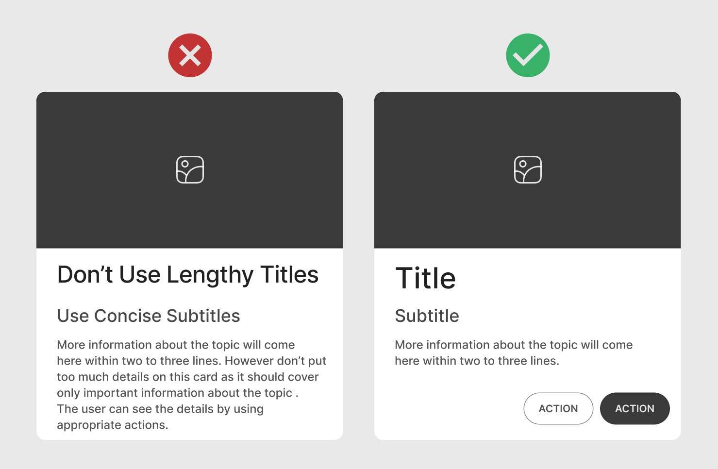
One Card One Concept
Provide a single concept per card to avoid overwhelming the user. Each card should convey one piece of information or action, such as a product, profile, article, or data point. Showing multiple concepts on one card can make it cluttered and confusing.
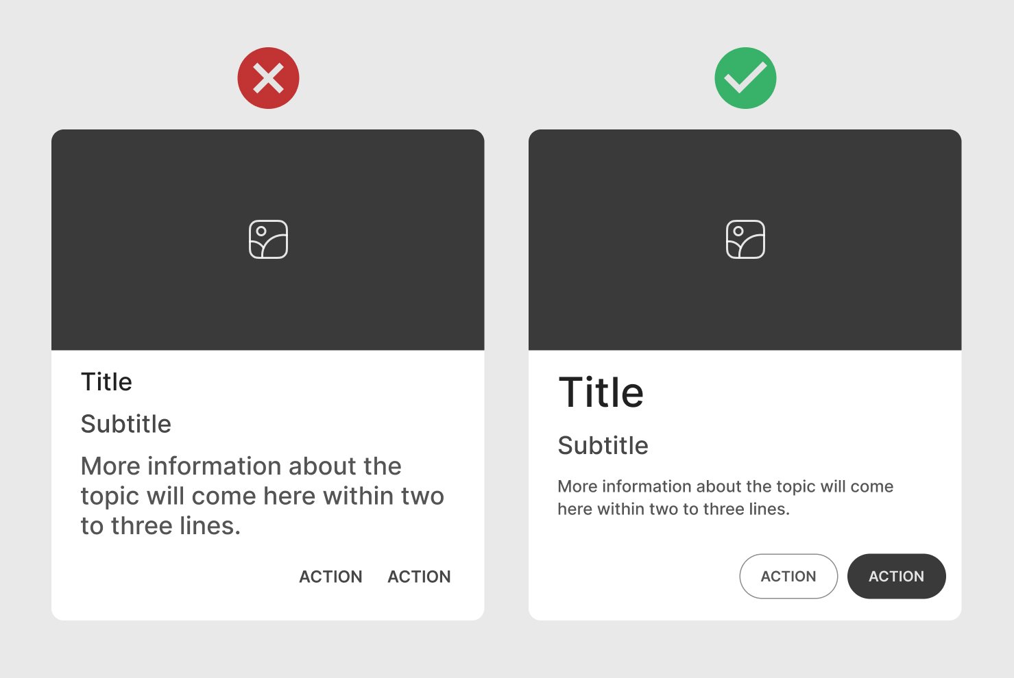
Actions
Primary Actions
Add one or two main actions to avoid clutter. Use buttons for actions and icons for secondary functions (like bookmarking).
Clickable Area
If the entire card is clickable, make it visually obvious. Otherwise, restrict the clickable area to specific elements to avoid accidental clicks.
Allow the whole card to be clickable only if it serves a purpose, like navigating to a new page. Otherwise, keep click areas restricted to specific buttons.
Feedback
Provide visual feedback when users interact with the card (e.g., hover effects, subtle animations, or color changes).
Dividers
Use thin borders or dividers to separate sections within a card, especially for complex cards that contain multiple elements.
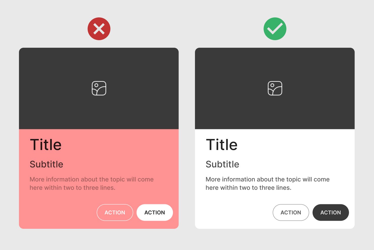
Color Contrast
Ensure text and background colors meet accessibility contrast standards for readability. Use easy-to-read fonts and appropriate contrast between text and background, keeping cards readable.
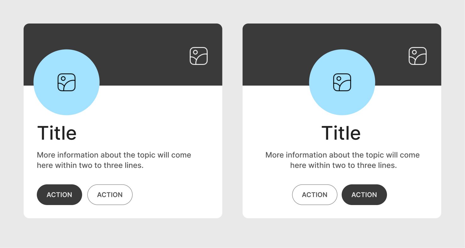
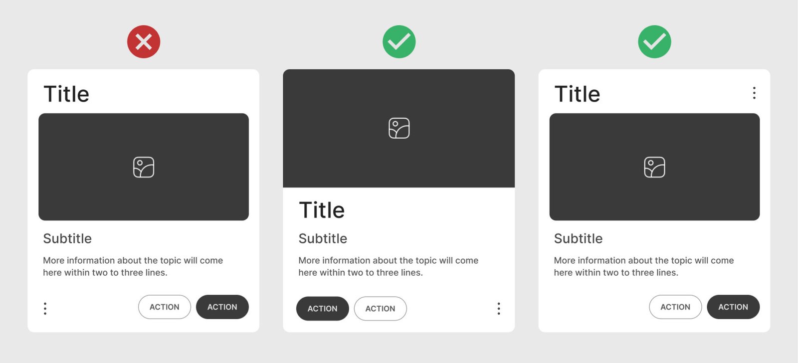
Menu Icon
Place the menu icon in a common place where users can find them without confusion. Typically, the top-right corner of a card is a preferred spot for menu icons, as it is a familiar location across many apps and websites.
Consistent positioning of menu icons across cards contributes to a cleaner and more predictable interface.
Whitespace
Provide reasonable whitespace in a card to give it a clean and organized look. Adding ample whitespace around elements like text, images, and icons helps visually separate each component, preventing the card from looking cluttered.
Types of cards
There are several types of UI cards that you can include in your design.
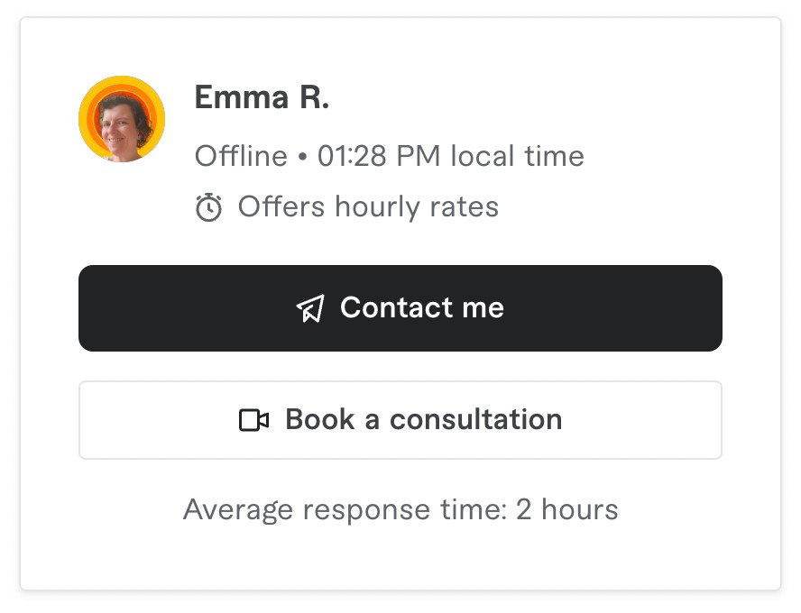
Profile card
Displays information about a person or entity, such as their name, photo, title, and short bio. It’s often used for team pages, social media profiles, or user accounts.
Common elements include profile picture, name, job title, contact info, and social media links.

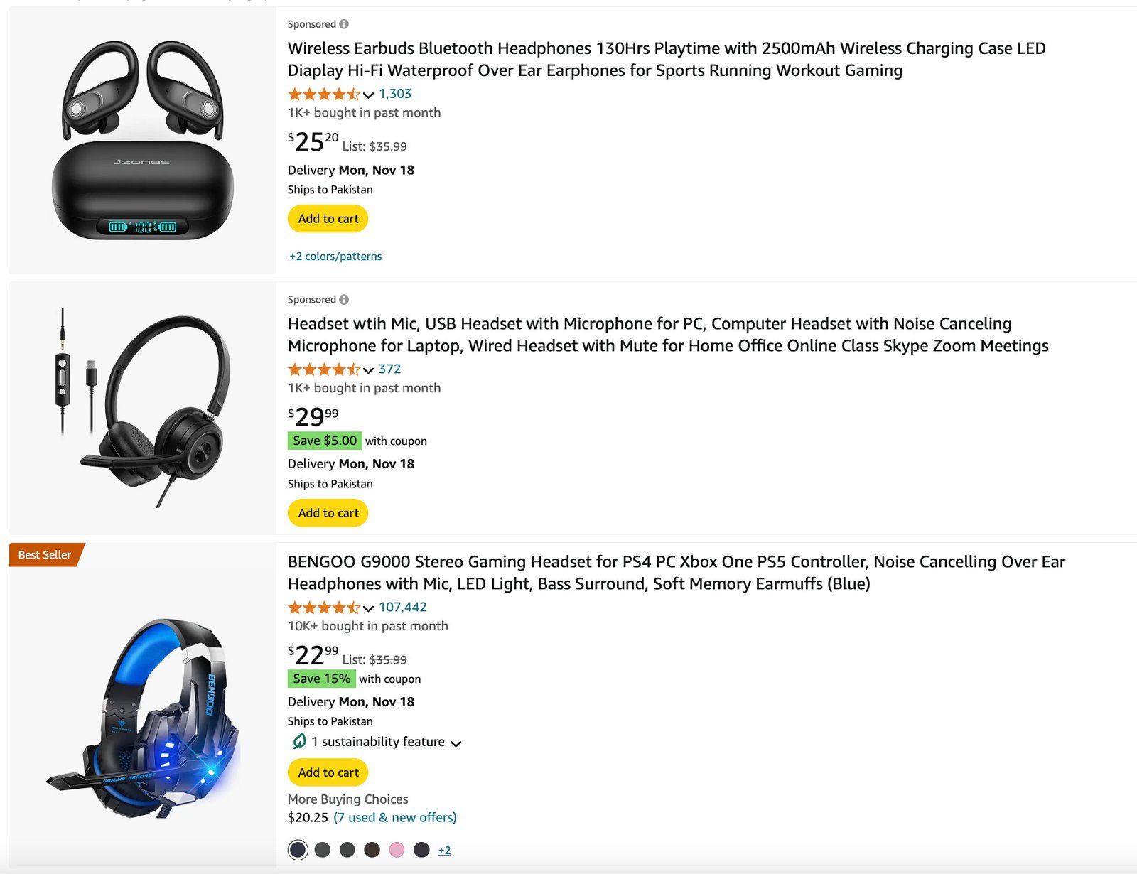
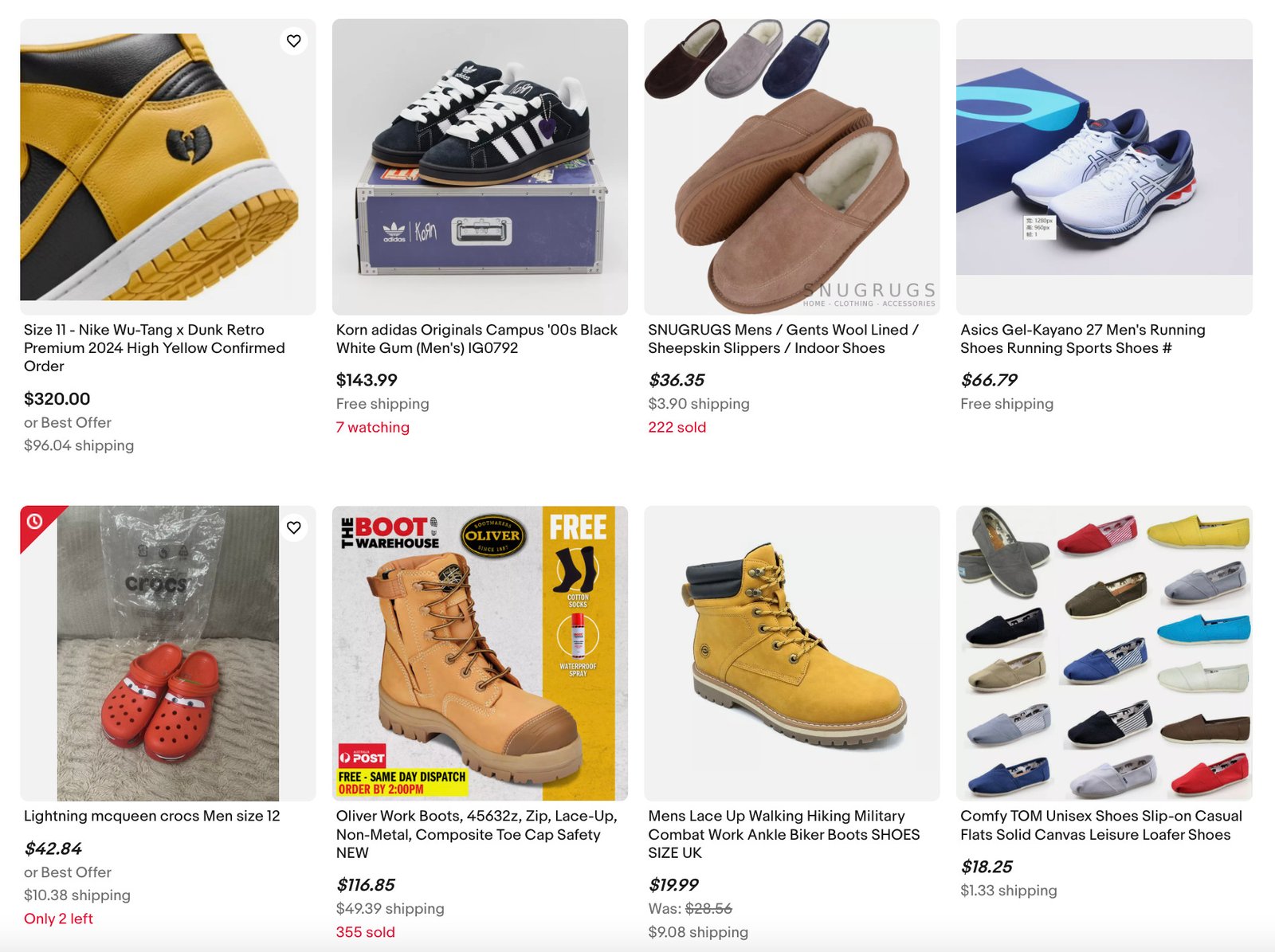
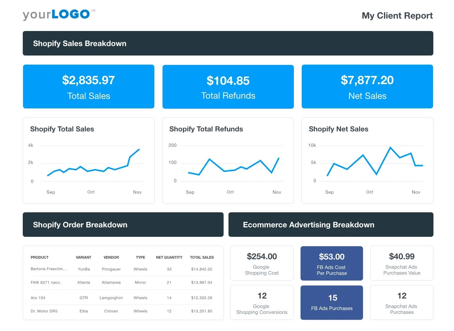
Product Card
Showcases a product with essential information like name, price, description, and actions such as “Add to Cart” or “Buy Now”. It is commonly used in e-commerce platforms and product catalogs.
Common elements include product image, title, price, short description, ratings, and primary actions.
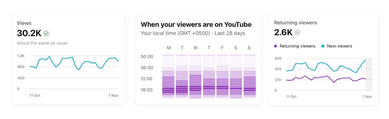
Data Card
Displays metrics or summarized data points, often used in dashboards. These cards provide quick insights or KPIs (Key Performance Indicators) in a compact format.
Common elements include Data value, icons or images, trend indicators, and supporting labels.
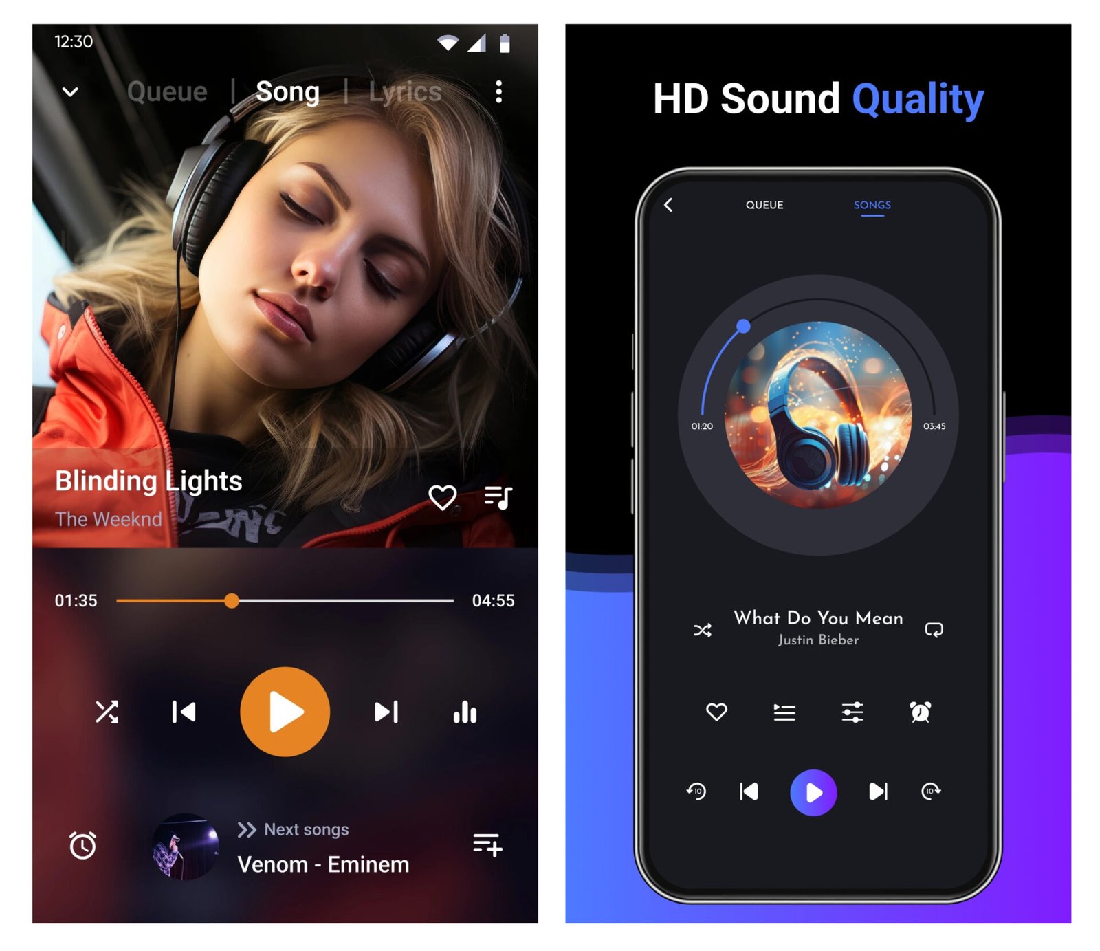
Media Card
It displays multimedia content, such as photos, videos, or audio. It is ideal for galleries, video libraries, and streaming platforms.
Common elements include media thumbnail, title, play button, duration, and minimal description.

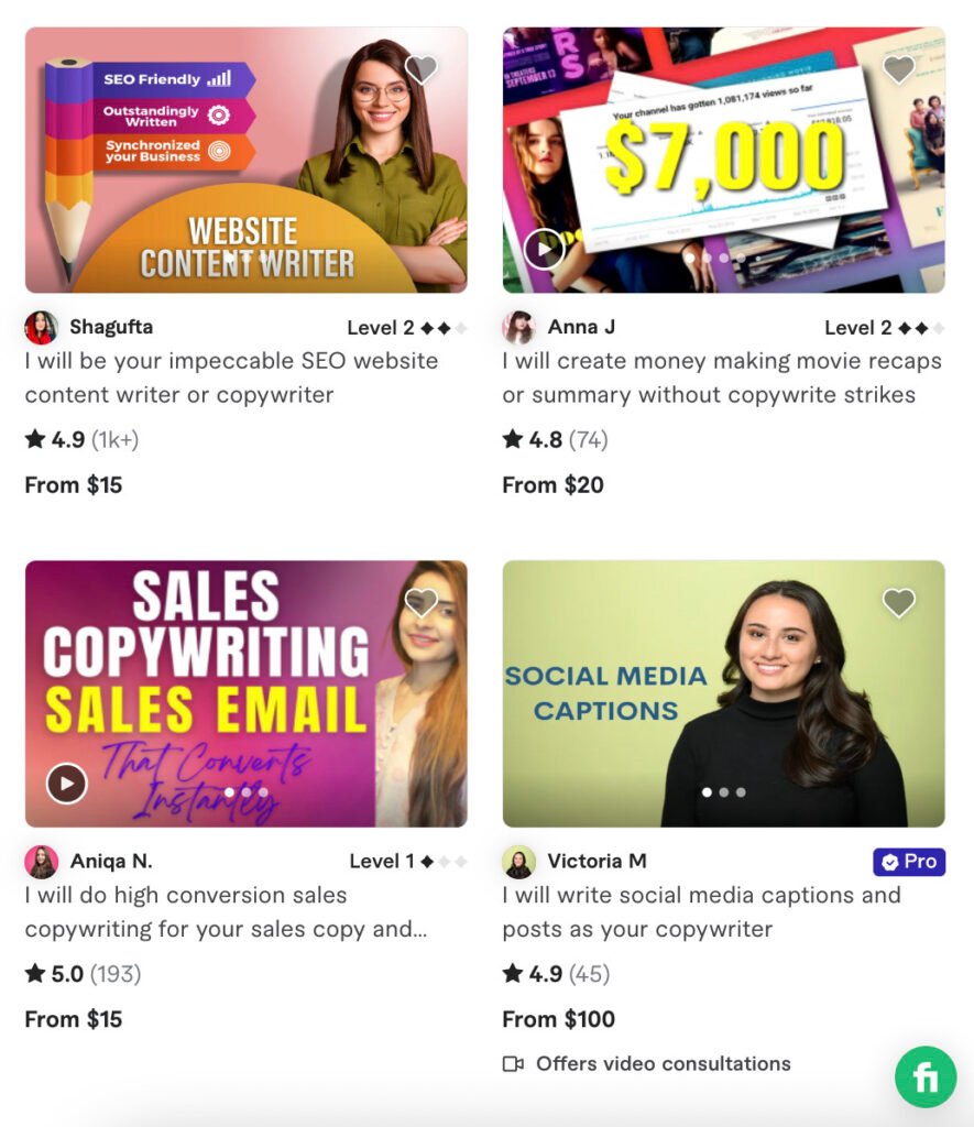
Service Card
A service card summarizes services or features offered by a business, product, or website. It is used frequently on SaaS platforms and service websites to present various options.
Common elements include icon or image, service name, short description, and action link.
A few other card types include:
- Article or news card
- Event card
- Recipe card
- Contact card
- Testimonial card
- Weather card
- Task or To-Do card
- Location or map card
- Job Posting card
- Pricing card
Conclusion
Cards are a powerful component of UI design, combining visual appeal with functionality.
UX designers can create an engaging interface by following the given best practices.
Remember, well-designed cards ultimately contribute to a better user experience.
Want to Learn UX Design?
- Try Interaction Design Foundation. IxDF offers online design courses covering the entire UX design spectrum, from foundational to advanced level. As a UX Design World reader, you get 25% off your first year of membership with the IxDF.
- The UI/UX Design Specialization from Coursera brings a design-centric approach to user interface and user experience design and offers practical, skill-based instruction centered around a visual communications perspective. By learning this Design Specialization, you can design high-impact user experiences for your customers.
Thanks for reading.
Subscribe to more related articles on UX World.
If you have any questions, contact us here: Facebook | YouTube | Instagram | Linkedin