Last Updated on July 25, 2024 by UX World
A tooltip is descriptive textual information that appears when the users hover or tap a UI element on the screen. The tooltip describes a brief explanation of the targeted UI element, making it easier for users to interact with the interface.
Tooltips provide immediate assistance without disrupting the user’s workflow. They allow the users to access help as needed, reducing the visual clutter on the UI
To design tooltips that truly enhance the user experience, it’s essential to follow a set of best practices.
Key Takeaways
- Tooltip is a small UI element that needs careful design consideration.
- Tooltips should display a clear and concise message that helps users understand the UI interactions. Avoid using technical jargon.
- Use a consistent tooltip design across the application.
- Use proper time and placement to display your tooltips.
- Take care of accessibility guidelines while designing tooltips.
- Do not overuse tooltips and use only where necessary.
- Do not use tooltips to display critical information.
- Consider mobile users while designing tooltips.
How to Design a Tooltip in Figma?
See the tutorial for designing a tooltip in Figma below.
Tooltip Design Best Practices
Below are a few best practices that help you design effective tooltips for your application.
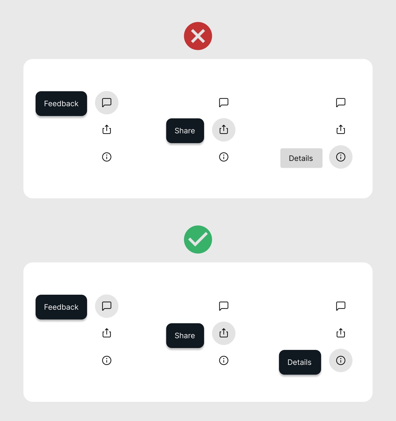
- Clarity and Conciseness
- Placement and Timing
- Tooltip Trigger
- Visibility and Accessibility
- Consistency
- Testing and Iteration
1. Clarity and Conciseness
- Provide tooltip text that helps the user understand the meaning of the UI element.
- Do not use jargon and complex language. Otherwise, the purpose of the tooltip will not be fulfilled.
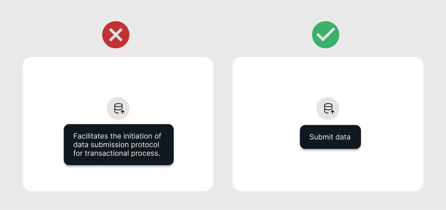
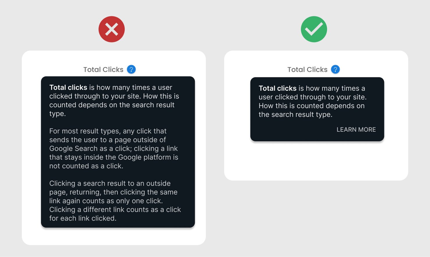
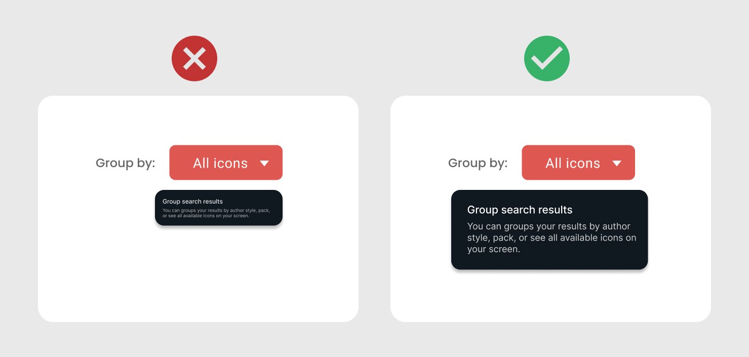
- Keep the message short and to the point. Lengthy tooltips are hard to read and take time to understand, thus contributing to an annoying experience.
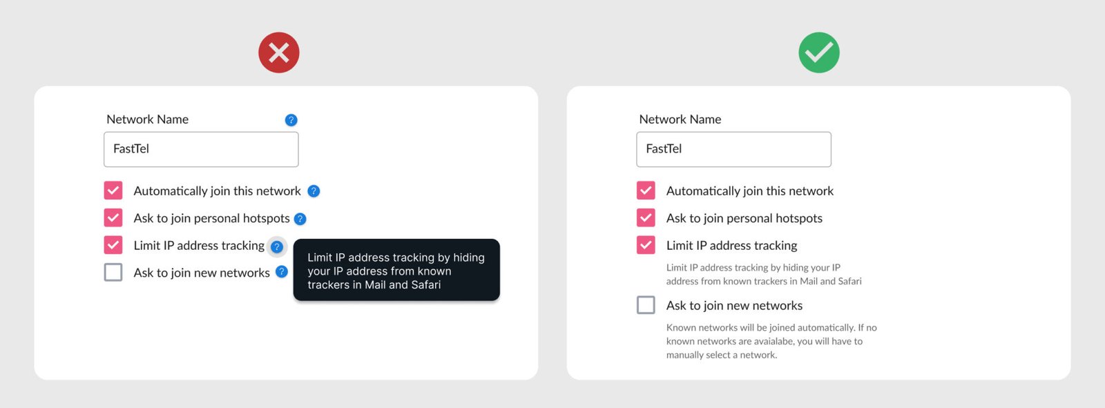
If you have large information to display in a tooltip, go for another UI control like a pop-up. Also, you can display a Learn more, See details kind of text in the tooltip to view the details related to the focused UI element.
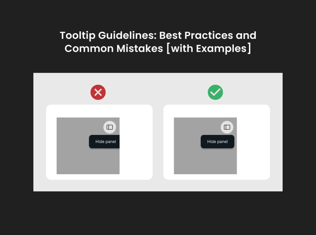
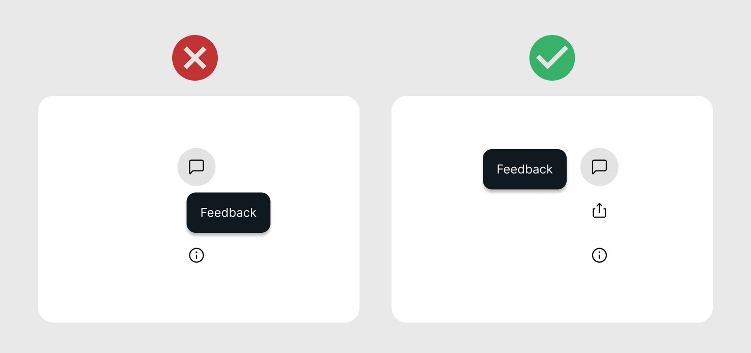
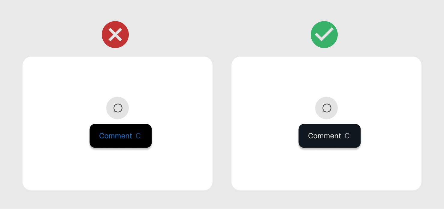
- Do not use redundant text of the UI label in the tooltip. It does not provide any additional information to the user. Sometimes it becomes unavoidable to maintain the consistency on the UI.
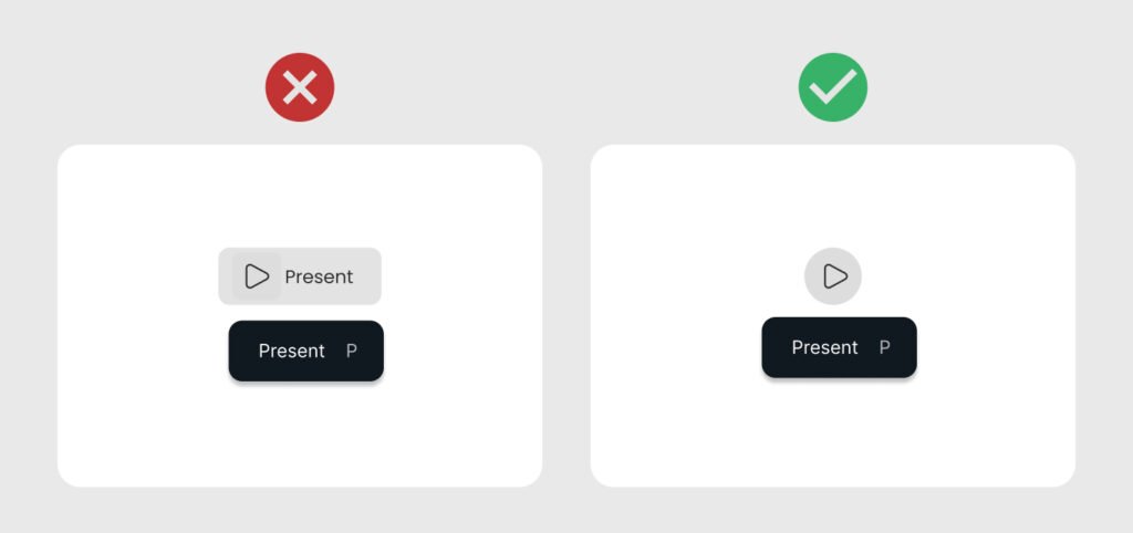
An important thing to consider here is maintaining the consistency. Sometimes you have to provide tooltips with all UI elements on the screen to provide a similar experience. If users see tooltips on most links, buttons, or icons, they will expect to have them on all the elements.
Instead of removing the redundant tooltip, it would be better to make useful tooltips for all such elements (or none, if the links are self-explanatory).
- The primary purpose of a tooltip is to convey a clear and effective message. The more concise and impactful the message, the better the user experience. Instead of focusing on the number of characters you can fit into the tooltip, consider what essential information you need to communicate to the user.
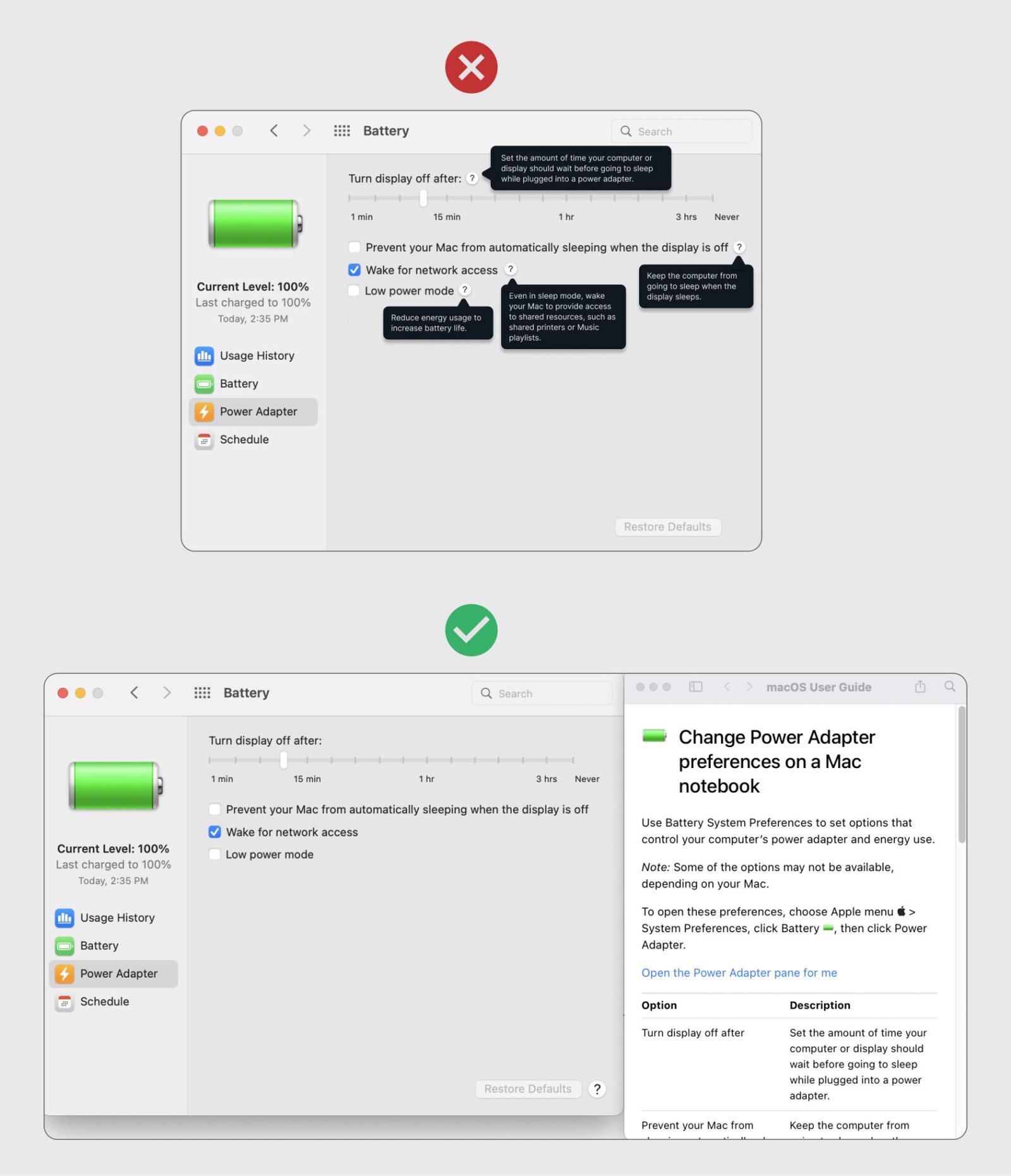
2. Placement and Timing
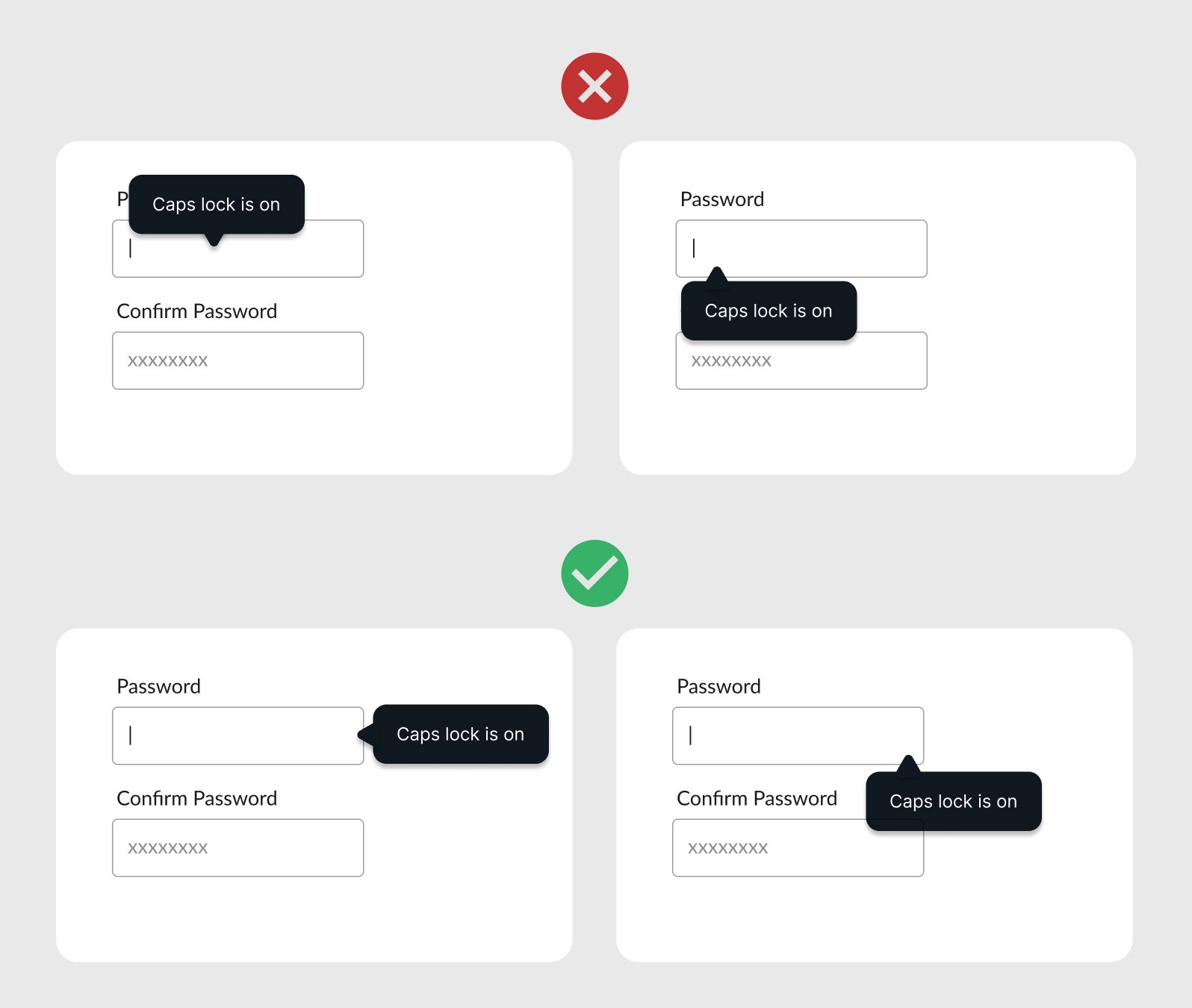
Place the tooltips near the relevant UI elements so the users can relate to them easily.
- Since tooltips can overlap the UI elements, place them in a position that does not interrupt the user flow.
- If tooltips block the content users want to see, they will move the mouse to close the tooltip and then see the required information. Ensure the tooltips do not block elements users need to complete their tasks.
- The placement of tooltips depends on the window you are working in. The placement should adjust itself according to the screen size. For example, a tooltip displays below a UI element adjusts itself to the top when the window is opened in a full-screen view.
- If you are working on a form where the users move through options from top to bottom, placing the tooltip on top of the UI element is a better idea. Since the user has already worked on the UI options above, it does not matter if a tooltip hides them for a while.
- Adjust tooltips to a place where they should not cut off from any side of the window.
- The visibility duration of a tooltip should depend on how effectively your target audience can read and understand its message. It’s more user-friendly to close a tooltip when the user removes the cursor from the UI element rather than making it disappear after a defined time.
3. Tooltips Triggers
Tooltips appear in two ways.
(i) When the user hovers over a UI element, its details are displayed in a tooltip. The tooltip disappears as soon as the cursor leaves the UI element.
The user has to hover over UI elements to see if a tooltip appears.
(ii) When the user clicks an Info or Help icon with a UI element, its details are displayed in a tooltip. The tooltip disappears either when the user clicks the icon again, or clicks outside the tooltip area.
This method can create clutter on the UI if there are too many options with an Info or Help icon.
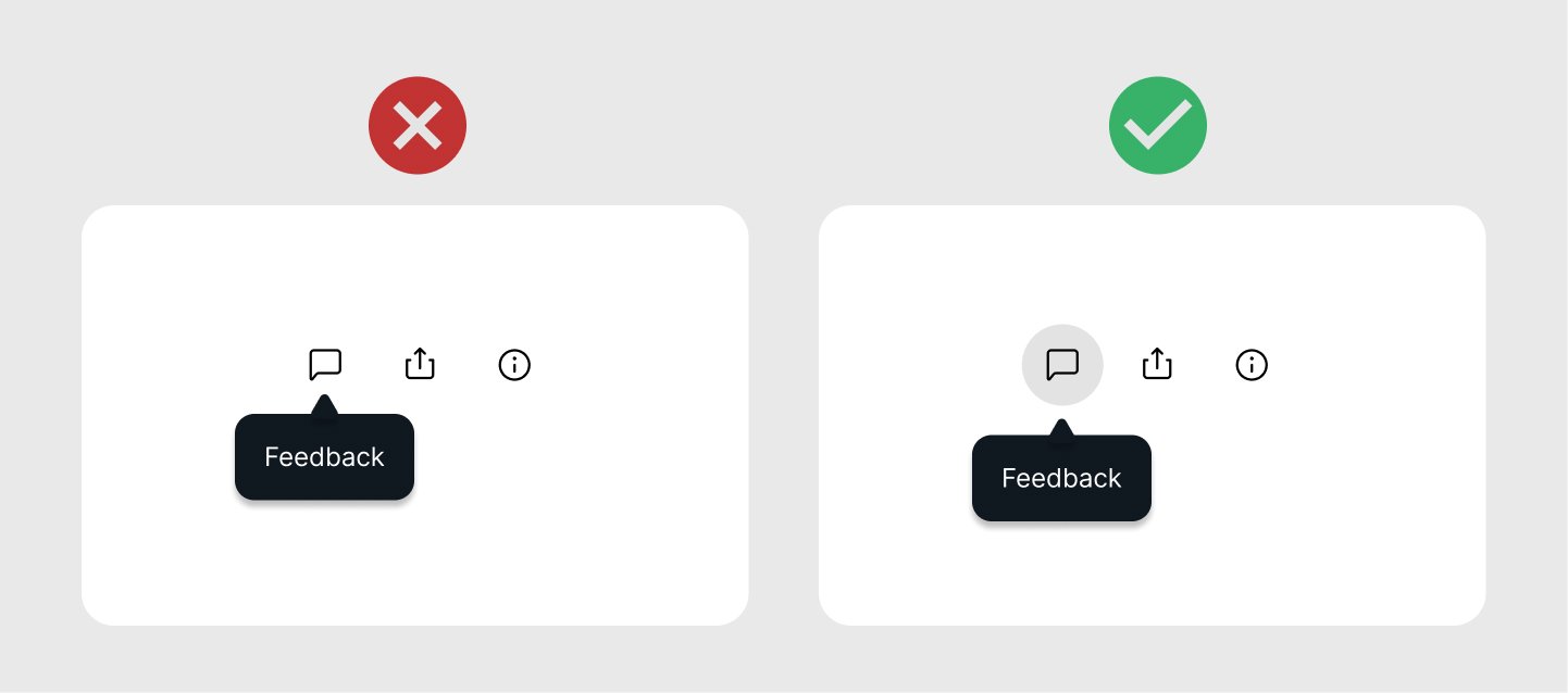
4. Visibility and Accessibility
Make sure tooltips are visible and readable.
- Tooltips must be visible and readable to all users, including those with disabilities. This involves using high-contrast colors and legible fonts. Also, ensure that tooltips remain visible for a reasonable amount of time.
- Choose the tooltip and font colors that are visible over the background UI. Use a clear contrast against the background.
- Make tooltips accessible for all users, including those with disabilities. Users with visual impairments cannot read light-grey tooltips with a white background.
- A tooltip is a small UI element that displays for some time. Choose a font size that is easier to read and understand. Adjust the spacing between characters to make the text readable. Consider using a reasonable line spacing where multiple lines are being used.
- Accessibility considerations also include providing keyboard navigability and screen reader support, making sure that all users, regardless of their abilities, can benefit from the tooltip information.
5. Consistency
Maintaining a consistent style and behavior for tooltips across the interface helps users predict and understand their function.
- Your product should use a consistent visual design of the tooltips. The user should be able to recognize and get familiar with the design and style of tooltips. Deciding on styling guidelines helps to create consistent tooltips.
- The time it takes to appear tooltips on hover should be consistent.
- The trigger to display the tooltip should be the same. For example, if tooltips are triggered by hovering over elements in one part of the interface, the same should apply throughout the application.
Consistent design ensures a more intuitive user experience and reduces the learning curve.
6. Testing and Iteration
User testing is essential to validate the effectiveness of your tooltips.
- Conduct usability tests to gather feedback on how users interact with the tooltips and whether the information provided is helpful.
- Iterate based on user feedback as it will help improve the clarity and functionality of tooltips.
Tools like A/B testing can be useful to determine which versions of tooltips perform best in terms of user engagement and satisfaction.
Common Mistakes to Avoid
Below is a list of common mistakes related to the tooltip design that can be avoided by following the best practices.
- Overuse of Tooltips
- Poor Timing and Placement
- Inconsistent Design
- Neglecting Mobile Users
- Displaying Critical Information
1. Overuse of Tooltips
No doubt, the tooltips are helpful for users and guide them through their interactions with an app or website. At the same time, overuse of tooltips can be overwhelming for users.
- Do not provide unnecessary tooltips as it will diminish their effectiveness. If every element on the screen has a tooltip, users may become overwhelmed or ignore them altogether.
- Tooltips cover up the area underneath them. Many tooltips on UI can be annoying as they interrupt the flow instead of being helpful for users.
- Tooltips should be used sparingly and only when they add significant value by providing essential information or clarifying complex features.
2. Poor Timing and Placement
Improper timing and placement of tooltips can frustrate users.
- Tooltips that appear too quickly or remain there for too long can be distracting. If tooltips display at a random interval when users mouse over a UI element, it can be frustrating. Use a reasonable consistent time to display the tooltip as soon as the user hovers over the element.
- Similarly, tooltips that appear far from the relevant UI element can confuse users. At times, the tooltip text is cut off and not properly visible. This can lead to a poor user experience. Tooltips need to adjust their position intelligently.
- The best practice is to place tooltips near the associated element and ensure they appear and disappear in a natural and non-intrusive manner.
For instance, hover-triggered tooltips disappear as soon as the UI element is no longer focused by the user’s mouse.
3. Inconsistent Design
Keep the tooltip design uniform across the application. Inconsistent tooltip design can confuse users and create a fragmented user experience.
Since the tooltip is a small UI control, a consistent style guideline and theme can be ignored.
- Make sure to define a consistent layout of tooltips across the product. This includes shape, size, color, fonts, placement options, and trigger methods.
- Consistent design helps users understand how and when to use tooltips, also it contributes to a more cohesive and professional-looking interface.
4. Neglecting Mobile Users
Tooltips are usually designed solely with desktop users in mind. The same definition when applied to mobile devices does not work well.
- Tooltips’ behavior for mobile devices needs to consider touch interactions. Design tap-triggered tooltips that can easily disappear on touch devices.
- Using a Help icon can create clutter on small screens. Tapping icons can display a tooltip, whereas a dotted line under text can indicate the presence of a tooltip for textual information. The reason for using a dotted line is to distinguish it from a link.
- Tapping again on a tooltip should close it.
- If you want to display a piece of information when the user opens a screen, you can use a tooltip. For example, displaying stats of your notifications on TikTok, Instagram, etc.
5. Displaying Critical Information
If some information is always needed to complete a task, you should keep it visible along with the relevant UI element on the page.
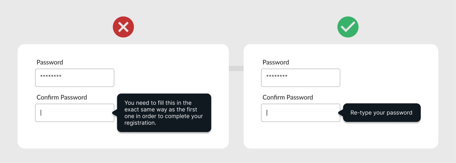
- For example, the criteria for a password should always be visible so the user can fulfill those requirements. In many places, the password requirements appear in a tooltip when users hover over a UI element (like an icon).
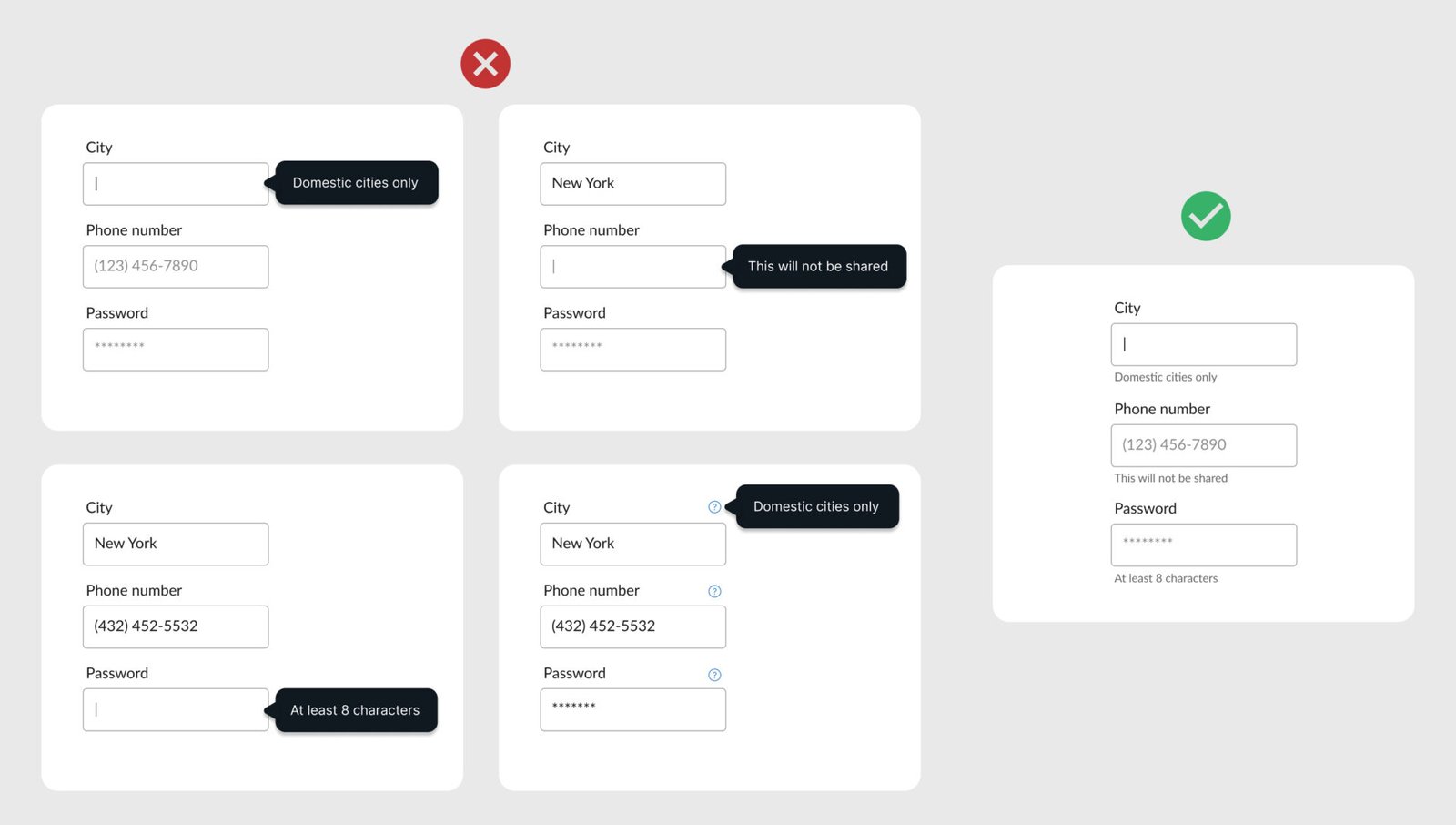
It is better to keep critical information visible so the users know about it without hovering or clicking anything.
Read more about Tooltips
- Tooltip Guidelines
- Tooltip Guidelines and Best Practices
- Tooltip: A Small UI Element with Big UX Impact
Want to Learn UX Design?
- Try Interaction Design Foundation. IxDF offers online design courses that cover the entire spectrum of UX design, from foundational to advanced level. As a UX Design World reader, you get 25% off your first year of membership with the IxDF.
- The UI/UX Design Specialization from Coursera brings a design-centric approach to user interface and user experience design and offers practical, skill-based instruction centered around a visual communications perspective. By learning this Design Specialization, you can design high-impact user experiences for your customers.
Thanks for reading.
Subscribe for more related articles at UX World.
If you have any questions, contact us here: Facebook | YouTube | Twitter | Instagram | Linkedin