Last Updated on June 23, 2024 by UX World
What is An Empty State in UX Design?
An empty state refers to the state of an application where the user interface (UI) does not have any content or data to display. This can happen when a user launches an app or website, performs a search that returns no results, or something goes wrong when the user interacts with the UI.
An empty state can be considered a way to communicate with the user about something useful. It can be the real purpose of your application, or it can be an action to resolve the empty state.
For example, an empty search result can display a message that no results were found and suggestions for alternative search terms so the user can continue interacting with the UI.
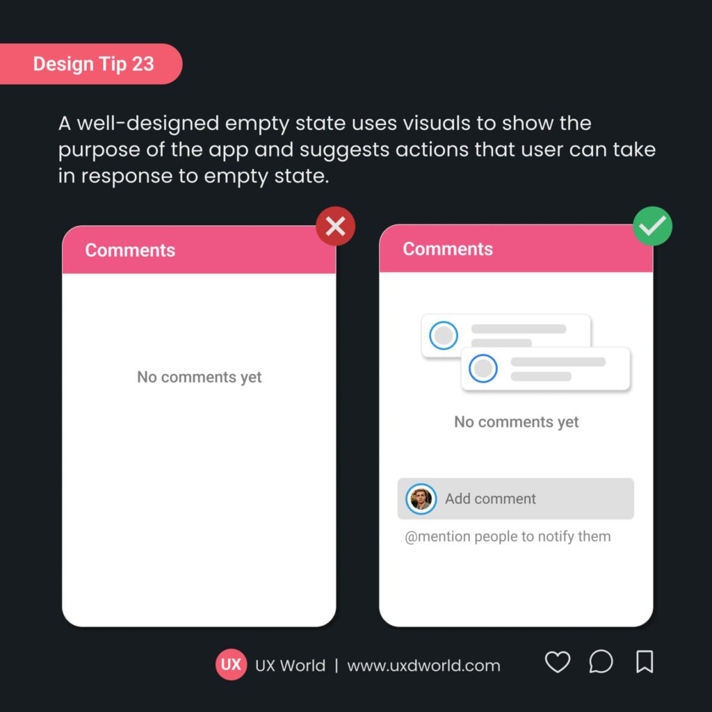
Empty states should be designed carefully as they make an impression on your user. A well-designed empty state guides the user and provides a clear path forward, while a poorly designed empty state can be confusing or frustrating.
Key Takeaways
- There are multiple types of empty states and you can use them depending on the scenario. For example, an empty state for a new user, an empty state for no content, an empty state for zero search results, etc.
- A well-designed empty state guides the users by suggesting the actions they can perform to continue interacting with the application. For example, perform a search, explore a feature set, create a new item, connect to a data source, and contact support.
- Design an empty state that is simple, visually appealing, matches the context, describes the purpose, and presents a suitable action that users can perform to move forward.
Learn to design an Empty state in this video tutorial.
Types of Empty State
There are different types of empty states that can be used at various places in your application.
1. Initial empty state
This empty state displays when a new user opens an application that has no content to display. This can be common when a user starts using your application.
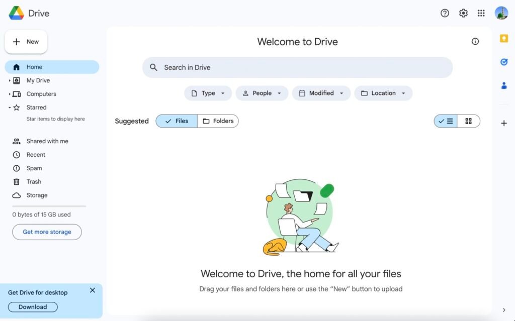
2. Empty search results
This is the state of the UI when a user performs a search and no results are found.
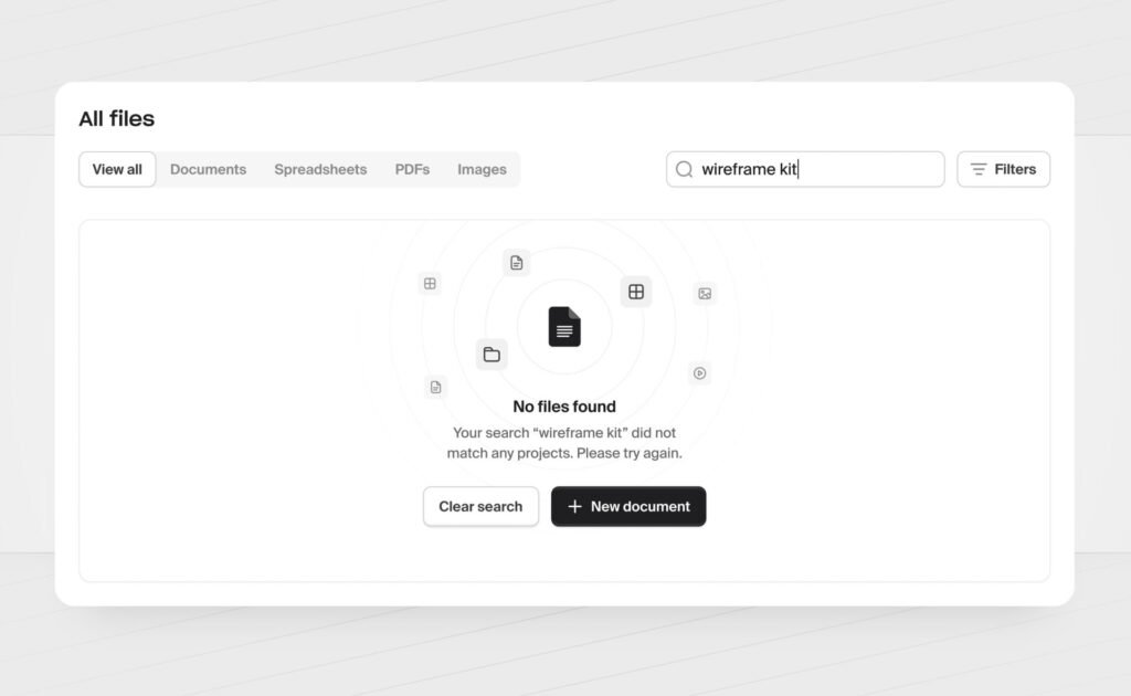
3. No data available
This can happen when a user has not entered any data into the application, or when there is a temporary issue with the source of data.
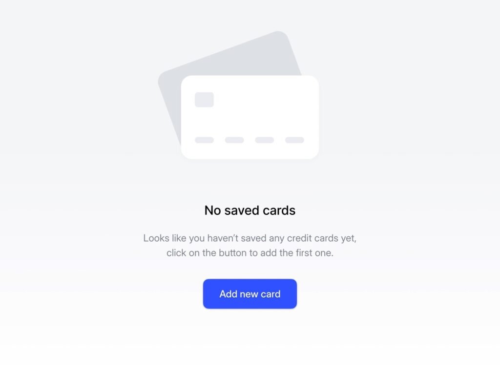
4. No Internet connection
This scenario occurs when users have a connectivity issue and they cannot access content from the Internet.

These are the most common types of empty states. There can be other types depending on the context of your application.
How Does Empty State Impact the UX of an Application?
Usually designing the empty states is ignored when UX designers work on an application. There are several reasons behind this.
- One of the main reasons is the lack of understanding of the importance of empty states, and UX designers usually prioritize other areas of the application.
- Other reasons can be (i) lack of time, or (ii) assuming that the application will always have something to display on the UI.
A well-designed empty state helps improve the user experience of your application in several ways.
Communicate the purpose
The user should learn something from an empty state like what the application does and how it can be used. This is particularly important for new users who may not be familiar with the application.
Guide the user
An empty state suggests actions the user can perform to view the desired content, such as searching or creating a new item. This helps to reduce the confusion about what to do next.
Help to avoid frustration
A poorly designed empty state can be confusing or frustrating for users, thus leaving a negative impact. On the other hand, a well-designed empty state minimizes frustration and improves your application’s overall experience.
A proper UX design for empty states is important because it helps to ensure that users understand the purpose of the application and know what actions they can take to achieve the desired goals.
Tips to Design an Effective Empty State
Below are a few tips for designing effective empty states for your application.
1. Communicate the Purpose of Your Application
Use the empty state to explain the purpose of the Application like what it does and how it can be used.
2. Suggest Actions that User Can Take
Suggest actions the user can take to populate the interface with content, such as performing a search or creating a new item.
3. Use Visuals
Use illustrations or other imagery to help the user understand the purpose of the app or website, or to suggest actions that the user can take.
4. Keep the Design Simple
Avoid cluttering the empty state with too much text or many elements. Keep the design simple and focused on the key message or action you want the user to take. A simple empty state design includes a title, description, image, and action.
5. Validate Designs with Users
Test and validate the empty state with real users to get their feedback. Use this feedback to improve your design.
6. Consider the Context
Think about the context in which the empty state will appear and design it accordingly. For example, if the empty state displays when the user has no internet connection, it should include a message about the loss of connection and suggestions for alternate actions.
Actions to Provide in Empty State
When designing empty states for your application, it is important to suggest actions that the user can take to explore the features of the application. Below are a few examples of actions you can show in empty states.
- Perform a search: If your application has a search feature, suggest the user to search for the content they are looking for.
- Create a new item: If the user is new to your application, you can suggest creating a new item to display something on the screen.
- Explore feature set: Provide an action to allow users to explore other application features and find the content they want to see.
- Connect to a data source: If the application relies on a data source to load the interface with content, you can suggest that the user connect to the data source to retrieve the content.
- Contact support: If users are facing an issue and cannot access the content, suggest them to contact support for assistance.
Examples of Well-Designed Empty State
Below are a few examples of well-designed empty states.
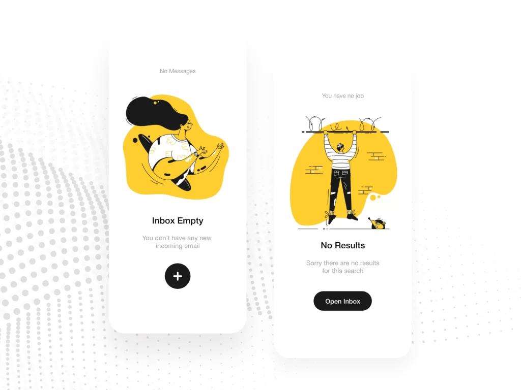

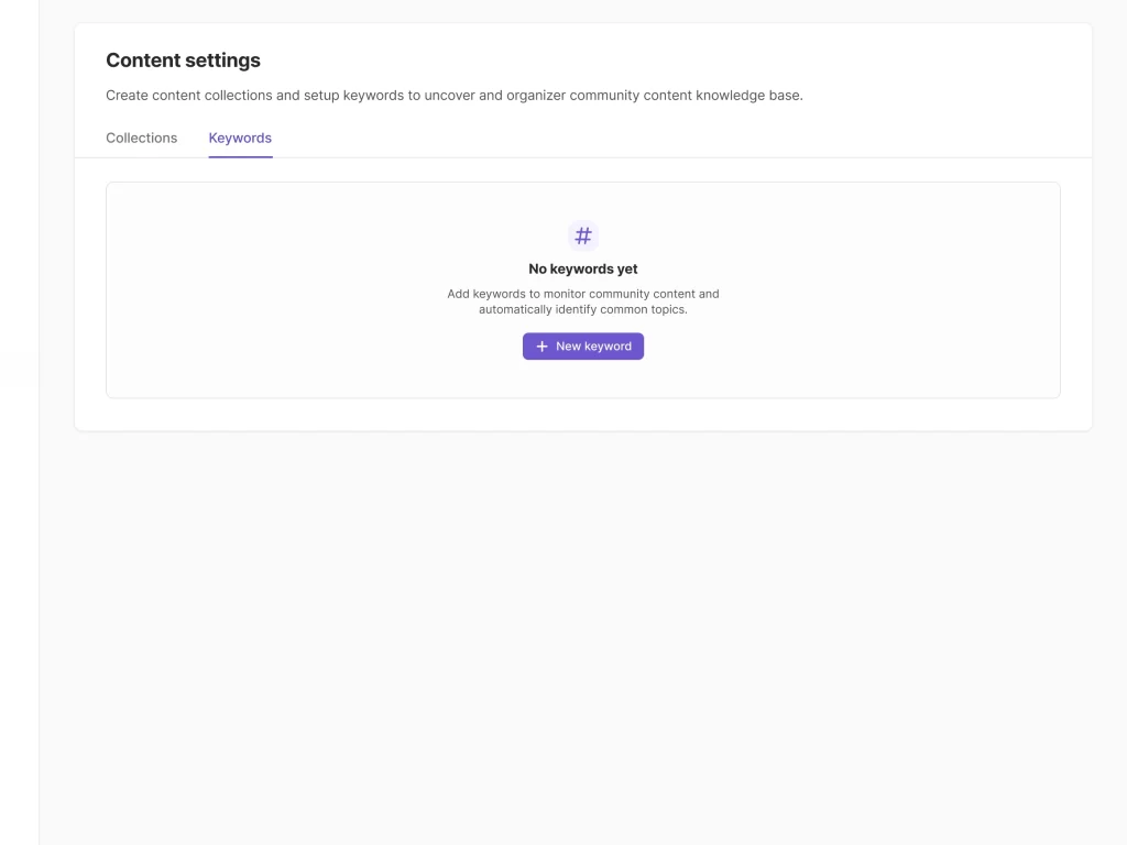

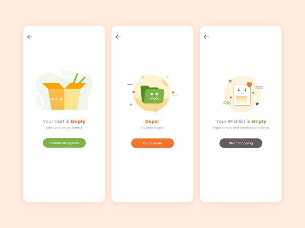
Conclusion
In summary, a well-designed empty state can positively impact the user experience of an application and can help increase user engagement and understanding.
Following the mentioned tips and guidelines, you can use empty states to educate your users about the application and its working. UX designers should design empty states that improve the user experience of their product, even when there is no content to display.
Want to Learn UX Design?
- Try Interaction Design Foundation. IxDF offers online design courses that cover the entire spectrum of UX design, from foundational to advanced level. As a UX Design World reader, you get 25% off your first year of membership with the IxDF.
- The UI/UX Design Specialization from Coursera brings a design-centric approach to user interface and user experience design and offers practical, skill-based instruction centered around a visual communications perspective. By learning this Design Specialization, you can design high-impact user experiences for your customers.
Thanks for reading.
Subscribe for more related articles at UX World.
If you have any questions, contact us here: Facebook | YouTube | Twitter | Instagram | Linkedin
