Last Updated on November 27, 2023 by UX World
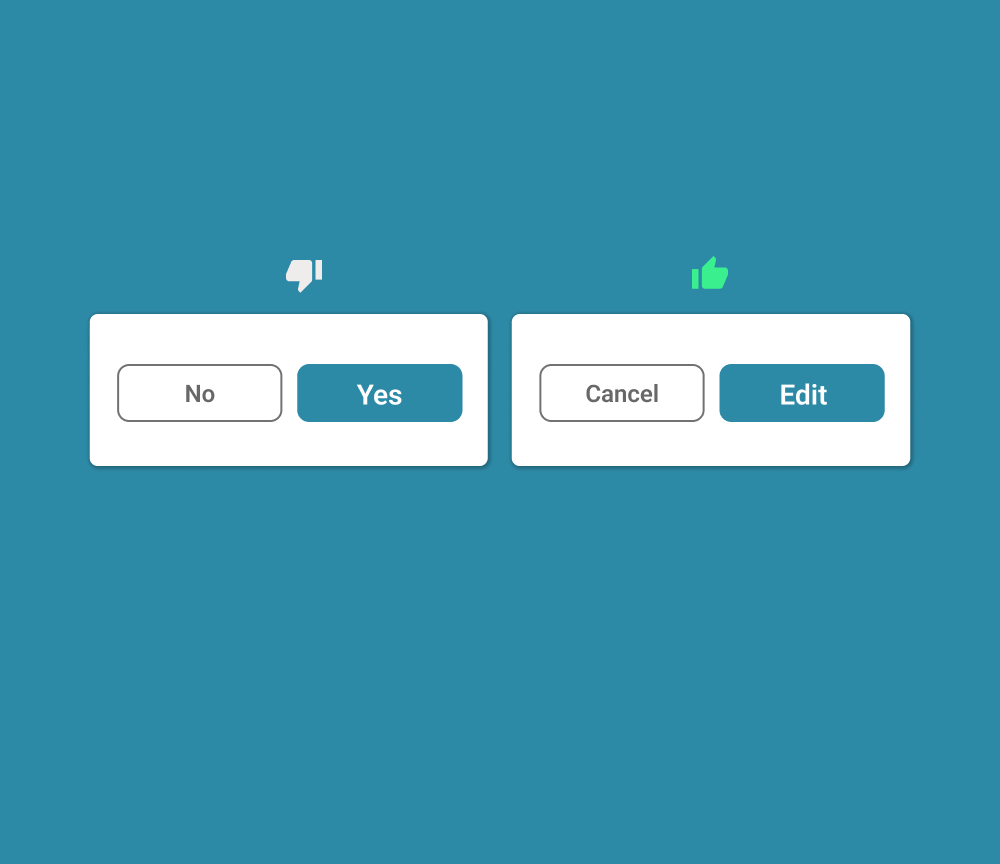
Writing button labels is thought to be one of the easiest and most unimportant tasks in UX design. But the reality is that this task has a very strong impact on the users’ minds. The message written on buttons serves as a means of communication between your product and users.
So if your button labels are confusing or not clear enough for the user to understand then the user is most likely to make mistakes and put some extra effort into performing his operation or a task.
Below are written a few best practices based on the examples of a college online admission form. These tips will become handy upon writing button labels in your design. By following these tips you will be able to write clear information on your buttons which will be easily understandable by users.
1. Use Active Verbs
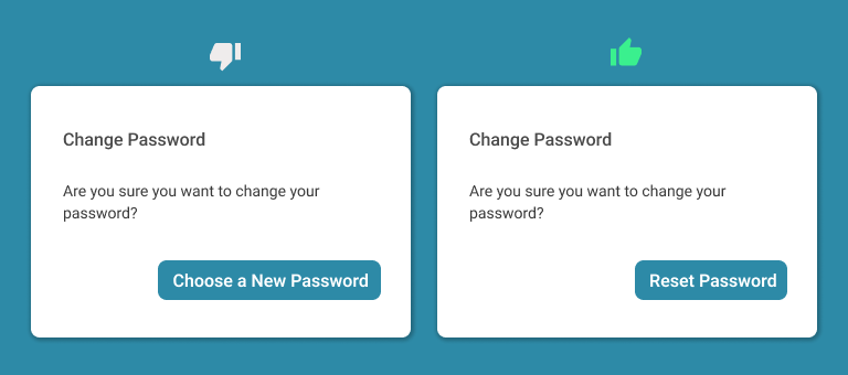
Your button labels must contain verbs that reflect the action that is to be done. After selecting a suitable action verb you will then pair it with a noun.
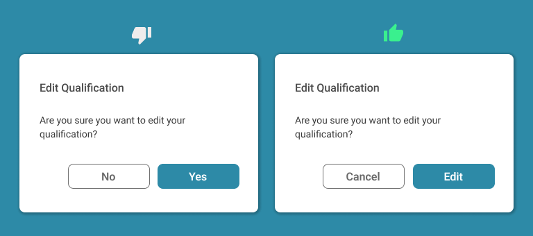
In the above image, you see that instead of using yes/no it’s advisable to use an action verb for the respective action. The action listed in the above text is “Are you sure you want to edit this information?” So this action reflects the verb edit qualification. Here action verb is “edit” and it has been paired with the noun “qualification”.
2. Explain the Future Action
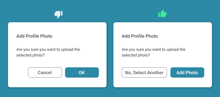
Explain to your users what will be the result of pressing the given button. In this case, users won’t hesitate to press the button. Moreover, the minimum effort of the user will be required in completing the operation because a user will clearly know what will happen next if he/she presses the given button.
3. Use Short Labels
Provide short and concise labels on your buttons that clearly show the user what action will be performed upon clicking that button. You should truncate unnecessary words.
4. Don’t Use Negative Actions
In case you provided an option to the user that he can cancel his operation and perform a new operation all over again then you will most likely write the word cancel in your button. But unfortunately, that’s not the right way. By doing this your user can get confused because you are canceling the cancelation.
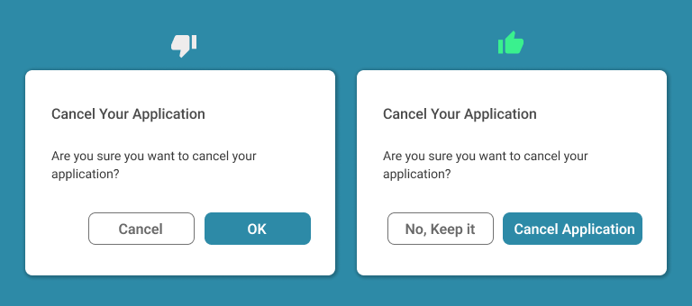
In the above image, we see the word cancel written on the button. Now if the user wants to cancel his application then he can click on the cancel button which will not perform his required operation rather the user will be thrown back to the previous screen where he will have to put in more time and effort to do his operation of canceling the application again.
5. Don’t Wrap Your Labels
A button label should remain on a single line. If you will put very rich information in a single button then your user can get confused. To avoid this you must be concise in writing a text on buttons that will show a clear picture to the user.

Conclusion
When it comes to button conversions, even a small word change can have a big impact on your user’s mind. So you must keep this thing in your mind and keep your words concise, simple, and to the point which does not have the potential to puzzle your users. By ensuring this you can expect a smooth and relaxed working on your designed product.
Want to Learn UX Design?
- Try Interaction Design Foundation. IxDF offers online design courses that cover the entire spectrum of UX design, from foundational to advanced level. As a UX Design World reader, you get 25% off your first year of membership with the IxDF.
- The UI/UX Design Specialization from Coursera brings a design-centric approach to user interface and user experience design and offers practical, skill-based instruction centered around a visual communications perspective. By learning this Design Specialization, you can design high-impact user experiences for your customers.
Thanks for reading.
Subscribe for more related articles at UX World.
If you have any questions, contact us here: Facebook | YouTube | Twitter | Instagram | Linkedin
