Last Updated on July 11, 2024 by UX World
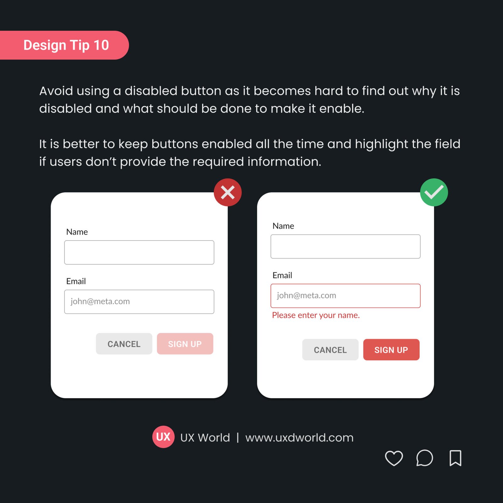
While designing the UI, avoid using a disabled button as it becomes hard to find out why it is disabled and what should be done to enable it.
It is better to keep buttons enabled all the time and highlight the field if users don’t provide the required information.
For detailed discussion on disabled buttons usability issues, see this article.
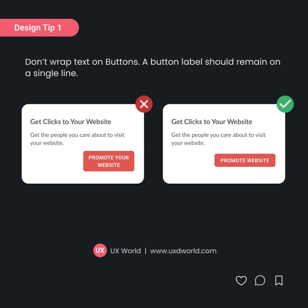
For tips on button labels, see this article.

Want to Learn UX Design?
- Try Interaction Design Foundation. IxDF offers online design courses that cover the entire spectrum of UX design, from foundational to advanced level. As a UX Design World reader, you get 25% off your first year of membership with the IxDF.
- The UI/UX Design Specialization from Coursera brings a design-centric approach to user interface and user experience design and offers practical, skill-based instruction centered around a visual communications perspective. By learning this Design Specialization, you can design high-impact user experiences for your customers.
Thanks for reading.
Subscribe for more related articles at UX World.
If you have any questions, contact us here: Facebook | YouTube | Twitter | Instagram | Linkedin


