Last Updated on December 3, 2024 by UX World
Designing sign-up and login pages is considered a simple task among UX designers and sometimes they do not pay much attention to this. From the users’ perspective, the onboarding experience of a website or app is as important as other features.
No doubt, this is a simple process, however, ignoring these tiny details can destroy the overall experience of your app.
Why designing a good experience for the onboarding process is important for your users?
Sign-up and Login page design
When users come to your site, registration is the first step that indicates the trust of your users in your site. Registering to a site is the beginning of a relationship that users want to have with your site as well as your business.
If the users get a trustworthy and secure process in addition to a simple and easy experience, they are confident to provide their information on your site. If the users find a poor and painful design where they are being asked to provide personal information, they will not take a risk.
Moreover, the users need to log in each time they visit the site. This also raises the need for a simple login page that does not overwhelm the users and they can easily follow a few steps to log in.
Below is a list of best practices that will help you design a simple and efficient onboarding process for your site.
- Allow sign-up with social media accounts (one-click registration)
- Don’t ask for password confirmation
- Indicate the Caps Lock option
- Provide instant input validation
- Show password requirements clearly
- Use a relevant button label
- Allow switching between sign-up and login
- Use email instead of username
- Indicate clearly why the password is invalid
- Split up the lengthy registration process
- Allow easy password recovery
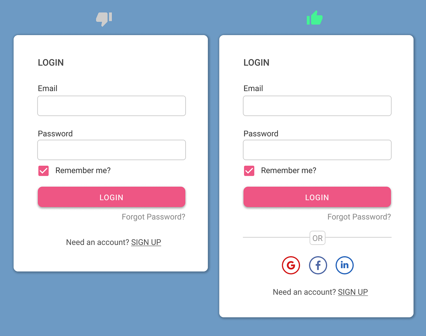
- Provide the Remember Me option
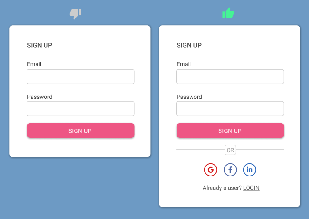
1. Allow sign-up with social media accounts (one-click registration)
Using existing social media accounts to sign-up for a new application is becoming popular among users.
This provides the user with a quick and efficient process to get registered without going into the hassle of creating a new account and providing all the information from scratch. The users feel more comfortable since they need to just click on a social media sign-up button to get into the application.
Since using an existing account to log into an application does not require users to create a new account, it also eliminates the process of setting a new password and remembering it each time when they come back to use the application.
2. Don’t ask for password confirmation
It seems that the Confirm Password field helps users avoid the chance of misspelling their password while signing up for the application. However, it decreases the sign-up form conversion rate.
The process involves several steps. Entering a password the first time, then entering it a second time, if it does not match the system will prompt an error, however, the users are not able to see and find the error. They should remove both passwords and re-type them again without any clue. The process can repeat itself multiple times, hence increasing users’ frustration.
A better solution that is quick as well as efficient is to provide a Show Password option with the Password field. The users can click the option, see the password they are entering, and hence make instant corrections if required.

3. Indicate the Caps Lock option
Commonly, the Caps Lock Key is accidentally pressed while working on a computer. The expected behavior in sign-up and login pages is to indicate to the users about this when they are trying to enter the password.
If the users are not aware of whether the Caps Lock key is ON or OFF, they can enter an incorrect password based on their assumption. This will raise an error when the set password does not match while signing in to the app or site. This is a simple solution to indicate to the users as soon as they enter the password in the field and hence helps to avoid any unexpected errors while reusing the password again.

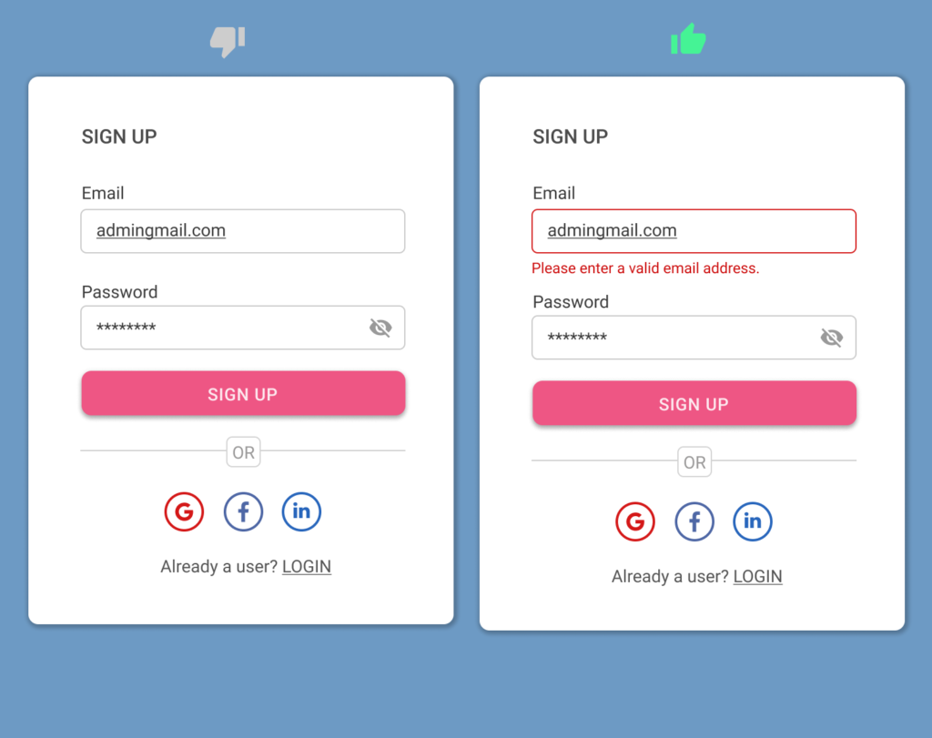
4. Provide instant input validation
Instant input validation is a way to increase the usability of your sign-up and login pages. The users do not have to wait to submit the form to see any errors that need their attention. Instant validation helps them easily relate the feedback with the input they have just provided and they can correct it in no time.
There are a few important factors to remember while providing a useful instant validation.
- Display the message only when the user just left the input field.
- Providing a positive error message helps the user to build their trust in your product. Also, the error message should explain well about the problem and how to resolve it.

 UX World is an approved Educational Partner of the Interaction Design Foundation, the world’s largest UX Design learning community.
Get 3 months of free membership to learn UX Design here!
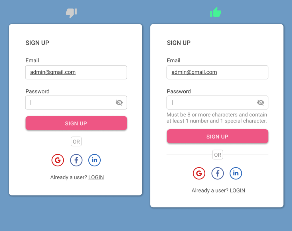
5. Show password requirements clearly
Always show password requirements to the users and do not assume that they must be aware of the strong password rules. Display the requirements near the password control so that users can see them while entering the password.
This is not a good practice to hide the password requirements in the default view and show them only when the user enters a weak password. This will both waste the users’ time as well as lose their confidence in your product.
6. Use a relevant button label
A common practice to provide a good user experience is to use the button label according to the action the user will perform while clicking that button. The button label should always define its purpose on the screen.
Providing a generic button will make it difficult for the user to relate it with the action and there is a chance that they will forget what they want to do on the screen.

7. Allow switching between sign-up and login
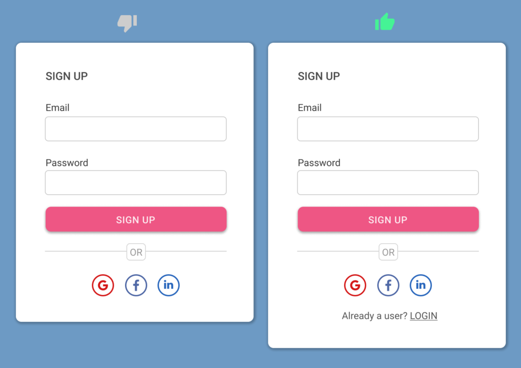
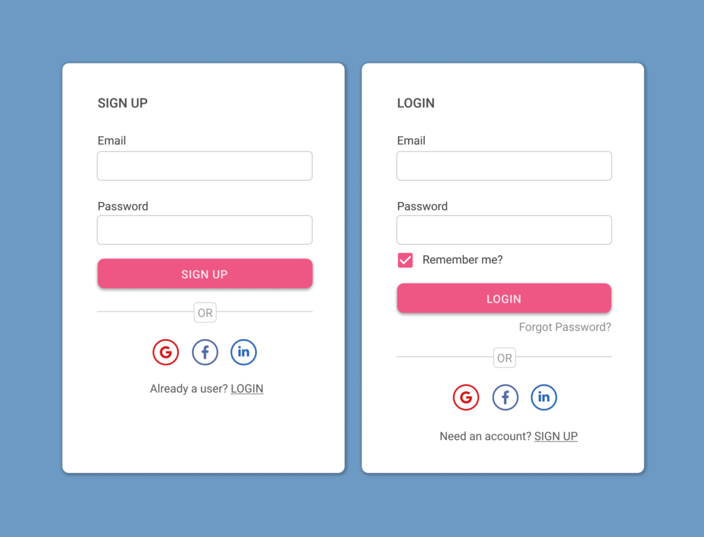
The user should be able to switch between login and sign-up forms when they reach your site or app. Provide an easy way to find the Login when the user is on the Sign-up page and Sign-up when the user is on the Login page. Both new and existing users will come to your site, so there is always a chance to switch between the two.
It will give an annoying experience to the users if they are unable to find the sign-up on a login page or vice versa.

8. Use email instead of username
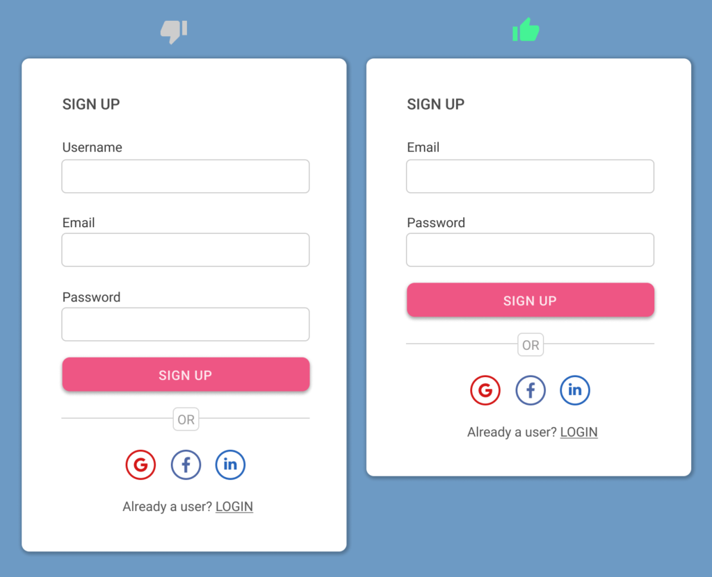
Avoid asking for usernames when users are getting registered on your site or app. It is always hard to remember a username for users, and even at times, users have to compromise on the selection of a username depending on the availability of a unique one. This makes it easier to forget multiple usernames for different sites.
Instead asking for an email address or a phone number helps users to come back and log in again easily without recalling the usernames.
9. Indicate clearly why the password is invalid
It is not a good practice to leave the users trying and guessing the reason why their password is invalid. Like any other error message, explain the clear reason why the entered password is invalid and how the user can make it correct.
It becomes very annoying for the users if they keep on trying and entering the passwords on a hit-and-trial basis. This leads to a frustrating user experience.

 UX World is an approved Educational Partner of the Interaction Design Foundation, the world’s largest UX Design learning community.
Get 3 months of free membership to learn UX Design here!
10. Split up the lengthy registration process
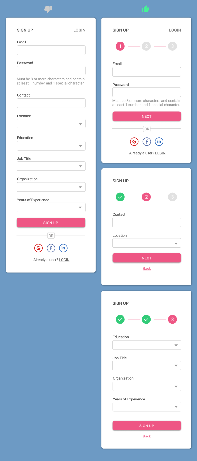
First, you should avoid providing any extra controls in the registration process by focusing on the necessary information only. Still, if there is more information that can be grouped logically, you can go towards a multi-step form.
A multi-step form makes it easier for users to manage large information in a simplified way. They can focus on a single group of properties at a time. While designing a multi-step form, it is important to make it user-friendly for the user. Name the steps relevant to the properties, provide easy navigation between steps, and allow the user to view a summary of the information he provided before submitting the form.
11. Allow easy password recovery
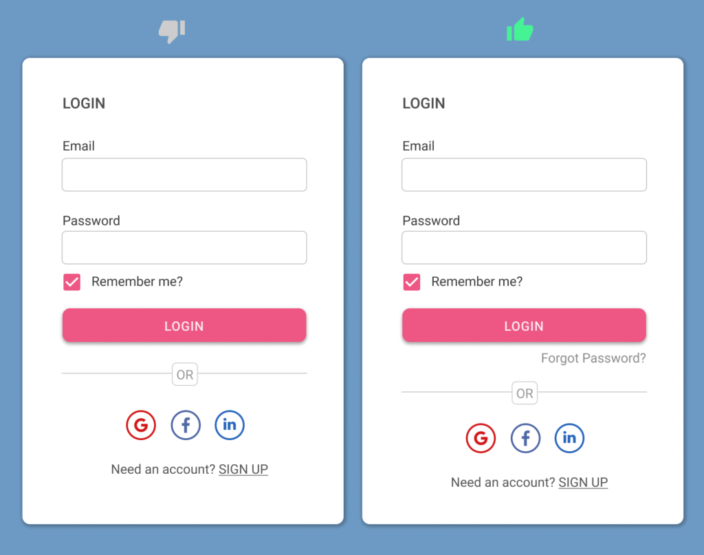
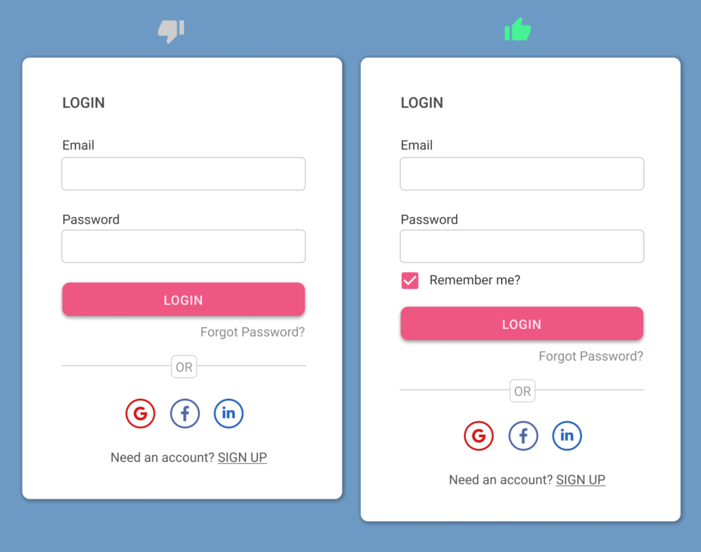
When the users try to log in using email and password, it is quite common that they do not recall the required password. The experience of a login page should allow the users to recover the lost password. Provide a Forgot Your Password option at a prominent place on the login page that can be found easily by the users.
This option will move the users through a smooth process of recovering the password by either sending the reset password link to their registered email address or sending a unique code to the registered mobile number.
12. Provide the Remember Me option
Providing an explicit Remember Me option helps users to give their opinion on whether they want to be remembered when they come back to the site. And it is quite easier for them to decide on their preferences and they can simply uncheck the option if they don’t want the site to remember their email ID, thus making it easier for someone else to guess their password.
The rule is quite simple. If you support the ability to remember the users on your site, you need to just provide this option in the login form, instead of making it a hidden feature and remembering the users without their intention.
Conclusion
The process of registration and logging on to a site or app is the first interaction that users could have with your product. It is critical to make this step easy for the user by designing usable sign-up and login forms. The given best practices are simple yet effective and will play an important role in increasing the usability of your onboarding process.
Want to Learn UX Design?
- Try Interaction Design Foundation (IxDF). IxDF offers online design courses that cover the entire spectrum of UX design, from foundational to advanced level. As a UX Design World reader, you get 25% off your first year of membership with the IxDF.
- The UI/UX Design Specialization from Coursera brings a design-centric approach to user interface and user experience design and offers practical, skill-based instruction centered around a visual communications perspective. By learning this Design Specialization, you can design high-impact user experiences for your customers.
Thanks for reading.
Subscribe for more related articles at UX World.
If you have any questions, contact us here: Facebook | YouTube | Twitter | Instagram | Linkedin


I was more than happy to find this web-site.I wished to thanks in your time for this wonderful read!! I undoubtedly enjoying each little bit of it and I have you bookmarked to check out new stuff you blog post.
Good post. I study something more challenging on completely different blogs everyday. It is going to always be stimulating to learn content from other writers and practice somewhat something from their store. I’d desire to use some with the content material on my weblog whether or not you don’t mind. Natually I’ll offer you a link in your web blog. Thanks for sharing.
Great post. I was checking continuously this blog and I am impressed! Extremely helpful information specially the last part 🙂 I care for such information a lot. I was looking for this particular info for a long time. Thank you and best of luck.