Last Updated on July 1, 2021 by UX World
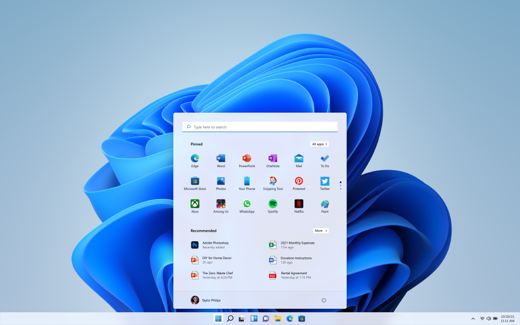
In the new Windows 11, Microsoft has made an amazing evolution in designing the user experience and visual interface. The design language is linked with the Fluent design system that makes it very human-friendly and provides a world-class experience to Windows users all over the world.
Watch Windows 11 new design leaks:
Windows 11 is designed by focusing on the five basic principles
Windows 11 provides an Effortless experience where the user can perform his tasks quickly in more intuitive ways.
It provides a feeling of Calmness with a more soft and decluttered design that is approachable to everyone.
Also, the user can define a more Personalized experience based on individual needs and preferences by using custom widgets.
Though there is a huge evolution in design, however, the interesting fact is the user can still feel a sense of Familiarity while working on Windows 11. This is a big achievement for designers of Windows 11 experience.
Windows 11 is providing a consistent, Complete, and Coherent experience across multiple devices and the user can access his apps easily since everywhere he will experience the same look and feel.
Below are a few highlights of the Windows 11 design experience
Rounded Corners
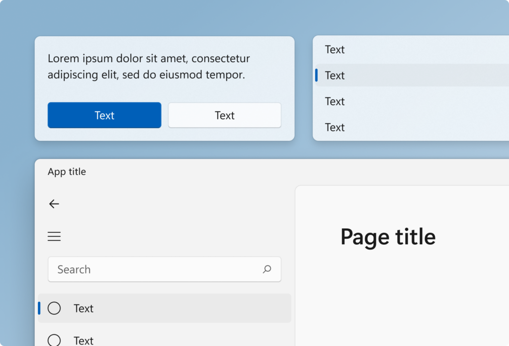
Windows 11 has modernized the visual experience by providing rounded corners to windows as well as other UI controls like buttons and menus. Depending on the size and current placement of the UI controls, different level of roundness is used to create a soft and sophisticated effect on UI that looks pleasant to the user and at the same time enhances the ease of use.
Light and Dard Color Modes
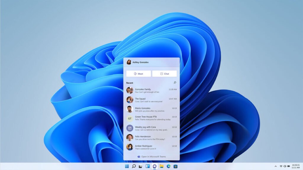
Windows 11 provide a beautiful blend of light and dark modes by defining a visual hierarchy to help users focus on their tasks. Each mode includes a group of colors that look calm and enhance the user interaction on the UI. Visual hierarchy is enabled by indicating the background elements that are not in focus at the moment using dark colors. Whereas the currently focused task and the surface are highlighted in a light color, thus making it more prominent on the UI.

Acrylic, Mica and Smoke Materials
To provide an amazing and awesome visual effects, Windows 11 has used three types of materials in the UI. Acrylic is used to highlight transient surfaces on the background like flyouts and menus. Mica is used in surfaces that are tinted with the desktop background. Smoke is used to dim the background UI elements when a modal dialog is opened on the top.
Modern Icons
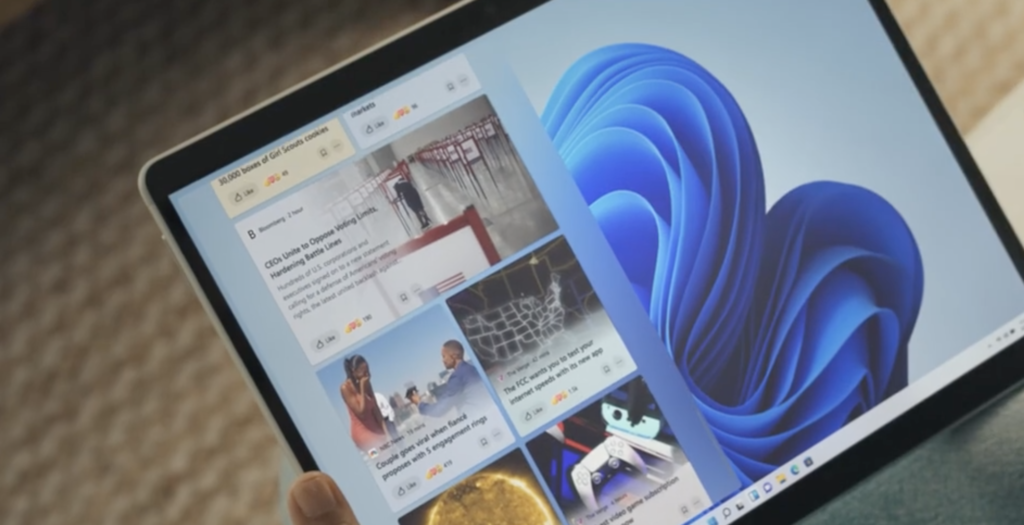
Windows 11 icons are more simple and meaningful in design. Everywhere in the UI, new icons are giving an appealing and attractive look to the user.

Typography
To provide a fresh content look, Windows 11 is using Segeo UI variable as the system font. Different sizes and weights are defined as per the placement of textual content on the UI to provide a balanced visual look.
Improved Productivity
Windows 11 allows you to open multiple apps on the desktop in multiple tabs and provides a convenient and easier way to switch between apps quickly.

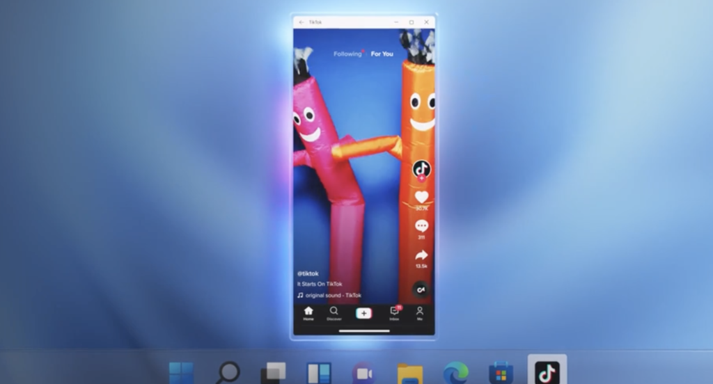
Android Apps
You can use Android apps on Windows desktop with the same experience as you use them on mobile devices.
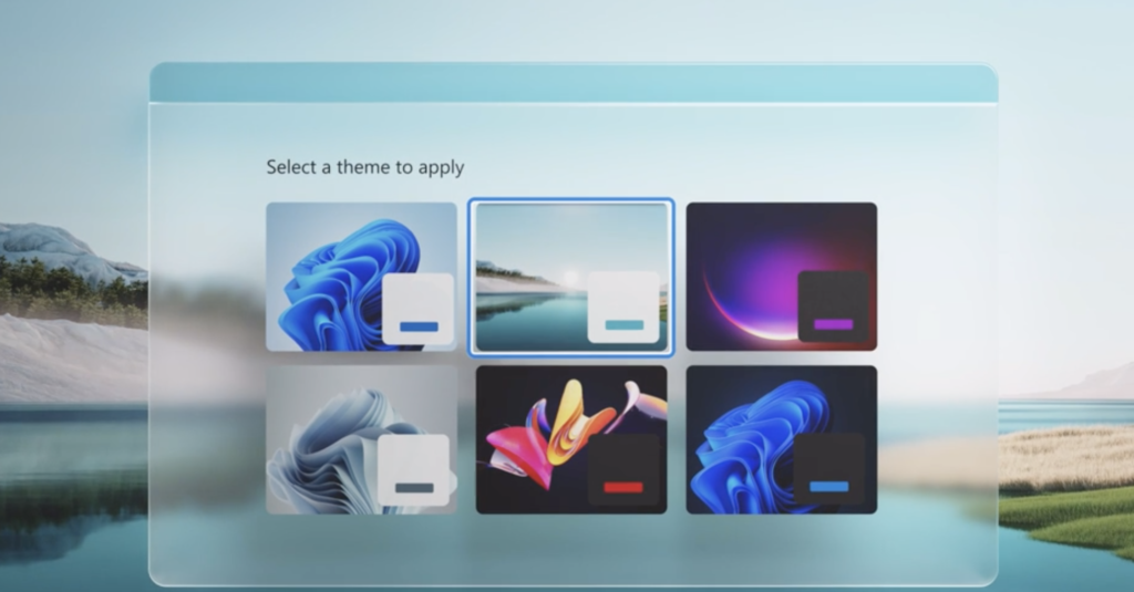
New and Attractive Themes
A set of highly attractive themes are available that you can set and your desktop will give you a refreshing look.
Microsoft is expected to release Windows 11 on October 20, 2021. After looking at the beautiful and attractive design leaks, I am eager to feel the experience by myself. A detailed article on Windows 11 design and user experience will be available when it is launched. Stay tuned!
Thanks for reading.
Subscribe for more related articles at UX World.
If you have any questions, contact here: Facebook | YouTube | Twitter | Instagram | Linkedin