Last Updated on December 9, 2024 by UX World
“Every click is an opportunity to lose prospects.”— Bryan Eisenberg
Clicking on a UI element in a site, app, or product is a way to navigate between multiple views. By clicking on available UI elements, the users interact with your product and move from one page to another to perform their desired tasks.
Navigation is a crucial part of user experience design as the user flows cannot be completed without navigating through different views and pages. I must say,
“Every click is an opportunity to lose prospects, and at the same time, every click is an opportunity to move closer to your goal.”
This means that designing an efficient navigation technique for your product will help you achieve your usability goals and enhance user satisfaction. The below rules will help you define an efficient navigation technique for your product.
Clear interactions
Make interactions clear for your user by providing easy-to-understand UI options. Make sure that clickable links and images are prominent on the interface and users can easily differentiate them from the rest of the controls and options. The interaction points on a page should be visible when the user comes to use your product.
Consistent behavior
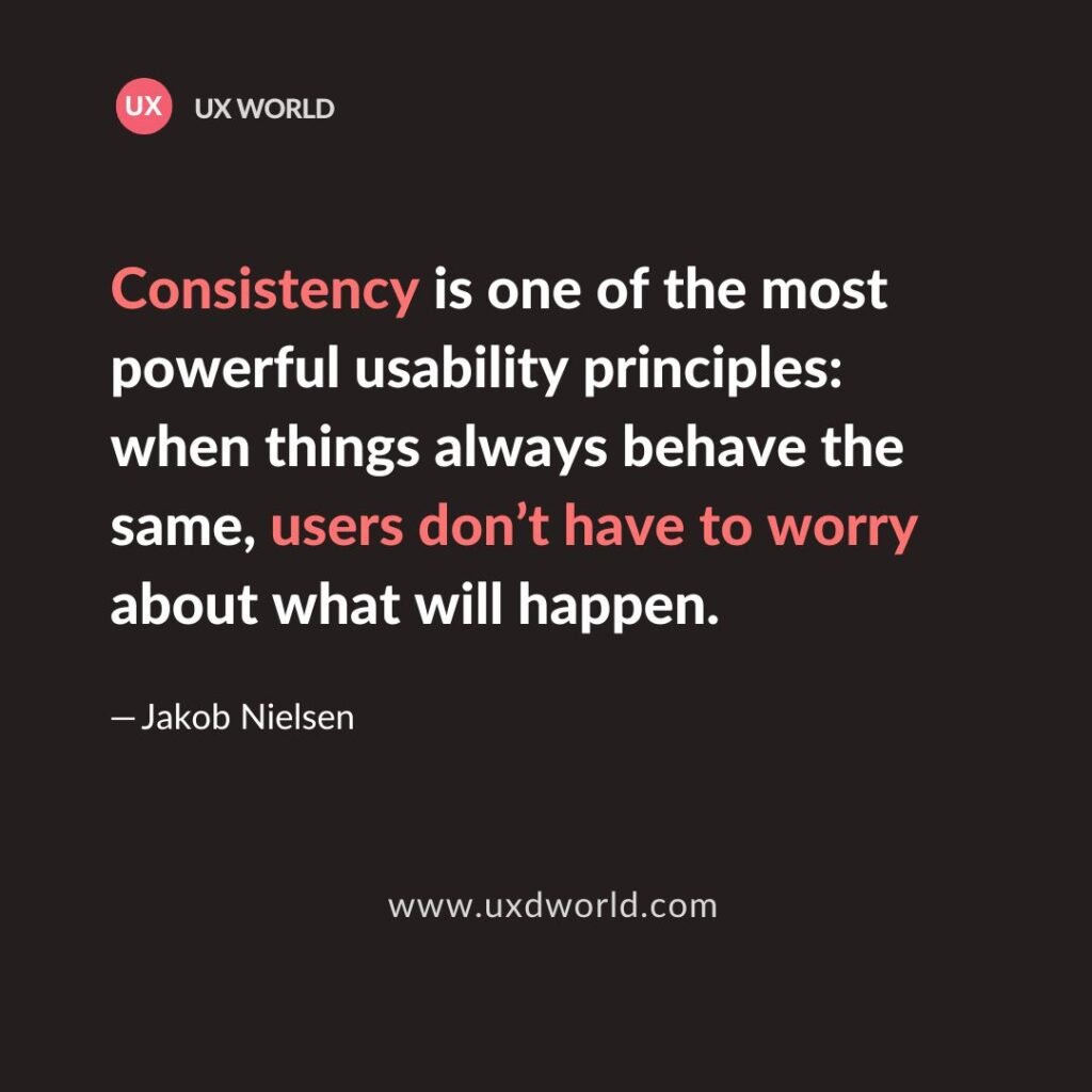
Follow consistency to provide navigation options. Clicking on different menu options should respond similarly. Clicking on UI elements should not surprise the users by showing a unique interaction each time. It will be difficult to remember for your users and will frustrate them.
Meaningful labels
Use meaningful and understandable UI labels that users can follow to move through the pages. The UI labels must be clear and precise so the user can click on them with confidence and go to the right option in your product.
Flat hierarchy
Try to limit the number of levels the user can navigate by clicking an option. Deeper levels will confuse the user and make it harder to remember the context where he is coming from.
Multi-device support
While defining the clicks and interactions, consider multiple devices and adjust the behavior accordingly. It may not be possible to provide similar interactions on the web as well as mobile.
If you follow these basic rules of navigation, clicking through different pages of your product will move the user closer to their goals, instead of losing their prospects.
Learn UX Design?
Try Interaction Design Foundation (IxDF). IxDF offers online design courses that cover the entire spectrum of UX design, from foundational to advanced level. As a UX Design World reader, you get 25% off your first year of membership with the IxDF.
Thanks for reading.
Subscribe for more related articles at UX World.
If you have any questions, contact us here: Facebook | YouTube | Instagram | Linkedin


