Last Updated on November 18, 2024 by UX World
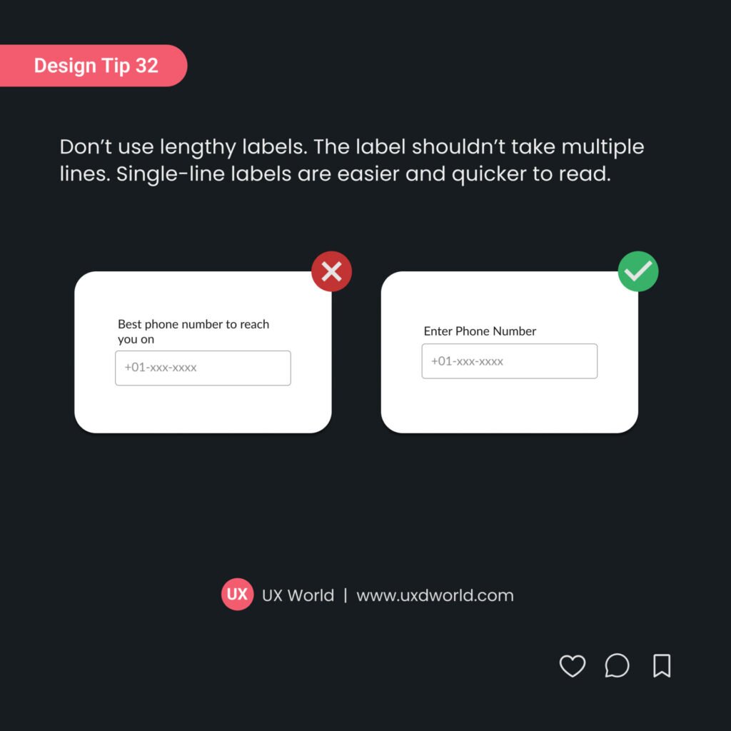
Don’t use lengthy labels for input controls. Labels shouldn’t take up multiple lines. It should be kept to a single line.
- Single-line labels are easier and quicker to read.
- When a label takes up multiple lines, it becomes harder to scan and understand, especially on small screens or in complex forms.
- Multi-line labels can make a form look cluttered and overwhelming, reducing the overall clarity of the design.
- Keeping labels on a single line ensures a consistent, cleaner, and more organized layout.
Use concise and clear language for your labels, ensuring they fit on a single line without losing meaning or clarity.

Want to Learn UX Design?
Try Interaction Design Foundation. IxDF offers online design courses covering the entire UX design spectrum, from foundational to advanced level. As a UX Design World reader, you get 25% off your first year of membership with the IxDF.
Thanks for reading.
Subscribe to more related articles at UX World.
If you have any questions, contact us here: Facebook | YouTube | Instagram | Linkedin


