Last Updated on March 2, 2022 by UX World
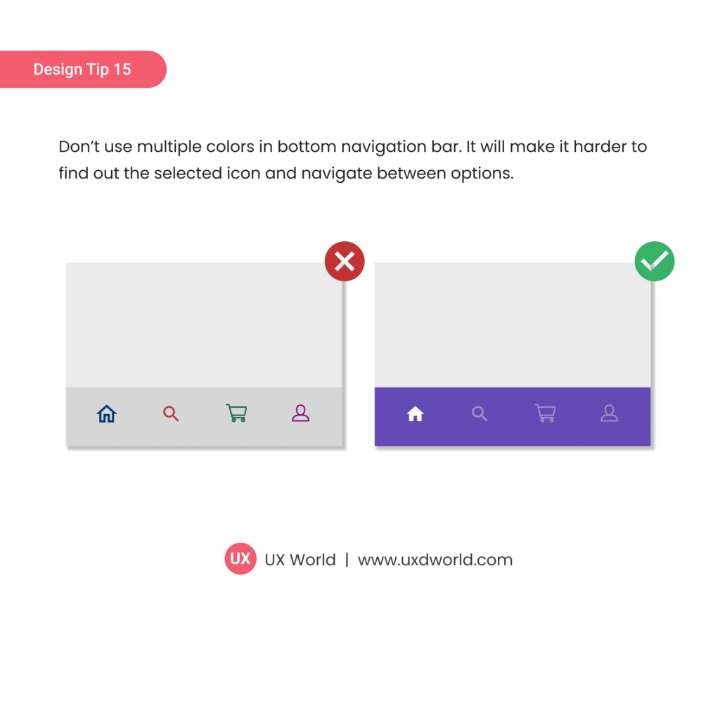
Don’t use multiple colors in the bottom navigation bar. It will make it harder to
find out the selected icon and navigate between options.

Learn More
To learn more on how to design better experiences, consider the Interaction Design Foundation’s online courses on Interaction Design for Usability.
Apart from courses, webinars, and bootcamps, the Interaction Design Foundation is also home to the biggest and most authoritative library of open-source UX Design Resources. Check out the free UX Literature here.
In addition, the UX Academy offers world-class 1-on-1 online training in UX design, access to a vibrant community, and help to get the product design job.
Thanks for reading.
Subscribe for more related articles at UX World.
If you have any questions, contact here: Facebook | YouTube | Twitter | Instagram | Linkedin


