Last Updated on December 24, 2023 by UX World
A landing page is a self-dependent page that is created for advertising or marketing purposes. Whenever you click on any link, or advertisement on any social media platform like Twitter, Facebook, Instagram, etc., you will land on a certain landing page.
The main purpose of the landing page is to provide the user with specific information about your business and demand action from the user in return. Unlike webpages or home pages, a landing page has only one triumph or goal set for users (CTA) and it doesn’t necessarily have navigation keys which can set the potential to distract users.
The landing page can be used as a powerful component in your business which will:
- Attract people towards your idea very effectively by displaying concise and specific information
- Influence the user to accept your idea and be your customer in the future
In this article, you will go through some very simple yet critical tips and ideas for designing a landing page.
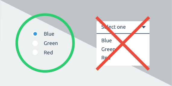
1. Make it Simple
You don’t need to put in extraordinary design skills to design a landing page. Designing a very rich landing page with fancy layouts might increase the loading time which can be annoying for your users.
Your objective should be to keep your landing page simple by including reasonable whitespace on your page. Whitespace will help users easily figure out the important parts or call to action (CTA) on your page. Fewer whitespace results in a cluttered UI and users will feel overwhelmed and distracted.
Make sure to check the layout of your landing page for different screen resolutions. Also, check that how is the layout of your landing page on the mobile screen.
2. Use Appropriate CTA
‘Call to Action’ (CTA) is the most important part of your landing page because it acts as a bridge between your customers and the service or product offered by your business. CTA provides users with specific information and in return asks for the desired action.
To make a strong CTA you must stick with the following tips:
- Use bright and appropriate colors that will make your CTA button more prominent.
- Avoid using phrases that don’t reflect any action. For example ‘Upload’, ‘Submit’, or ‘Start’. All these phrases don’t reflect any type of action. So users might not understand what action you are demanding. Instead of this use actionable phrases for example ‘Upload now’ or ‘Start now’.
- If your landing page is long then make sure to place CTAs on top and bottom of your page so that your users won’t have to scroll up to find your CTA and perform the action.
- When writing your CTA, try to be concise and very specific because your users will only take or do an action when they understand properly what you want them to do.
3. Gain the Trust of People
Your landing page needs to have the potential to gain the trust of people who are new or who visit your landing page for the very first time. You should show your awards, ratings, and quality certifications.
The display of your achievements can be in the form of widgets displayed on top. This develops the feeling of trust in your users and they will eventually transform into your valuable customers.
4. Use of Real Human Images
Using the faces of real people provides the user with a feeling of more realistic interaction. The smiling faces usually reflect friendliness and develop the trust of users. Instead of using artificial faces or avatars, you can use a real person’s face to show a friendly gesture to the user to capture his attention and develop his trust in you.
Moreover, you can also follow the same practice in your CTA design. You can use pictures of real people who are aiming toward your CTA. This practice makes it easier for the user to see your CTA and perform the given action.
5. Use Colors Wisely
Always make sure that you use contrasting colors on your landing page. This makes your page aesthetically beautiful as well as helps you highlight the important content. You can view your landing page in grayscale to check whether you have included enough contrast in colors or not.
Know about the specific meaning or symbol that each color represents. For instance, the blue color can give a feeling of confidence to the user, the green color reflects security or trust and similarly, other colors would have different meanings.
In case you are designing a landing page for a wide range of people who are associated with different cultures, then you need to know that people of different cultures will have different psychological ideas regarding colors. So it is your job to do research and figure out which color is liked by people of some specific culture and which one is disliked.
6. Make your Landing Page Fascinating
If your landing page contains a huge amount of text, then there might be a chance that your users’ attention might drift away as they continue to read the text. So to avoid this you can put different animations in between your text. These animations will explain your idea through visual means and thus this can grab users’ attention at once.
Moreover, you can also shift to the video landing page, if you cannot reduce the amount of your text. The video landing page will not lead users toward boredom.
7. Use Click Triggers
Click triggers can be used as a strategy to eliminate any doubts in users’ minds before conversion. Usually, click triggers are placed very next to your CTA. The purpose of this is to reduce the fear and doubt which is on users’ minds due to risks associated with their conversion into customers.
For example, ‘100% privacy guaranteed’, or ‘Money payback guaranteed’.
After seeing the above examples you must have got a very clear idea of what click triggers are, how much they are important and how you can use them to grab the trust of your users at the very last moment of their decision. If you don’t use click triggers then you may miss the opportunity of converting great numbers of users into valuable customers.
8. Make Your Design Compatible with Smart Devices
Nowadays, the majority of online traffic uses smartphones to operate. So you must provide the same experience to people using smartphones that you are providing to the people using desktops, laptops, or tablets.
You must ensure that your landing page is responsive on the smartphone, the display quality is fine, all the texts including CTAs, videos, or animations are clearly visible and the loading time is also quick.
9. PerformA/B testing
Making a landing page doesn’t guarantee you success unless and until you carry out the alpha and beta testing of your landing page. You must do A/B testing to figure out whether your CTA is displayed on the right side, your landing page is appealing to users, and your landing page has the potential to grab the attention of users and impress them enough that they decide to be your customer.
You can also see how many users land on your page and through what means they land i.e. either they use mobile or a laptop. You can also see how many clicks your page has received and how the overall response of users is after viewing your landing page. For all this, you must carry out A/B testing.
Want to Learn UX Design?
- Try Interaction Design Foundation. IxDF offers online design courses that cover the entire spectrum of UX design, from foundational to advanced level. As a UX Design World reader, you get 25% off your first year of membership with the IxDF.
- The UI/UX Design Specialization from Coursera brings a design-centric approach to user interface and user experience design and offers practical, skill-based instruction centered around a visual communications perspective. By learning this Design Specialization, you can design high-impact user experiences for your customers.
Thanks for reading.
Subscribe for more related articles at UX World.
If you have any questions, contact us here: Facebook | YouTube | Twitter | Instagram | Linkedin