Last Updated on June 30, 2024 by UX World
Introduction
Creating a user-friendly digital experience involves paying close attention to details, especially when dealing with errors.
Error messages are essential as they guide users through their problems while navigating through the user interface. Good error messages can reduce the user’s frustration, thereby increasing the chances of conversion.
This article covers the best practices for creating effective error messages. By following these practices, designers can convert the user’s frustration into a positive experience.
Key Takeaways
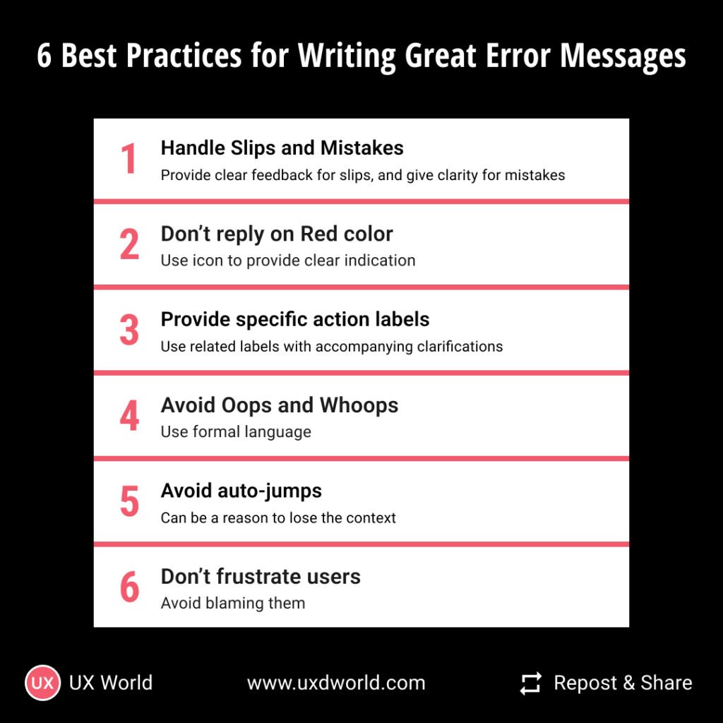
- While writing error messages, take care of slips and mistakes. A slip occurs when the user intends to perform an action but ends up with something else. A mistake occurs when the user does not have the correct knowledge.
- Showing an error in red is not a desired experience, instead displaying the word ‘error’ or using an error icon along with the related control is more meaningful.
- Use related keywords in action buttons.
- Avoid auto-jumps on the page to display the error placement.
Best practices to write great error messages
Below are a few best practices that help you write effective error messages.
1. Differentiate between slips and mistakes
Slip
A slip occurs when a user acts incorrectly despite knowing the correct procedure.
For example, a user intends to click the Save button but accidentally clicks on the “Delete” button. The suitable error message for this case can be:
“Are you sure you want to delete this item? Click Cancel to go back or Confirm to proceed”.
From the above error message, the designer can easily avoid an inconvenience caused due to slips by providing clear feedback for user actions and adding confirmations for irreversible actions like deleting.
Mistake
Whereas, a mistake is the result of a lack of knowledge or misunderstanding that leads to errors from the user’s side.
For example, a user tries registering an app using an unavailable username. The suitable error message for this case is:
“This username already exists. Please choose a different one.”
You see that the above error message is clear and concise. To address mistakes, the designers should focus on enhancing the clarity of instructions and providing contextual help where necessary.
Moreover, there can be scenarios where users are not clear about certain fields in an input form. In such cases, you should provide contextual help by directing users to click on the question mark icons placed next to each form field. Like this:
“Need help? Click on the ’?’ icon for an explanation”
2. Don’t rely only on red color
It is a common practice to write error messages in red because the color is usually associated with errors/dangers etc.
But have you ever thought about users who have color blindness, how will they figure this out? That’s the common accessibility issue found in the majority of designs.
To tackle this situation, you can’t rely only on the red-colored bold message displayed for an error.
Rather you should use icons such as an exclamation mark ‘!’ to indicate errors. Another good practice is to show the error icons such as ’!’ on the left side of the field. This can provide better visibility especially when users zoom in and out. Additionally, you can highlight the entire section containing the error.
3. Keep user actions specific and logical
Make sure the buttons in your error messages are super clear. Even if users don’t read everything, they should know right away what to click to fix the problem.
If the error message has a Yes, No, or Cancel action button, consider adding an action word after it.
For instance in the scenario of subscription renewal, rather than just writing “Renew Subscription”, consider “Renew Subscription Now” and “Renew Subscription Later” with accompanying clarifications like:
“Renew Subscription Now – Your subscription will be extended right now”
or
“Renew Subscription Later – Keep enjoying current benefits until the end of the billing cycle”.
4. Don’t use Oops and Whoops
Now that time has gone when Oops and Whoops, or other kinds of such fancy words played their game.
In the current scenario, using these words sounds unprofessional as you are talking to your users, not your friends or family members.
Rather you can use formal words like “Sorry”, “Apologies”, and “Regrettably”.
For example:
“Apologies, but the connection to the server has been lost. Please check your internet connection and try again”.
5. Avoid auto-scrolling and auto-jumps
Auto scrolling refers to the automatic scroll-up of the page to the first error. Now there isn’t a clear answer to the question of “Should auto-scrolling be used?” It depends on the situation.
From the user’s perspective, sudden movements (auto jumps) on the page can be annoying as they might lead to distraction. So auto jumps must be avoided on any occasion, but auto scrolling can be considered.
Scrolling provides users with the direction of change which is critical in terms of finding out errors effectively. If your form is too big, then consider auto-scrolling for the convenience of your users.
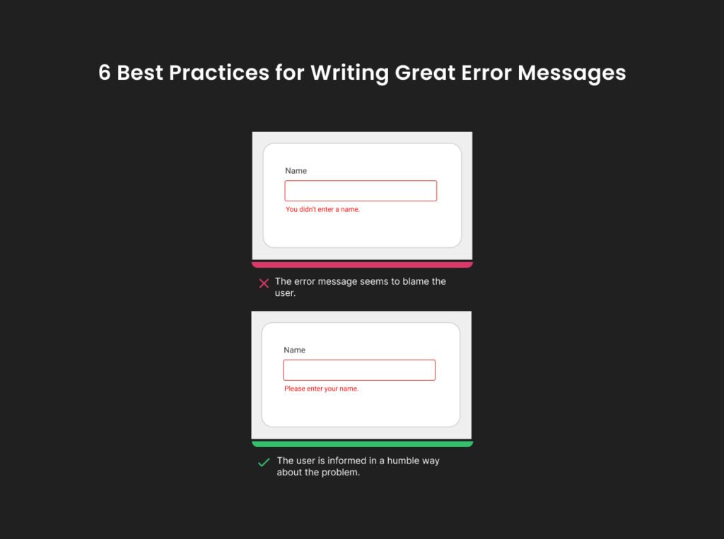
6. Don’t frustrate users
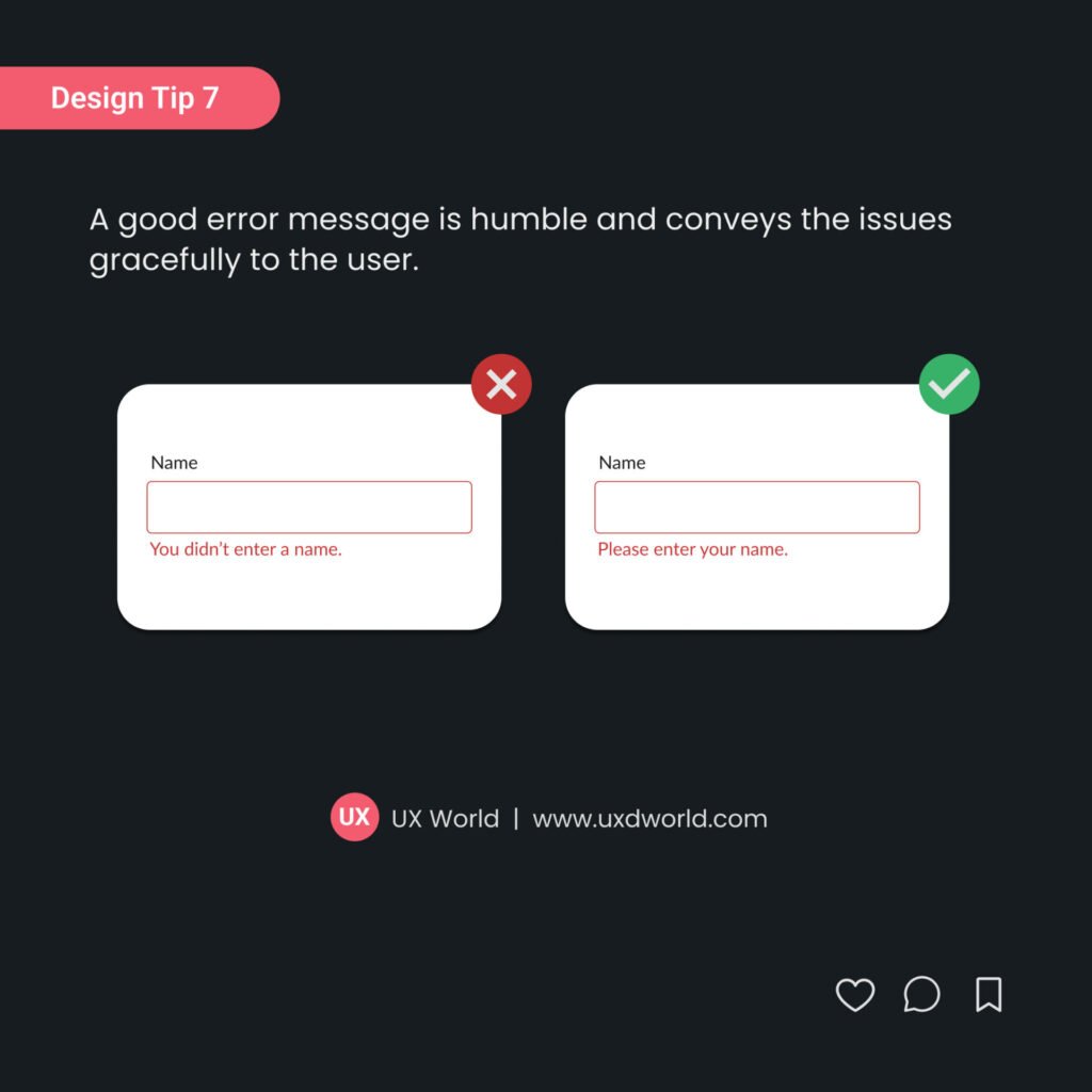
Seeing error messages upon actions already makes users frustrated. Don’t increase their frustration levels by blaming them for their mistakes in error messages. In simple words, avoid using phrases such as “you didn’t”, “you did”, you haven’t” etc.
For example, if the password the user entered doesn’t meet the requirements, say:
“Please ensure your password includes at least 8 characters, one uppercase letter, and one number”
instead of
“Your password doesn’t meet the requirements.”
Let’s take another example: if the user fails to fill out a required field, say:
“Please fill out the required field.”
along with the field instead of
“You missed a required field.”
Conclusion
If your objective is to provide your users with an excellent user experience, then you will have to go into detail about every element involved in the design. And writing proper error messages is among those elements. The above article covers some important aspects of designing error messages. The error messages must be user-friendly yet effective. They should be concise and meaningful.
Want to Learn UX Design?
- Try Interaction Design Foundation. IxDF offers online design courses that cover the entire spectrum of UX design, from foundational to advanced level. As a UX Design World reader, you get 25% off your first year of membership with the IxDF.
- The UI/UX Design Specialization from Coursera brings a design-centric approach to user interface and user experience design and offers practical, skill-based instruction centered around a visual communications perspective. By learning this Design Specialization, you can design high-impact user experiences for your customers.
Thanks for reading.
Subscribe for more related articles at UX World.
If you have any questions, contact us here: Facebook | YouTube | Twitter | Instagram | Linkedin