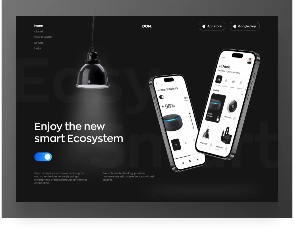
A landing page is a self-dependent page that is created for advertising or marketing purposes. Whenever you click on a link, or advertisement on social media platforms like Twitter, Facebook, Instagram, etc., you will land on a certain landing page.
The main purpose of the landing page is to provide the user with specific information and demand action from the user. Unlike webpages or home pages, a landing page has only one triumph or goal set for users, which is a call to action (CTA) and it may not have navigation keys that can distract users.
The landing page can be used as a powerful component in your business which will attract people towards your idea effectively by displaying concise and specific information about your idea and influencing the user to accept your idea and be your customer for the future.
This article will discuss some common mistakes that beginners or start-ups usually make in designing their landing pages. Avoiding such mistakes will result in an effective landing page design, which will help your business to grow and expand.
1. Multiple CTAs
The purpose of the landing page is to convert users into valuable customers by convincing them of your idea and demanding a certain action from them using CTA. Your landing page must have only one CTA. Using multiple CTAs means that you are asking your users to do more actions which might cause their attention to divert from the main objective.
How to avoid this mistake
So it would be best if you use a single CTA that should contain short, concise, and relevant information that has the potential to grab users’ attention and convert them into customers.
2. Including a Footer and Navigation Menu
As stated earlier, unlike webpages or home pages, the landing page has only one triumph or goal set for users, i.e., CTA. Therefore there is no such need to include a footer and navigation on your landing page.
How to avoid this mistake
If you feel the need to include navigation and a footer, then you must look back to see whether your landing page is overburdening the users by setting multiple actions for them or your information is not concise.
3. Slow Loading Speed
If your landing page is very rich in design i.e. it includes high-resolution images or videos and other fancy design elements, then it is good as far as UI is concerned – but this will slow the loading speed of your landing page.
The slow loading speed is irritating for users who have limited time to view your page. It is estimated that a random user would only wait for approximately 3 seconds and will leave your page if it isn’t loaded. So you will lose your traffic just because your page has a large loading time.
How to avoid this mistake
So always keep the design simple enough that it doesn’t contribute to increasing the loading time of the landing page.
4. No Optimization for Smart Devices
People most spend time on the internet via smartphones. So your landing page design must be optimized for smart devices. If you don’t optimize your design for multiple devices then you will fail to provide a good user experience. Users will get frustrated and might leave your page while feeling disappointed.
How to avoid this mistake:
You need to provide a seamless experience on all devices including desktops, laptops, tablets, and mobiles. Ensure that your landing page is responsive on the smartphone, the display quality is fine, all the texts including CTAs, videos, or animations are visible and the loading time is quick.
5. Lengthy Input Form
When the user is satisfied with your landing page and is interested in your business idea, then you will display an input form to collect user information. It is important to ask for necessary information only from users. If you demand irrelevant information then the form length will increase which might annoy your user at some point in filling out the form.
Moreover, irrelevant information can include sensitive personal information as well which the user doesn’t want to share. So in this way, you can lose your willing customer just because you annoyed him at the very last stage of the process which will be a great setback for you and your organization.
How to avoid this mistake
Therefore it is advised to demand only relevant information and try to keep the form as short as possible.
6. Prefer Design over Functionality
The most common mistake people make in designing a landing page is that they give more importance to design and ignore functionality. In simple words they just want their landing page to be very rich in design including fancy design elements, high-resolution images, animations, colors, etc. But they forget that the user is more concerned with the functionality of the page. Yes, good design will have a pleasant effect on the user but if the landing page isn’t functional then that design is of no use to the user.
Now the question arises here how does design affect functionality? So answer to this question is quite simple when your landing page is very rich in design, then the loading time of the page may increase which will be problematic for users. Moreover, the design optimization for every type of device might also be challenging. This might lead to poor user experience on other devices like smartphones or tablets.
How to avoid this mistake
Therefore we advise you that making a good design landing page is encouraged but besides this keep in mind always that your page should also be functional i.e. it should provide a good user experience and when the user visits your page, he/she is provided with smooth and un-interrupted working experience which will have a positive impact on them and they may think of becoming your lifetime customers if they like your idea.
7. Present Too Much Information
Including too much information whether it is in the form of text or in the form of images or using too many CTAs, etc. will create an ocean of information in which your users might get lost and they will be distracted from the main idea of your page. Landing pages are only created to show users relevant and concise information regarding one particular idea and in return ask them for one single action only (CTA).
How to avoid this mistake
After completing your design always look behind and check whether you have included irrelevant information or not. In case you find out that your page is too rich in information then optimize it by eliminating every irrelevant info and displaying short, concise, and relevant information only.
In the last don’t mix up the landing page with a webpage. On the webpage, you may include bunches of information but not on the landing page.
Want to Learn UX Design?
Try Interaction Design Foundation. IxDF offers online design courses that cover the entire spectrum of UX design, from foundational to advanced level. As a UX Design World reader, you get 25% off your first year of membership with the IxDF.
Thanks for reading.
Subscribe for more related articles at UX World.
If you have any questions, contact here: Facebook | YouTube | Twitter | Instagram | Linkedin


