
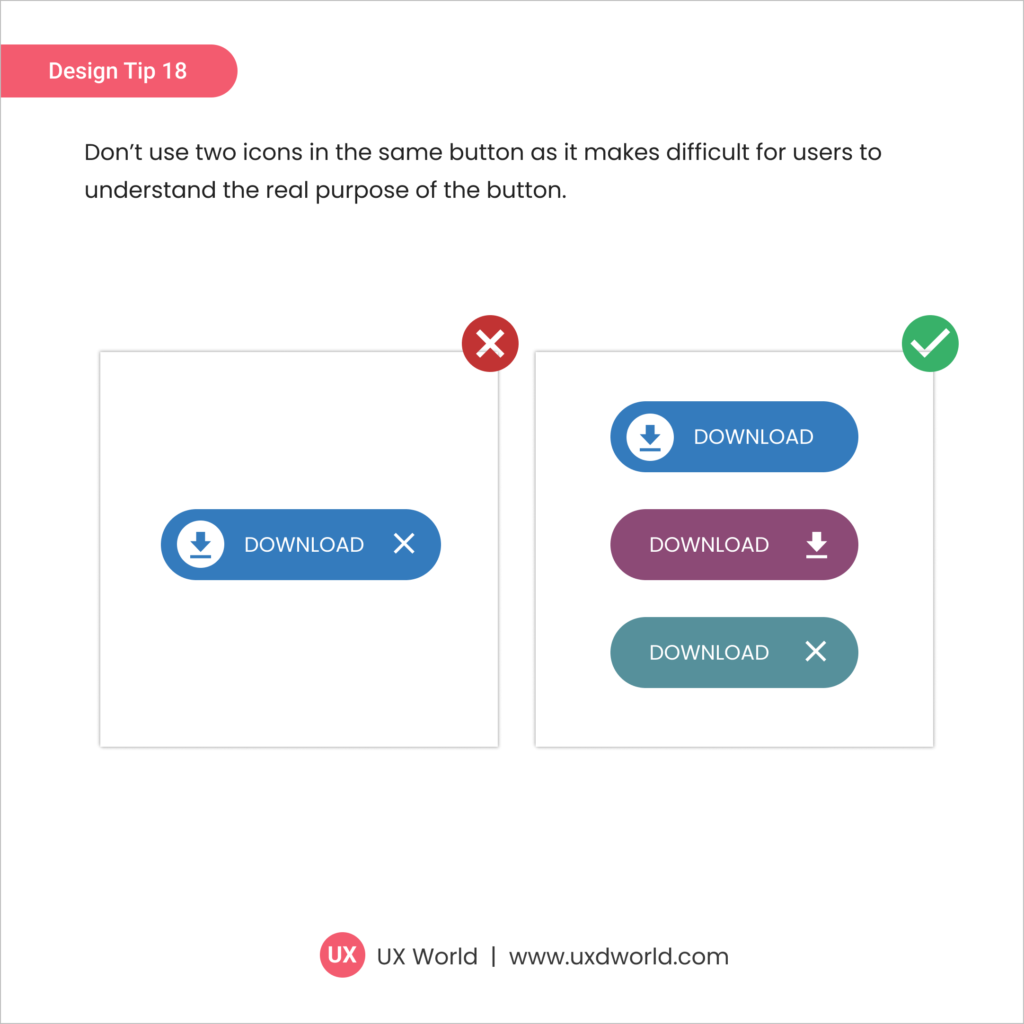
Design Tip#18 – Don’t Use Two Icons in the Same Button
Design Tip: Don’t use two icons in the same button as it makes difficult for users to understand the real purpose of the button.
Design Tip: Don’t use two icons in the same button as it makes difficult for users to understand the real purpose of the button.

Design Tip: Use checkboxes when applied settings require confirmation before they are submitted.
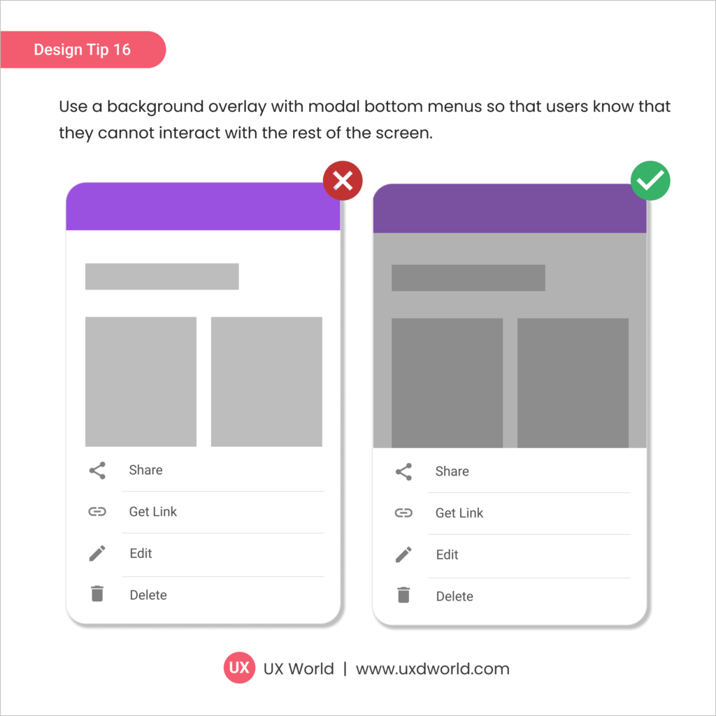
Design Tip: Use a background overlay with modal bottom menus so that users know that they cannot interact with the rest of the screen.
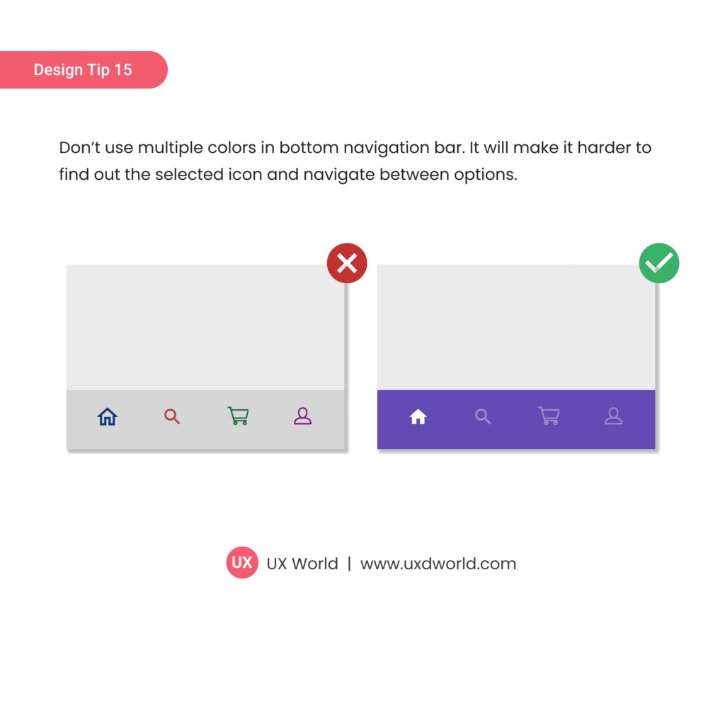
Don’t use multiple colors in the bottom navigation bar. It will make it harder to find out the selected icon and navigate between options.

Don’t place a button below another button if there is enough space to place them side by side.
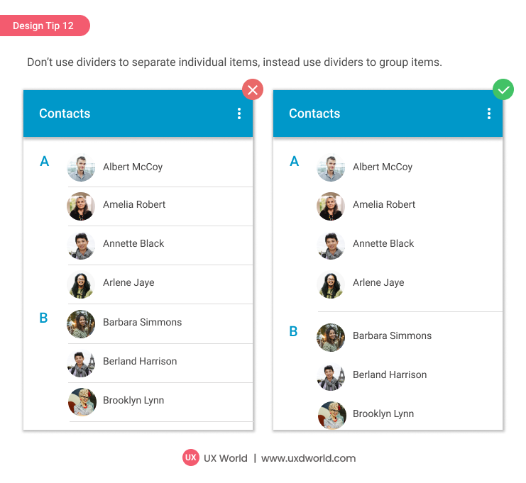
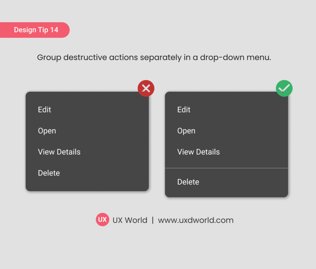
Don’t use dividers to separate individual items, instead use dividers to group items. Find more UI design tips here.

The color contrast should support easy-to-read and distinguishable text over the background and make the useful information stand out effectively. Find more UI design tips here.
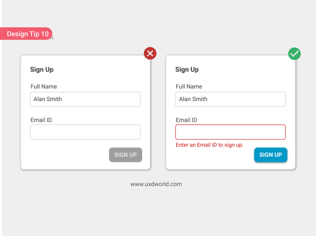
While designing the UI, avoid using a disabled button as it becomes hard to find out why it is disabled and what should be done to make it enable.

Icons provide a great visual way to grab the user’s attention and are fast to recognize and understand.
What is a Design System? A design system is a collection of reusable components including code snippets, images, assets, guidelines, and standards that belong to a product design team within an organization. This collection is referred to while designing and …
How to Create a Design System in 8 Steps – Part I Read More »