
“Mobile user experience (UX) design refers to the design of positive experiences during the use of mobile devices and wearables, and applications or services running on such devices.” Interaction Design Foundation
Below are 8 simple rules of mobile design that help you design user-friendly mobile apps.
- Provide simple navigation
- Make a large touch area
- Reduce clutter
- Display large text
- Use touch controls
- Use simple forms
- Consider thumb-friendly zones
- Design consistent experience
Watch this video if you want to get a quick idea of these rules.
1. Provide Simple Navigation
Simple navigation provides an obvious way of moving between screens and finding the desired items as mobile users must go and forth within the same window.

2. Make a Large Touch Area
Make sure to design control sizes that are easier to tap using the thumb. Providing smaller controls will annoy users when they use your app.
3. Reduce Clutter
It is not necessary to display every possible information on the interface. Organize your content in a way that provides the user with a clear understanding of the available features. Reduce clutter and keep minimum content on screen.


4. Display Large Text
Keep in mind the smaller size of the mobile screen and make your text larger in size so that it can be easier to read and understand.
5. Use Touch Controls
A lot of mobile controls are available to use in design. It is not a good idea to use simple web controls as it is difficult to interact with them on mobile.

6. Use Simple Forms
Try to provide simpler forms where users can provide their input with ease. Use form controls where typing the text is less required.
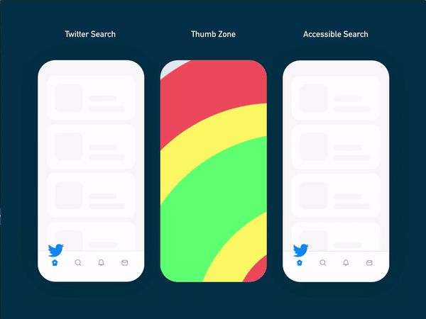
7. Consider Thumb-Friendly Zones
Design screen layout while researching about the thumb-friendly zones. Provide tapping controls at a place where users can easily tap them using their thumb.
8. Design Consistent Experience
If your site/app is present on both web and mobile, provide a consistent experience to the user. Minimize your content on small devices by keeping the experience similar to other devices.
Missed anything important related to mobile design? Give a shoutout below.
Want to Learn UX Design?
- Try Interaction Design Foundation. IxDF offers online design courses that cover the entire spectrum of UX design, from foundational to advanced level. As a UX Design World reader, you get 25% off your first year of membership with the IxDF.
- The UI/UX Design Specialization from Coursera brings a design-centric approach to user interface and user experience design and offers practical, skill-based instruction centered around a visual communications perspective. By learning this Design Specialization, you can design high-impact user experiences for your customers.
Thanks for reading.
Subscribe for more related articles at UX World.
If you have any questions, contact us here: Facebook | YouTube | Twitter | Instagram | Linkedin