
A very common error that you come across while working on the internet is the ‘404 error’ or ‘Page not found’ error. This appears when you enter a web address that does not exist.
The message that appears on this error page should be designed in a way that does not give the user a negative impact. Along with giving a reason for the error, this page should re-direct the user to an actual page of the site.
Many popular websites have designed error pages that give users a pleasant user experience by telling them about the error in a humorous way and guiding them to the correct path.
Here are 18 examples of 404 error pages from a few popular websites that will help you understand how to design a user-friendly error page.
- Adobe
- Amazon
- Awwwards
- Behance
- Canva
- DesignerNews
- Dribbble
- eBay
- Notes
- Interaction Design Foundation
- Justinmind
- Mailchimp
- Medium
- Sitesee
- YouTube
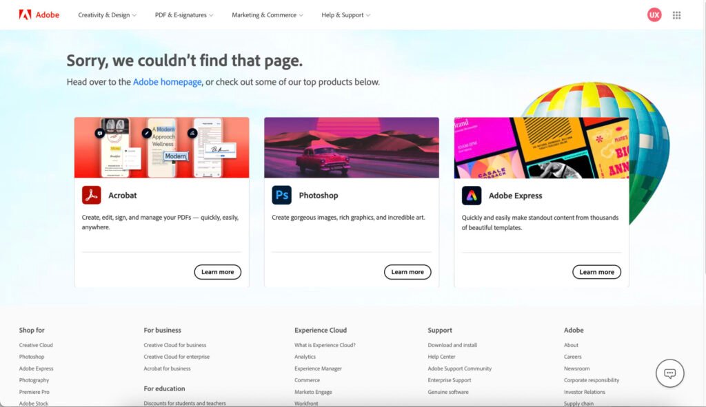
1. Adobe
Adobe’s error page provides a pleasant look at once with visual images and a short message at the top of the page.
The title of the error page is displayed at the top. No further description or reason for the error are mentioned.
The user is given two options to remove this error. One is to move to the Adobe home page, the other is to explore the Adobe products given below.
Like other site pages, the Sign In option and link to the main pages are part of the Error page.
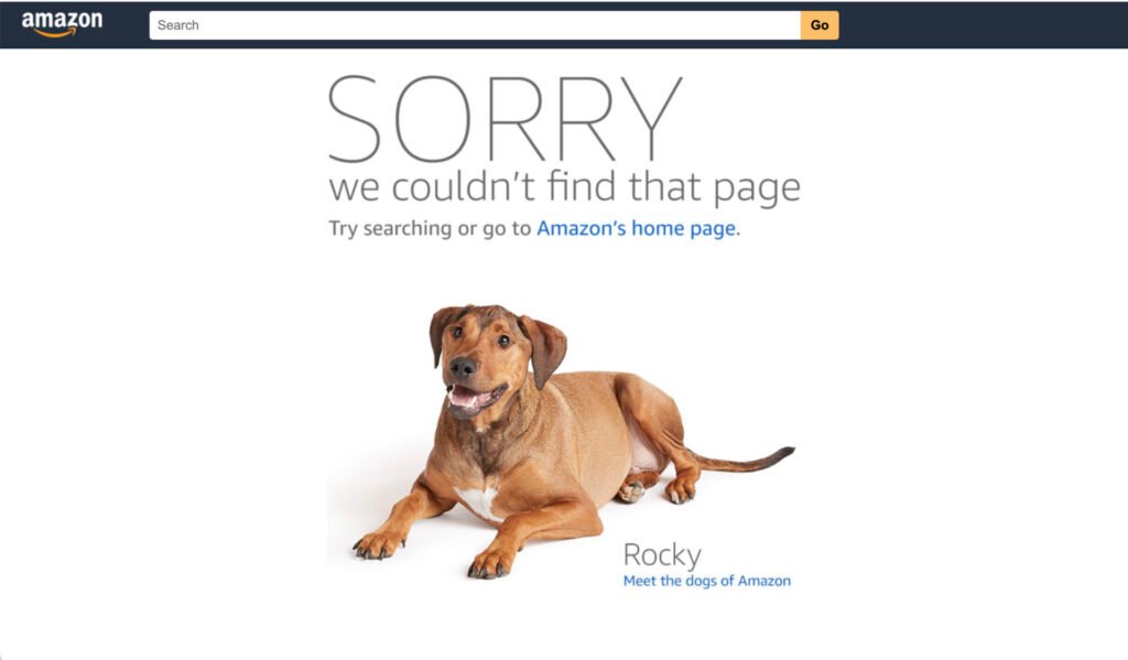
2. Amazon
Amazon provides a simple and attractive error page.
‘Sorry’ mentioned in large fonts gives the user an idea that something is not correct here. The error description says that we couldn’t find that page. No reason for this error is mentioned on the page.
The user is given two options to remove the error. He can go to the Home page of the site, or he can try searching on the entire site.
A big visual picture of a dog provides a light impression to the user. A link to the Amazon blog with an interesting tagline gives users a humorous experience. Users can follow the blog link to go to Amazon’s blog page.
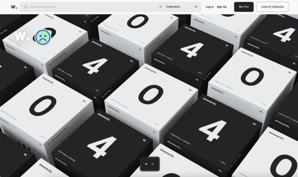
3. Awwwards
Awwwards’s error page is a simpler one.
The page displays several boxes showing 404 labels. An error message displays on each box using a very small font.
A small sad face is shown on the top left side which indicates that something bad has happened.
The page contains common links and options like any other page of the site.
A menu displays that allows the user to go to the other site pages and an option to Submit your Site displays on the top.
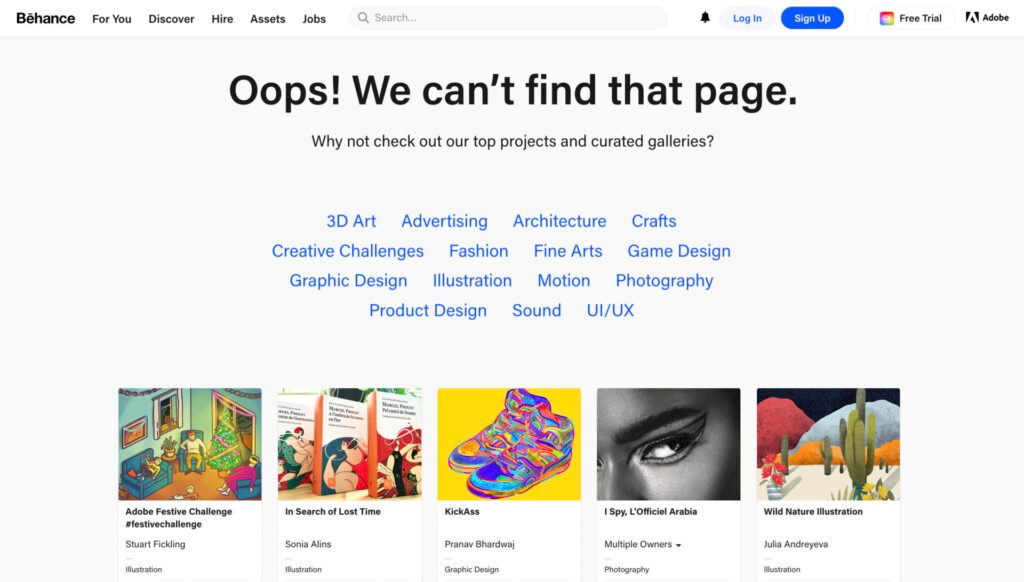
4. Behance
Behance’s error page is like other site pages with an error message in the center of the page.
The error message simply states that the page is not found. However, no reason is mentioned as to why this message appears and what the user has done wrong.
To remove the error, they provide users an option to check out different galleries and projects on Behance. For this purpose, a list of categories is displayed so that users can click on them and go to the projects belonging to that category.
Popular design projects are also displayed at the bottom.
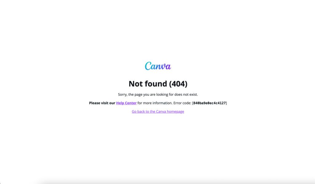
5. Canva
Canva error page displays a simple text to show the error message and code.
The error message is not user-friendly and written in technical language.
Links to the Canva home page and Help center are visible on the page.
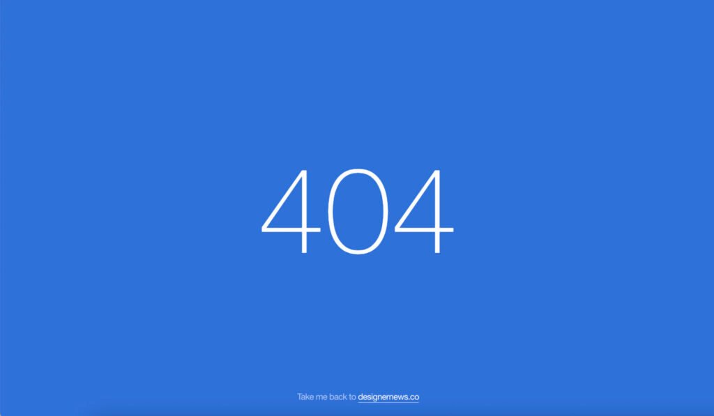
6. DesignerNews
DesignerNews’s error page is much simpler with no text on it.
A large visual image of 404 with no description of the error displays on the page.
A link to the home page is given to go to the home page of the site.
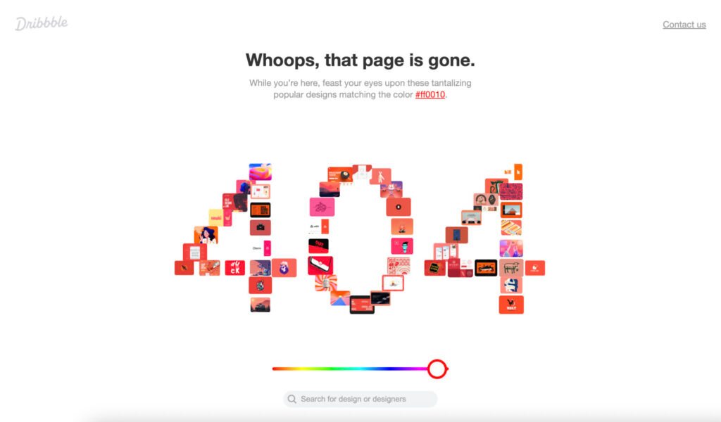
7. Dribbble
Dribble’s error page gives a nice and lighter look to the user.
The page displays an error message along with a visual indication of the error type as 404. No other description of the error is given on the page.
There is an interesting option for users that they can use to change the theme of the error page. While they are on the page, the design allows them to play with the color theme and see the real-time changes on the page.
In addition, links to the Home and Contact pages are given to the user to move to those pages.
A search option allows users to find out what they want to see.
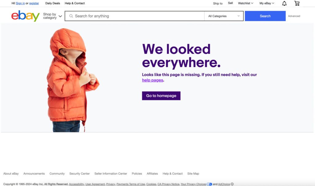
8. eBay
eBay’s error page is a simpler and cute one.
It contains all common options that are displayed on any other page of the site.
The error message is displayed in plain text along with the picture of a kid. There is no specific description or reason mentioned in the message.
Links are provided to either go to the Help page or to the Home page of the application.
The Search option allows users to find an item from the site that they are looking for.
9. Notes
The Notes website displays an error page which is simple yet intuitive.
A cute image indicates the error with a description of why this error has occurred.
The only other thing is a link to the Home page. It can be seen that the user is asked to get in touch with the site owner, however, there is no such link or address for the user to follow.

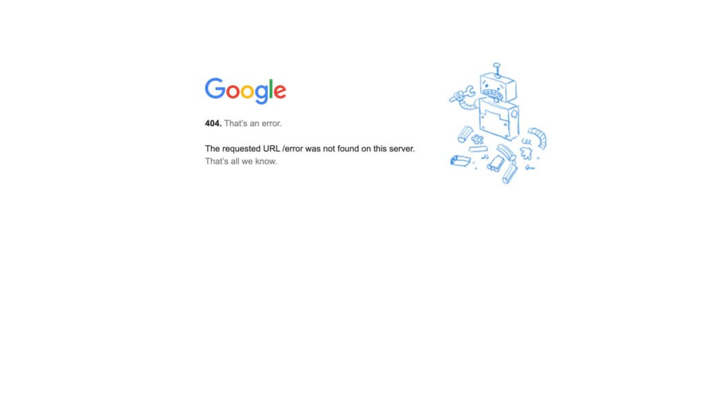
10. Google
Google’s error page is very simple and provides little information.
The language being used is not user-friendly. An image displays a broken robot holding a tool in his hand which is not going along with the description as no one seems here to help you resolve the error.
There is no visible option to go anywhere from this error page. The user can click on Google Image to go to the Home page.
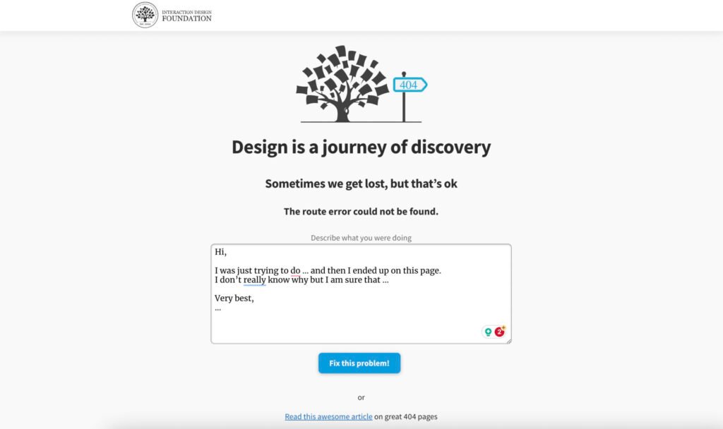
11. Interaction Design Foundation
IDF error page uses the same template that is being used for other pages of the site and at once it is difficult to find out that this is an error page.
The page title does not indicate anything related to the error. However, a small icon with 404 text displays that is not very visible on the UI.
There is an option to send a custom error message that helps to resolve the problem. Also, the page contains a link to an article related to 404 error pages which is a way to move the user to the site’s articles.
Like other pages, there is a link to the main pages including the Home page. The login option is also presented on the screen.
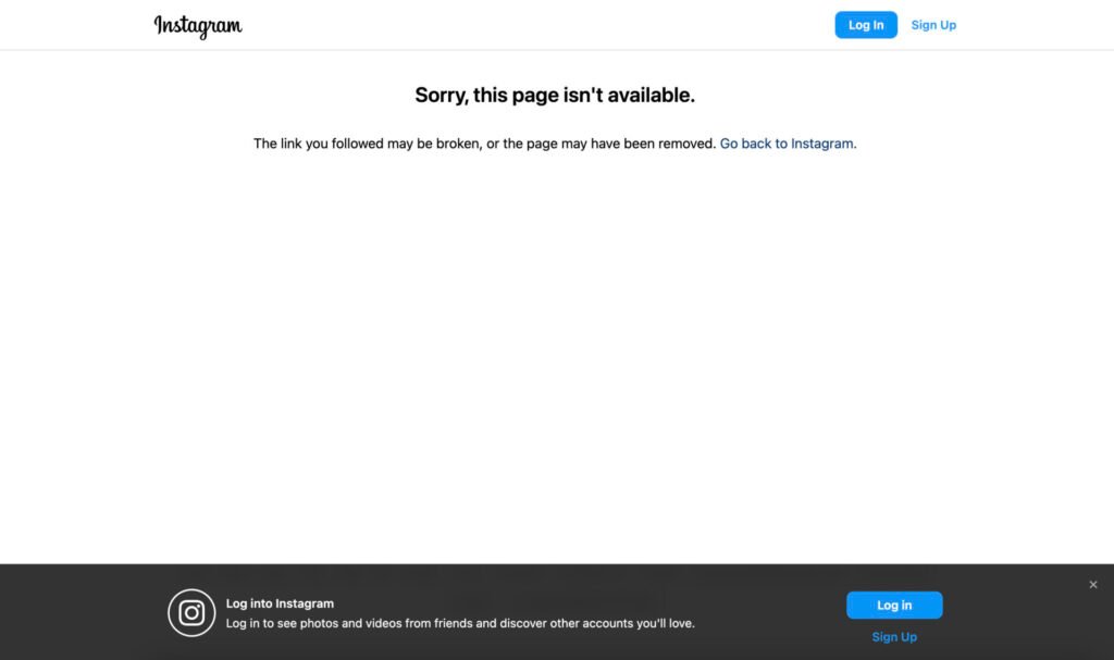
12. Instagram
Instagram displays a simple error page with just one line of text.
The error message is displayed in plain textual form with a good description and possible reasons for this error.
The login option and links to the Home page and other main pages of the site are available on UI.
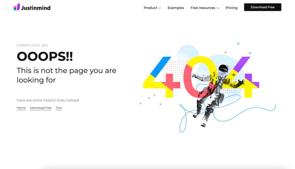
13. Justinmind
Justinmind’s error page uses a nice theme that gives the user a feeling of some error at first glance.
The page contains an error message with large fonts. The error description is written in simple language, however, there is no reason why this error has occurred.
In addition to common links on the top bar, the error message also ends up with three options for the user where he can go from this error page.
A large visual image displays along with the error message. Overall page theme and layout look appealing to the user.
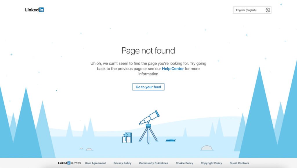
14. LinkedIn
LinkedIn error page uses a pleasant template to display the error message.
Error message title and description are placed in the center of the page. There is an option to go to the Help Center and find the answer to your questions.
Links to the Feed and Home pages are given along with other main pages. There is an option to change the language of the site.
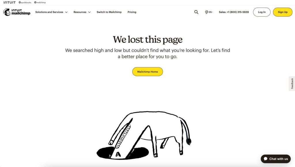
15. MailChimp
Mailchimp’s error page uses a good design template.
It contains an error message along with an image where an animal is trying to search for something deep inside the ground. The error description does not say anything about the reason for the error.
Links to the Home page and main site pages are also given. Options to log in to the site and search the site are displayed on the UI.
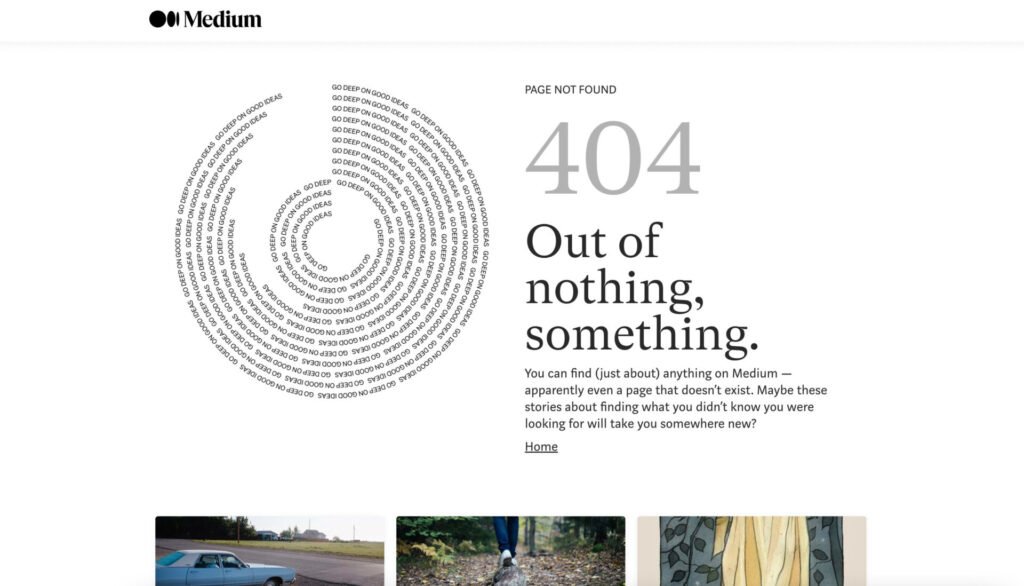
16. Medium
Medium displays a simple and interesting error page.
It displays an error message with a title of 404. No clear reason for this error can be seen on the page.
A link to the Home page is available where the user can find any article or author. Also, a few popular stories are shown at the bottom.
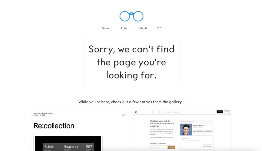
17. Sitesee
The Sitesee error page is very simple with a little different content.
Instead of displaying a conventional error message, they said that there is nothing to see. They ask the user to send a tweet to them so that they can solve the problem. They move the user to the Twitter page of the site.
The option to go to the Home page of the site is available on the screen.
18. YouTube
The YouTube error page displays an interesting and simple design.
A funny image shows where a monkey is searching for something which gives the user an idea that the website is looking for something that it couldn’t find.
A simple error message displays with the image. This message does not give any reason for the error.
However, it presents the user with an option of searching for something else that he may able to find on the site.

Conclusion
A user-friendly error page contains:
- An image related to the error
- Error title that is prominent on the screen
- Description of the error in simple language including error, reason, and solution
Preferably,
- Error page template should be different than other site’s pages so that it grabs the user’s attention when it opens.
- The theme should be like the site itself.
Want to Learn UX Design?
- Try Interaction Design Foundation. IxDF offers online design courses that cover the entire spectrum of UX design, from foundational to advanced level. As a UX Design World reader, you get 25% off your first year of membership with the IxDF.
- The UI/UX Design Specialization from Coursera brings a design-centric approach to user interface and user experience design and offers practical, skill-based instruction centered around a visual communications perspective. By learning this Design Specialization, you can design high-impact user experiences for your customers.
Thanks for reading.
Subscribe for more related articles at UX World.
If you have any questions, contact us here: Facebook | YouTube | Twitter | Instagram | Linkedin